Sherwin Williams' Blithe Blue SW 9052 is a soothing hue that embodies tranquility and sophistication. With an RGB composition of (144, 189, 189), it ventures into a soft teal spectrum, offering a gentle balance between blue and green undertones. This versatile color is perfect for creating serene and inviting spaces, enhancing both modern and traditional interior design elements.
Color Description
Blithe Blue SW 9052 is a blue paint color that offers a calm and serene appearance, suitable for both interior and exterior projects.
Undertones
The color does not have explicitly mentioned undertones in the provided sources, but it is generally characterized as a straightforward blue shade without strong secondary hues.
Color Values
The hex code for Blithe Blue is #90bdbd, indicating a medium to light blue color.
Usage
Blithe Blue can be used for various paint projects, including walls, trim, and accents, in both interior and exterior settings.
Atmosphere
This color creates a calm, soothing, and peaceful atmosphere, making it ideal for spaces where relaxation and tranquility are desired.
Sherwin Williams Blithe Blue SW 9052 Color Alternative
Sherwin Williams Blithe Blue SW 9052 offers a classic hue, and exploring color alternatives can provide fresh inspiration for any project. Tikkurila Mistral K491, Dulux River Valley 50BG 44/094, and Little Greene Grey Stone 276 serve as inspiring alternatives that maintain a balance between contemporary and timeless aesthetic. Experimenting with these alternatives may unveil unique textures and moods, giving every space its own distinguished character.
Bathroom
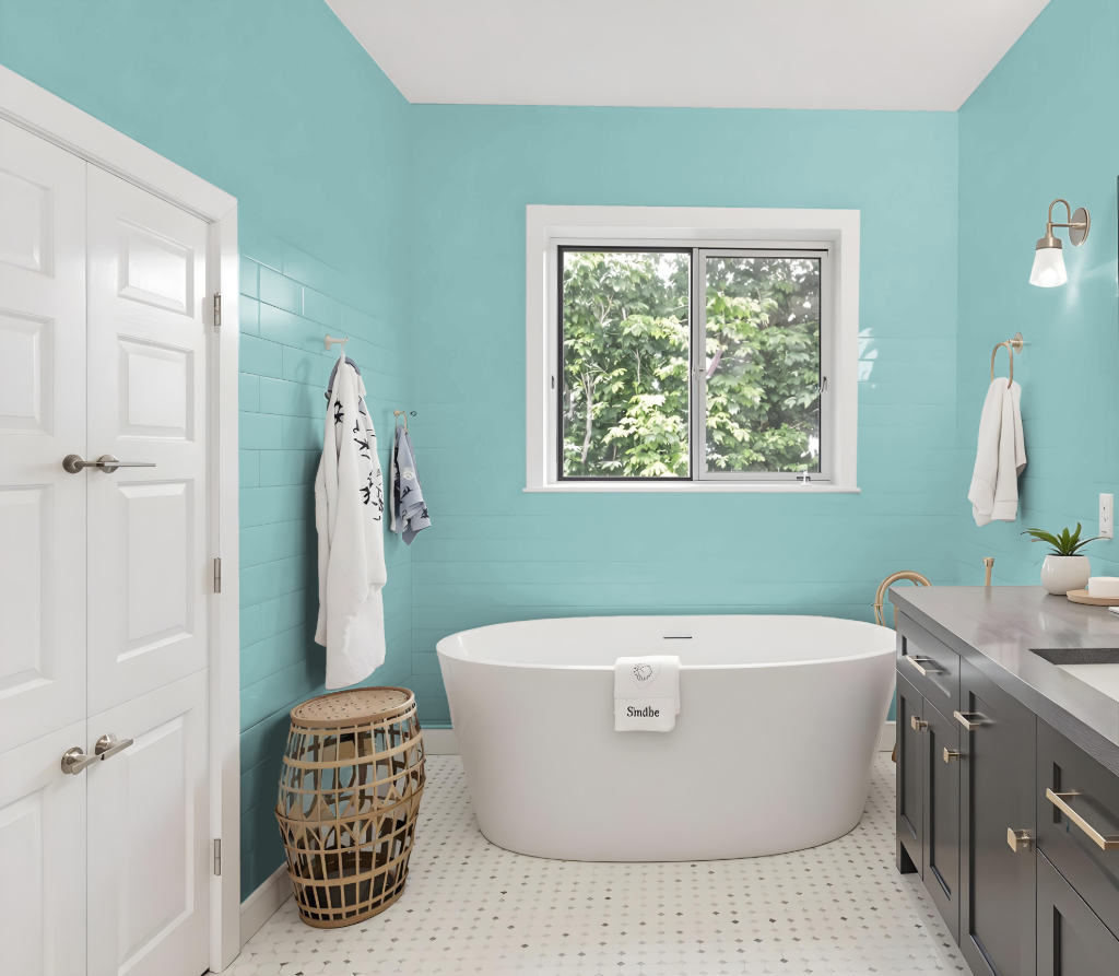
Sherwin-Williams Blithe Blue SW 9052 is an excellent choice for a bathroom, offering a calming tone that sets a soothing atmosphere perfect for this intimate space. The color harmonizes well with various design styles and complements fixtures and decor featuring cream, gray, and gold accents.
Its subtle depth allows for a cohesive look when incorporated into a monochromatic scheme with lighter or darker variations of the same shade. The gentle undertones contribute to a tranquil setting where relaxation and rejuvenation are key.
Bedroom
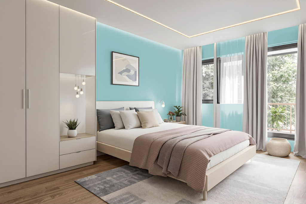
Sherwin Williams Blithe Blue SW 9052 provides a calming bedroom color that fosters a tranquil retreat for relaxation and rest. This hue creates an inviting atmosphere perfect for spaces where unwinding is a priority.
It seamlessly adapts to different design approaches, whether using a monochromatic scheme of various intensities or pairing with warmer hues for an engaging contrast. Its ability to harmonize with both formal and casual decor ensures a cohesive and welcoming look across walls, furniture, and accent elements.
Kitchen
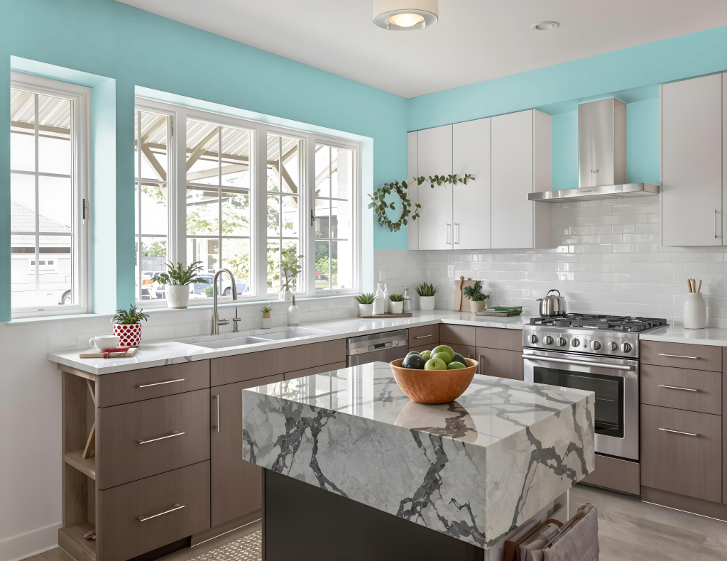
For a kitchen color scheme, Sherwin Williams Blithe Blue SW 9052 creates a unique and calming atmosphere that promotes tranquility and sophistication. Its cool mid-tone quality serves as a solid base that can be enhanced with red-hued complements like Sherwin Williams Mauve Tinge or Studio Mauve, offering an energetic contrast that enlivens the space.
This color also supports a more unified look when employed in a monochromatic palette featuring various shades, tints, and tones, making it important to include accent decor to avoid monotony. Ideal for pairing with a range of kitchen fixtures and decor elements—from cabinets and bookshelves to ceilings and walls—Blithe Blue helps establish a cohesive and engaging environment.
Living Room
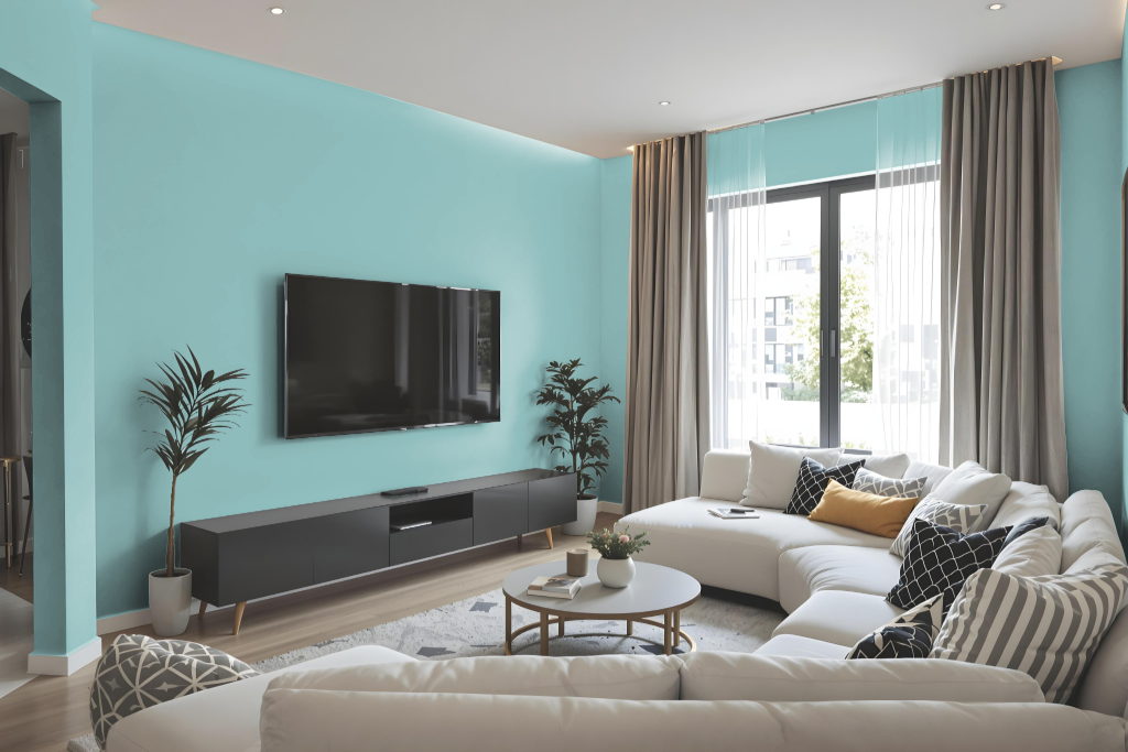
Living room color Sherwin Williams Blithe Blue SW 9052 creates a calming and soothing sanctuary that sets a tranquil tone for relaxation and comfort. Its gentle presence enhances spaces designed for unwinding while imparting a touch of refined sophistication.
This serene hue seamlessly adapts to various settings like bedrooms and home offices, offering an inviting and cozy atmosphere. When paired with complementary colors featuring a red hue, it invites a dynamic visual interplay that elevates the overall aesthetic of any interior design.
Outdoor
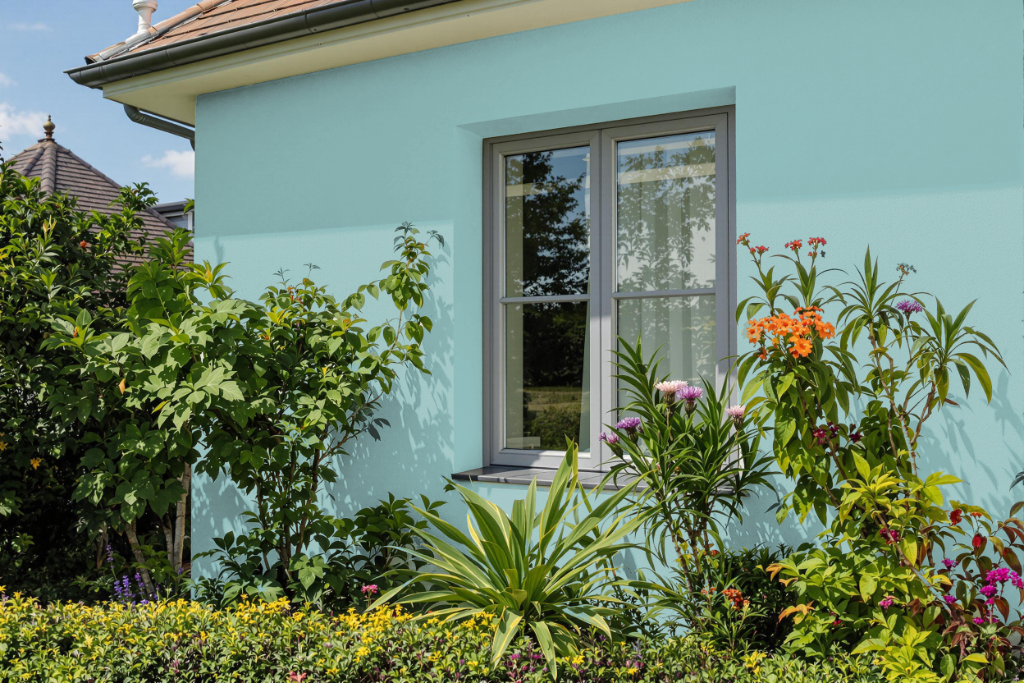
Sherwin Williams Blithe Blue offers a refreshing home outdoor color option that can add a distinctive charm to your home's exterior. While often favored for indoor settings like bedrooms and living areas, this shade can also work effectively outdoors when applied to diverse surfaces, from rough walls to smoother elements such as cabinets or trim.
When considering this color for your home's exterior, it's important to evaluate its appearance under varying lighting conditions and textures. Testing the shade with no-damage adhesive samples can help ensure it harmonizes with your overall aesthetic and adheres to any local guidelines or homeowners' association requirements before committing to a full paint job.