Sherwin Williams Bosc Pear SW 6390 is a sophisticated hue that embodies the warmth of a rich tan, subtly balancing both earthy and golden undertones. Its RGB composition of 192, 144, 86 produces a color that is versatile enough to complement a wide range of interior design styles, from modern minimalist to cozy rustic spaces. This refined shade not only adds depth to a room but also creates a welcoming atmosphere that is both elegant and timeless.
Color Description
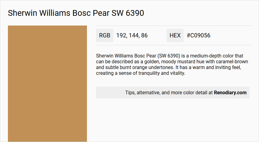
Sherwin Williams Bosc Pear (SW 6390) is a medium-depth color that can be described as a golden, moody mustard hue with caramel-brown and subtle burnt orange undertones. It has a warm and inviting feel, creating a sense of tranquility and vitality.
Undertones
The undertones of Bosc Pear are accurately described as having a red hue, with significant caramel-brown and subtle burnt orange hints. These earthy undertones bring a touch of nature and warmth to the color.
Color Values
- Hex Color Code: #C09056
- RGB Color Code: RGB(192, 144, 86)
- CMYK Values: 0.0%, 25.0%, 55.2%, 24.7%
- Light Reflectance Value (LRV): Approximately 32 (medium color)
Usage
Bosc Pear is versatile and can be used in various applications:
- Works well as an accent color for front doors, shutters, or trim, enhancing curb appeal.
- Pairs beautifully with both bold, dark colors like Sherwin-Williams Ironclad and lighter neutrals like Shoji White.
- Suitable for modern, contemporary, traditional, or organic architectural styles.
- Complements natural materials such as stone, wood, or brick.
Atmosphere
Bosc Pear creates a warm, inviting, and sophisticated atmosphere. It brings a sense of rejuvenation and harmony to indoor spaces and adds a unique, earthy vibe to exteriors. The color strikes a balance between rich depth and welcoming warmth, making it ideal for spaces seeking a balance between relaxation and productivity.
Sherwin Williams Bosc Pear SW 6390 Color Alternative
Sherwin Williams Bosc Pear SW 6390 offers a unique blend of softness and warmth that can be enhanced or mimicked with complementary hues. Tikkurila Beeswax L396, Tikkurila Curry L395, and Dulux Cherished Gold 20YY 36/370 serve as excellent alternative color options, each providing its own distinct character to any space. By considering these alternatives, designers can achieve a versatile palette that honors the original inspiration while exploring new creative possibilities.
Bathroom
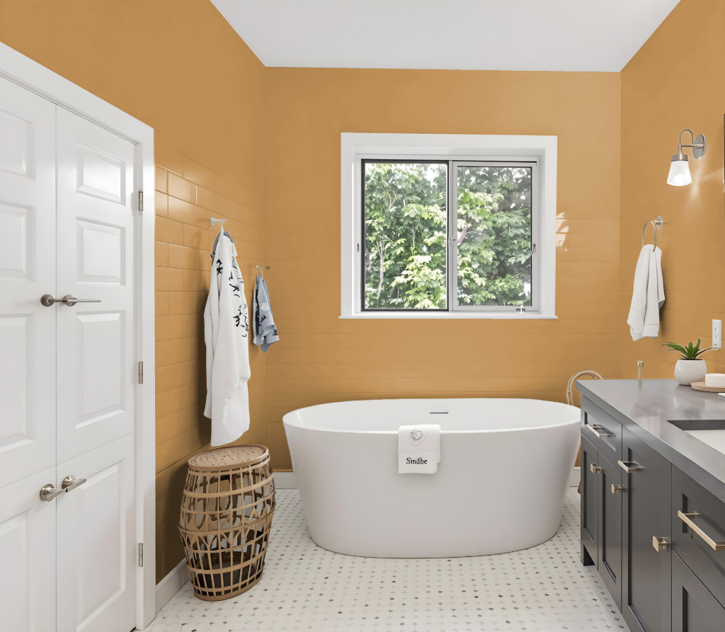
For a bathroom, Sherwin-Williams Bosc Pear offers a uniquely inviting color choice with a medium-depth tone that brings warmth but may also create a cozier, darker feel in smaller spaces. It lends an organic quality that pairs well with lighter, neutral shades on trim and ceilings to create a balanced and harmonious atmosphere.
Enhance the overall aesthetic by integrating natural elements like stone or wood accents, which complement its rich, earthy undertones. It is important to test the color in the specific bathroom environment using peel-and-stick samples to ensure its interaction with existing lighting and fixtures meets your design vision.
Bedroom
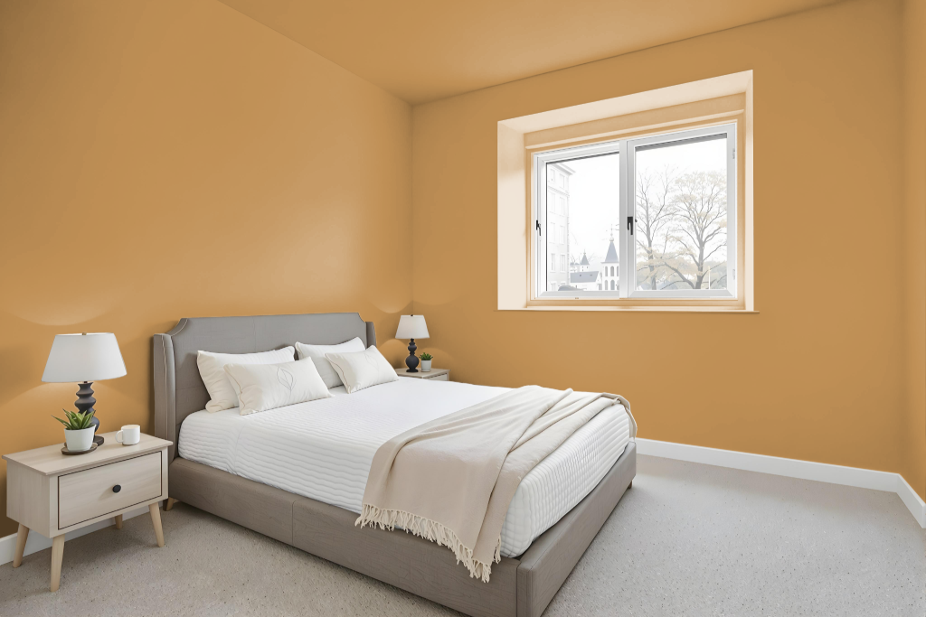
Sherwin Williams Bosc Pear SW 6390 creates a serene and inviting atmosphere in the bedroom. This distinctive hue works beautifully as either an accent wall or throughout the entire space, enhancing a variety of decor styles from modern to traditional. Its earthy undertones contribute to a harmonious balance between relaxation and productivity.
The rich depth of the color is further accentuated when combined with complementary shades, such as cooler tones for vibrant contrast or softer, lighter options for a gentle appeal. It is advisable to test the color in your specific room conditions using peel-and-stick samples to ensure it harmonizes effectively with the lighting and architectural details.
Kitchen
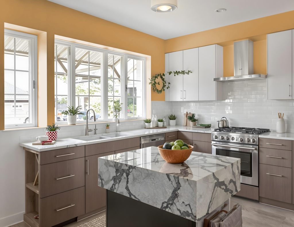
For a kitchen color scheme, Sherwin Williams Bosc Pear SW 6390 provides an appealing option that harmonizes with both modern and traditional styles. This color works effectively as an accent or a primary shade in the room, establishing a rich backdrop that elevates the space.
Paired with elements like backsplashes, countertops, and hardware, Bosc Pear creates a balanced and inviting atmosphere. It pairs seamlessly with lighter shades to maintain cohesion or with darker tones for a bold contrast, and it integrates well within monochromatic or complementary color schemes alongside selections such as Sherwin Williams Mount Etna and Debonair.
Living Room
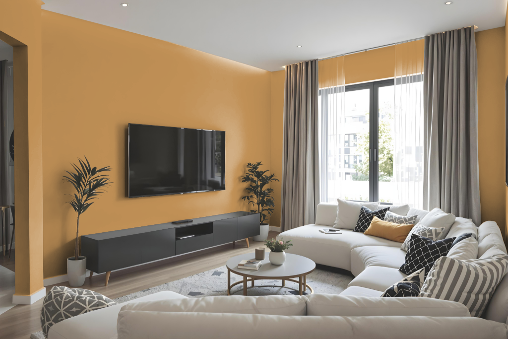
Sherwin-Williams Bosc Pear is an excellent living room color that brings a balanced and harmonious feel, promoting both relaxation and productivity. It works beautifully whether used on an accent wall or to envelop the entire space, creating a warm and inviting atmosphere that adapts to various decor styles.
When combined with complementary shades like blues for a vibrant contrast or earthy tones for a natural vibe, the color adds depth and sophistication. It harmonizes well with natural materials such as wood, stone, or brick, ensuring a cohesive look that enhances texture and overall design.
Outdoor
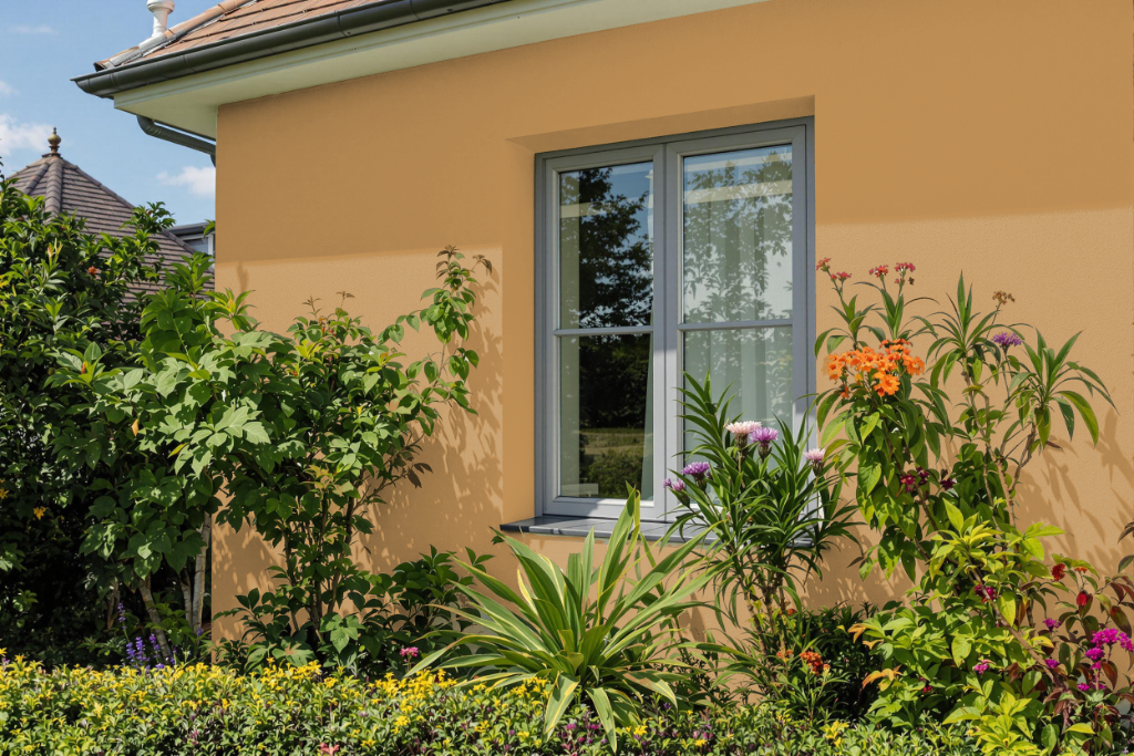
Sherwin-Williams Bosc Pear is a striking home outdoor color that brings warmth and charm to any exterior, particularly as a front door accent that elevates curb appeal. Its engaging hue complements both dark, assertive tones and softer, neutral shades, resulting in a dynamic interplay that enhances architectural features.
Pairing beautifully with natural materials such as stone, wood, and brick, this shade also harmonizes with olive greens for an organic feel. Its balanced light reflectance ensures a refined yet inviting look, making it an excellent choice for enhancing the overall exterior design of any home.