Sherwin Williams' Breathless SW 6022 is popularly recognized as Dusty Rose, a soothing hue that blends the elegance of soft pink with subtle taupe undertones. This color, with an RGB composition of 214,194,190, captures a tranquil ambiance, making it an ideal choice for creating serene interior spaces. Its delicate balance between warmth and neutrality allows it to complement both modern and traditional decor styles effortlessly.
Color Description
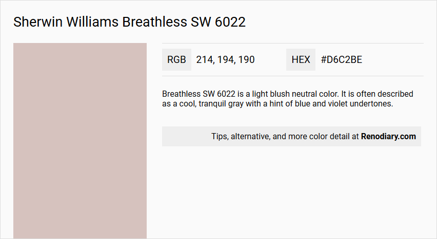
Breathless SW 6022 is a light blush neutral color. It is often described as a cool, tranquil gray with a hint of blue and violet undertones.
Undertones
The color has cool violet undertones and a slight blue hint, which distinguishes it from warmer neutrals.
Color Values
- RGB: 214, 194, 190 (or 214, 194, 189 in some sources)
- HEX: #D6C2BD
- Light Reflectance Value (LRV): 56.36
Usage
This color can be used to create an airy and energetic mood in various spaces. It is recommended to pair it with cool blue accents for a striking effect.
Atmosphere
Breathless SW 6022 evokes an airy, energetic mood and can contribute to a tranquil and calming atmosphere due to its cool undertones.
Sherwin Williams Breathless SW 6022 Color Alternative
Sherwin Williams Breathless SW 6022 makes a sophisticated statement on its own, and its appeal is enhanced when considered alongside these color alternatives: Tikkurila Shawl Y467, Dulux Soft Stone 80YR 59/089, and Dulux Malt Chocolate 80YR 57/070. Tikkurila Shawl Y467 reflects a similar elegance with its balanced warmth, seamlessly complementing the modern vibe of Breathless SW 6022. Meanwhile, Dulux Soft Stone 80YR 59/089 and Dulux Malt Chocolate 80YR 57/070 introduce nuanced depth and versatility, offering exciting options for both accentuating and substituting this distinctive hue in various design contexts.
Bathroom
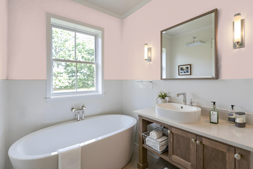
In bathrooms, Breathless SW 6022 sets a calm and sophisticated tone. It works harmoniously with crisp whites and sandy neutrals, creating a serene backdrop for fixtures and tiles.
Accents in muted greens or subtle blues enhance its appeal, while cool blue touches offer a striking contrast. Incorporating complementary shades into the design introduces a dynamic visual effect that enlivens the space.
Bedroom
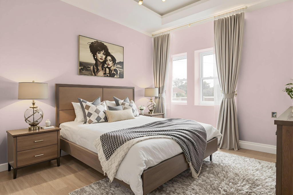
In a bedroom, Sherwin-Williams Breathless SW 6022 creates a serene and stylish atmosphere when combined with crisp whites and sandy neutrals. This soothing backdrop is enhanced by carefully chosen accents in muted greens or subtle blues, which add depth and interest while maintaining balance.
For those seeking a more dynamic look, integrating complementary shades with a greenish tint can bring an additional layer of sophistication. Consistent application throughout the room is key, and it’s beneficial to examine a physical material sample before finalizing the design choice.
Kitchen
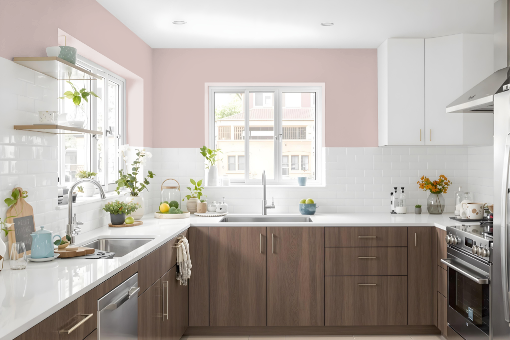
For a kitchen color scheme, Sherwin-Williams Breathless SW 6022 brings a serene yet impactful presence to the space. It pairs harmoniously with crisp whites and sandy neutrals, establishing a calm and sophisticated backdrop that anchors the overall design.
To create engaging contrast, complement this primary shade with muted greens or subtle blues, introducing an element of vibrancy. Additionally, using lighter tints of Breathless for trim and ceilings elevates the monochromatic scheme, while darker variations applied to accent areas or island cabinets add depth and interest.
Living Room
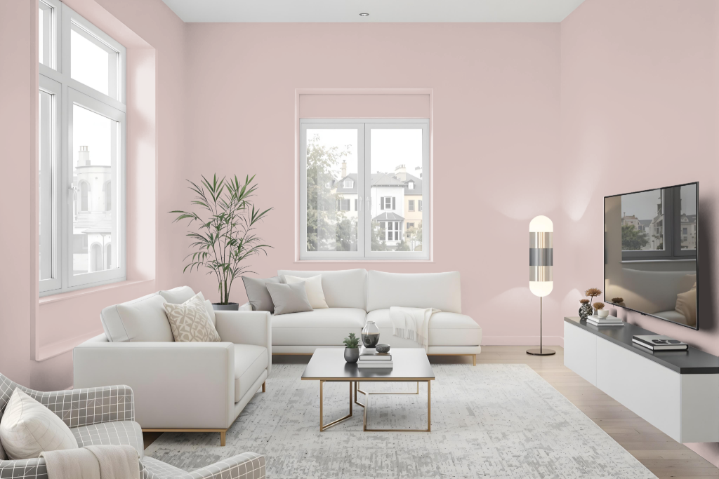
Sherwin Williams Breathless SW 6022 is an excellent choice for a living room color that creates a calm and inviting atmosphere. It harmonizes beautifully with crisp whites and sandy neutrals to establish a sophisticated palette with a subtle warmth, making it a refined option for modern interior settings.
Enhancing this base with accents in muted greens or subtle blues can further elevate the aesthetic appeal while introducing a striking contrast. Its inherent red undertone allows for seamless integration into both coordinated and contrasting color schemes, offering creative flexibility in designing a balanced and dynamic space.
Outdoor
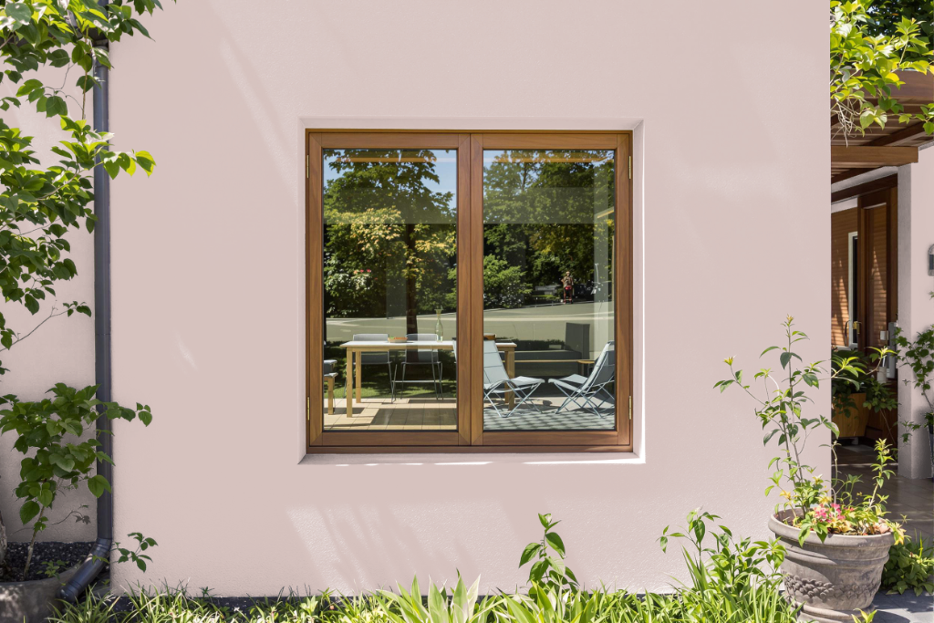
Home outdoor color Breathless by Sherwin Williams is an excellent choice for enhancing your home's exterior. Its appearance, influenced by natural light and weather conditions, pairs harmoniously with crisp whites and sandy neutrals, while muted greens or subtle blues offer complementary accent options for an elegant outdoor look.
For achieving a long-lasting finish, proper surface preparation and the use of high-quality exterior paint are essential. Additionally, employing custom spray paint for finer details such as railings or HVAC vents can help ensure a consistent and refined application across your outdoor spaces.