Sherwin Williams Breezy SW 7616, with its distinctive RGB composition of 160, 174, 175, exudes a serene and versatile blue-gray hue. This particular shade is often cherished for its calming effect, making it an excellent choice for creating tranquil environments in both residential and commercial spaces. Its subtle balance of blue and gray undertones allows it to seamlessly blend with various interior design styles, offering a timeless appeal.
Color Description
Breezy SW 7616 is a slate blue color that gives off a relaxed and cooling vibe.
Undertones
The primary undertones of Breezy SW 7616 include shades of lilac, mint, grey, light gray, light purple, pale yellow, pale pink, turquoise, and blue.
Color Values
RGB: 160, 174, 175
Usage
This color works wonderfully in bedrooms, living rooms, and hallways.
Atmosphere
Breezy SW 7616 creates a relaxed and calming atmosphere, making it ideal for spaces where a serene ambiance is desired.
Sherwin Williams Breezy SW 7616 Color Alternative
Sherwin Williams Breezy SW 7616 presents a vivid backdrop that inspires creative reinterpretations through carefully selected alternatives. Little Greene Celestial Blue 101, Farrow and Ball Dix Blue 82, and Sherwin Williams Dutch Tile Blue SW 0031 offer unique nuances that harmonize with and build upon the dynamic qualities of Breezy SW 7616. Each of these alternatives provides a distinct perspective, allowing designers and homeowners to explore varied aesthetics while maintaining a sense of continuity and balance.
Bathroom
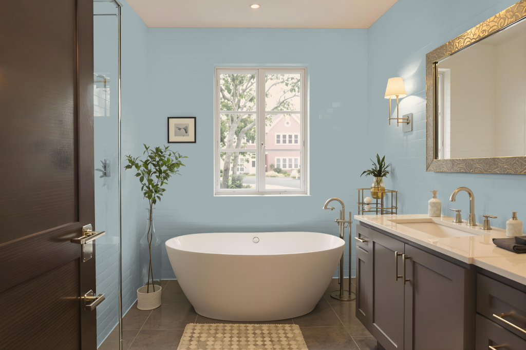
Sherwin Williams Breezy SW 7616 is an elegant choice for bathroom paint. It pairs seamlessly with crisp whites and neutral tones, creating a harmonious setting when combined with warm greys and soft blues for a calming atmosphere.
The cool mid-tone character of Breezy adapts well to varying lighting conditions, ensuring that the space remains both stylish and relaxing throughout the day. Coordinating it with complementary hues lends an added touch of refinement to any bathroom.
Bedroom
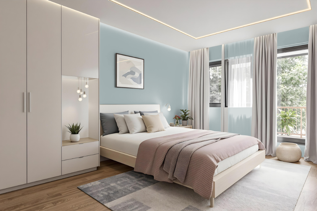
For a bedroom color scheme, Sherwin Williams Breezy SW 7616 sets a calming tone that works well with crisp whites, warm greys, and soft blues. This shade provides a foundation for creating an inviting ambiance, whether applied as the main color in the room or used on an accent wall to add depth and interest.
By incorporating lighter tones for trim and details, the overall look remains harmonious through a balanced monochromatic approach or an enriched complementary palette. Soft neutrals and gentle greens, respecting the blue undertones, further enhance the design while ensuring a cohesive and dynamic atmosphere.
Kitchen
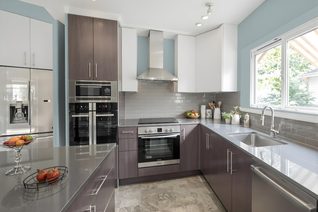
For a kitchen color scheme, Sherwin Williams Breezy sets a fresh and inviting tone. It pairs well with crisp whites for cabinets or countertops, while warm greys on flooring or backsplashes provide balance, and soft blues introduced through accessories or a kitchen island help maintain a cohesive look.
Breezy also works in combination with green hues to create a dynamic visual effect, though careful design is needed to keep the space from feeling overpowering. As an accent on a single feature or wall, it adds a touch of elegance, ensuring the overall kitchen design remains engaging yet harmonious.
Living Room
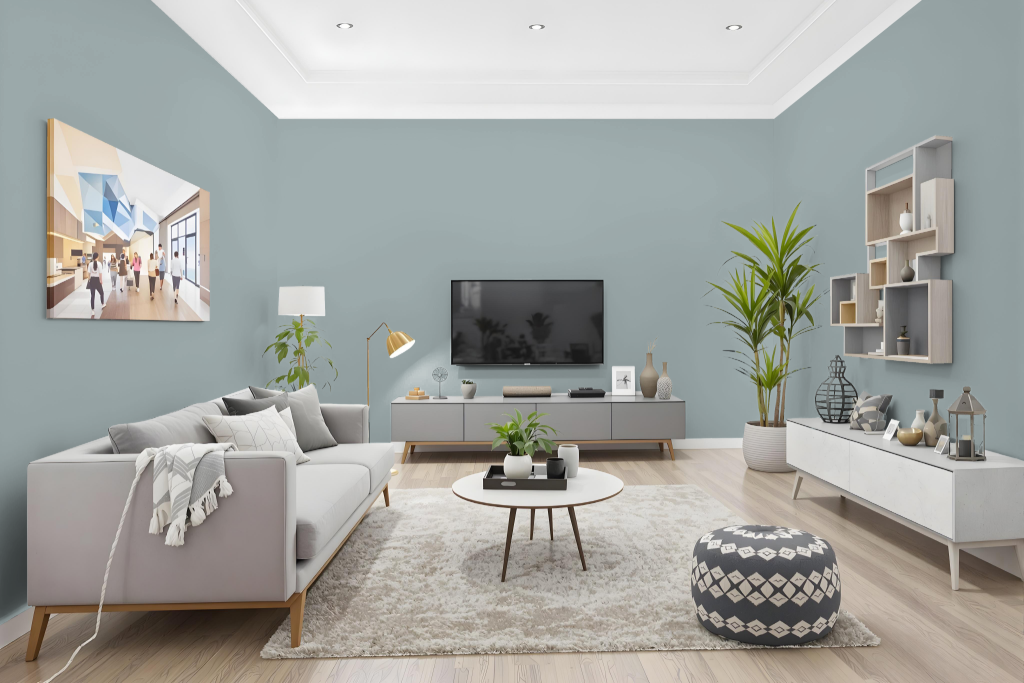
Living room color Breezy from Sherwin Williams enhances a space with a calming and elegant vibe. Its blend harmonizes with elements like crisp whites, warm greys, and soft blues to create an inviting palette that brings both serenity and a refreshing touch to any environment.
This shade works beautifully as a primary or accent tone, infusing a living room with style and tranquility. It easily coordinates with a range of decor styles while complementing existing furnishings, making it an ideal choice for crafting a relaxed and sophisticated atmosphere.
Outdoor
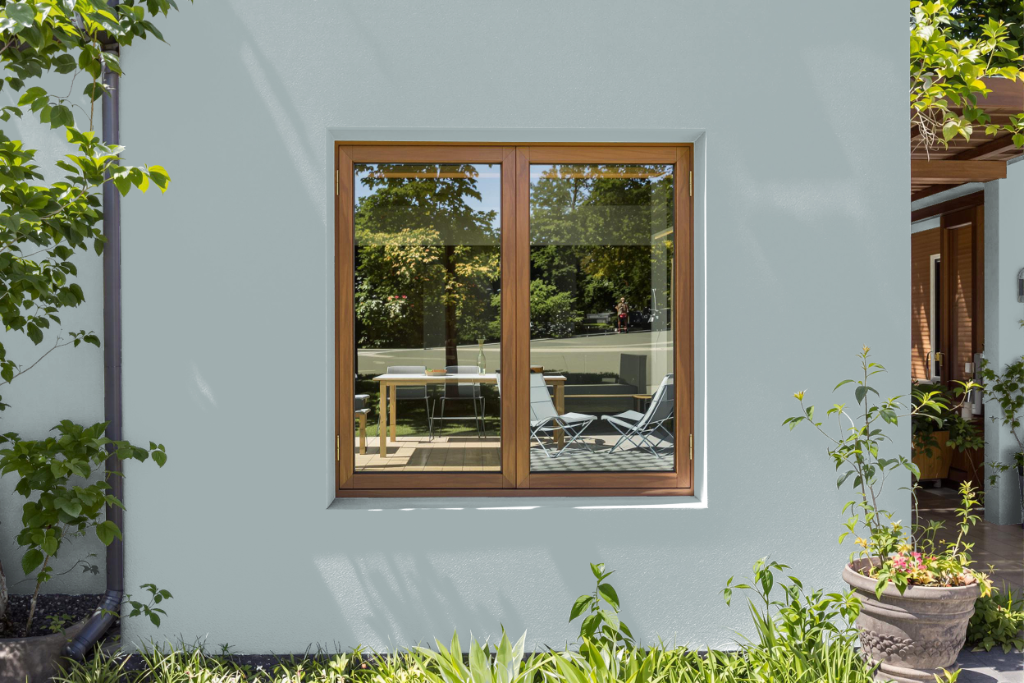
Sherwin Williams Breezy SW 7616 is a striking home outdoor color that brings a refreshing aesthetic to exterior walls, ceilings, and outdoor decor. It creates a harmonious and inviting atmosphere when paired with crisp whites, warm greys, and soft blues, making it an excellent choice for enhancing curb appeal.
This color's adaptability to different lighting conditions allows it to maintain its charm throughout the day, while peel-and-stick samples offer a practical solution to test its impact on your space before a complete application. Its coordination with various exterior elements helps ensure a cohesive and attractive overall design.