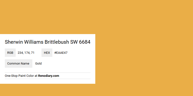
Sherwin Williams Brittlebush SW 6684 showcases a warm and inviting hue that seamlessly blends the richness of gold with subtle earthy undertones. Its RGB composition of 234, 174, 71 reveals a vibrant yet harmonious balance, making it an ideal choice for spaces that seek a touch of elegance and sophistication. This color can effortlessly enhance interiors by infusing them with a sense of optimism and energy, reminiscent of the natural beauty of sunlit landscapes.
Color Description
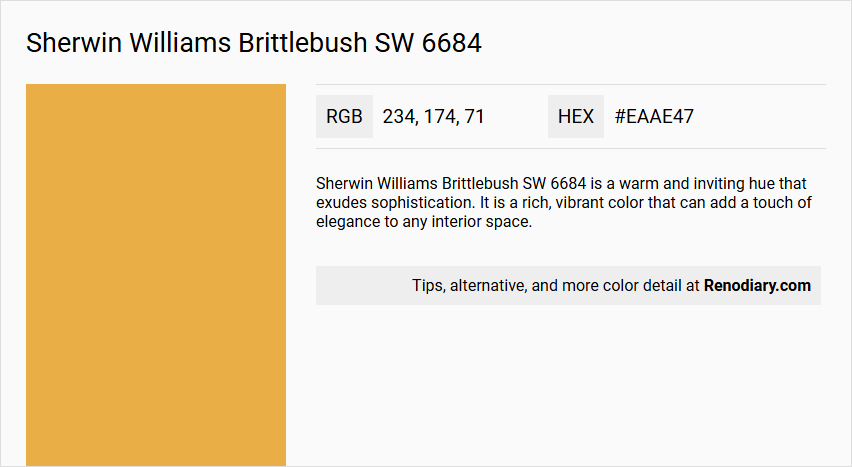
Sherwin Williams Brittlebush SW 6684 is a warm and inviting hue that exudes sophistication. It is a rich, vibrant color that can add a touch of elegance to any interior space.
Undertones
The undertone of Brittlebush SW 6684 is predominantly red, giving it a distinct and warm character.
Color Values
- HEX value: #EAAE47
- RGB code: 234, 174, 71
Usage
This color is versatile and can be used in various settings. It pairs harmoniously with both bold and neutral tones, making it suitable for creating a cozy and elegant interior. It can be complemented by furnishings in shades of deep navy, muted terracotta, or soft sage green. Accents in metallic finishes like brass or copper can further enhance its luxurious feel.
Atmosphere
Brittlebush SW 6684 creates a cozy and elegant atmosphere, making it ideal for areas where warmth and sophistication are desired. The color is associated with a sense of happiness and optimism, similar to other warm hues, and can add a sunny and cheerful feel to living rooms and kitchens.
Sherwin Williams Brittlebush SW 6684 Color Alternative
Sherwin Williams Brittlebush SW 6684 has several appealing alternatives that bring fresh perspectives to both warm and vibrant design schemes. Sherwin Williams Goldenrod SW 6677, Sherwin Williams Gambol Gold SW 6690, and Sherwin Williams Osage Orange SW 6890 each offer their own unique blend of hue and intensity while maintaining a natural connection to the original aesthetic. By considering these alternatives, designers can achieve a balanced interplay of color that invigorates spaces with a creative and spirited flair.
Bathroom
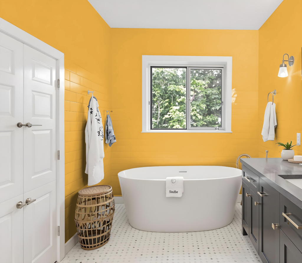
For a bathroom, Sherwin Williams Brittlebush offers a unique and inviting color with a rich, bold quality that creates a dramatic or cozy atmosphere. Complement this hue with furnishings and accents in deep navy, muted terracotta, or soft sage green, along with metallic finishes like brass or copper, to enhance the ambiance and luxurious feel of the space.
This choice not only sets an elegant tone but also benefits from the practicality of high-performance interior acrylic latex paints that resist moisture and mildew, ensuring durability in a moisture-prone environment.
Bedroom
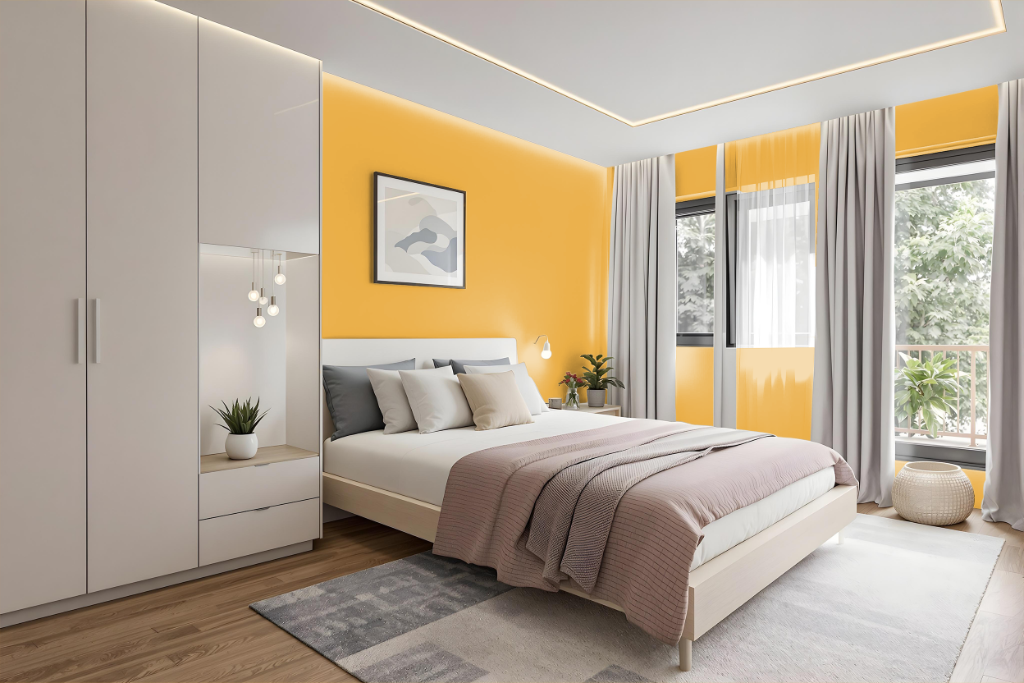
For a bedroom color theme using Sherwin Williams Brittlebush SW 6684, the warm tone sets a welcoming and rich foundation that pairs beautifully with complementary hues. Deep navy, muted terracotta, or soft sage green furnishings intensify the inviting atmosphere, while soothing gray on accent walls or trim provides a balanced contrast.
Metallic finishes such as brass or copper add a touch of luxury that elevates the overall design. The carefully coordinated palette supports a mix of bold and neutral elements, crafting a cozy yet elegant bedroom space.
Kitchen
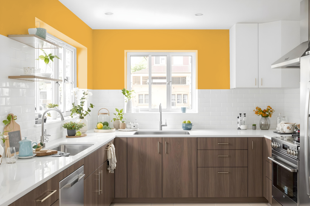
Sherwin Williams Brittlebush SW 6684 is an attractive choice for a kitchen color scheme that creates an inviting air in any cooking space. Its warm and engaging tone pairs well with both deep, saturated hues and softer, more muted accents, making it a natural fit for kitchens designed around a rich, sophisticated style or a more serene, calming atmosphere.
This dynamic hue works harmoniously with accents such as deep navy, muted terracotta, or gentle sage green to balance and enhance the overall design. Complementing the color with metallic finishes like brass or copper, along with natural materials such as wood, further elevates the space by adding a luxurious touch while softening the impact of cooler-toned appliances and countertops.
Living Room
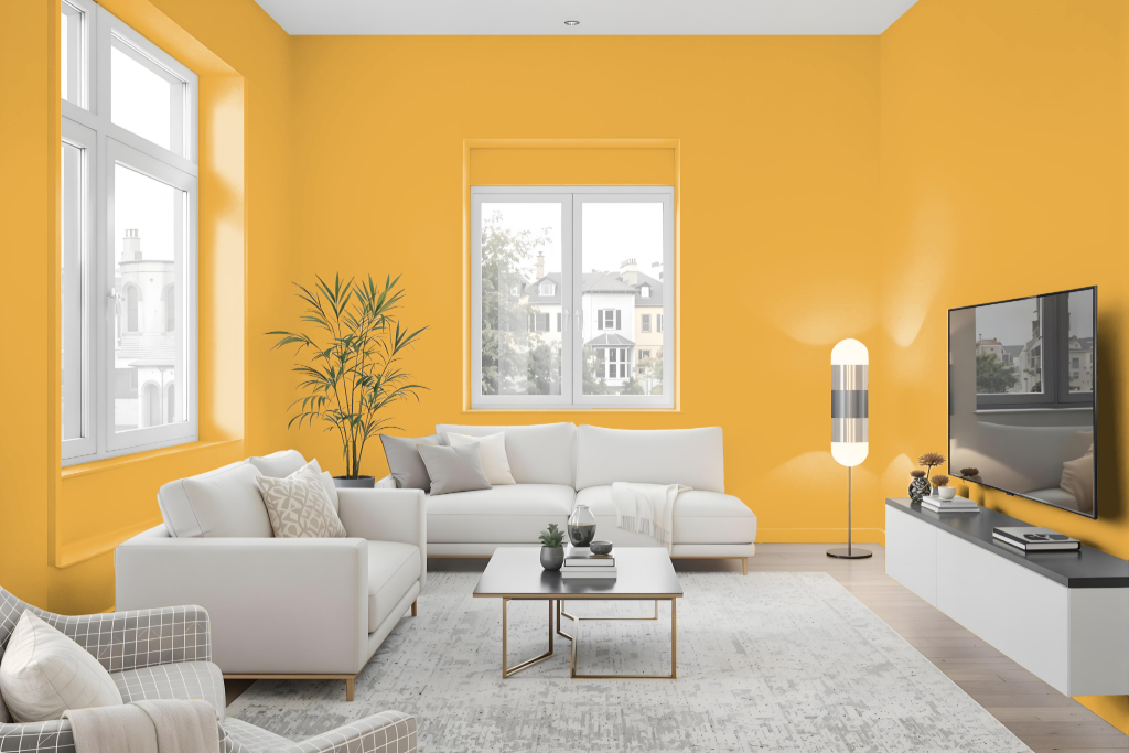
In living spaces, Sherwin Williams Brittlebush creates a cozy and elegant atmosphere, making it an ideal choice for a warm living room setting. This color harmonizes with both bold and neutral decorating schemes and works well when paired with furnishings such as deep navy or muted terracotta, as well as accent pieces in soft sage green.
Complementary metal accents in finishes like brass or copper further enhance its luxurious feel, while using the same shade for trim helps maintain a clean, uninterrupted look. Adding a soothing gray on a focal wall introduces balance between energetic and refined elements in the room.
Outdoor
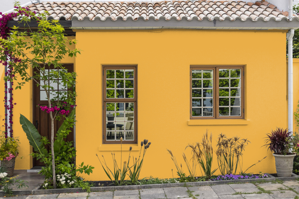
For your home's exterior, the paint color Sherwin Williams Brittlebush SW 6684 brings a warm, inviting tone that complements outdoor living spaces. This shade harmonizes beautifully with deep navy or muted terracotta accents applied to trim, shutters, or outdoor furniture, creating an enhanced natural appeal.
Pair this warm hue with metallic finishes such as brass or copper to infuse a touch of luxury into your decor. Complementary blues, including shades like Bewitching Blue or Dazzle, can further energize the overall aesthetic, offering lively accents that balance the inviting backdrop.