Sherwin Williams Cape Verde SW 6482 is a dynamic shade that leans towards a rich teal, characterized by its deep and invigorating blend of green and blue tones. Its RGB composition of (1, 85, 79) brings a sense of balance and sophistication, ideal for creating a serene and calming atmosphere in any space. This color exudes versatility, making it a popular choice for both modern and traditional interior designs.
Color Description
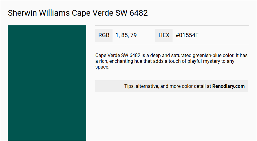
Cape Verde SW 6482 is a deep and saturated greenish-blue color. It has a rich, enchanting hue that adds a touch of playful mystery to any space.
Undertones
This color has strong green undertones, which distinguish it from a pure blue and give it a unique character.
Color Values
- Red: 0
- Green: 81
- Blue: 82
Hexadecimal: #01554f
Usage
Cape Verde SW 6482 is suitable for both interior and exterior paint projects. It is particularly recommended for bathrooms and other areas where a unique, enchanting atmosphere is desired.
Atmosphere
This color creates a playful and mysterious atmosphere, making it ideal for spaces where you want to evoke a sense of enchantment and depth. It can add a magical feel to any room, especially when used in bathrooms or other areas where a distinctive hue is desired.
Sherwin Williams Cape Verde SW 6482 Color Alternative
Sherwin Williams Cape Verde SW 6482 offers a vibrant foundation that can be creatively complemented by other expressive shades. Sherwin Williams Blue Peacock SW 0064, Benjamin Moore Sherwood Forest 2048-10, and RAL Classic Pearl opal green RAL 6036 serve as compelling alternatives that share a similar balance of sophistication and warmth while introducing their own distinct character. Each option can transform a space with its unique undertones, allowing designers to tailor environments that resonate with both energy and timeless appeal.
Bathroom
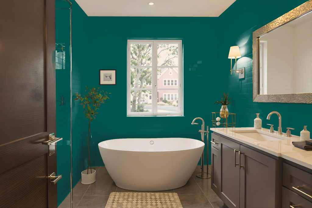
For a bathroom, Sherwin Williams Cape Verde SW 6482 sets a refreshing tone with its cool blue undertones. This hue creates an inviting space when balanced with soft neutrals for crisp contrast or deeper tones to evoke a calming atmosphere. Accents in lighter shades can further enhance its invigorating qualities while maintaining a dynamic and balanced look.
Combining this color with complementary hues, such as those featuring a red tint, can add an element of vibrant visual interest. Whether employed in a monochrome framework or alongside its complementary counterparts, Cape Verde helps craft a scene that is both engaging and harmoniously styled.
Bedroom
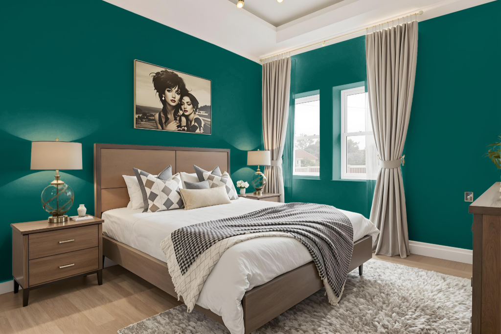
For a bedroom color scheme, Sherwin-Williams Cape Verde SW 6482 sets a tranquil tone that effortlessly creates a harmonious and inviting space. It works beautifully when paired with soft neutrals like Extra White to deliver a clean contrast, or with deeper hues such as Sea Salt to foster a calming atmosphere. Accents in complementary lighter shades, like Dover White or Tidewater, further enhance the uplifting character of the space.
Integrating complementary colors with red hues—such as Azalea Flower or Jaipur Pink—introduces an energetic contrast while still maintaining a serene environment. Additionally, the blue undertone of the color lends itself well to a cohesive monochromatic design, where varying shades and tints work together to achieve a balanced and engaging look.
Kitchen
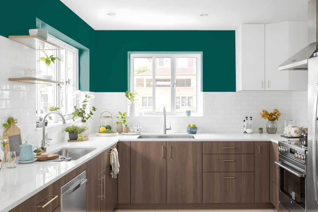
In a kitchen, Sherwin Williams Cape Verde SW 6482 creates a unique and vibrant focal point. It pairs well with soft neutrals for a crisp contrast or richer shades to offer depth, making it an excellent choice for accent walls, cabinets, or islands that elevate the overall ambiance.
When applying this dynamic hue, careful attention to lighting and complementary design elements is essential to maintain balance. Thoughtfully coordinated accents enhance its energetic appeal while ensuring the space remains inviting and harmonious.
Living Room
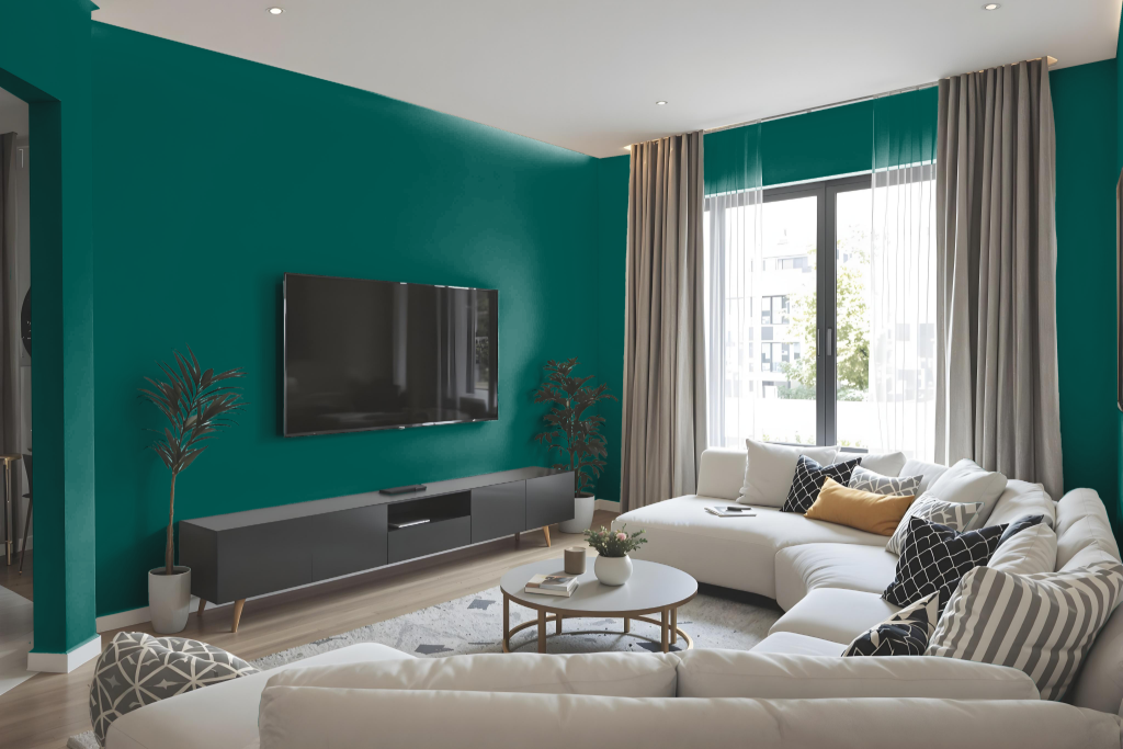
In a living room setting, Sherwin Williams Cape Verde sets a striking tone that can mesh with multiple color schemes to craft unique moods. Pairing it with light neutrals like Extra White delivers a crisp contrast, while the addition of deeper hues creates a soothing atmosphere.
This bold shade also shines when accented by complementary tones, elevating the space with invigorating nuances. Introducing hints of warmer red-inflected shades further amplifies its dynamic energy, resulting in a balanced yet engaging visual presentation.
Outdoor
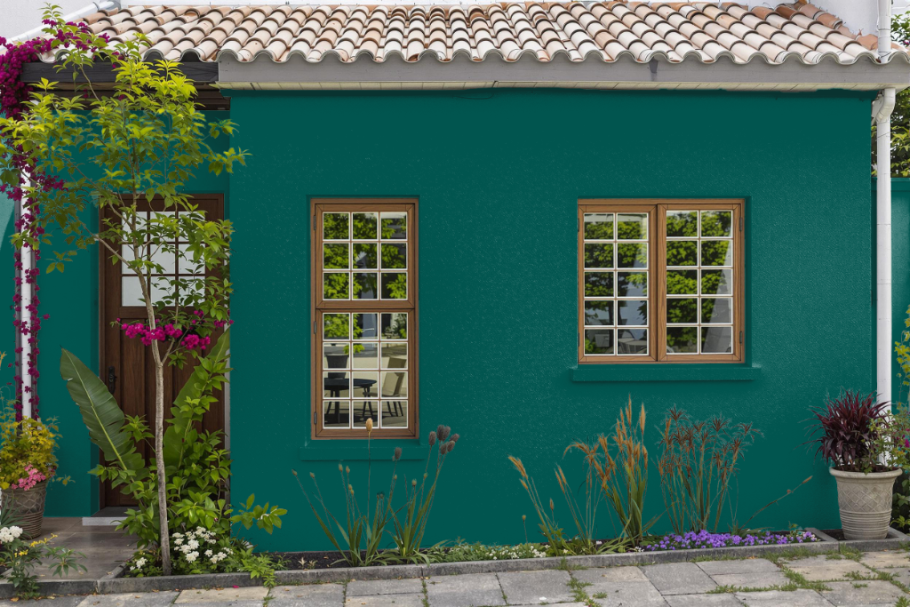
Sherwin-Williams Cape Verde SW 6482 offers an inviting outdoor color option for home exteriors. It adapts to varying light conditions while enhancing the overall appeal by coordinating with soft neutrals for trims and contrasting deeper hues for accented elements.
This dynamic shade creates an engaging, balanced aesthetic that can be paired with complementary colors to form a cohesive visual narrative. Whether paired with lighter tones for a clean, refreshing look or deeper shades to add depth, Cape Verde elevates any home's exterior style while maintaining a harmonious presence.