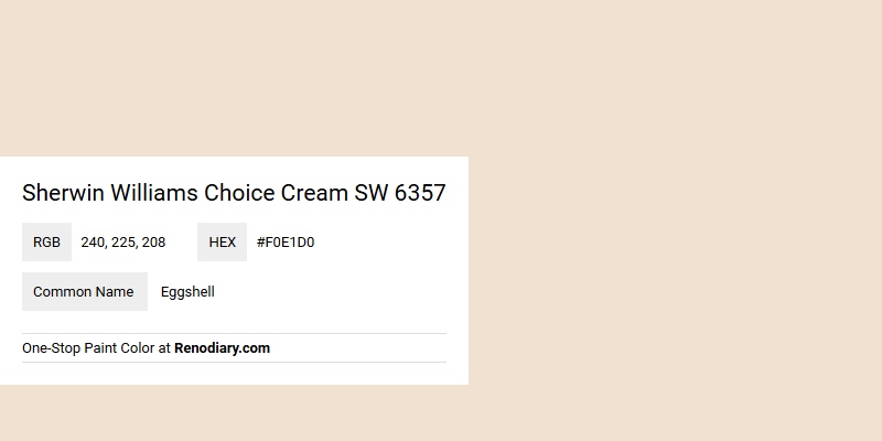
Sherwin Williams Choice Cream SW 6357, with its soft and inviting hue, captures the essence of classic Eggshell. Its RGB composition of 240, 225, 208 lends a gentle warmth to spaces, making it a versatile choice for both modern and traditional interiors. This color effortlessly infuses rooms with a sense of tranquility and subtle sophistication, enhancing the overall ambiance.
Color Description
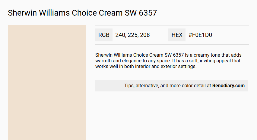
Sherwin Williams Choice Cream SW 6357 is a creamy tone that adds warmth and elegance to any space. It has a soft, inviting appeal that works well in both interior and exterior settings.
Undertones
The undertone of Choice Cream SW 6357 is a red hue, which is evident when isolating the pure hue from any tints, tones, and shades.
Color Values
- HEX value: #F0E1D0
- RGB code: 240, 225, 208
Usage
This color is versatile and can be used in various settings:
- Exterior: It pairs well with stucco exteriors and can enhance the appearance of a home, especially when combined with brownish colors for the fascia, soffits, and trim.
- Interior: It is suitable for rooms like dining rooms, study rooms, and hallways, creating a calm, cozy, and luxurious feel.
Atmosphere
Choice Cream SW 6357 creates a refined and classic look when paired with rich browns, and a tranquil and organic feel when combined with soft greens. When used with deep blues, it brings a sense of calm sophistication to the room. It promotes a harmonious and sophisticated interior design scheme when incorporated with warm neutrals and natural textures.
Sherwin Williams Choice Cream SW 6357 Color Alternative
Sherwin Williams Choice Cream SW 6357 can be elegantly replaced with alternatives that offer a unique yet connected identity, such as Tikkurila Parchment F466, Tikkurila Tofu Y462, and Dulux Summer Linnen 30YY 79/053. Each of these options provides a slightly different nuance, making them perfect choices for designers seeking versatility without straying from the essence of creamy, warm tones. Selecting one of these alternatives ensures a seamless transition in any creative project, allowing spaces to maintain character while benefiting from the quality and distinctive appeal of these recognized hues.
Bathroom
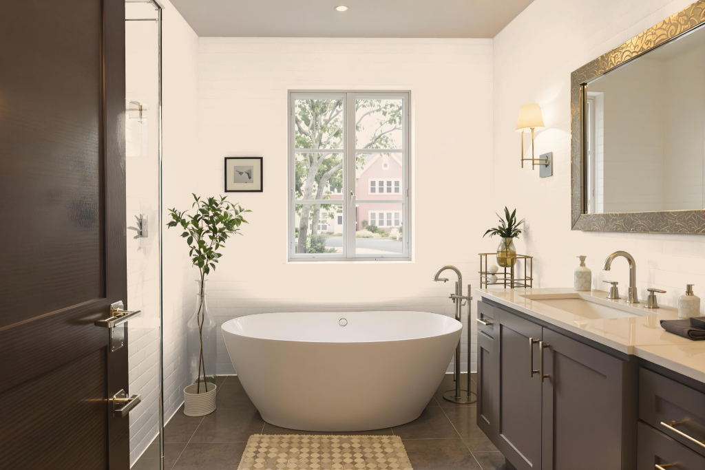
For a bathroom, Sherwin-Williams Choice Cream SW 6357 creates a warm and inviting atmosphere through its creamy, soft hue. This timeless color pairs well with rich browns, soft greens, and touches of blue to evoke a vibrant yet organic feel while maintaining a sense of tranquility.
Complement the base with furnishings in warm neutrals and natural textures, and consider accent decor that enhances a monochromatic look without creating monotony. Utilizing a high-performing paint ensures lasting durability in a moisture-prone environment, resisting stains and mildew while elevating the overall aesthetic.
Bedroom
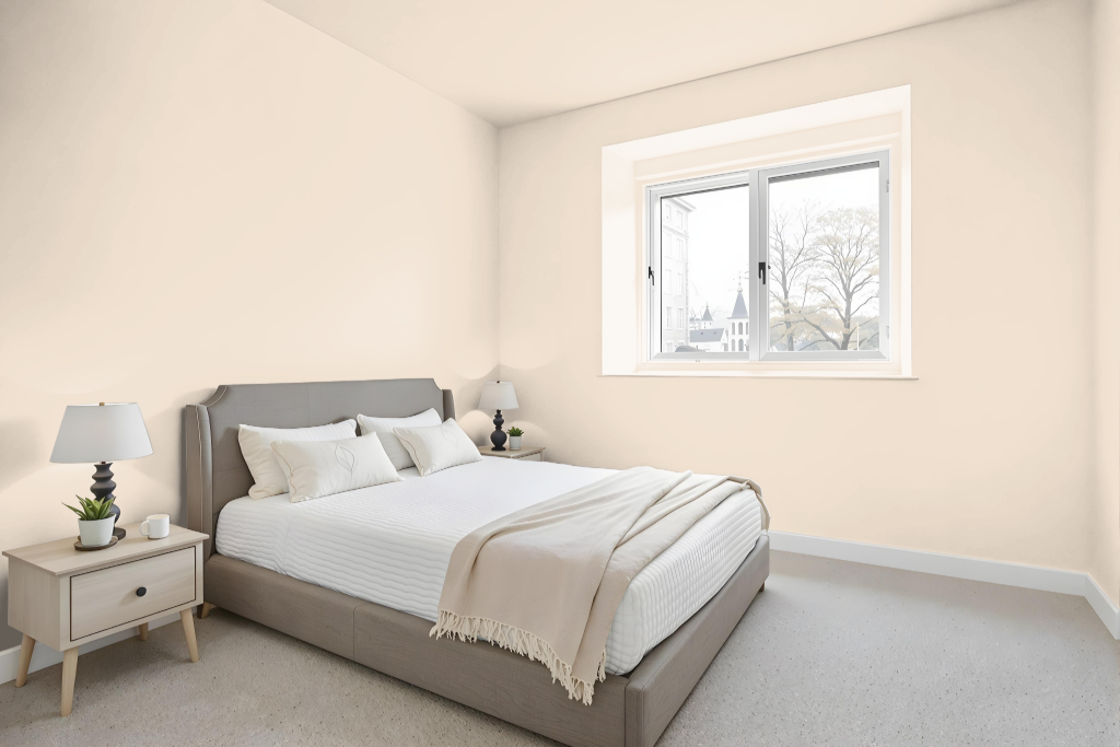
Sherwin Williams Choice Cream SW 6357 is an excellent choice for a bedroom color scheme, offering calming and cozy effects that enhance a relaxing retreat. It creates a refined and classic look when paired with rich browns and contributes a tranquil, organic feel when combined with soft greens.
In a bedroom setting, this inviting tone works beautifully with warm neutrals and natural textures to achieve a harmonious and sophisticated design. It also complements rich deep shades to add an extra layer of calm sophistication and enhance the overall luxurious ambiance of the space.
Kitchen
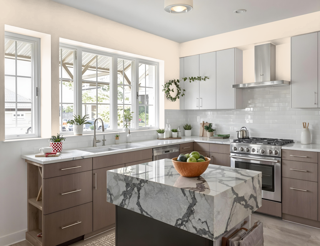
For a kitchen color scheme, Sherwin-Williams Choice Cream SW 6357 offers an elegant option that pairs beautifully with rich browns for a classic ambiance and soft greens for a tranquil, organic feel. Deep blue accents introduce a sense of calm sophistication, creating an atmosphere that is both refined and serene.
To elevate the interior design, incorporate furnishings in warm neutrals and natural textures that enhance the overall harmony. The red undertone of this hue should be thoughtfully considered when selecting additional complementary colors, ensuring that the visual impact remains both cohesive and vibrant.
Living Room
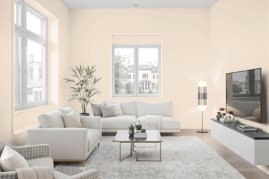
Sherwin Williams Choice Cream is a living room color that brings elegance and refinement to modern spaces. It harmonizes beautifully with rich browns for a classic look and soft greens for an organic, calming atmosphere, while accents in deep blues add a touch of calm sophistication.
Ideal for creating cozy, inviting areas, this color adapts well to dining rooms, studies, and other living spaces. It also pairs smoothly with warm neutrals and natural textures to form a unified, sophisticated interior aesthetic.
Outdoor
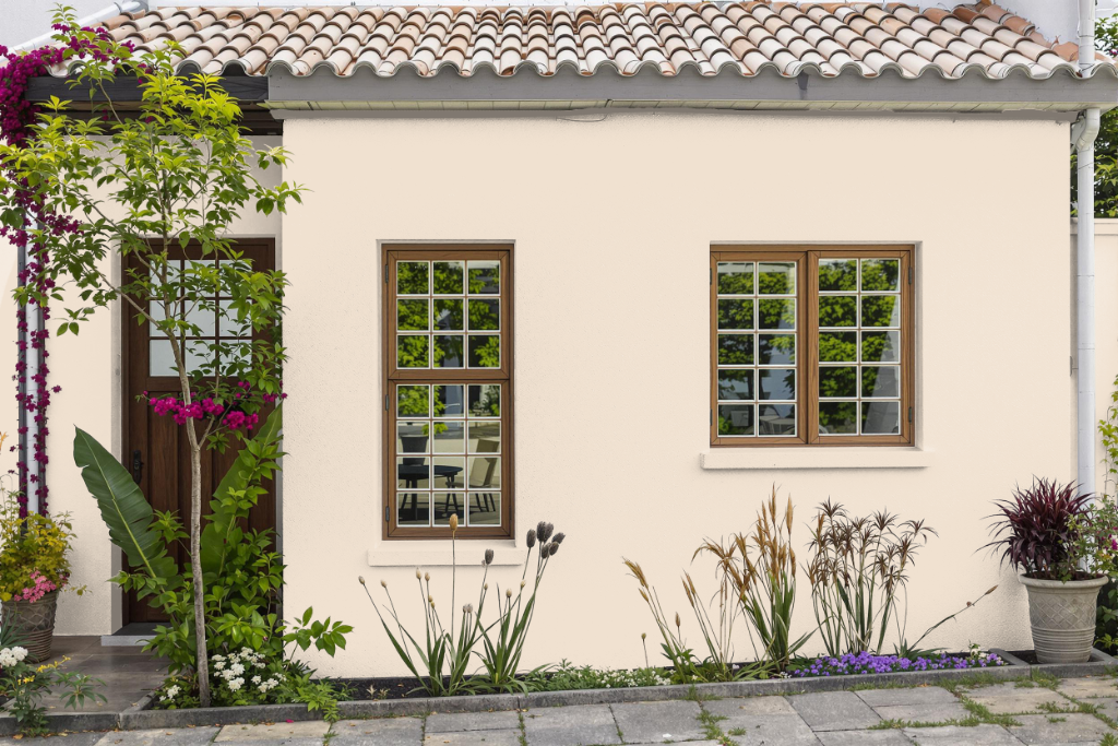
Sherwin Williams Choice Cream SW 6357 is a refined home outdoor color that elevates the exterior appeal of houses while providing a balanced and sophisticated backdrop. It harmonizes beautifully with materials like stucco siding and pairs effortlessly with complementary hues such as rich browns or soft greens to enhance the look of fascia, soffits, and trim.
This elegant off-white tone brings a touch of style and charm to any home, creating a striking presence that can captivate neighbors and potential buyers alike. It also works well when accented with details like copper, wood, or contrasting trim shades, adding an enduring sense of modernity and warmth to your exterior design.