Sherwin Williams Creamy SW 7012 is a elegant shade that falls within the off-white spectrum, offering a warm and inviting ambiance. Its RGB composition of 239, 232, 219 gives it a subtle, soft glow reminiscent of classic ivory hues. This particular color is ideal for creating a serene yet sophisticated environment in both modern and traditional spaces.
Color Description
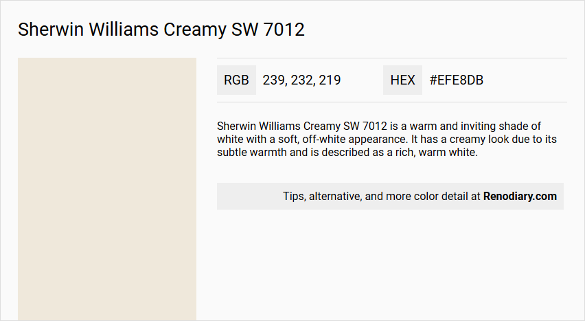
Sherwin Williams Creamy SW 7012 is a warm and inviting shade of white with a soft, off-white appearance. It has a creamy look due to its subtle warmth and is described as a rich, warm white.
Undertones
This color has pale yellow or golden-yellow undertones, which are noticeable but do not make the color appear as a full yellow paint. These undertones contribute to its warm and cozy feel.
Color Values
- RGB: R: 239, G: 232, B: 219
- Hex Value: #EFE8DB
- LRV (Light Reflectance Value): 81
Usage
Sherwin Williams Creamy SW 7012 is versatile and can be used in various rooms such as kitchens, living rooms, and bedrooms. It complements both Scandinavian and modern interior styles, as well as traditional and contemporary interiors. It is particularly suitable for those looking for an off-white color with depth and warmth.
Atmosphere
This color creates a cozy and inviting atmosphere, adding a touch of warmth and comfort to any space. The warm tones help to breathe life and light into a room in a gentle, rather than harsh, way.
Sherwin Williams Creamy SW 7012 Color Alternative
Sherwin Williams Creamy SW 7012 is celebrated for its warm and inviting aura that brings neutrality and light to any space. Tikkurila Feather F487 and Tikkurila Cloud Y481 offer distinct yet harmonious alternatives that maintain the gentle sophistication of the original shade. Tikkurila Canvas G485 rounds out these options by providing an equally compelling variation, ensuring that every choice preserves the nuanced beauty of Sherwin Williams Creamy SW 7012.
Bathroom
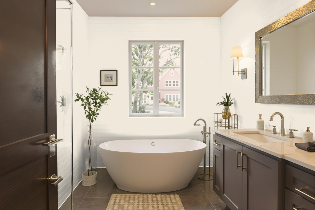
Sherwin Williams Creamy SW 7012 creates a warm and bright atmosphere in the bathroom with its high light-reflecting qualities, making the space feel cozy and inviting. Its strong yellow tone is ideal for establishing a light and cheerful environment, though it may present challenges when pairing with other colors for trim and cabinetry.
To enhance the overall look, pairing this color with a clean, soft white for trim and ceilings can provide a balanced and harmonious finish throughout the room. This combination helps to amplify the brightness of the bathroom while ensuring a cohesive and serene design.
Bedroom
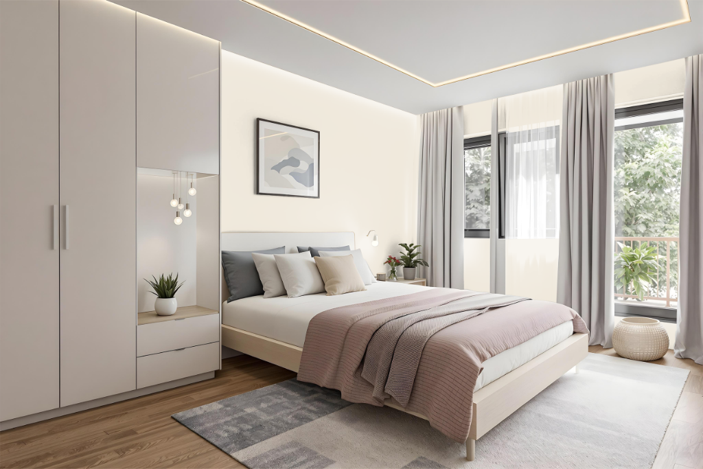
For a bedroom, Sherwin-Williams Creamy SW 7012 sets a warm, inviting tone with its soft off-white hue that brightens the space without dominating it. In settings with bright light, the color enhances the room’s openness, while under filtered or low natural light it retains a calm and neutral quality that supports a tranquil environment.
This warm shade pairs beautifully with furnishings featuring wood accents and earthy tones, as well as cooler lighting elements, harmonizing with various design styles. For the best finish in a bedroom, a flat application is ideal, though eggshell or satin options can introduce a subtle sheen and simpler maintenance.
Kitchen
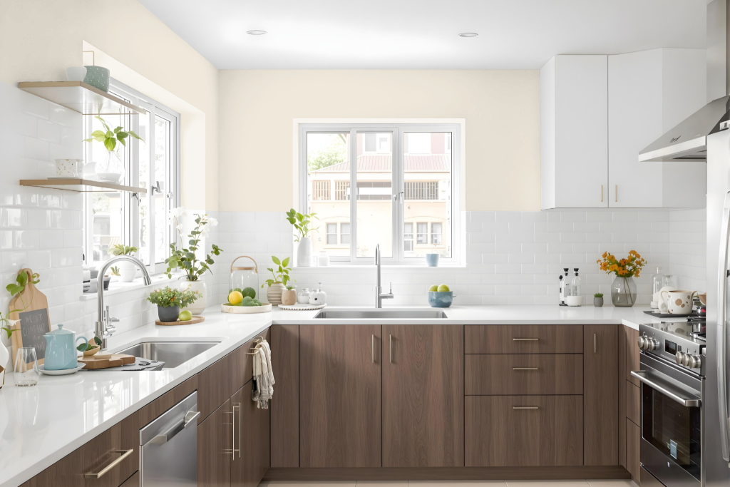
For a kitchen color scheme, Sherwin Williams Creamy SW 7012 offers a warm, inviting foundation when paired with crisp white trim such as Pure White, White Snow, Cloud White, or Simply White, which help to highlight its subtle warmth. While its yellow undertones work well in many spaces, they can sometimes create challenges when coordinating with cabinets and other finishes.
For cabinetry and additional surfaces, opting for alternatives like White Dove or Alabaster may yield more seamless pairings. In settings with warm lighting, this hue enhances rich wood tones and softens cooler countertop shades, establishing a cozy and balanced atmosphere that complements warm beige accents and dark wood details.
Living Room
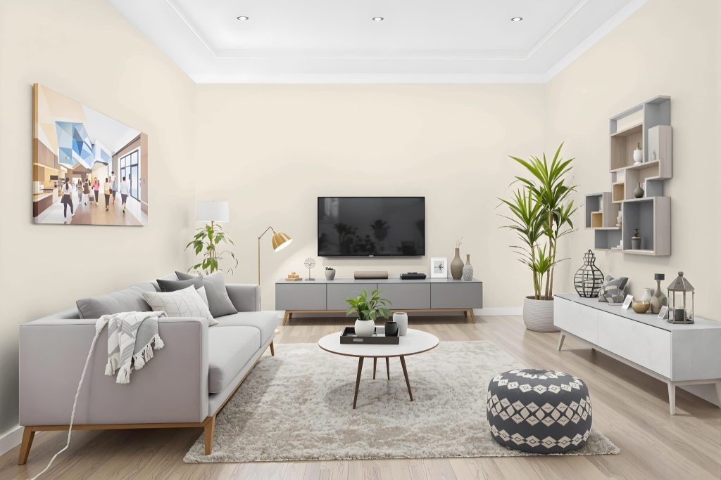
Sherwin Williams Creamy SW 7012 is a popular living room color that adapts beautifully to different lighting conditions. In cooler, north-facing spaces it warms the room without an overwhelming yellow cast, while in sunlight-rich areas its warm undertones become more pronounced, adding depth and a welcoming glow.
Paired with a clean, soft white for trim and cabinetry, Creamy works harmoniously with modern and Scandinavian-inspired designs. Its coordination with soft warm hues and contrasting cool accents helps create an inviting atmosphere that is both balanced and engaging.
Outdoor
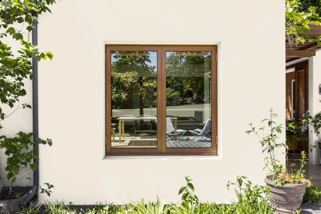
For home outdoor color, Sherwin-Williams Creamy SW 7012 lends a warm and inviting appearance to exteriors, creating a gentle, off-white backdrop that can enhance the architectural features of a house. Its yellow undertones, however, may become more pronounced under certain lighting conditions, particularly on south or afternoon west-facing walls, which requires careful observation throughout the day.
When considering this shade for exterior use, it is important to test it on the specific surface to evaluate how it interacts with natural light, ensuring it aligns with your design vision. Exploring similar alternatives might also be beneficial if a highly consistent outcome is desired.