Sherwin Williams' Crisp Linen SW 6378 is a paint color that captures the classic elegance and subtle warmth often associated with cream shades. With its RGB composition of 243, 230, 212, it reflects a delicate balance of lightness and warmth, making it a versatile choice for creating airy and inviting spaces. This color can effortlessly complement various interior styles, from traditional to modern, offering a serene backdrop that enhances the aesthetic appeal of any room.
Color Description
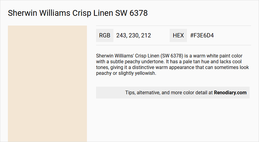
Sherwin Williams' Crisp Linen (SW 6378) is a warm white paint color with a subtle peachy undertone. It has a pale tan hue and lacks cool tones, giving it a distinctive warm appearance that can sometimes look peachy or slightly yellowish.
Undertones
Crisp Linen has definite pinkish and yellow undertones, which contribute to its warm and peachy appearance. These undertones are noticeable, especially when compared to pure white or cooler white shades.
Color Values
The RGB values for Crisp Linen are 243, 230, 212. This color has a warm and light tone, reflected in its high RGB values.
Usage
Crisp Linen can be used as a trim paint, cabinet color, or wall color. It works well in various rooms, including living rooms, kitchens, and bedrooms, and is versatile enough to fit different styles from rustic to sophisticated. It is often used as a neutral backdrop to allow other accent colors or design elements to stand out.
Atmosphere
Crisp Linen creates a tranquil and inviting atmosphere. It brings a subtle, sunny glow to a room due to its warm undertones. When paired with earthy tans, terracotta, and warm brass or gold accents, it enhances the warmth and coziness of the space. It is particularly effective in balancing cooler light in north-facing rooms and amplifying the warm ambiance in south-facing rooms.
Sherwin Williams Crisp Linen SW 6378 Color Alternative
Sherwin Williams Crisp Linen SW 6378 is celebrated for its warm, inviting undertones that enhance both residential and commercial environments. Its color alternatives—Tikkurila Dough F398, Dulux Natural Calico 37YY 79/084, and Dulux Almond White—each offer their own unique take on a similar sophisticated palette. Depending on the lighting and overall design goals, these options can complement a space perfectly, ensuring a refined and balanced aesthetic.
Bathroom
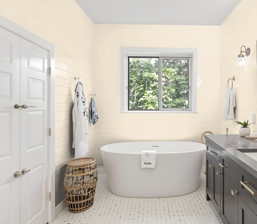
Sherwin Williams Crisp Linen is a stylish bathroom color that creates a serene and welcoming ambiance. Its adaptable nature makes it suitable for spaces with varying light conditions, balancing the overall temperature of the room. As a neutral backdrop, it allows key design elements like fixtures, tiles, and decor to shine.
Pairing this hue with cooler tones such as blue or green brings out a lively contrast, while combining it with warmer shades like beige, taupe, or brown emphasizes its inherent warmth. Incorporating contrasting accents like black further enhances the elegance and sophistication of the space, especially in bathrooms with limited natural light.
Bedroom
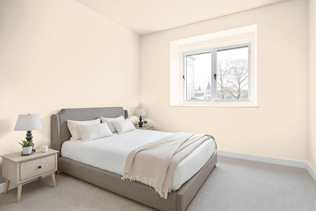
For a bedroom color, Sherwin Williams Crisp Linen creates a soothing backdrop that enhances a calm and inviting space. Its warm undertones serve as a neutral canvas for rich earth-inspired accents, from terracotta and tan leather to brass or gold finishes, making it a perfect foundation for emphasizing design elements.
This hue adapts well to different lighting—adding warmth in cooler, north-facing rooms and reinforcing a welcoming vibe in bright, south-facing spaces. Layering in varied textures like natural wood, boucle, marble, and velvet, along with carefully chosen lighting fixtures, further enriches the ambiance and offers the flexibility to incorporate crisp, contrasting shades for an elegant, dynamic appearance.
Kitchen
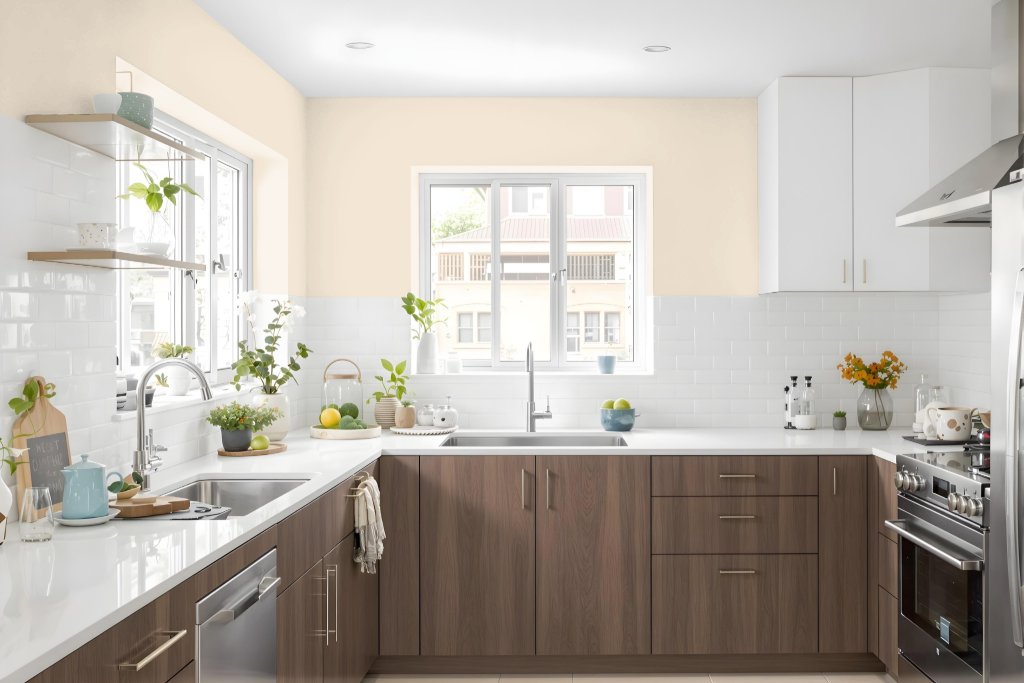
For a kitchen color scheme, Sherwin Williams Crisp Linen SW 6378 offers a welcoming neutral backdrop that sets the stage for a refined yet cozy environment. It pairs beautifully with warm earthy hues such as terracotta, tan, and warm brass or gold accents, which enhance its soft, peachy undertones and create an inviting atmosphere.
Elevate the design further by integrating natural materials like wood, marble, and rich textiles along with light fixtures that impart a gentle warmth. Adding layered textures and subtle patterns, while introducing complementary accents in cooler tones like blue or green, brings depth and balance that adapts seamlessly to varying lighting conditions.
Living Room
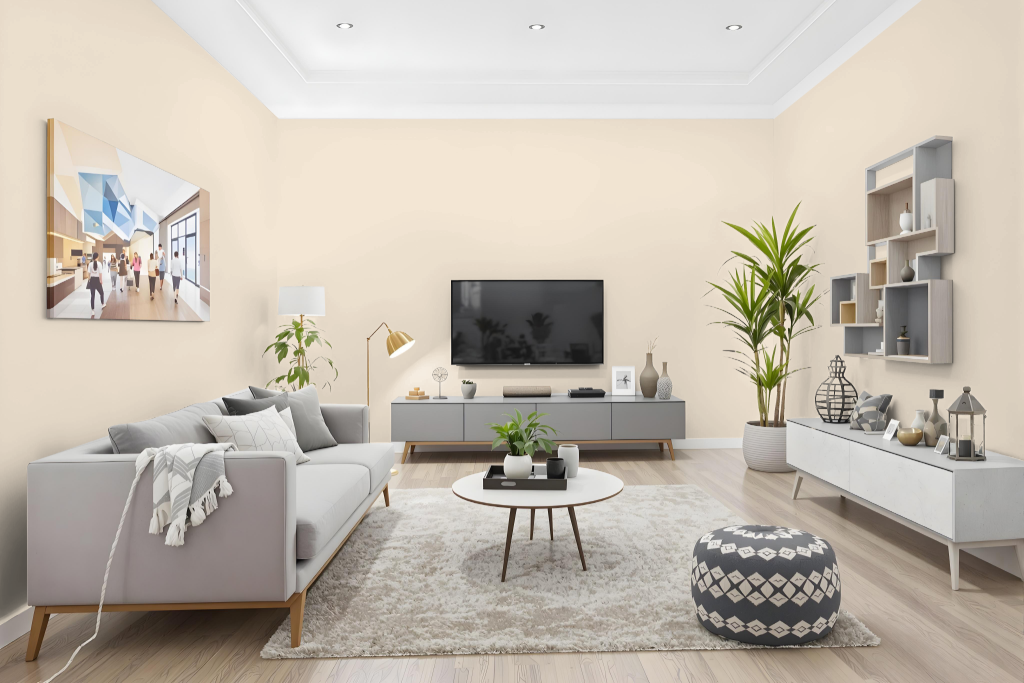
For living rooms, Sherwin Williams Crisp Linen SW 6378 creates a neutral canvas that allows carefully selected accent hues to make a statement. Paired with warm earthy tones like tan, terracotta, and brass or gold accents, the space gains a welcoming and elegant mood, while rich textures such as natural woods, boucle, marble, and velvet enhance the overall sophistication.
To further elevate the ambiance, warm lighting helps to amplify the innate warmth of the space, highlighting its inviting character. The addition of cooler tones like blue or green provides a dynamic contrast without overwhelming the cohesive design, ensuring a bright and balanced environment regardless of the natural light exposure.
Outdoor
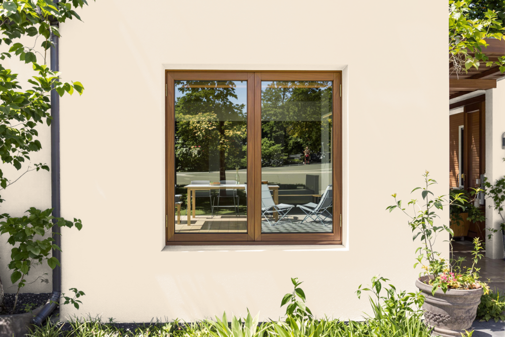
For home outdoor color, Crisp Linen is a warm option with a welcoming feel, though it is primarily intended for indoor spaces. Homeowners looking to achieve the same hue on exterior surfaces should proceed with caution, as lighter shades with warm undertones may fade with prolonged sun and heat exposure.
For optimal durability and protection against weathering—such as fading, cracking, and peeling—it is advisable to choose an exterior-specific paint. An option like a 100% acrylic latex formulation, known for its resistance to environmental stresses, can ensure that the home exterior retains its color and integrity over time.