Sherwin Williams' Cultured Pearl SW 6028 is a distinctive shade that elegantly balances a blend of soft neutrals, characterized by its RGB composition of (229, 220, 214). While it may bear similarities to beige, it offers a subtler, more refined appearance that's perfect for adding a touch of sophistication to any space. This versatile hue works harmoniously in various settings, creating a serene and welcoming ambiance.
Color Description
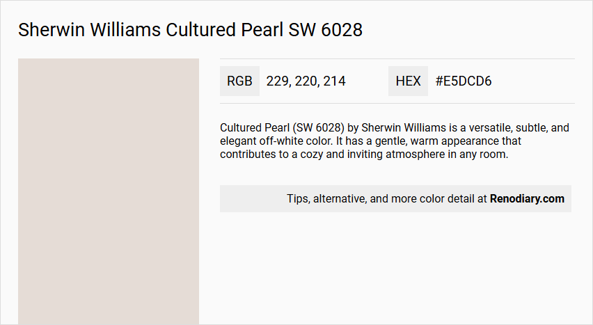
Cultured Pearl (SW 6028) by Sherwin Williams is a versatile, subtle, and elegant off-white color. It has a gentle, warm appearance that contributes to a cozy and inviting atmosphere in any room.
Undertones
The undertones of Cultured Pearl are primarily red, with subtle hints of violet. This red undertone is evident when the color is analyzed without tints, tones, and shades.
Color Values
- HEX: #E5DCD6
- RGB: 229, 220, 214
- CMYK: Not explicitly provided, but can be derived from RGB values
- LRV (Light Reflectance Value): Approximately 73.
Usage
Cultured Pearl is suitable for various rooms, including living rooms, bedrooms, and home offices. Its neutral tones make it an excellent choice for creating a serene ambiance, a peaceful retreat, or a refined workspace. It complements a variety of design styles and is ideal for spaces seeking a timeless yet contemporary aesthetic.
Atmosphere
This color brings a sense of calm and sophistication to any room. It creates a tranquil and graceful atmosphere, making it perfect for spaces where a soothing and elegant feel is desired.
Sherwin Williams Cultured Pearl SW 6028 Color Alternative
Sherwin Williams Cultured Pearl SW 6028 has several appealing alternatives, including Tikkurila Talcum G484, Tikkurila Merino Y458, and Tikkurila Kaolin H497, that provide distinct options for varied design aesthetics. Tikkurila Talcum G484 offers a crisp, clean appearance, while Tikkurila Merino Y458 delivers a warmer, more inviting tone. Meanwhile, Tikkurila Kaolin H497 contributes a calming presence, making these alternatives versatile choices for diverse interior applications.
Bathroom
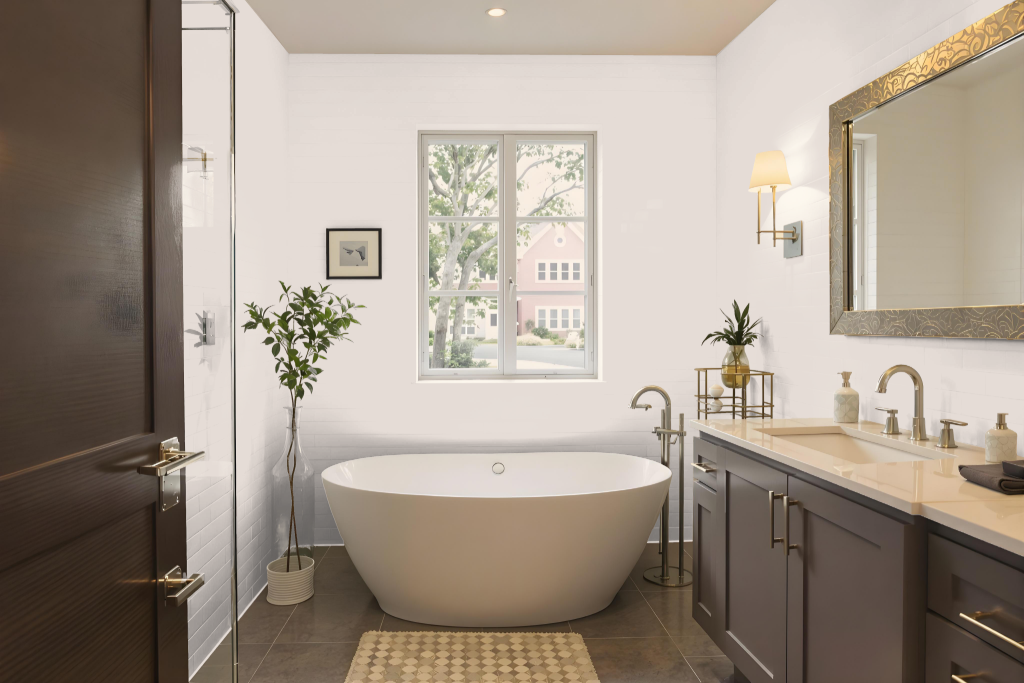
Sherwin Williams Cultured Pearl is an elegant bathroom color that offers a neutral backdrop to various design styles. Its balanced and understated tones seamlessly enhance both contemporary and classic bathroom aesthetics by complementing a range of fixtures and tile finishes.
The paint performs well in moisture-prone environments, and applying a satin or semi-gloss finish can increase its durability and simplify maintenance. Its subtle allure also creates a serene ambiance, making it an excellent choice for spaces designed for relaxation.
Bedroom
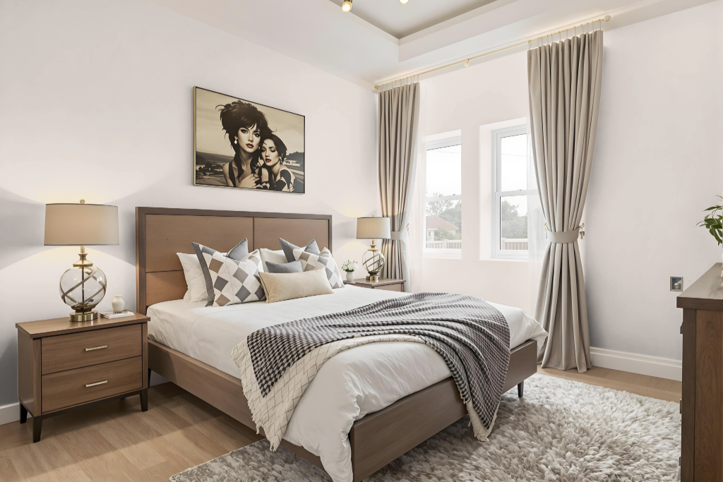
For a bedroom color scheme, Sherwin Williams Cultured Pearl SW 6028 creates a serene and peaceful ambiance, making it an excellent choice for both traditional and contemporary settings. It blends seamlessly with a monochromatic palette where varying shades of the same color foster a cohesive, balanced backdrop.
For a more dynamic impact, this hue can be combined with complementary tones that introduce hints of green, adding subtle contrast and visual interest. When paired with neutral bases and refined furnishings, it results in a tranquil, inviting retreat perfect for restful living spaces.
Kitchen
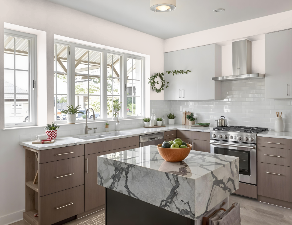
For a kitchen color scheme, Sherwin Williams Cultured Pearl SW 6028 offers a refined and elegant backdrop that complements a range of design aesthetics. This light and calming hue creates a serene ambiance in the space, while pairing well with colors that add a vibrant touch, such as soothing greens that introduce a dynamic contrast.
In application, Cultured Pearl harmonizes beautifully with various materials and surfaces found in kitchens—from cabinets and countertops to walls and ceilings. Whether used in a monochromatic approach or alongside analogous tones for added depth, this color helps maintain a cohesive look that enhances the overall visual impact of the space.
Living Room
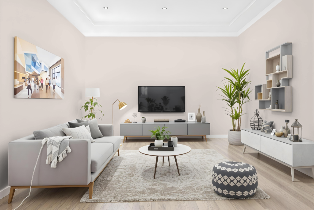
For the living room, Sherwin Williams Cultured Pearl SW 6028 creates a serene and inviting atmosphere. Its subtle, refined tone enhances the space, setting a calm foundation that complements a range of design aesthetics.
This gentle hue brings a peaceful retreat to bedrooms and a sophisticated touch to home offices. It works harmoniously in both monochromatic and complementary schemes—pairing beautifully with green accents—and suits both interior and exterior applications for a cohesive look throughout the home.
Outdoor
Home outdoor color and the color name Cultured Pearl offers an inviting option for homes, though it was mainly formulated for interior settings. While it can be used on exteriors with extra protection, those looking for a reliable finish under harsh weather conditions might want to consider products specifically engineered for outdoor durability.
Specialty exterior finishes, such as Duration and Superpaint, provide enhanced protection against the common challenges of outdoor environments, including fading, peeling, and chalking. With advanced features that inhibit moisture, mildew, and UV damage, these alternatives ensure longevity and maintain a strong, attractive finish when facing the elements.