Sherwin Williams' Daphne SW 9151, with its RGB values of 137, 156, 170, presents a serene shade that effortlessly embodies the calming essence of Dusty Blue. This color provides a versatile backdrop that harmonizes beautifully with both contemporary and traditional design elements, making it a popular choice for creating soothing indoor environments. Whether used in living spaces or accents, Daphne SW 9151 offers a tranquil aesthetic that invites relaxation and sophistication to any room.
Color Description
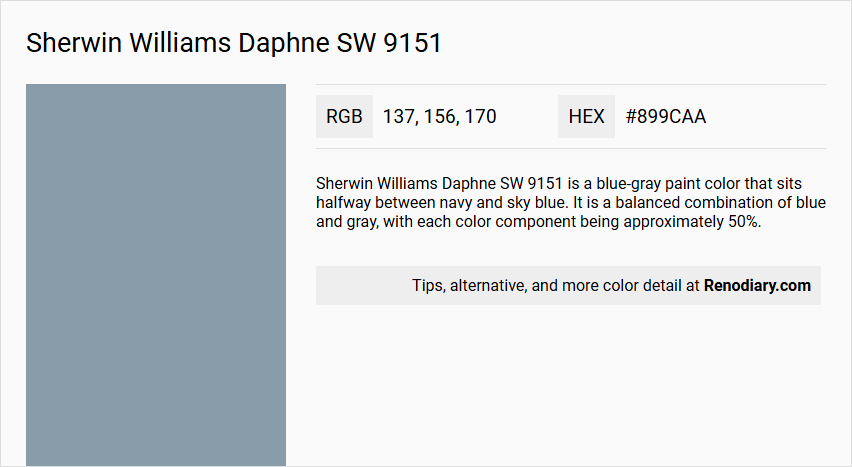
Sherwin Williams Daphne SW 9151 is a blue-gray paint color that sits halfway between navy and sky blue. It is a balanced combination of blue and gray, with each color component being approximately 50%.
Undertones
Daphne SW 9151 has well-balanced gray-blue undertones. The gray undertones prevent the blue from becoming too bright or overwhelming, maintaining a cool and balanced appearance.
Color Values
- LRV (Light Reflectance Value): 32, indicating it reflects 32% of the light shone on it.
- RGB: Red: 137, Green: 156, Blue: 170.
- Hex Value: #899caa.
Usage
Daphne SW 9151 is versatile and can be used in various rooms, including living rooms, bathrooms, and kitchens. It works well on walls, furniture, and accessories. However, it may not perform well in dark rooms due to its low LRV, making it more suitable for rooms with adequate lighting, such as south-facing rooms.
Atmosphere
Daphne SW 9151 creates a calm and soothing atmosphere, often associated with feelings of accessibility, glamour, and grace. The cool blue-gray color brings a beachy and modern feel to the room, making it ideal for spaces where a relaxing and trendy ambiance is desired. The balanced undertones ensure the color does not overwhelm the space, maintaining a balanced and serene environment.
Sherwin Williams Daphne SW 9151 Color Alternative
Sherwin Williams Daphne SW 9151 is a distinctive hue that has inspired several alternatives for those seeking a similar aesthetic in their projects. Tikkurila Tide L491, Dulux Steel Symphony 3 90BG 35/068, and Little Greene James 108 offer complementary options that reflect the unique balance and character of the original color. Each of these alternatives captures elements of the palette found in Sherwin Williams Daphne SW 9151, making them ideal substitutes for achieving a harmonious design.
Bathroom
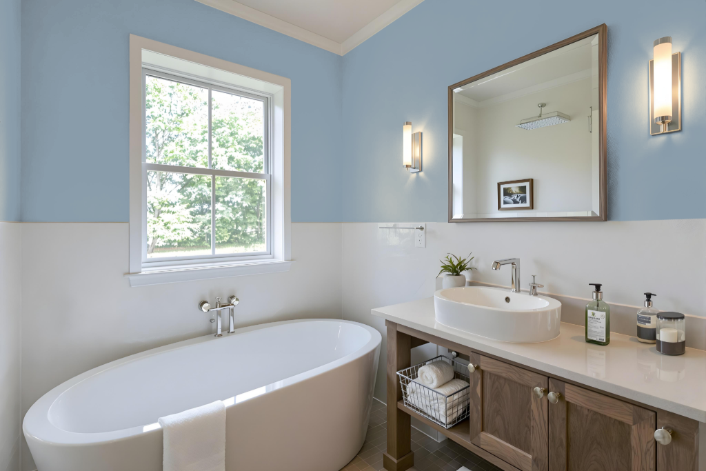
Sherwin Williams Daphne SW 9151 is a calming bathroom color that sets an elegant tone in well-lit or south-facing spaces. Its mid-tone quality creates a balanced ambiance, ensuring that the room feels both serene and sophisticated without overwhelming the space.
This hue pairs beautifully with crisp whites for a clean, fresh look or with deeper shades for a bold contrast. Thoughtfully selected trim colors further enhance its presence, contributing an inviting and harmonious design to the overall bathroom decor.
Bedroom
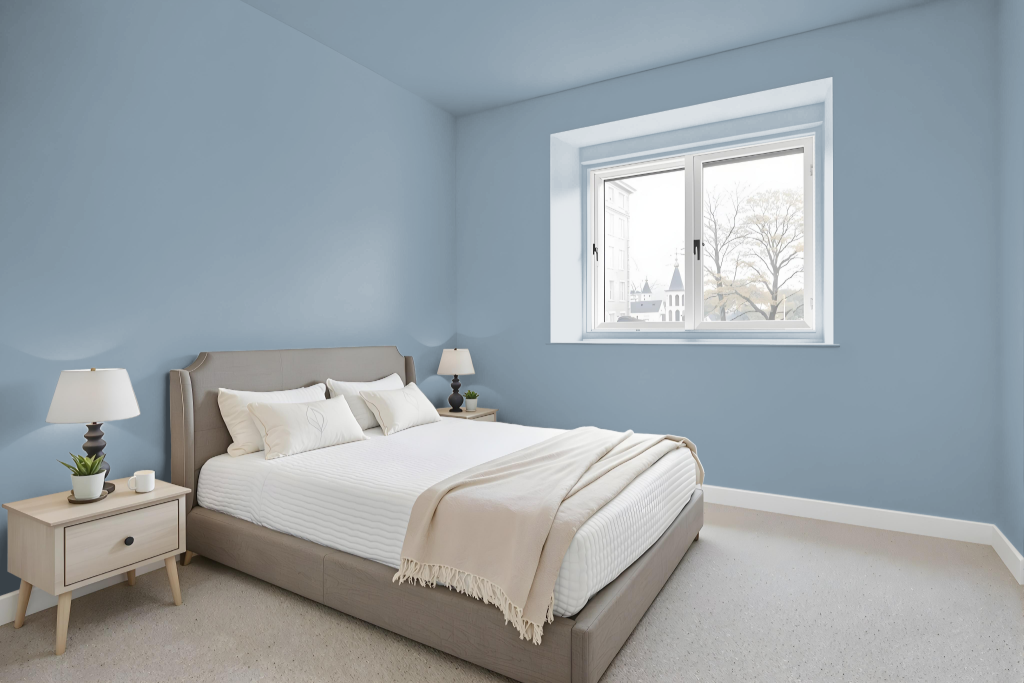
For a bedroom color scheme, Sherwin Williams Daphne SW 9151 creates a calming ambiance that adapts well to different lighting conditions, particularly in spaces with softer or more intense natural light. It serves as a soothing backdrop that harmonizes with warm shades such as Accessible Beige or crisp, clean whites like Alabaster, adding a fresh and timeless touch to the room.
Pairing Daphne with deeper tones, such as charcoal accents or rich, saturated hues, offers a dramatic yet subtle contrast that enhances the overall tranquility of the space. Complementary trim colors like Creamy or Retro Mint further elevate the aesthetic by framing the central color without overwhelming its serene appeal.
Kitchen
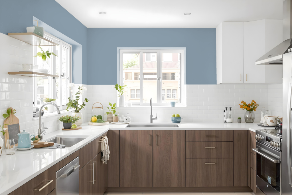
For a kitchen color scheme, Sherwin Williams Daphne SW 9151 can create a calming and modern atmosphere. Its moderate light reflectance makes it ideal for well-lit kitchens, especially those with south-facing windows, ensuring the space feels refreshed and open. Designers can counterbalance its cool undertones by incorporating warmer hues for accents or trim, resulting in a harmonious blend of soft and inviting elements.
To add depth and interest, energetic pops of color can be introduced through complementary details that provide a lively contrast. In spaces with limited natural light, pairing this color with a lighter shade can help brighten the room while preserving a balanced aesthetic throughout the overall design.
Living Room
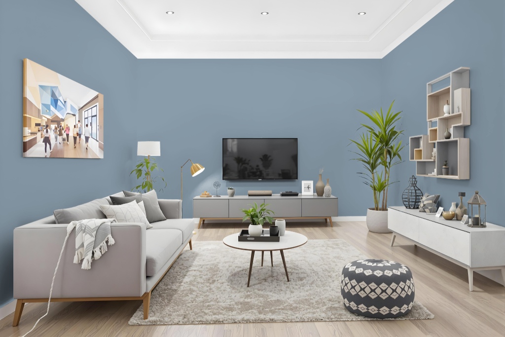
Sherwin Williams Daphne SW 9151 is a living room color that creates an inviting and well-lit setting, making it ideal for spaces with abundant natural light, particularly those with southern exposures. Its balanced light-reflection fosters an atmosphere that suits both relaxed evenings and active social gatherings, ensuring the ambiance remains controlled and appealing under various lighting conditions.
Daphne complements other colors beautifully, pairing smoothly with warm gray accents like Drift of Mist, rich blue nuances reminiscent of Dress Blues, or the subtle neutrality offered by Accessible Beige. Enhancements through trim choices such as Creamy or Retro Mint further refine the overall aesthetic, resulting in a harmonious and cohesive design scheme.
Outdoor
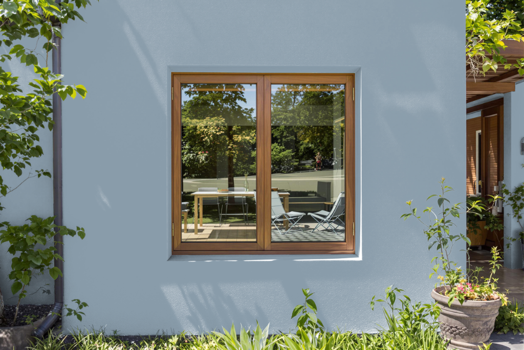
For home outdoor use, Sherwin Williams Daphne SW 9151 provides a calming aesthetic that benefits from bright, sunlit conditions. Its light reflecting quality makes it an ideal pick for areas with ample natural light, ensuring the color maintains a cool and balanced appearance, whereas in spots with limited illumination it may appear more saturated.
Its cool undertones help balance warmer sunny areas, and when paired with trim colors such as Creamy SW 7012 or Retro Mint SW 9036, the overall look is both harmonious and balanced. With the aid of proper artificial lighting, the intended mood of Daphne can be consistently achieved in various outdoor settings.