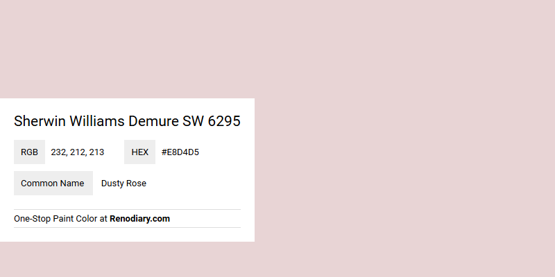
Sherwin Williams Demure SW 6295 is a soft and soothing hue known as Dusty Rose, featuring a gentle blend of subtle pink undertones. Its RGB composition of 232, 212, 213 captures a delicate balance that evokes a sense of elegance and tranquility. This versatile color is perfect for creating a serene atmosphere in any space, whether used as a main wall color or an accent.
Color Description
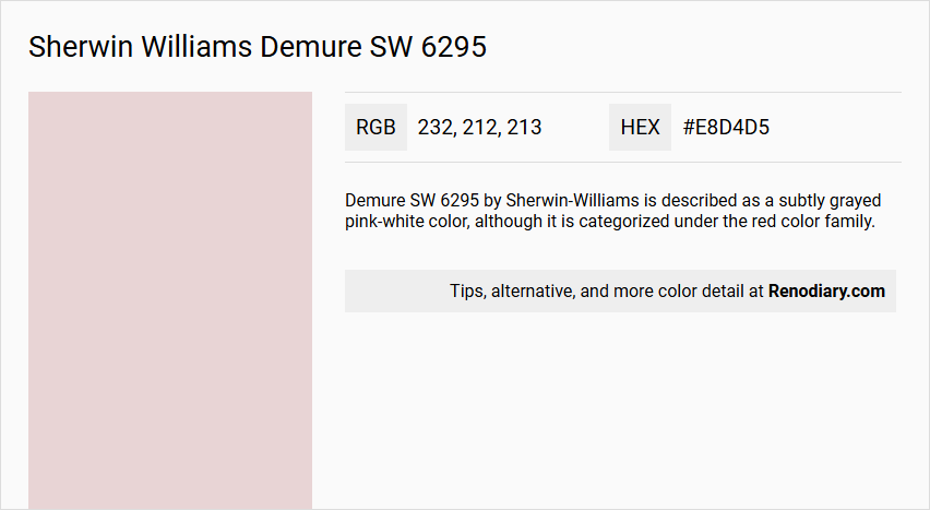
Demure SW 6295 by Sherwin-Williams is described as a subtly grayed pink-white color, although it is categorized under the red color family.
Undertones
The color has warm undertones.
Color Values
The color values for Demure SW 6295 include:
- RGB: #e8d4d5
- Lab, HLC, and CYMK values are also available, detailed in the color charts.
Usage
Demure SW 6295 can be used for both interior and exterior paint projects.
Atmosphere
This color creates a soft, calming atmosphere due to its muted and warm tones, making it suitable for spaces where a gentle, soothing ambiance is desired.
Sherwin Williams Demure SW 6295 Color Alternative
Sherwin Williams Demure SW 6295 has inspired a range of appealing alternatives that can enhance any interior design scheme. Designers and homeowners are increasingly considering options like Tikkurila G475, Dulux Pale Nutmeg 10YY 73/042, and Little Greene Confetti 274, each of which captures a unique perspective while maintaining a harmonious balance of warmth and sophistication. These color alternatives deliver varied nuances that allow for creative expression without straying from the inviting and refined aesthetic that Demure SW 6295 originally offers.
Bathroom
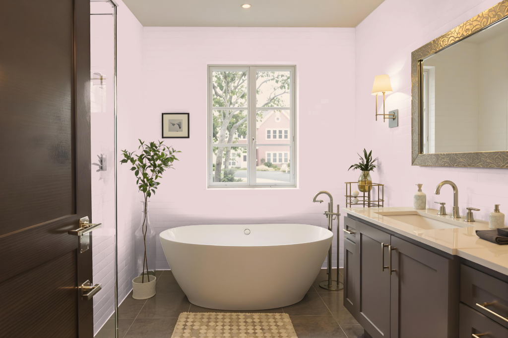
Sherwin Williams Demure SW 6295 is an excellent bathroom color that brightens the space with its airy quality and high light reflectance. This warm tone creates a welcoming ambiance, making rooms feel more open and inviting while offering a subtle charm that promotes calm and harmony.
Its ability to complement various fixtures and trim, such as honey oak, enhances the overall design. When paired with colors that infuse a touch of green, the result is a dynamic visual accent that elevates the room's character and establishes a cohesive, stylish aesthetic.
Bedroom
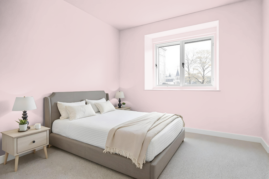
In the bedroom, Sherwin Williams Demure SW 6295 provides a calming and serene atmosphere ideal for relaxation and productivity. Its light-reflecting quality enhances the perception of space and openness, creating an environment that feels both tranquil and inviting.
This gentle hue pairs beautifully with decorative elements like honey oak trim and cabinetry while harmonizing with crisp white accents and deeper blue tones. It can be incorporated into monochromatic, complementary, or analogous design schemes to achieve a well-balanced and stylish look.
Kitchen
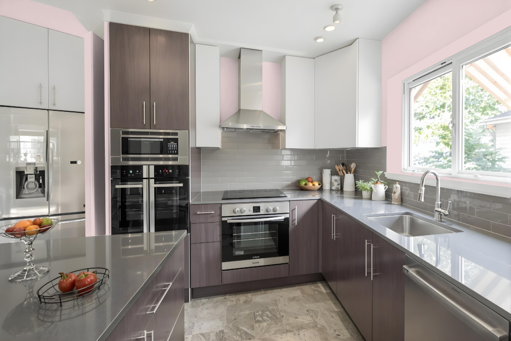
For a kitchen color scheme, Sherwin Williams Demure creates a bright and inviting atmosphere with its high light reflectance value that makes the space feel more spacious and airy. Its light, neutral tone helps brighten up the room, offering a refreshing ambiance that encourages an open and cheerful environment.
When using Demure in your design, consider pairing it with greens such as Sherwin Williams Mountain Air or Niebla Azul to achieve a vibrant, dynamic effect. This color pairs well with coordinated schemes, including monochromatic or analogous palettes, resulting in a cohesive look that can be adapted to various kitchen styles and décor.
Living Room
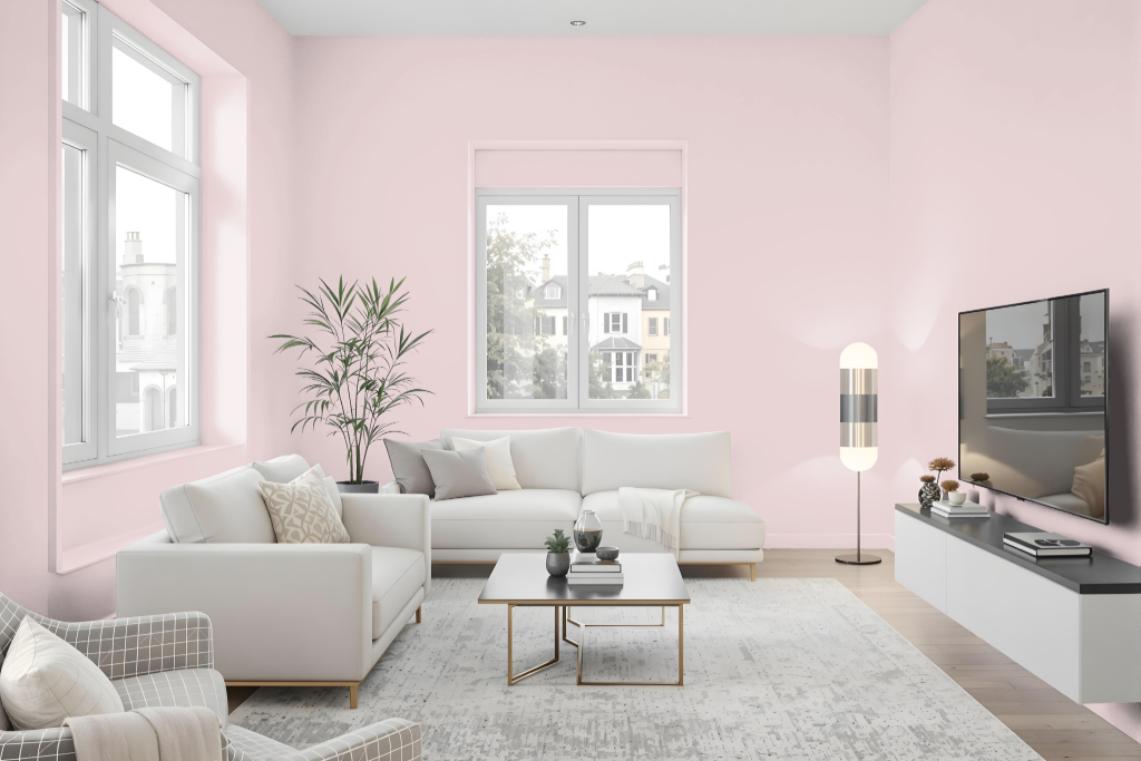
Sherwin-Williams Demure SW 6295 is an excellent choice for living rooms, evoking a serene atmosphere that promotes relaxation and productivity. This tranquil color pairs beautifully with decor featuring honey oak trim and cabinets, enhancing both modern and classic design elements.
Design ideas include using various shades, tints, and tones of Demure for a monochromatic look or pairing it with complementary green hues for a more dynamic vibe. For the most accurate depiction, it's advisable to examine a physical sample or painted chip, as on-screen representations may differ from the actual shade.
Outdoor
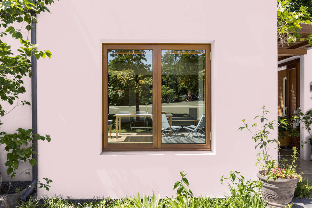
Sherwin-Williams Demure SW 6295 is a striking home outdoor color that adds character to exterior spaces. Known for its appealing look, it performs well when matched with paint formulations specially engineered to handle environmental factors such as sunlight, rain, and fluctuating temperatures.
For outdoor applications, it's crucial to choose an exterior-grade product that upholds the paint's integrity and longevity. Reviewing a physical sample of the color in varying natural light will help confirm that the appearance meets your expectations before committing to the final paint choice.