Sherwin Williams Dill SW 6438 features a harmonious blend that leans towards the earthy and calming tone of olive green. Its RGB composition of 120, 141, 96 encapsulates a balance between muted vibrancy and natural sophistication, making it an ideal choice for spaces that aim to provide tranquility and warmth. This shade fits seamlessly in both modern and traditional design palettes, exemplifying versatility and understated elegance.
Color Description
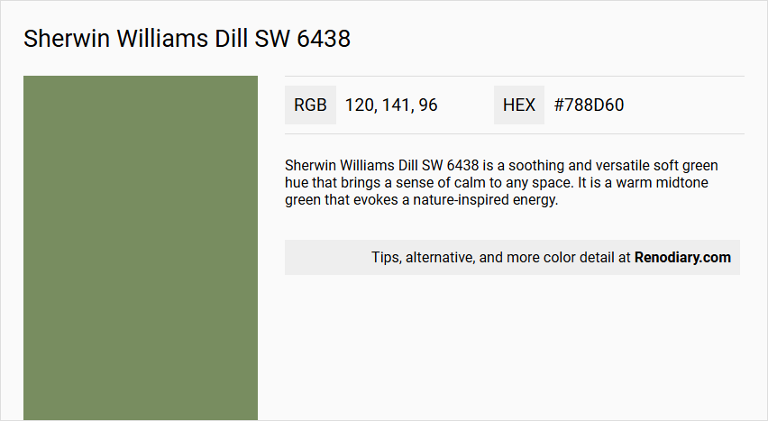
Sherwin Williams Dill SW 6438 is a soothing and versatile soft green hue that brings a sense of calm to any space. It is a warm midtone green that evokes a nature-inspired energy.
Undertones
The undertone of Dill is predominantly green, with no significant other undertones noted.
Color Values
- HEX value: #788D60
- RGB code: 120, 141, 96
Usage
Dill can be used as a main wall color or as an accent color. It pairs beautifully with warm neutrals like SW 6073 Perfect Greige and SW 7036 Accessible Beige for a harmonious and cozy atmosphere. For a more contemporary look, it can be combined with crisp whites such as SW 7005 Pure White or SW 7008 Alabaster.
Atmosphere
The color Dill creates a refreshing and serene atmosphere, making it ideal for gathering spaces where it can foster engaging conversations and a sense of calm. It adds a harmonious and cozy element to any room.
Sherwin Williams Dill SW 6438 Color Alternative
Sherwin Williams Dill SW 6438 is a distinctive hue that has inspired many color alternatives for creative projects. Tikkurila Sepal L447, Tikkurila S448, and Little Greene Sage Green 80 offer varied yet complementary options for those seeking a fresh interpretation without straying far from the original vibrancy. Each alternative provides a unique twist, enabling designers to achieve a balanced aesthetic that respects the integrity of Sherwin Williams Dill SW 6438 while exploring new stylistic possibilities.
Bathroom
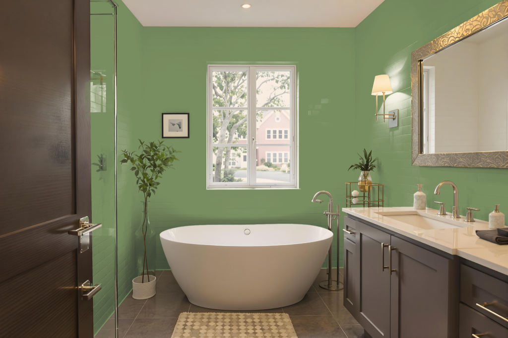
Sherwin Williams Dill SW 6438 is an inviting bathroom color that sets a calming tone for the space. Its natural, soothing quality pairs beautifully with warm neutrals like Perfect Greige and Accessible Beige, creating a harmonious atmosphere that feels cozy and tranquil.
Elevating the overall aesthetic further, Dill can be combined with crisp whites to introduce a modern edge while still maintaining a serene vibe. Whether applied as a primary wall color or used as an accent, its adaptable nature depends on the bathroom’s lighting and decor, ensuring the environment remains balanced and welcoming.
Bedroom
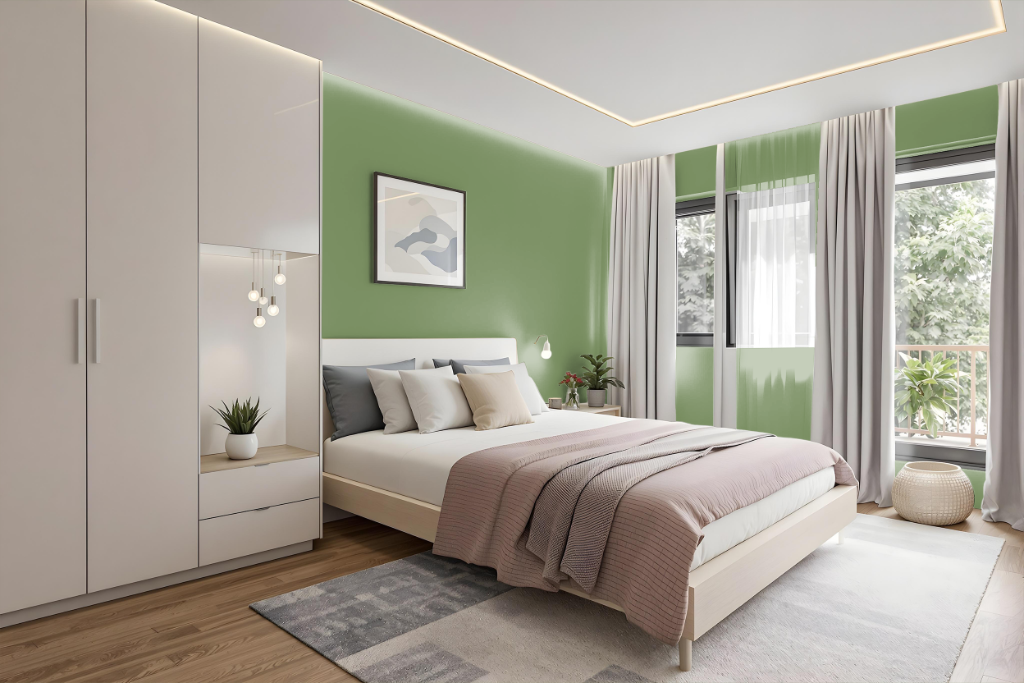
For a bedroom color scheme, Sherwin Williams Dill sets a calming foundation with a soothing tone that promotes relaxation and harmony. This inviting shade blends well with warm neutrals like soft greige and understated beige, making it an ideal choice for accent walls, trim, or furniture to amplify the room’s peaceful atmosphere. Crisp whites can also be paired to introduce a clean, modern contrast that refreshes the overall aesthetic.
In addition, Dill can be harmonized with complementary hues that feature subtle blue tones to inject lively energy into the space. This balanced approach creates dynamic visual interest while preserving a coherent, serene mood, ensuring the bedroom remains both engaging and restful.
Kitchen
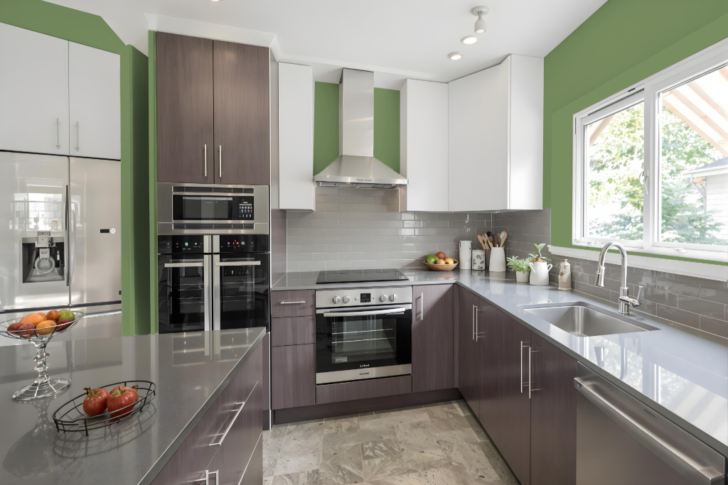
For a kitchen color scheme, Dill provides a rich, inviting essence that can serve as a focal point within the culinary space. It harmonizes beautifully with warm neutral accents such as certain greige and beige tones on cabinets, countertops, or walls, while also pairing with crisp whites to introduce a modern flair.
This design approach allows Dill to be showcased as an accent for kitchen islands, backsplashes, or additional wall features, ensuring a balanced and engaging environment. Careful attention to how the color interacts with various textures and surfaces further enhances the overall ambiance and character of the space.
Living Room
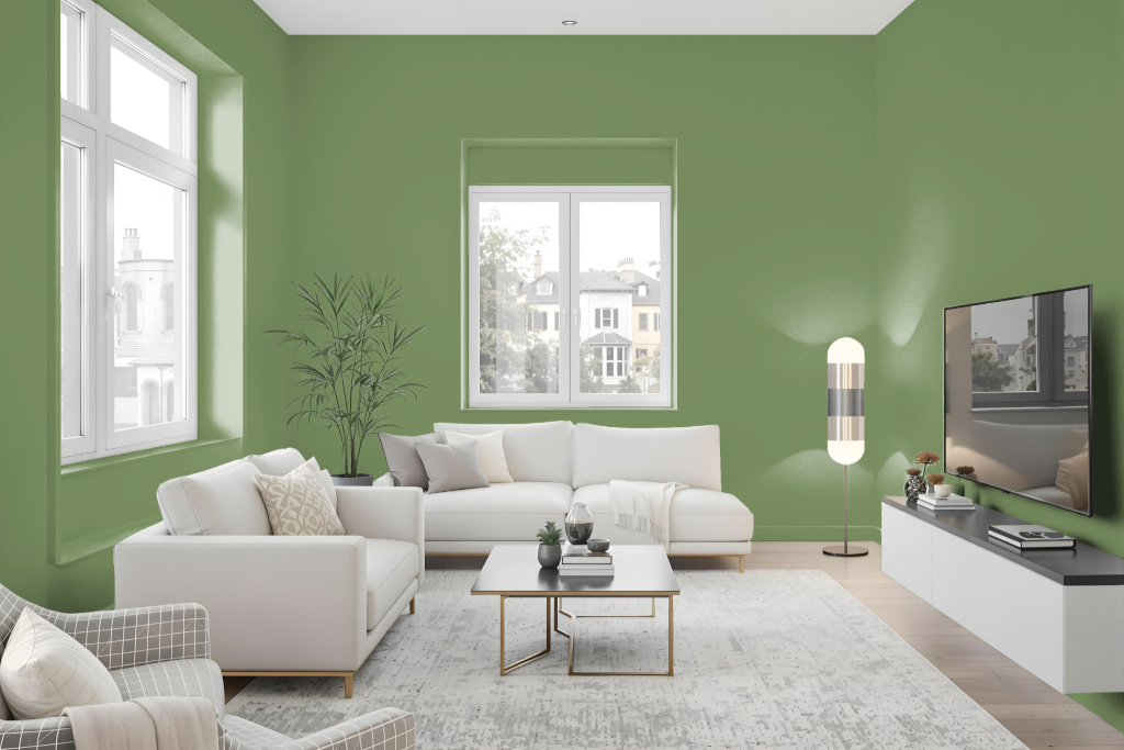
Sherwin Williams Dill SW 6438 brings a harmonious atmosphere to a living room, creating a cozy backdrop that pairs beautifully with warm neutrals like Perfect Greige and Accessible Beige to enhance the room’s inviting feel. Its soothing presence effortlessly fosters a sense of comfort and balance within the space.
For a contemporary feel, pairing this inviting color with crisp white accents such as Pure White or Alabaster introduces a modern touch, providing an ideal contrast that refreshes and enlivens the decor. Whether applied as a primary treatment or as a thoughtful accent, it helps establish a serene and well-curated ambiance in any living area.
Outdoor
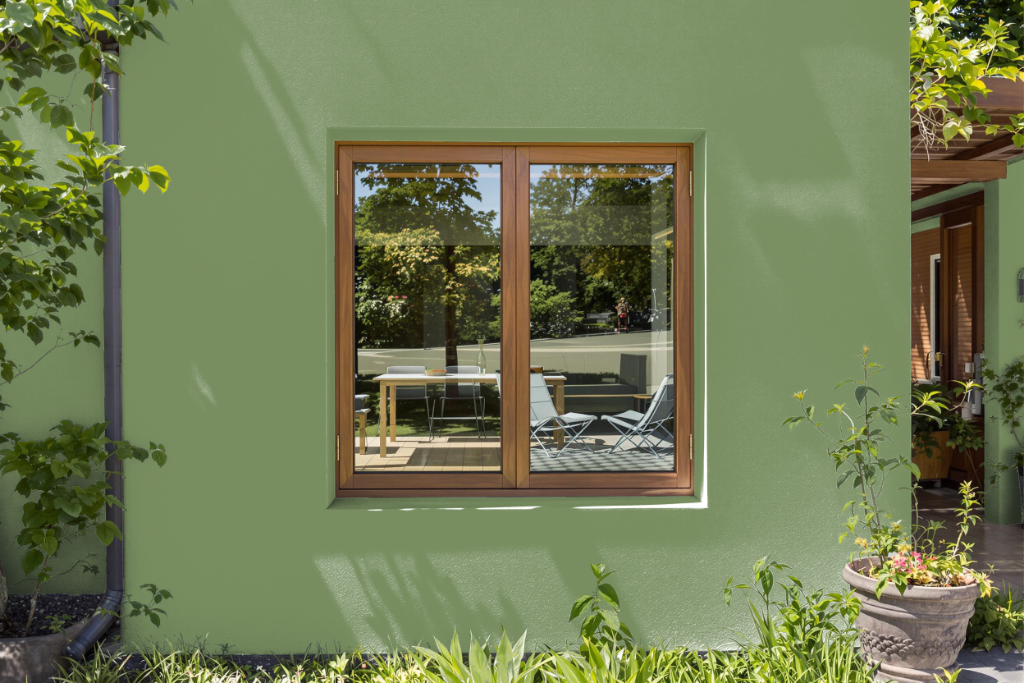
Sherwin Williams Dill SW 6438 stands out as a home outdoor color that brings a modern and refreshing essence when applied to exterior spaces. It pairs well with crisp whites to create striking contrasts, though the final appearance can vary depending on whether it’s applied to rough walls or smoother surfaces like trim and doors.
For optimal outcomes, it is important to check a physical swatch or sample since on-screen representations can be misleading. When using Dill SW 6438 for touch-ups on previously painted areas, consider that exposure and aging may alter the hue; opting for a custom spray application or a full recoat can help maintain a consistent look.