Sherwin Williams Drizzle SW 6479 is a captivating shade often recognized for its soothing and calming effect, making it an ideal choice for spaces aiming to evoke tranquility. Its RGB composition of 140, 174, 171 reveals a gentle blend of green and blue tones, ultimately manifesting as a Dusty Teal that can enhance any room's ambiance with subtle sophistication. This versatile color effortlessly complements a variety of interior styles, from modern minimalist to cozy cottage, lending a refreshing yet understated charm.
Color Description
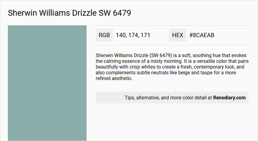
Sherwin Williams Drizzle (SW 6479) is a soft, soothing hue that evokes the calming essence of a misty morning. It is a versatile color that pairs beautifully with crisp whites to create a fresh, contemporary look, and also complements subtle neutrals like beige and taupe for a more refined aesthetic.
Undertones
The undertone of Drizzle can be accurately described as a blue hue, which is evident from its color profile.
Color Values
- HEX value: #8CAEAB
- RGB code: 140, 174, 171
Usage
Drizzle is suitable for various spaces, including bedrooms, where it can create a serene atmosphere. It is an ideal choice for those looking to add a touch of understated elegance to their home decor. The color works well in monochromatic, complementary, and neutral color schemes.
Atmosphere
Incorporating Drizzle into a space helps to create a serene atmosphere and brings a touch of tranquility to any room. Its gentle undertones contribute to a calming and elegant environment.
Sherwin Williams Drizzle SW 6479 Color Alternative
Sherwin Williams Drizzle SW 6479 is celebrated for its unique tone and versatile application, making it a favored choice in contemporary color palettes. Tikkurila Tide L491, Tikkurila L493, and Tikkurila V438 serve as excellent alternative options, each offering a distinct character that complements the original while providing subtle variations. Designers can confidently incorporate these Tikkurila alternatives to achieve a refined aesthetic that balances modern appeal with classic sophistication.
Bathroom
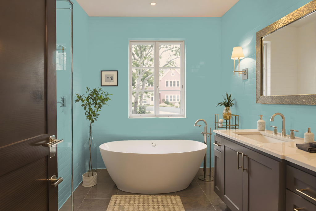
Sherwin Williams Drizzle SW 6479 is a bathroom color that creates a serene and tranquil atmosphere. It harmonizes beautifully with crisp whites, often seen in fixtures and trim, to achieve a fresh and contemporary look enhanced by subtle neutrals such as beige and taupe for added refinement.
The mid-tone cool quality of this color also lends itself well to dynamic color schemes by pairing with hues that carry a red undertone, resulting in a vibrant visual contrast that can elevate the overall design of the space.
Bedroom
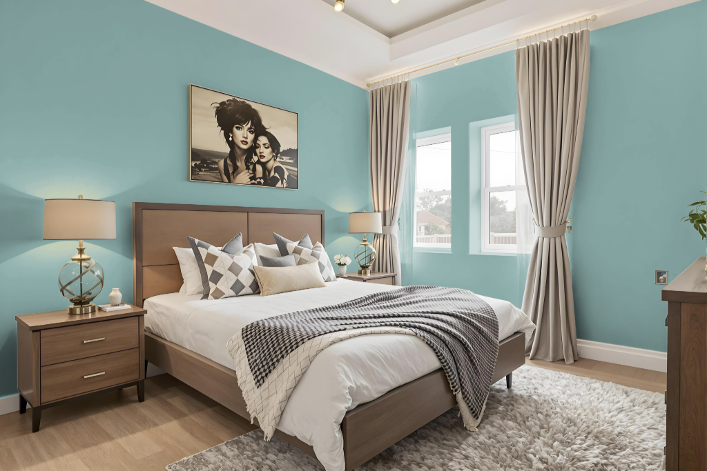
Sherwin Williams Drizzle SW 6479 is a bedroom color that brings a balance of calm and style, offering a blue undertone that creates a serene and tranquil atmosphere. Its fusion with crisp whites helps achieve a fresh, contemporary look, while pairing it with subtle neutrals like beige and taupe lends a refined, understated quality to the space.
Enhancing design flexibility, different shades, tints, and tones of this color can be layered for a monochromatic scheme, or combined with hues carrying red influences to infuse vibrancy and energy. Its reflective properties help maintain a balanced lighting effect, making it an appealing choice for thoughtfully curated bedroom interiors.
Kitchen
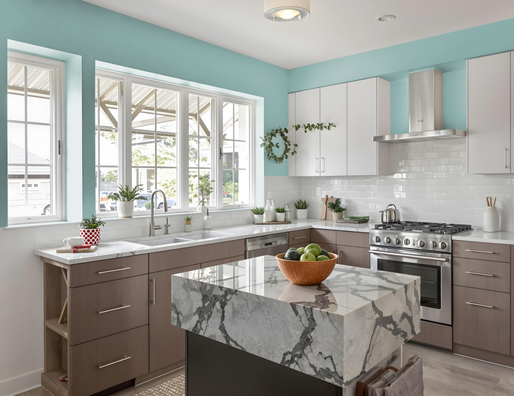
For a kitchen color scheme, Sherwin Williams Drizzle offers a calming choice that works well with crisp whites to create a fresh, contemporary look for cabinets, walls, or accent pieces. It blends seamlessly with subtle neutrals like beige and taupe, enhancing countertops, flooring, or furniture for a refined, cohesive aesthetic.
Incorporating this cool tone into your kitchen design can establish a serene atmosphere, while pairing it with complementary hues that carry warm red undertones brings a dynamic contrast to the space. The result is an inviting and tranquil environment balanced with an element of visual excitement.
Living Room
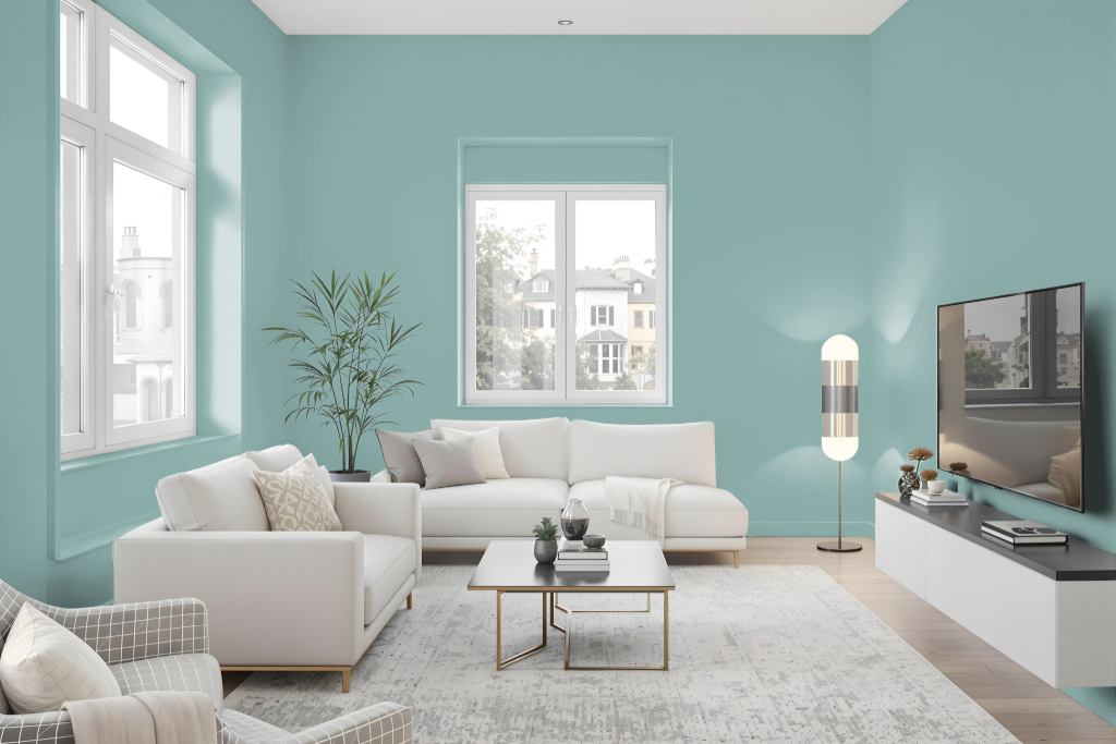
Sherwin Williams Drizzle SW 6479 is a curated living room color choice, balancing brightness with its moderate light reflectance and cool blue undertones. This hue harmonizes with a variety of design settings, working well with crisp white accents for a modern feel or soft neutrals to create a more refined atmosphere.
It pairs effectively with both lighter and darker shades, and contrasting accents can introduce dynamic visual interest. Testing the color with samples on different surfaces and under various lighting conditions is recommended to ensure the desired effect is achieved in your space.
Outdoor
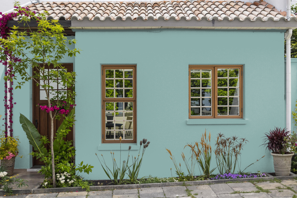
Home outdoor color Sherwin Williams Drizzle SW 6479 brings a calming effect to exteriors, making it an attractive option for elevating a house’s overall appearance. Paired with crisp white trim and subtle neutral accents like beige or taupe, this shade creates a harmonious and refined look that enhances various architectural details.
Its appearance may vary across different textures, with rough exterior walls displaying a distinct character compared to smooth surfaces such as doors or shutters. Testing with peel-and-stick samples or consulting a color expert can help in visualizing how this hue will enliven your specific outdoor surfaces.