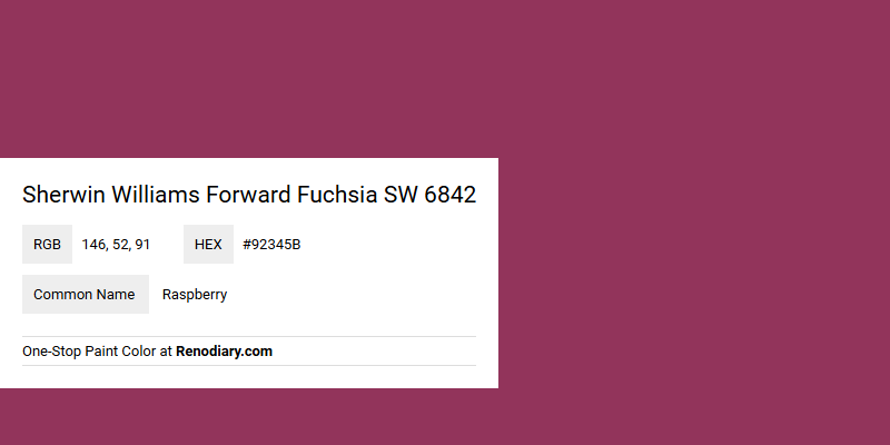
Sherwin Williams Forward Fuchsia SW 6842, captured by its vibrant RGB signature of 146, 52, 91, offers a bold and lively expression akin to Raspberry. This rich hue is ideal for creating energetic and dynamic spaces, adding a pop of color that can invigorate any room. The captivating blend of deep pink and purple undertones makes it a popular choice for those looking to infuse their environment with a spirited and modern flair.
Color Description
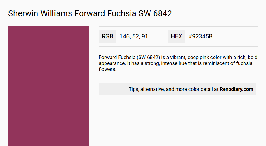
Forward Fuchsia (SW 6842) is a vibrant, deep pink color with a rich, bold appearance. It has a strong, intense hue that is reminiscent of fuchsia flowers.
Undertones
The color has reddish and slightly purplish undertones, giving it a complex and dynamic appearance.
Color Values
- RGB: 146, 52, 91
- CMYK: 36.91, 42.93, -1.43, 358
- L*ab: 37, 43, -1.43
- Light Reflectance Value (LRV): Approximately 9
Usage
Forward Fuchsia is suitable for both interior and exterior painting projects. It can be used to create a bold, eye-catching effect in rooms, or to add a vibrant touch to exterior walls and trim.
Atmosphere
This color creates a lively, energetic atmosphere and can add a sense of excitement and playfulness to any space. It is ideal for areas where a strong, vibrant color is desired, such as in creative spaces, children's rooms, or in outdoor decor to make a statement.
Sherwin Williams Forward Fuchsia SW 6842 Color Alternative
Sherwin Williams Forward Fuchsia SW 6842 stands out as a bold and energetic color that can be beautifully complemented by a range of striking alternatives. Benjamin Moore Royal Flush 2076-20 offers a similarly vibrant energy, while RAL Classic Red violet RAL 4002 and RAL Effect RAL 530-2 provide creative options that echo its dynamic intensity. Together, these alternatives allow designers to experiment with a palette that maintains the original color's spirit while exploring unique applications in various design contexts.
Bathroom
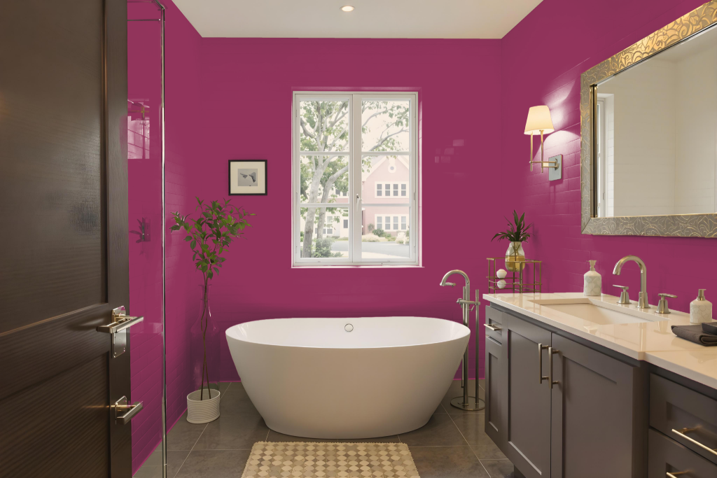
For a bathroom, Sherwin-Williams Forward Fuchsia SW 6842 adds a bold and energetic touch that makes accent walls, painted vanities, or decorative backdrops behind bathtubs stand out. Pairing this vivid hue with complementary deep tones, soft greys, or crisp whites creates a dynamic contrast, elevating the overall design.
Using this bright color on cabinets, shelves, or even the ceiling can further enhance the space, introducing a striking element that draws the eye. It is advisable to test the color with peel-and-stick samples first to ensure it meshes well with the bathroom’s lighting and aesthetic.
Bedroom
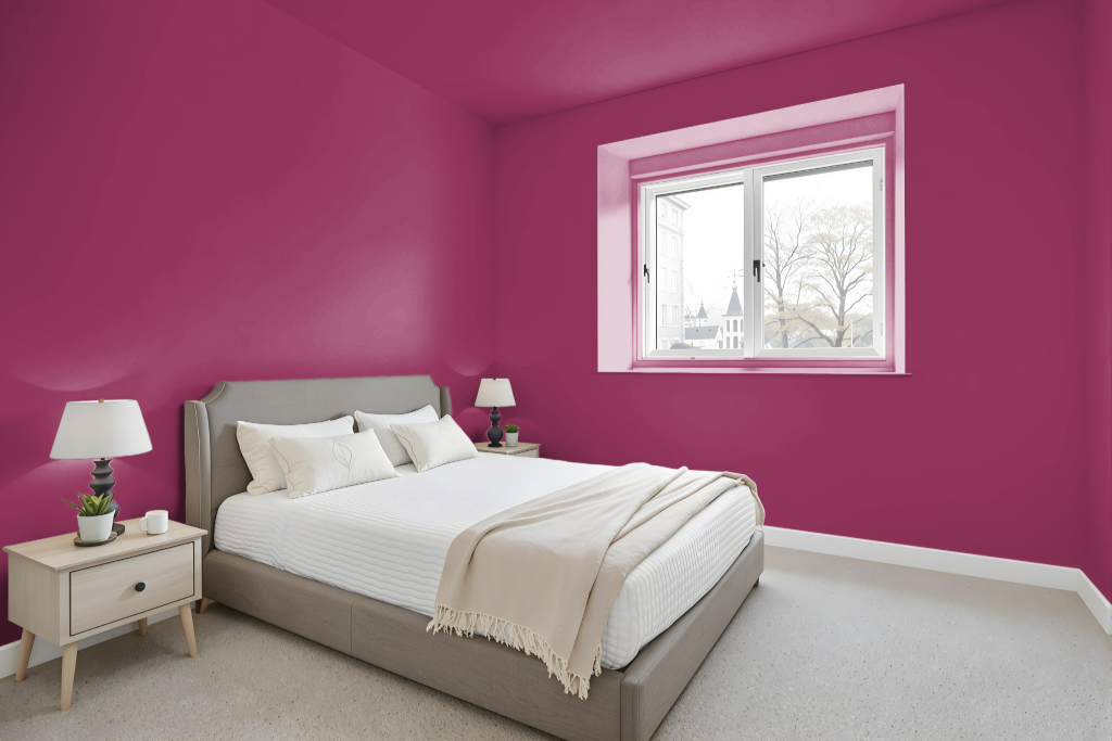
The bedroom color scheme can center on Sherwin Williams Forward Fuchsia, creating a bold and inviting atmosphere that captures attention with its energetic hue. Pair it with deep blues, soft greys, or crisp whites to enhance the contrast and bring balance to the room. Alternatively, use this lively color on an accent wall or in statement pieces such as furniture and bedding for a focused burst of energy.
Complement the intense color with shades that have a green undertone, creating a harmonious interplay that heightens the visual dynamics. Integrate neutral tones to ground the space and ensure that the vivid hue remains engaging without becoming overwhelming, resulting in a refined yet spirited interior design.
Kitchen
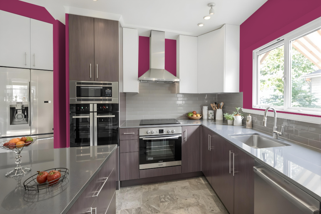
For a kitchen color scheme, Sherwin Williams Forward Fuchsia SW 6842 adds bold energy and contemporary flair. This striking shade pairs well with deeper hues like those seen in Mountain Air and Dard Hunter Green, creating a high-contrast, dynamic visual effect in the space.
When balanced with soft neutrals such as gentle greys or crisp whites, this vibrant tone stands out as an eye-catching accent in minimalist settings. Ideal for accent walls, cabinetry, or focal design elements, it introduces depth and warmth while maintaining a sophisticated aesthetic.
Living Room
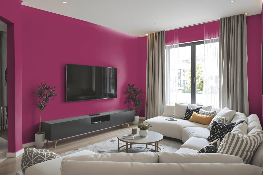
Sherwin Williams Forward Fuchsia SW 6842 is a bold living room color that creates a striking accent wall or statement piece, especially within minimalist design schemes by adding depth and warmth. This dynamic hue enhances the space, drawing attention and bringing a lively energy to the room.
Ideal for a variety of settings, it harmonizes beautifully with complementary shades like deep blues, soft greys, or crisp whites, ensuring a cohesive yet energetic look. Beyond living rooms, this vivid color also makes an impact in dining areas, bedrooms, kitchens, and bathrooms by introducing a distinctive pop and elevating the overall aesthetic.
Outdoor
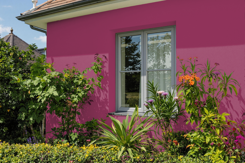
For outdoor use, Sherwin-Williams Forward Fuchsia SW 6842 offers a bold and vibrant home exterior color that can transform accent walls, statement features, or decorative elements like doors and shutters. Paired with complementary shades such as deep blues or greens, it creates a striking visual impact that truly stands out.
Its energetic personality demands careful consideration of natural light and surroundings, ensuring that the color enhances the overall architectural style while harmonizing with the neighborhood's aesthetic. This approach guarantees a balanced, cohesive look that's both captivating and contextually appropriate.