Sherwin Williams Framboise SW 6566 is a color known for its deep, rich hue, reminiscent of a ripe raspberry. Its RGB composition, set at (124,54,85), connotes a blend of red and purple tones, offering a warm and inviting ambiance. This particular shade, often associated with the elegant Dusty Rose, provides a sophisticated and timeless appeal, making it a popular choice for both modern and traditional interior designs.
Framboise SW 6566
Color Description
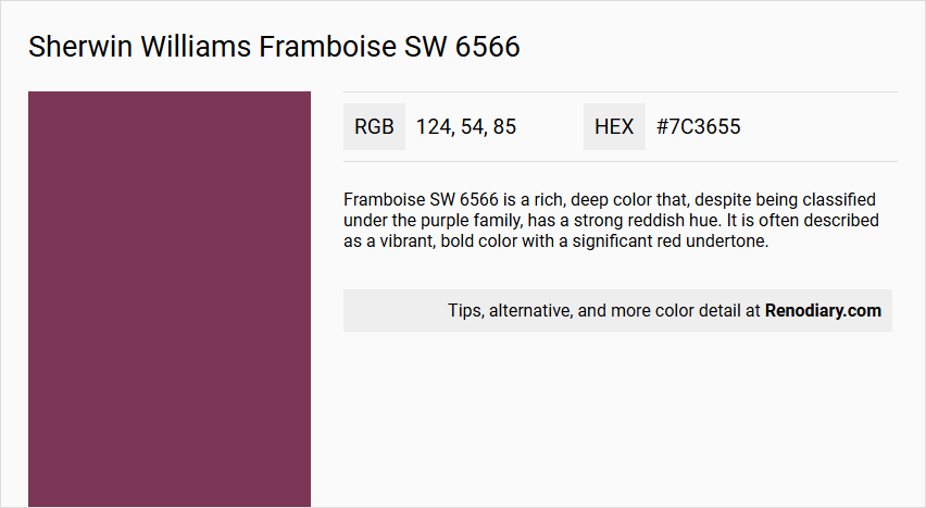
Framboise SW 6566 is a rich, deep color that, despite being classified under the purple family, has a strong reddish hue. It is often described as a vibrant, bold color with a significant red undertone.
Undertones
The color has warm undertones, which contribute to its rich and inviting appearance.
Color Values
- Red: 128
- Green: 48
- Blue: 82
Usage
This color is suitable for both interior and exterior paint projects. It can be used to create a dramatic and luxurious atmosphere in living rooms, dining rooms, or any space where a bold statement is desired.
Atmosphere
Framboise SW 6566 creates a warm, luxurious, and energetic atmosphere. The color's deep, rich tone can add a sense of sophistication and elegance to any room, making it ideal for spaces where a bold and vibrant aesthetic is desired.
Sherwin Williams Framboise SW 6566 Color Alternative
Sherwin Williams Framboise SW 6566 stands out with its deep, sophisticated allure that makes it an attractive option for accent walls and modern interiors. Designers looking for vibrant alternatives can consider Benjamin Moore Carter Plum CW-355, RAL Effect RAL 530-3, and RAL Effect RAL 530-4, each offering a unique interpretation of rich color intensity. These color alternatives open up creative avenues while maintaining the dynamic character that Sherwin Williams Framboise SW 6566 is known for.
Bathroom
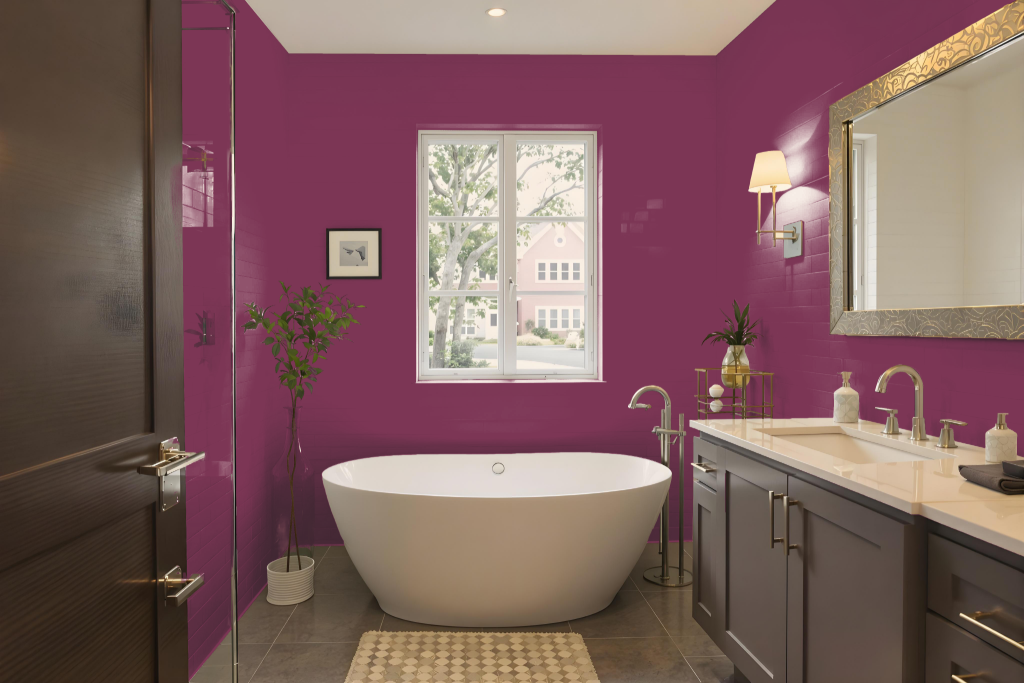
When considering Sherwin Williams Framboise for a bathroom, the color brings a dramatic and sophisticated tone that can create a distinctive and moody ambiance in the space. Its deep nature lends itself well to design strategies that embrace contrast and refined elegance.
To counterbalance its intense character, pair this hue with lighter accents such as creamy off-white tones or subtle light grays, which help to brighten the overall atmosphere. Incorporating metallic elements in gold or brass further enhances the luxurious undertones, making it ideal for creating a captivating accent wall or adding refined detail to specific design features.
Bedroom
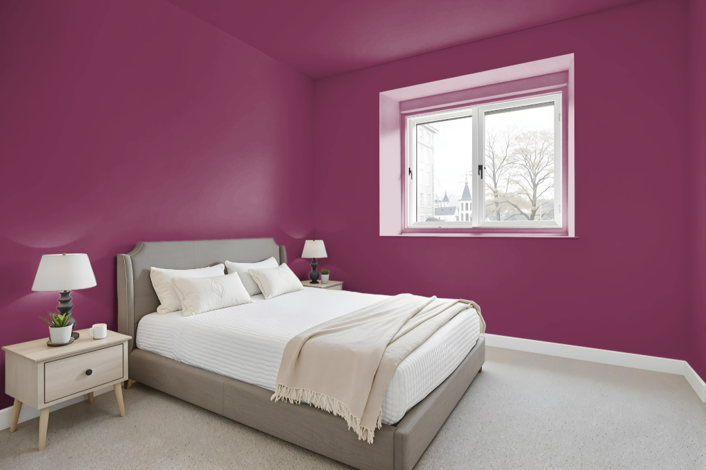
A bedroom color scheme featuring Sherwin Williams Framboise SW 6566 sets a refined tone, creating a warm and inviting retreat. This deep, rich shade works beautifully with creamy off-white tones and subtle light grays that bring balance and a timeless elegance to the space.
To add visual interest and a dynamic touch, consider incorporating contrasting greens that harmonize with the primary color, or create a layered look using various tints and shades of Framboise. Accents in gold or brass further emphasize the luxurious elements, transforming the room into a sophisticated sanctuary.
Kitchen
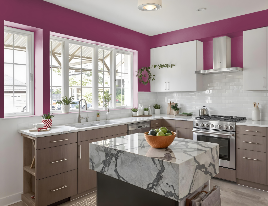
For a kitchen color scheme, Sherwin Williams Framboise SW 6566 offers a bold and elegant palette that can serve as a striking focal point. Pairing it with creamy off-white shades or light grays helps create a classic and refined look, while adding metallic accents in gold or brass accentuates its luxurious undertones.
Using complementary green hues can further enhance the design by providing a dynamic and vibrant contrast. Whether featured on a statement wall or woven subtly through the space, this color brings depth and timeless allure to any kitchen interior.
Living Room
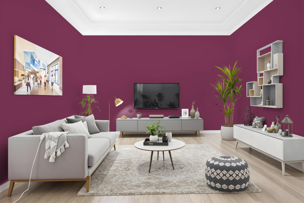
Sherwin Williams Framboise SW 6566 enlivens a living room with its sophisticated warmth and rich allure. This striking shade creates an inviting yet refined atmosphere, making it an excellent choice for a statement wall or accent areas throughout the space.
To balance the deep, sumptuous tone, it is recommended to integrate creamy off-white hues or light grays in the decor, while metallic accents in gold or brass contribute to its modern elegance. As always, reviewing a physical color sample is key, as on-screen depictions can differ from the actual finish.
Outdoor
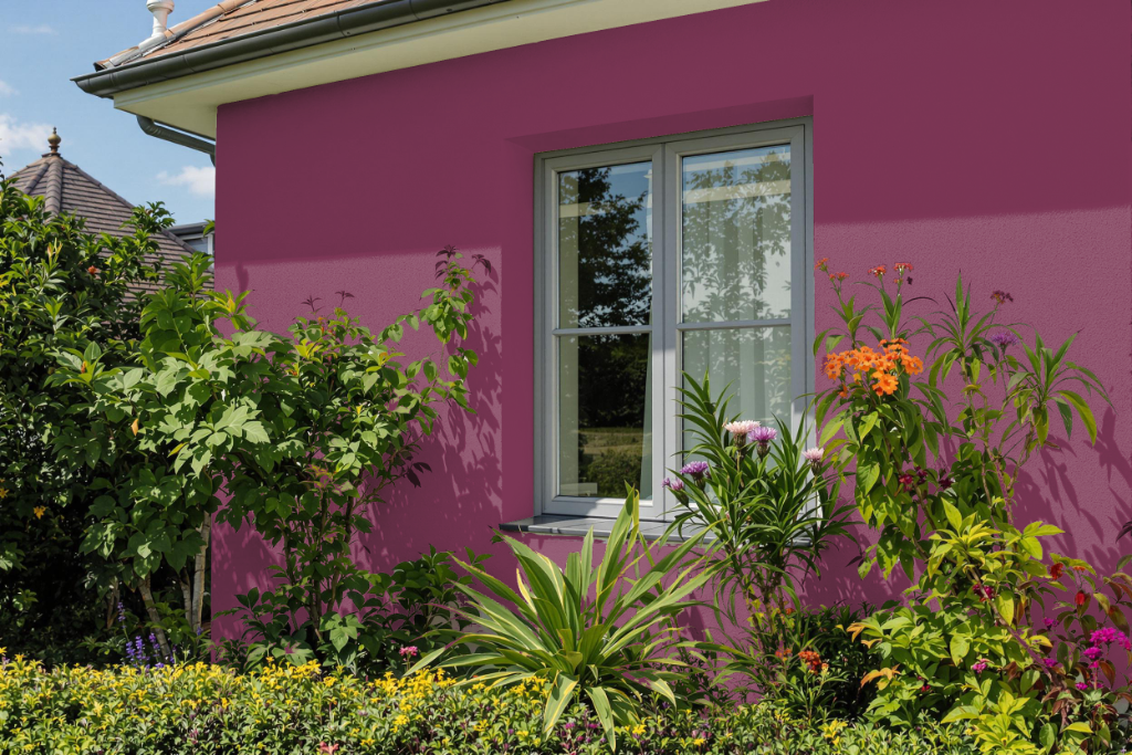
Sherwin Williams Framboise SW 6566 is an eye-catching option for your home outdoor setting. While it makes a bold statement, this rich shade may be more susceptible to the effects of sunlight, making fade and discoloration a concern over time. Using a high-quality exterior formulation with enhanced UV protection is essential to maintain its appearance in outdoor environments.
To enhance its impact, consider pairing this distinctive hue with complementary colors like deep greens to create a lively contrast within your landscape. It is recommended to evaluate a physical sample under your specific outdoor conditions before finalizing your decision, ensuring the desired effect is achieved in your unique setting.