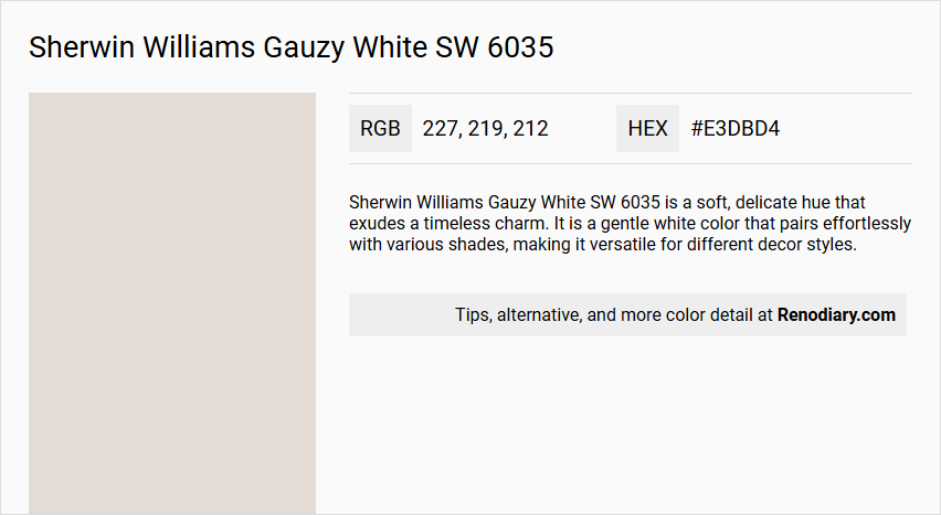
Sherwin Williams Gauzy White SW 6035, with its soft and muted hue, fits seamlessly into the off-white color category, boasting an RGB composition of 227, 219, and 212. This delicate shade is ideal for creating a serene and airy atmosphere in interior spaces, offering a subtle backdrop that complements a wide array of design elements. Whether used on walls or trim, Gauzy White enhances natural light and adds a touch of understated elegance to any room.
Color Description
Sherwin Williams Gauzy White SW 6035 is a soft, delicate hue that exudes a timeless charm. It is a gentle white color that pairs effortlessly with various shades, making it versatile for different decor styles.
Undertones
The undertone of Gauzy White can be accurately described as having a red hue. This is evident when isolating the pure hue and eliminating any tints, tones, and shades.
Color Values
- HEX: #E3DBD4
- RGB: 227, 219, 212
Usage
Gauzy White can be used in various rooms such as living rooms, dining rooms, bedrooms, kitchens, bathrooms, and even exterior spaces. It complements both modern and traditional decor styles seamlessly. It can be paired with colors like SW 6258 Tricorn Black for a striking contrast and SW 7017 Dorian Gray for a subtle, elegant combination.
Atmosphere
When used, Gauzy White creates a calming and welcoming atmosphere. For example, when paired with furniture in SW 7036 Accessible Beige, it enhances the sense of calm and hospitality in a room.
Sherwin Williams Gauzy White SW 6035 Color Alternative
Sherwin Williams Gauzy White SW 6035 is known for its clean and versatile appeal, yet those seeking subtle variations in tone can explore alternatives that offer unique characteristics. Tikkurila Talcum G484 presents a refined, crisp appearance, while Tikkurila Merino Y458 delivers a warm, balanced ambiance, and Tikkurila Tofu Y462 introduces a creamy, inviting texture to the design. By considering these alternatives, designers and homeowners have the flexibility to tailor spaces with distinct yet complementary shades that ensure a harmonious and engaging aesthetic.
Bathroom
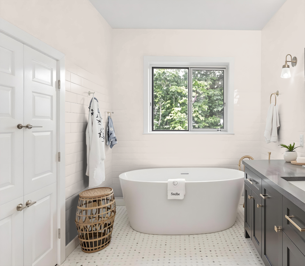
For a bathroom, Sherwin Williams Gauzy White SW 6035 offers a calming effect and a fresh base to build your design around. This shade creates a welcoming backdrop perfect for pairing with both darker accents to create striking contrasts and softer hues for subtle elegance.
Its warm red undertones allow it to complement an array of colors, from deep greys providing refined sophistication to gentle neutrals that enhance a peaceful ambiance. Additionally, it coordinates beautifully with complementary greens to introduce a vibrant, dynamic visual appeal.
Bedroom
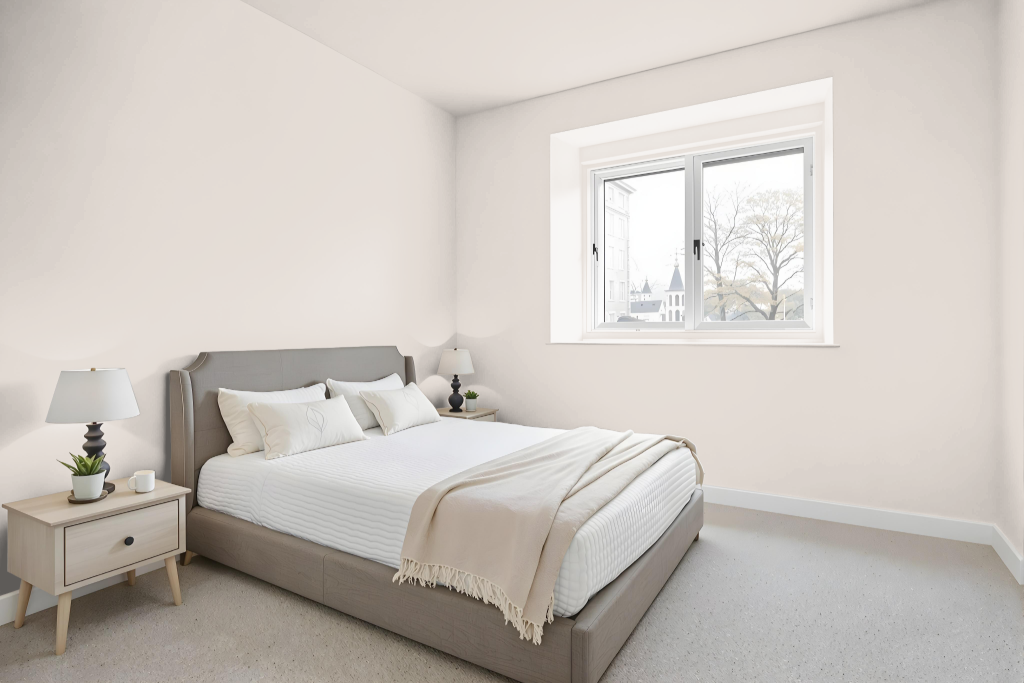
For a bedroom color scheme, Sherwin Williams Gauzy White SW 6035 offers a calming backdrop that sets the stage for both bold contrasts and subtle harmonies. It pairs impressively with deep and intense tones as well as understated gray shades, while incorporating hints of green accents can introduce a lively visual pulse to the space.
Complementing Gauzy White with furniture in Accessible Beige reinforces a welcoming and serene atmosphere. This foundation supports a design that gracefully bridges modern aesthetics with traditional elements, resulting in a dynamic yet balanced setting.
Kitchen
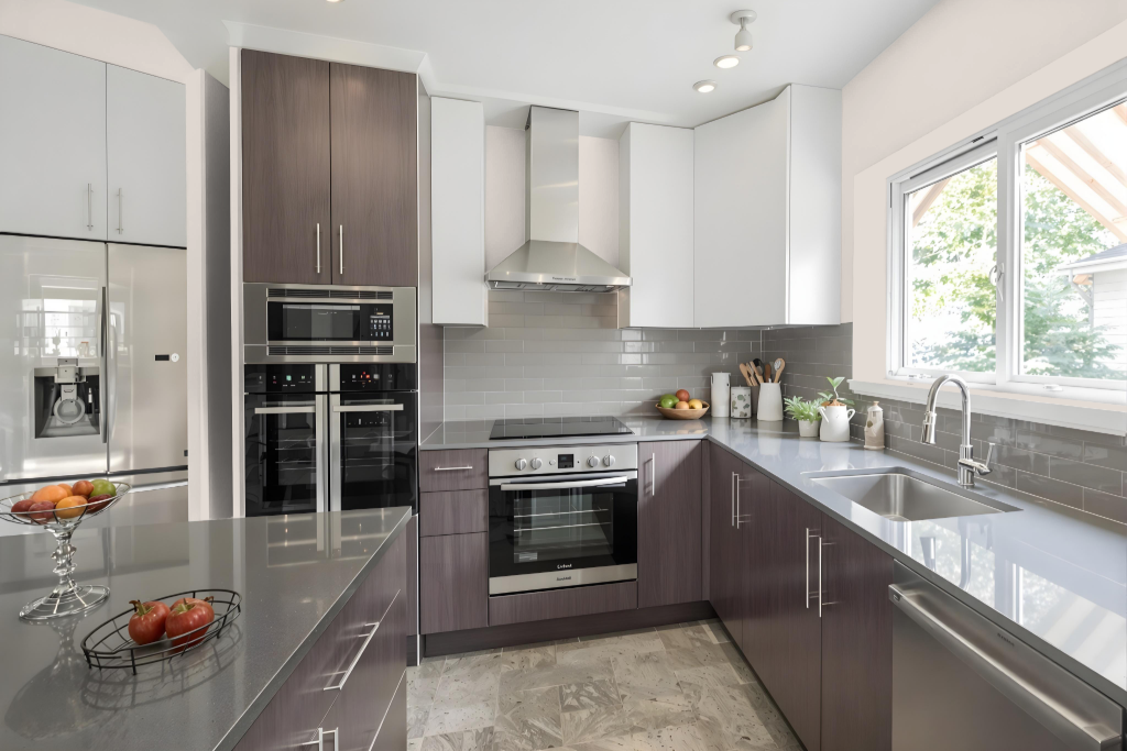
Sherwin Williams Gauzy White is an excellent kitchen color that enhances both modern and traditional decor styles. This shade pairs seamlessly with contrasting hues, such as a deep black for a bold statement and a refined gray for subtle elegance, creating visually engaging combinations.
When integrated with furniture in a warm neutral tone, the overall scheme exudes a calming and inviting atmosphere. Additional options for a monochromatic or complementary approach offer dynamic visual effects, allowing flexibility in achieving a balanced yet energetic design.
Living Room
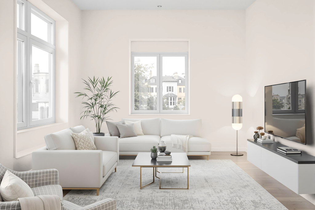
Gauzy White brings an inviting, stylish aura to living rooms, elevating the atmosphere with its crisp and balanced appeal. It pairs well with deep contrasting shades like a bold black and a refined gray to create dynamic visual interest that enhances the overall ambiance.
When combined with warm beige furnishings, this color fosters a soothing and welcoming environment ideal for both contemporary and classic interiors. Its ability to harmonize with a range of decorative elements makes it a popular choice for spaces seeking a balance of sophistication and comfort.
Outdoor
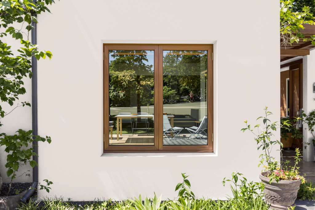
For home outdoor color, Sherwin Williams Gauzy White SW 6035 offers a subtle, warm tone that enhances exterior spaces with its distinctive character. Its red undertones provide depth and interest, yet caution is needed as exposure to sunlight and heat can lead to fading over time, a common challenge for hues that inherently absorb more light.
For outdoor applications, achieving lasting results depends on using a top-quality 100% acrylic latex paint renowned for ensuring durability, and resistance to fading, cracking, and peeling. With its light, reflective nature, this color is well-suited for exterior surfaces that benefit from brightness and longevity, provided proper attention is given to environmental factors and the paint's performance characteristics.