Sherwin Williams' Granite Peak SW 6250 is a sophisticated color that artfully blends elements of both blue and gray. Its RGB composition of 96, 107, and 117 showcases a harmonious balance, giving it a versatile and calming aesthetic. This particular hue adds a modern, elegant touch to any interior or exterior space, making it a popular choice among designers seeking a timeless look.
Color Description
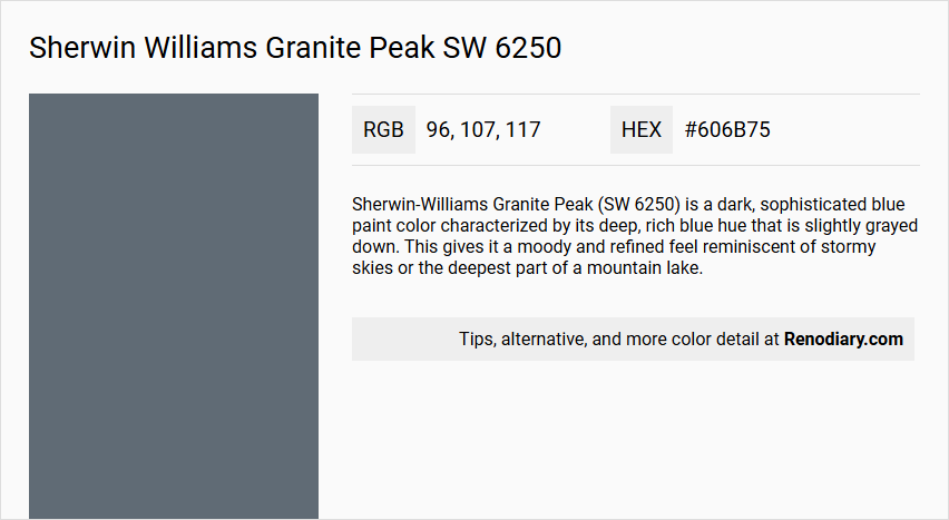
Sherwin-Williams Granite Peak (SW 6250) is a dark, sophisticated blue paint color characterized by its deep, rich blue hue that is slightly grayed down. This gives it a moody and refined feel reminiscent of stormy skies or the deepest part of a mountain lake.
Undertones
Granite Peak has undertones of slate gray that balance the blue tone and prevent it from feeling too bright or overwhelming. Faint green undertones are also present, though the primary undertone is slate gray.
Color Values
- Light Reflectance Value (LRV): 14-15.28
- HEX Value: #636F78 or #606B75
- RGB Values: 96, 107, 117 or 99, 111, 120
Usage
Granite Peak is versatile enough for both interior and exterior applications. For interiors, it works well as an accent wall, in accent rooms, or for painting entire spaces such as bedrooms, living rooms, and studies. It pairs beautifully with lighter neutrals like SW 7043 Worldly Gray and SW 7015 Repose Gray. On exteriors, it is ideal for sidings, shutters, and front doors, particularly when complemented with red or pink brick and warm earthy stone.
Atmosphere
The color creates a cozy, inviting, and sophisticated atmosphere. It adds depth and interest to any space, providing a calm yet strong presence. Throughout the day, varying light conditions reveal different facets of the color—from blue tones in the morning to pronounced gray undertones at midday, and a deeper overall hue in the evening.
Sherwin Williams Granite Peak SW 6250 Color Alternative
Sherwin Williams Granite Peak SW 6250 offers a striking balance of bold personality and refined elegance that inspires creativity in any space. Its color alternatives, Tikkurila S429, Tikkurila V490, Tikkurila Amethyst M428, provide distinctive options for those seeking a fresh yet complementary palette. By thoughtfully incorporating these alternatives into your design scheme, you can enhance both the visual interest and harmony of your environment.
Bathroom
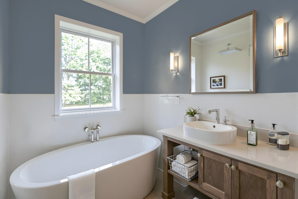
Sherwin-Williams Granite Peak SW 6250 is an excellent bathroom color that brings depth and sophistication to the space. Its capacity to work well in varying lighting conditions makes it a practical option for both well-lit and dimly lit environments. The color pairs seamlessly with lighter neutrals and can be enhanced with crisp whites on trim and ceilings, creating a refined and harmonious atmosphere.
In addition to offering aesthetic appeal, Granite Peak is designed to perform in spaces exposed to moisture and regular cleaning. Its deep tone requires careful consideration of natural and artificial lighting to ensure the color is fully appreciated, making it particularly important for smaller bathrooms or those with limited light sources.
Bedroom
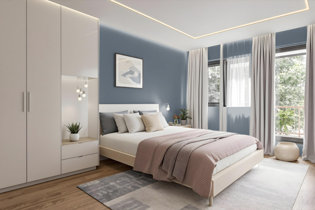
For a bedroom color scheme using Sherwin-Williams Granite Peak, the deep, refined hue establishes an accent wall behind the bed to create a cozy and inviting environment. The rich tone pairs beautifully with crisp white or ivory bedding for contrast, while natural wood furniture and woven fiber baskets introduce warmth and texture. Layered neutral accents and warm metal lamps contribute to a calming ambiance that enhances the overall sophistication of the space.
Attention to lighting and finishing details further elevates the design; smooth wall applications with appropriate primer ensure even coverage, while the room's orientation subtly shifts the mood—north-facing spaces emphasize the cooler undertones, and south-facing areas reveal hints of blue. This carefully balanced approach results in a serene retreat that harmonizes color depth with natural elements for a well-curated sleeping sanctuary.
Kitchen
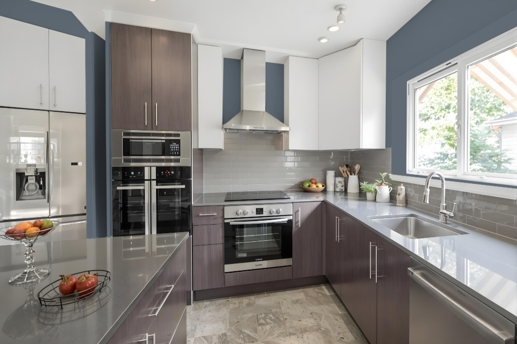
For a kitchen color scheme, Sherwin-Williams Granite Peak imparts a sophisticated and dramatic touch. Applied to islands or cabinetry, it creates a striking contrast against white upper cabinets, enhancing the overall visual appeal and modernity of the space.
Complement this tone with white quartz or marble countertops, brushed brass hardware, and warm wood cutting boards to create an inviting balance. Cream-colored bar stools and additional natural wood accents introduce a gentle warmth, making the setting both cozy and refined.
Living Room
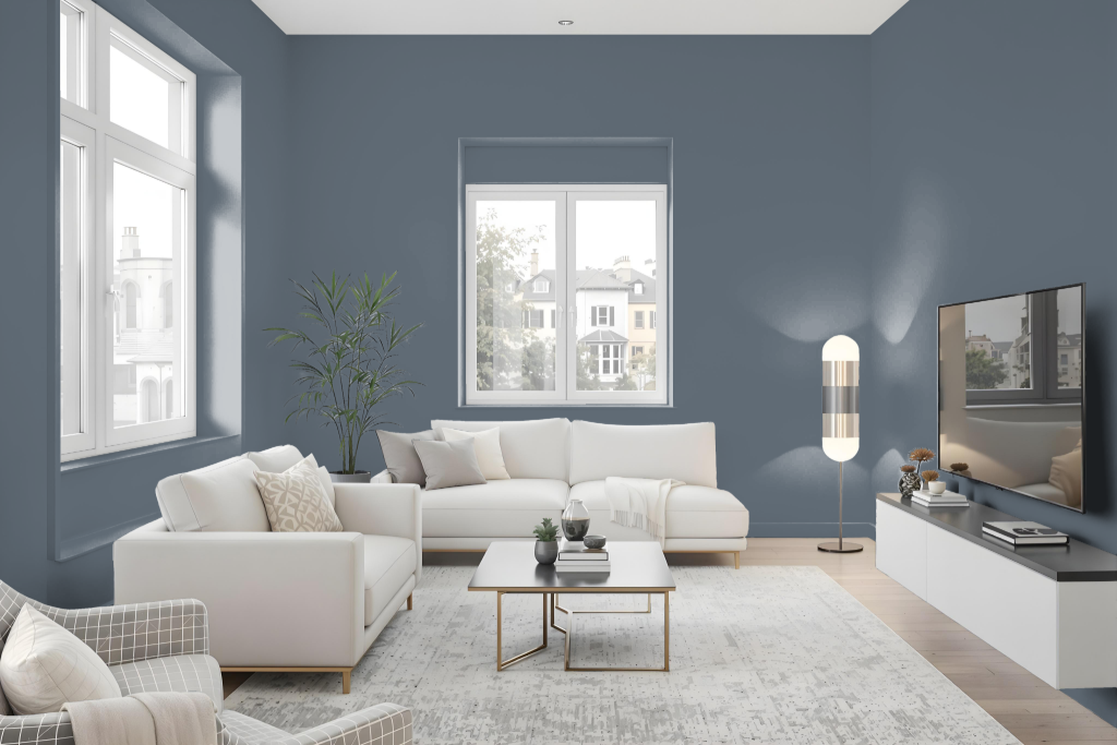
In living rooms, Sherwin Williams Granite Peak SW 6250 sets a cozy yet sophisticated tone when used as a wall color. It forms a refined backdrop that pairs beautifully with lighter neutrals like Repose Gray or Agreeable Gray, and is especially effective alongside tan leather upholstery and brass fixtures. Its dark nature absorbs more light, making it an excellent choice for spaces with abundant natural sunlight as well as rooms where a moody ambiance is desired.
The color also functions well as an accent by highlighting board and batten details or serving as a statement wall, adding layered interest to the room. It harmonizes with white trim such as Pure White or Alabaster, and works in concert with warm-toned area rugs and natural wood furniture to create an inviting, well-balanced interior environment.
Outdoor
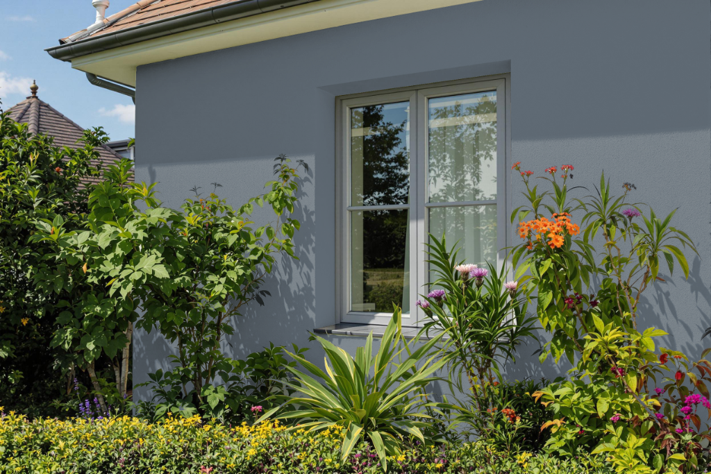
For home outdoor color, Sherwin-Williams Granite Peak delivers a distinctive, dark mid-toned blue that enhances the appearance of exteriors. This rich hue pairs beautifully with red or pink brick and earthy stone accents, offering a refined backdrop for a home's facade.
Ideal for applications such as siding and accents on shutters or front doors, Granite Peak harmonizes with lighter neutral tones to create a balanced and sophisticated look. Its enduring, grounded character adapts well to changing lighting conditions throughout the day, ensuring an inviting exterior appeal.