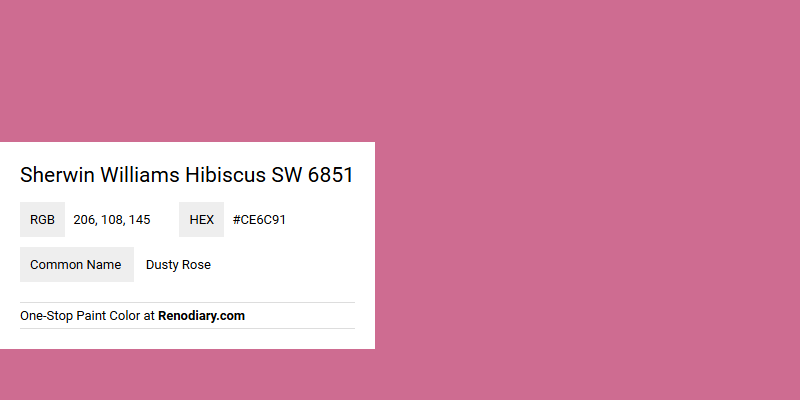
Sherwin Williams Hibiscus SW 6851, characterized by its RGB values of (206,108,145), captures the alluring essence of Dusty Rose, a color often associated with elegance and subtlety. This shade brings a warm, inviting atmosphere to any space, marrying the sophistication of muted pink with a gentle hint of vibrancy. Whether used in contemporary or traditional settings, this hue serves as a versatile and timeless choice for both interior and exterior design elements.
Color Description
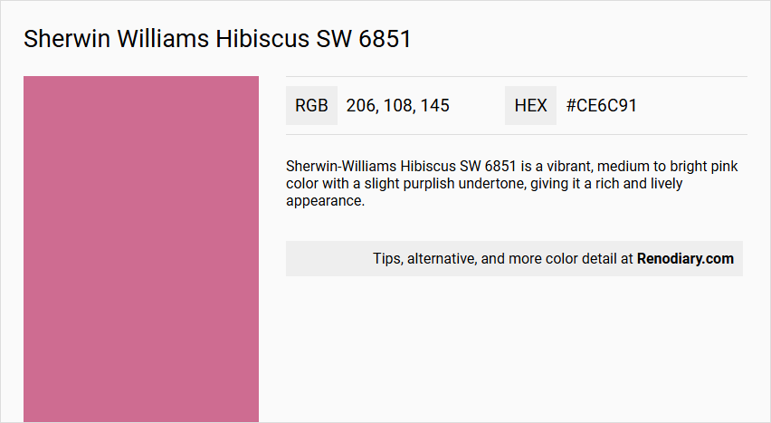
Sherwin-Williams Hibiscus SW 6851 is a vibrant, medium to bright pink color with a slight purplish undertone, giving it a rich and lively appearance.
Undertones
The color has noticeable pink and slightly purplish undertones, which contribute to its dynamic and energetic feel.
Color Values
- Red: 213
- Green: 104
- Blue: 144
Usage
This color is suitable for both interior and exterior paint projects. It can be used to add a bold and cheerful touch to various spaces, such as bedrooms, living rooms, or even exterior accents. However, due to its vibrant nature, it might be more effective as an accent color rather than a primary wall color.
Atmosphere
Hibiscus SW 6851 creates a lively and energetic atmosphere, making it ideal for spaces where a bright and cheerful ambiance is desired. It can add a sense of warmth and playfulness to any room.
Sherwin Williams Hibiscus SW 6851 Color Alternative
Sherwin Williams Hibiscus SW 6851 offers a vibrant option that can be interpreted through various alternative color schemes. An equivalent approach is to explore RAL Classic Heather violet RAL 4003, which shares a comparable depth and richness. Additionally, RAL Effect RAL 510-4 and RAL Effect RAL 480-6 provide distinct yet harmonizing alternatives that maintain the striking appeal of Sherwin Williams Hibiscus SW 6851.
Bathroom
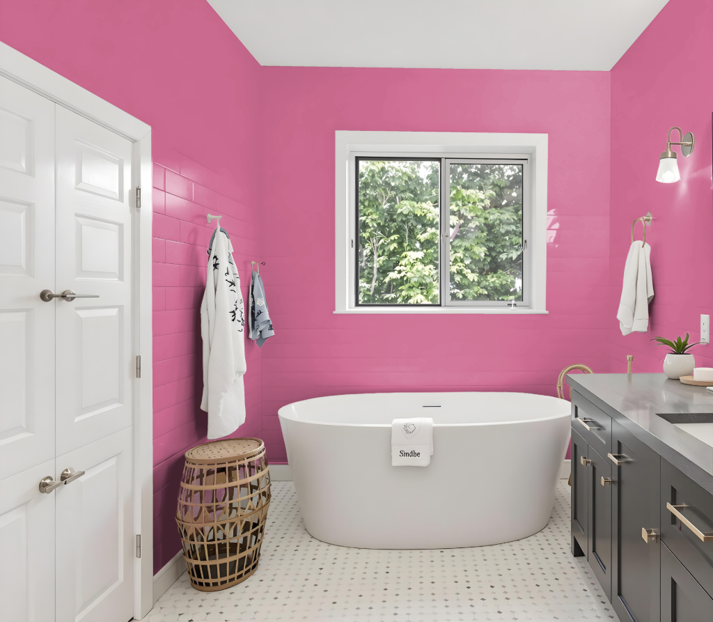
Sherwin Williams Hibiscus SW 6851 makes a bold and sophisticated bathroom color choice, offering a vibrant statement while inviting refined design possibilities. Its dynamic presence pairs beautifully with neutral tones that create a modern and balanced feel, ensuring the space remains both lively and harmonious.
For added depth and luxury, deep contrasting shades can be employed to further enhance the overall aesthetic. Incorporating subtle metallic accents elevates the elegance of the design, making the color an excellent option for accent walls or feature areas that invite creative refinement.
Bedroom
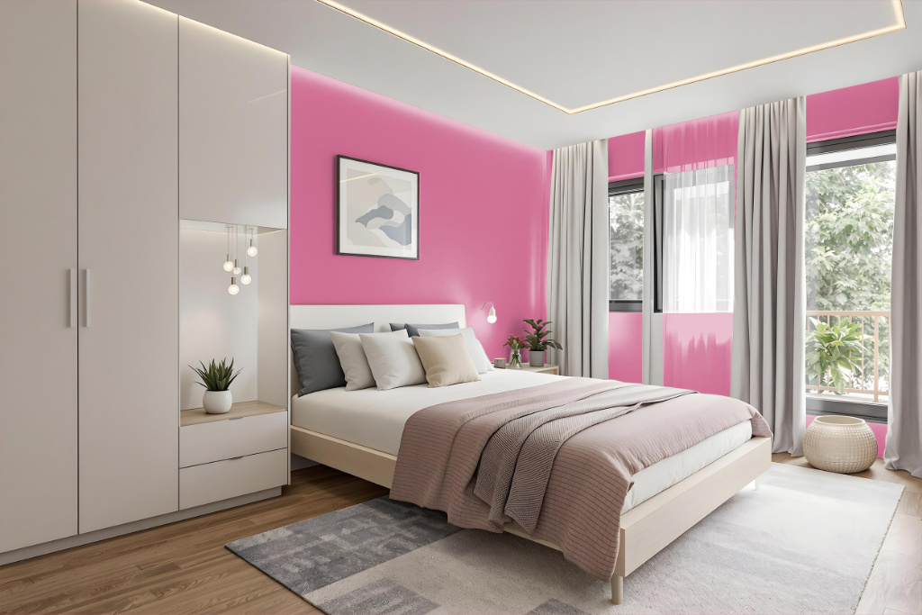
For a bedroom color scheme, Hibiscus presents a bold and striking choice as a backdrop that commands attention. Designed to create a modern look, it works well when balanced with neutral shades like soft alabaster or cool grays, while also pairing effectively with deeper hues for a more dramatic effect.
Given its vibrant character, this color is ideally suited for accenting key architectural features or serving as a statement wall, rather than dominating the entire space. Added metallic touches, such as gold or brass accents, can further enhance the luxurious feel and create a sophisticated, layered design.
Kitchen
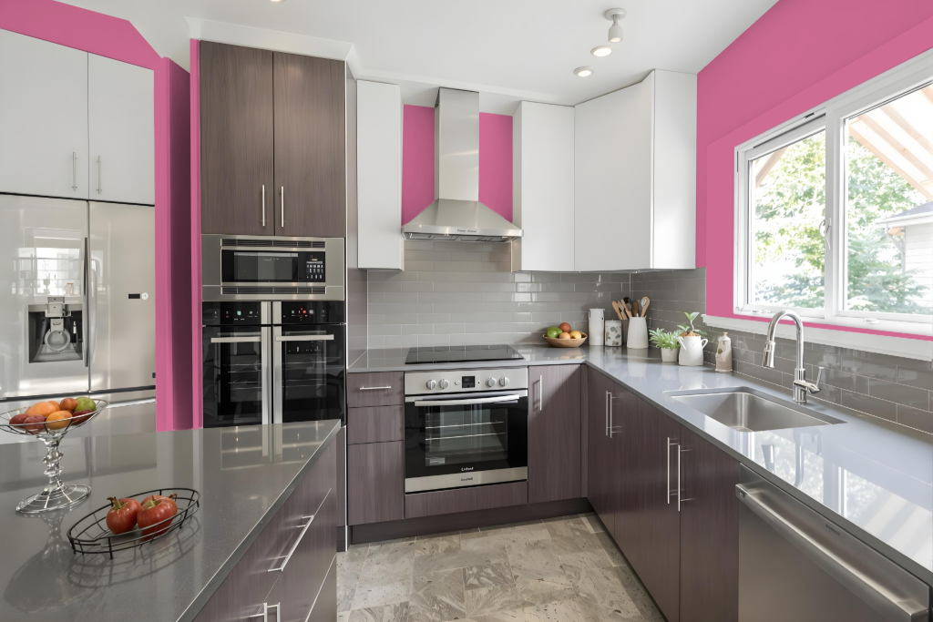
For a kitchen color scheme, Sherwin Williams Hibiscus offers a bold, striking option that establishes a dramatic atmosphere. Pair it with neutral tones like Alabaster or Grizzle Gray to create a refined backdrop for walls and trim, and consider using deeper hues such as Tricorn Black or Destiny for accents and cabinetry.
Enhance the luxurious feel of the space with metallic finishes in gold or brass. Introducing complements with green-inflected shades, such as Mountain Air or Dard Hunter Green, can also add a dynamic element to the visual harmony of the room.
Living Room
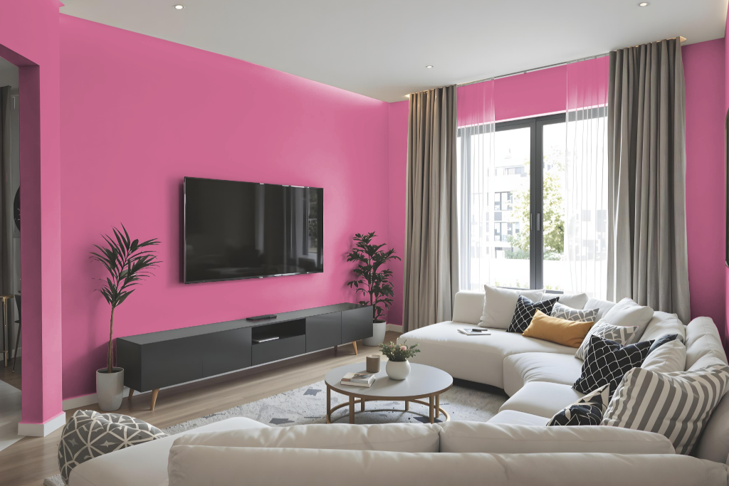
Hibiscus is an excellent choice for a living room, adding warmth and personality to the space. It harmonizes beautifully with neutral tones like light alabaster and soft gray, while bold contrasts can be achieved when paired with deeper shades and accented with metallic finishes, enhancing the overall luxurious feel.
For those exploring different design schemes, a monochromatic approach using various intensities of Hibiscus allows for a cohesive look. Alternatively, combining it with green hues can create a vibrant, dynamic environment that elevates the room’s visual impact.
Outdoor
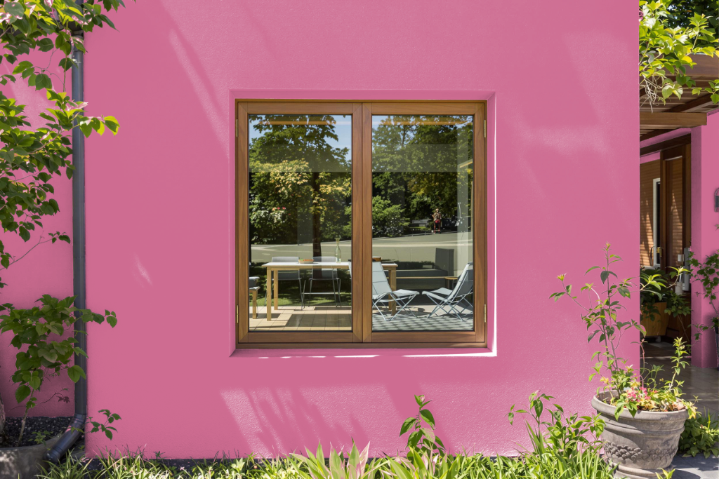
For outdoor use, Sherwin-Williams Hibiscus SW 6851 delivers a vibrant and energetic aesthetic to your home's exterior. Its dynamic hue works exceptionally well when paired with neutral tones and accentuated by metallic finishes like gold or brass, creating a harmonious yet eye-catching look.
This lively shade brings personality and warmth to various features such as accent walls, doors, or trim, while inviting natural surroundings into your overall design. Testing the color in your specific lighting conditions is recommended to ensure it maintains its intended brilliance throughout different times of the day.