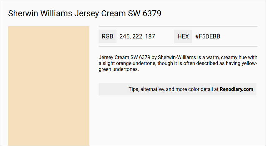
Sherwin Williams' Jersey Cream SW 6379, a shade reminiscent of Wheat, embodies a warm and inviting hue with its soft balance of reds and yellows. With an RGB composition of 245,222,187, this paint color exudes a gentle brightness that can illuminate and add a cozy feel to any interior space. Its versatile tone makes it ideal for creating an ambiance that is both comforting and lively, turning any room into a welcoming haven.
Color Description
Jersey Cream SW 6379 by Sherwin-Williams is a warm, creamy hue with a slight orange undertone, though it is often described as having yellow-green undertones.
Undertones
The color has warm, yellow-green undertones, which contribute to its creamy and inviting appearance.
Color Values
The hex code for Jersey Cream SW 6379 is#f5debb, indicating a light to medium shade with a moderate level of saturation.
Usage
This color is ideal for use in various rooms such as kitchens, bathrooms, living rooms, dining rooms, and bedrooms. It is also suitable for exterior projects.
Atmosphere
Jersey Cream SW 6379 creates a bright and welcoming atmosphere, making it perfect for spaces where a warm and inviting ambiance is desired. The color helps to brighten the room and can add a sense of comfort and coziness.
Sherwin Williams Jersey Cream SW 6379 Color Alternative
Sherwin Williams Jersey Cream SW 6379 is celebrated for its warm, classic appeal that effortlessly elevates both contemporary and traditional spaces. Designers seeking comparable atmospheres might consider Dulux Soft Peach, Sherwin Williams Napery SW 6386, or Sherwin Williams Full Moon SW 6679, as these alternatives reflect subtle variations while maintaining a similar inviting vibe. Each of these hues brings its own unique nuance to interior designs, offering ample opportunity for creative expression without straying far from the comforting essence of the original shade.
Bathroom
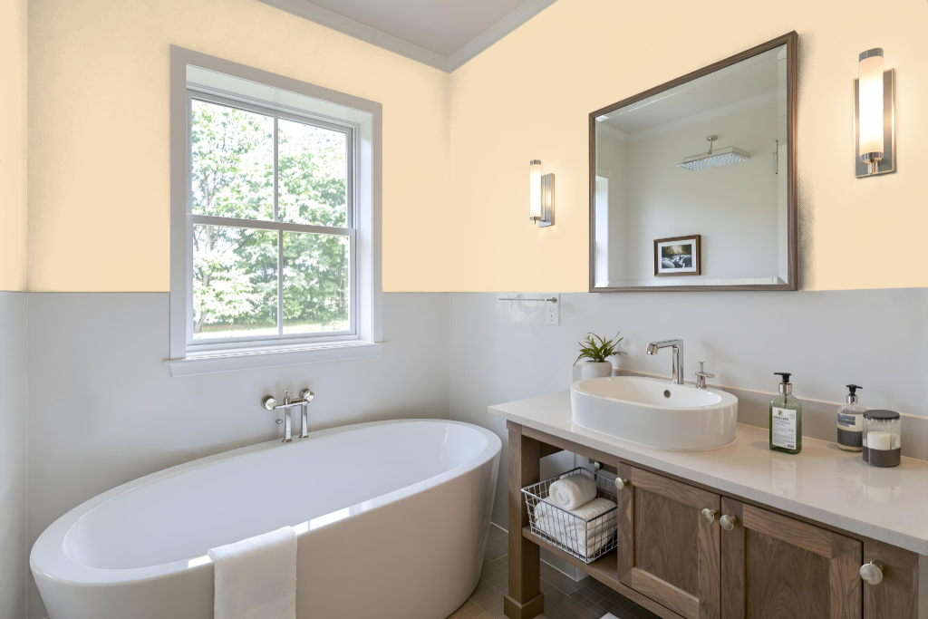
Sherwin Williams Jersey Cream is an appealing choice for a bathroom, offering a warm and inviting hue that sets the stage for thoughtful design. Its nuanced red undertones influence the way it interacts with bathroom elements like tiles, fixtures, and natural light, making it important to consider how the color will integrate with existing features.
To achieve a balanced look, pairing Jersey Cream with complementary shades—such as blue-hued tones for a lively contrast or neutral colors to evoke a modern and elegant feel—can enhance the overall ambiance. Testing the color with peel-and-stick samples on various surfaces and under different lighting conditions is essential to ensure the final result meets your design expectations.
Bedroom
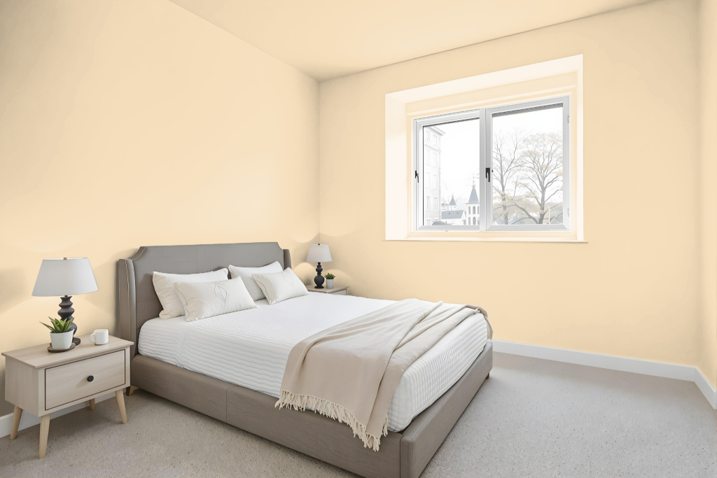
For a bedroom color scheme, Sherwin Williams Jersey Cream offers a warm and inviting foundation that is enhanced by complementary tones like Worldly Gray for a modern, polished feel or Alabaster for a classic, refined ambiance. This base pairs effortlessly with both lighter and deeper cream variations to achieve a balanced, monochromatic look that exudes comfort and sophistication.
Adding depth to the design, blues can be introduced as accent colors for a dynamic visual interplay that enlivens the overall palette. This thoughtful combination of shades creates a harmonious environment that is both welcoming and stylish.
Kitchen
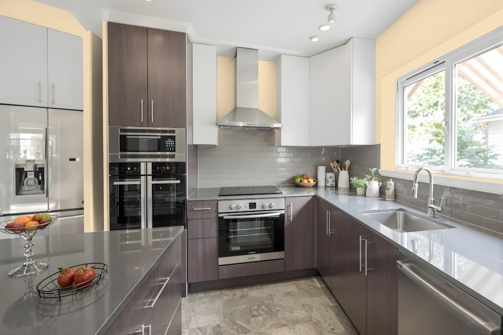
For a kitchen color scheme, Sherwin Williams Jersey Cream SW 6379 serves as an inviting centerpiece that can be paired with complementary tones for a modern and elegant ambiance, as well as offering a refined touch when combined with classic accents. The color works seamlessly with airier shades for a light, open feel or with deeper hues to introduce contrast and added depth.
Using different color intensities creates dynamic layers within the space, while its soft warm undertones are especially effective in north-facing rooms, enhancing the overall welcoming atmosphere.
Living Room
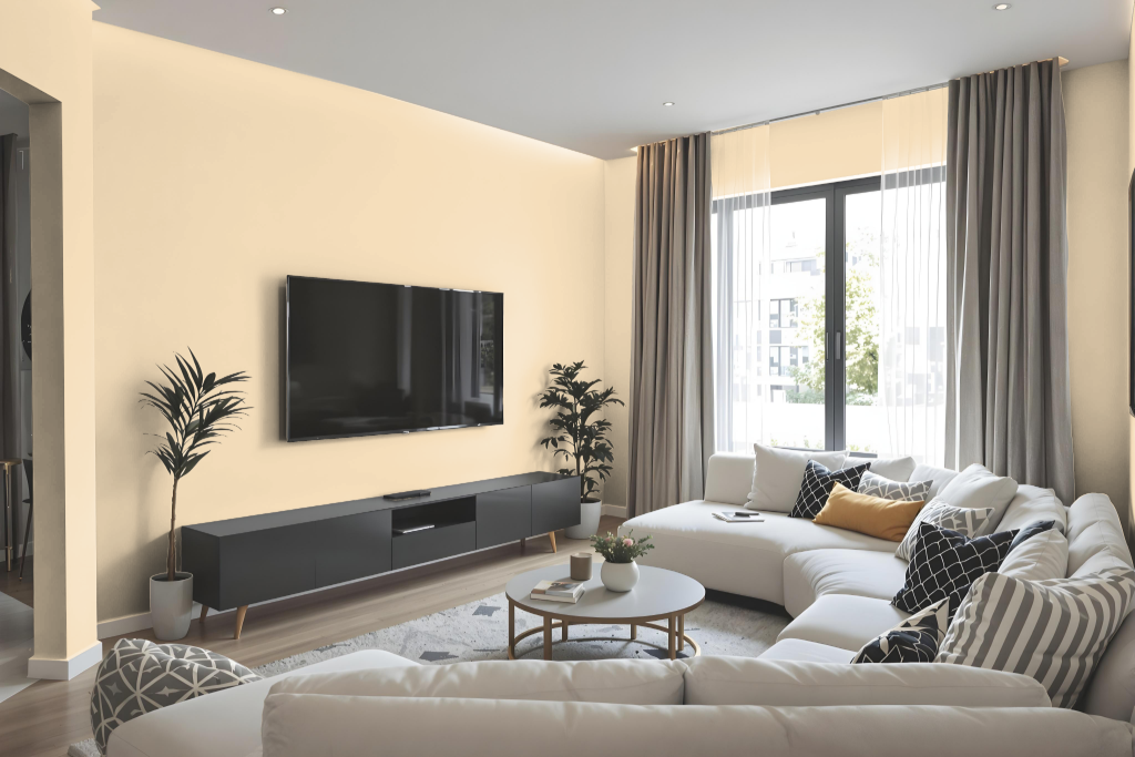
In the living room, Sherwin Williams Jersey Cream refreshes the space with a modern and elegant touch. Paired with soft neutrals and refined lighter and darker shades within the same family, it creates a harmonious and balanced ambiance perfect for curated interiors.
This sophisticated hue also excels when contrasted with cool blue tones, adding an energetic pop to any design scheme. Its adaptability makes it an excellent choice for a range of surfaces—from ceilings and exterior walls to cabinets and bookshelves—ensuring a cohesive look throughout the home.
Outdoor
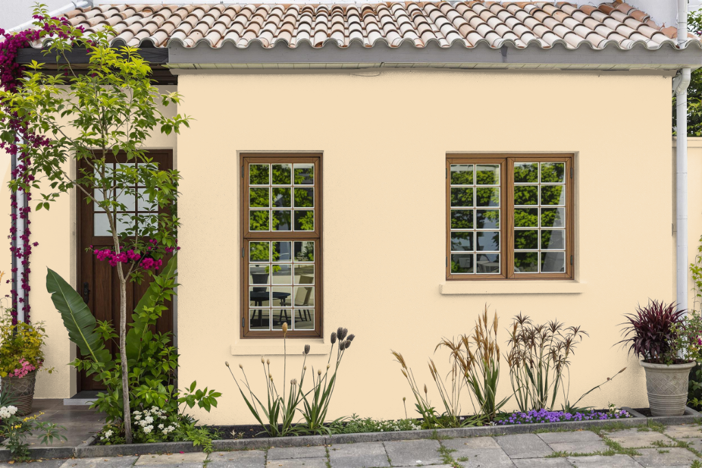
Sherwin-Williams Jersey Cream SW 6379 is an appealing home outdoor color that brings warmth and sophistication to exterior projects. It performs well under various lighting conditions, and when combined with complementary hues like Resolute Blue or Down Pour, it creates a vibrant, dynamic visual effect.
Considering the texture and condition of the surface is essential, as the color may vary on different finishes. Testing the shade with peel-and-stick samples can help ensure that the final outcome meets your expectations before committing fully.