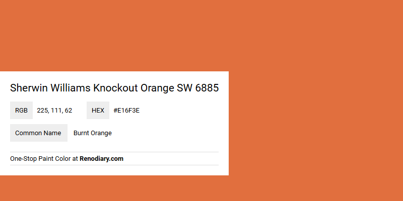
Sherwin Williams Knockout Orange SW 6885, characterized by its bold and vibrant hue, captures the essence of autumnal foliage and sunset brilliance. This particular shade, with its RGB composition of (225, 111, 62), brings warmth and energy to any space, making it a popular choice for accent walls and decor elements. Often associated with the name "Burnt Orange," it embodies a sense of vigor and creativity, perfect for invigorating living areas or workspaces that require a lively atmosphere.
Knockout Orange Color Information
Color Description
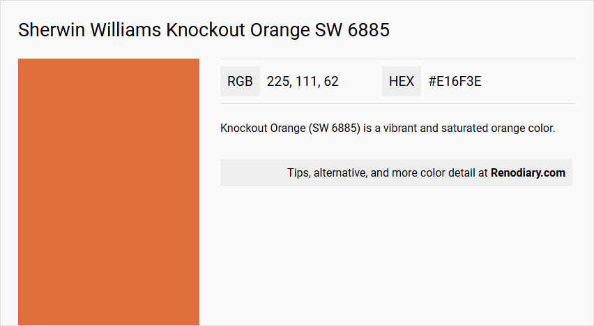
Knockout Orange (SW 6885) is a vibrant and saturated orange color.
Undertones
This color features a strong orange hue with slight reddish undertones, highlighted by its high red value in the RGB model.
Color Values
- RGB: 225, 111, 62
- Hex: #E16F3E
- CMYK: 0.0%, 50.7%, 72.4%, 11.8%
Lab and HLC values are also available, but the RGB and CMYK values provide a clear representation of its color composition.
Usage
This color is ideal for creating a bold and energetic atmosphere. It works great for accent walls, decorative elements, or any area where a vibrant and attention-grabbing color is desired.
Atmosphere
Knockout Orange can create a lively, energetic, and stimulating atmosphere. It is more saturated and lighter compared to some other orange shades, such as Invigorate (SW 6886), making it a standout choice for dynamic settings.
Sherwin Williams Knockout Orange SW 6885 Color Alternative
Sherwin Williams Knockout Orange SW 6885 brings a vibrant energy to any space, and designers have identified several color alternatives that maintain this distinctive appeal. Little Greene Orange Aurora 21, Farrow and Ball Charlotte's Locks 268, and Sherwin Williams Invigorate SW 6886 each offer a unique twist on the original hue, providing options that blend modernity with classic warmth. Exploring these alternatives can help achieve a personalized design aesthetic without straying from the bold spirit of Sherwin Williams Knockout Orange SW 6885.
Bathroom
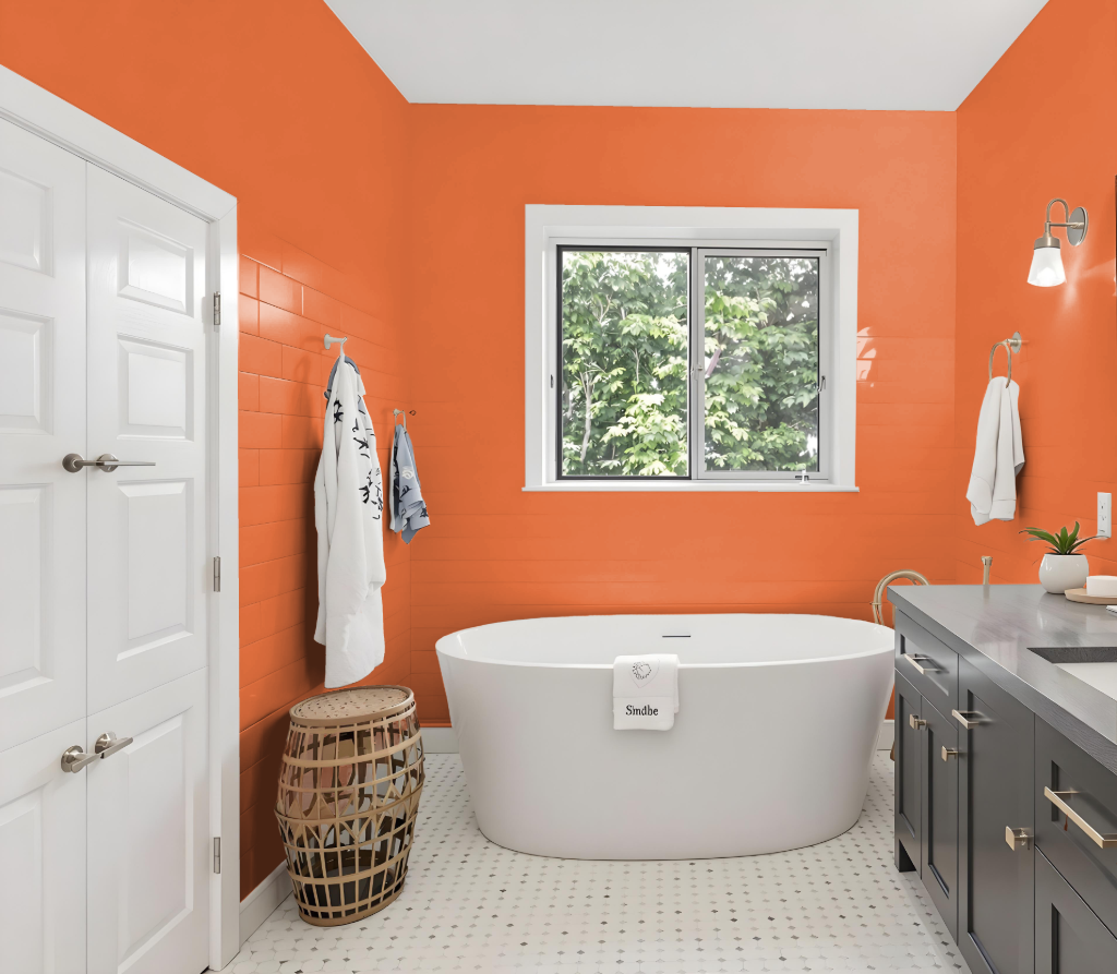
For a bathroom, Sherwin Williams Knockout Orange SW 6885 can create a vibrant and energetic atmosphere. Its bold hue works best when used on accent walls or specific design elements to prevent the space from feeling too overwhelming.
Balancing this intensity with crisp neutrals like an alabaster tone or modern accents such as a slate gray introduces contrast and sophistication. Considering the reflective nature of bathroom surfaces, it's advisable to review a physical sample in the actual lighting conditions before making a final decision.
Bedroom
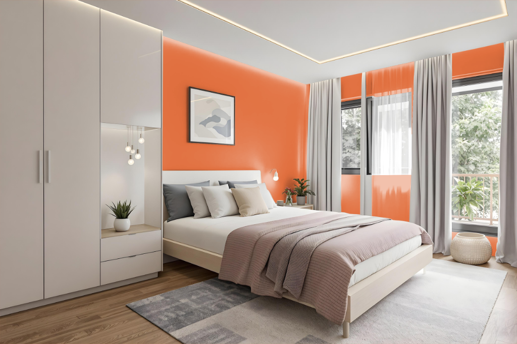
In a bedroom, Sherwin Williams Knockout Orange sets an energetic tone when thoughtfully integrated into the color scheme. Balancing this vibrant hue with soft neutrals and cool grays creates a visually engaging and inviting space, while the addition of dark blue tones provides a striking contrast that enhances the overall appeal.
Using Knockout Orange as an accent—whether on a single wall or select furniture pieces—ensures the room doesn't feel overwhelming. Complementing it with white, black, or other understated elements in bedding, curtains, and decor results in a harmonious design that is both dynamic and soothing.
Kitchen
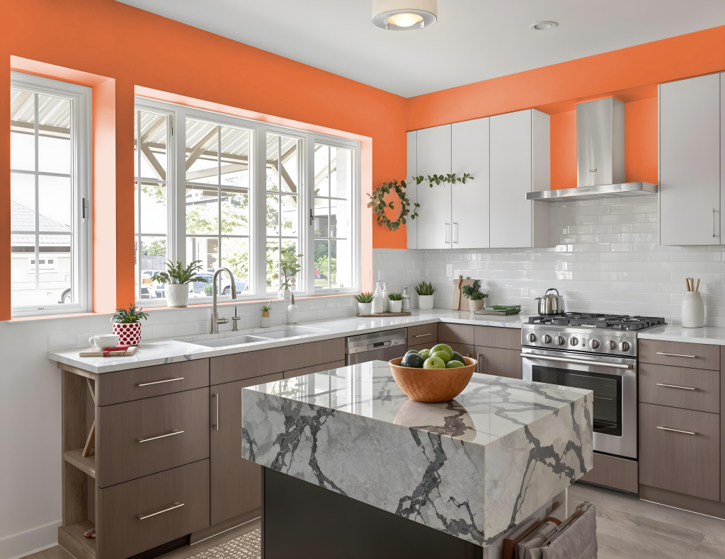
For a kitchen color scheme, Sherwin-Williams Knockout Orange SW 6885 can add a bold and inviting touch. The rich tone establishes a crisp, energetic backdrop when paired with neutral shades such as Alabaster, creating a striking contrast that brightens and modernizes the space. Accents of cool grays help to moderate the vibrancy, contributing to a balanced and clean aesthetic.
Combining this color with hints of cooler blue hues, like navy or turquoise, generates a visually dynamic interplay that enriches the overall design. The thoughtful integration of warm and cool elements results in an inviting environment full of personality while maintaining a modern, sophisticated look in the kitchen.
Living Room
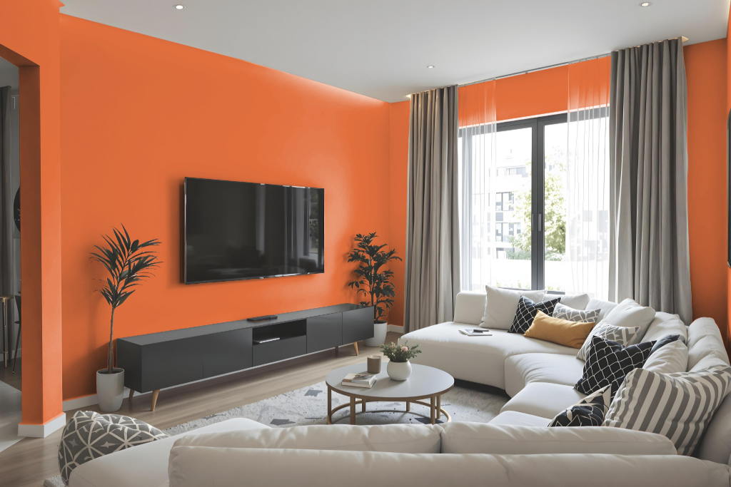
In the living room, Sherwin Williams Knockout Orange SW 6885 brings vibrancy and energy, creating a lively atmosphere that immediately elevates the space. This dynamic hue is best showcased when combined with neutral elements like subtle off-whites and cool grays to create a balanced backdrop that offsets its intensity.
Pairing the color with soft neutrals prevents the space from feeling overpowering, while using complementary shades such as deep greens or navy blues adds a sophisticated contrast. The overall effect is an inviting and harmonious environment where the energetic tone of the orange is celebrated without overwhelming the room.
Outdoor
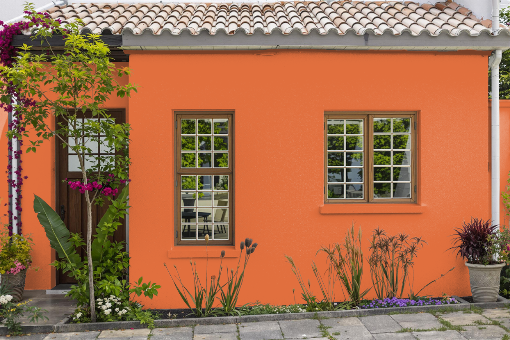
For outdoor use, Sherwin Williams Knockout Orange SW 6885 delivers a vibrant and energetic touch to your home's exterior. Its lively tone creates a bold and inviting atmosphere that can elevate the overall appearance of your property.
Pair this spirited hue with complementary shades like soft neutrals or cool grays to achieve a dynamic yet harmonious look. The engaging contrast between these colors enhances your home's curb appeal while ensuring enduring performance on a variety of surfaces.