Sherwin Williams Laurel Woods SW 7749, with its unique RGB composition of 68, 73, 61, closely resembles the deep, muted hue known as Rifle Green. This rich, earthy tone evokes a sense of grounded elegance and is often used to create a cozy yet sophisticated atmosphere in interior spaces. Its dark, natural complexion makes it a versatile choice for accent walls or detailed woodwork, seamlessly complementing both contemporary and traditional design elements.
Color Description
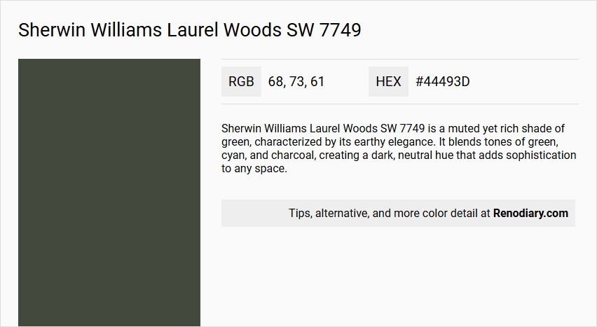
Sherwin Williams Laurel Woods SW 7749 is a muted yet rich shade of green, characterized by its earthy elegance. It blends tones of green, cyan, and charcoal, creating a dark, neutral hue that adds sophistication to any space.
Undertones
The undertones of Laurel Woods can be described as a green hue, with no significant deviations into other color families. This green undertone is dominant and contributes to its natural, earthy feel.
Color Values
- HEX Value: #44493D
- RGB Code: 68, 73, 61
- CMYK: 30.27, -4.04, 6.49, 122
- Light Reflectance Value (LRV): Approximately 6
Usage
Laurel Woods SW 7749 is versatile and can be used in various rooms such as cozy living rooms, lush bedroom retreats, serene home offices, and even in bathroom renovations. It is ideal for creating a harmonious blend of nature-inspired hues in any space.
Atmosphere
This color evokes a sense of tranquility and sophistication, creating a soothing and stylish atmosphere. It infuses spaces with a touch of organic beauty and refined charm, making it perfect for rooms seeking a calm and elegant ambiance.
Sherwin Williams Laurel Woods SW 7749 Color Alternative
Sherwin Williams Laurel Woods SW 7749 offers a unique aesthetic that can transform any room, but those seeking alternatives have several distinctive options to consider. Tikkurila Ficus N378 brings a fresh, balanced vibe, while Sherwin Williams Foxhall Green SW 9184 adds a vibrant contrast that stands out in modern designs. Additionally, Sherwin Williams Iron Ore SW 7069 provides a deep, sophisticated tone that complements a wide range of decor styles seamlessly.
Bathroom
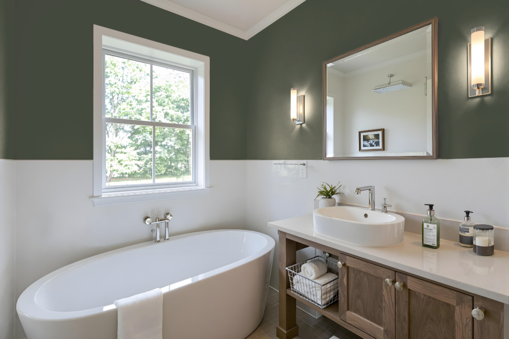
Sherwin Williams Laurel Woods SW 7749 serves as an excellent choice for a bathroom paint color, bringing a soothing quality that creates a serene and sophisticated atmosphere essential for relaxation. This shade enhances the space when paired with natural elements and earthy accents, allowing the bathroom to maintain a calm, balanced feel while complementing various fixtures and styles.
To further elevate the design, consider incorporating accents with a blue hue such as Wood Violet or Berry Cream. These complementary colors introduce a vibrant, dynamic effect that contrasts beautifully with the understated elegance of Laurel Woods, resulting in a well-rounded and inviting bathroom environment.
Bedroom
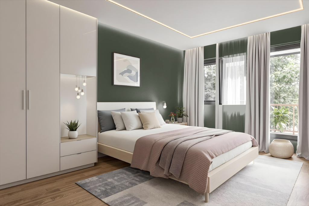
For a bedroom color scheme, Sherwin Williams Laurel Woods SW 7749 establishes a serene and sophisticated ambiance, setting the stage for a calming retreat. This hue works harmoniously with a range of gentle grays and soft complementary tones, allowing for accent variations that enhance the room's depth and interest.
Enhancing the space with natural wood elements and earthy textiles further amplifies its refined charm, creating an organic and balanced atmosphere. Thoughtfully chosen accent colors, like muted blues, add a dynamic touch that complements the overall tranquil feel.
Kitchen
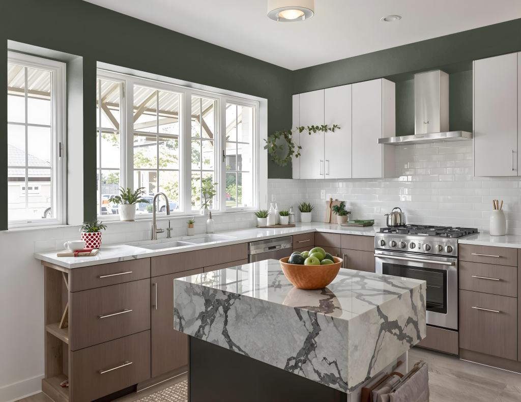
For a kitchen color scheme, Sherwin Williams Laurel Woods SW 7749 creates an inviting and refined backdrop perfect for enhancing the space. Using different shades, tints, and tones of this color in a monochromatic approach adds depth while maintaining a balanced ambiance.
By pairing Laurel Woods with complementary hues that incorporate hints of blue, a vibrant yet harmonious contrast is achieved. Additional coordinating colors such as deep wood tones and soft neutrals work seamlessly with Laurel Woods, further enriching the kitchen's overall character and warmth.
Living Room
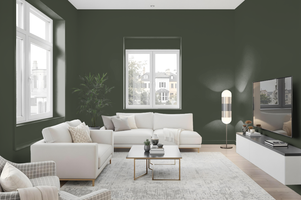
Sherwin-Williams Laurel Woods SW 7749 is an excellent living room color that creates a sense of tranquility and sophistication. It adapts well in various lighting conditions and works beautifully as part of a monochromatic design or when paired with complementary hues to enhance the overall ambiance of the space.
Using peel-and-stick samples can be an effective way to visualize how the tone will transform your walls before a full application. In addition, taking advantage of Sherwin-Williams' complimentary virtual consultation offers personalized advice to ensure that Laurel Woods integrates seamlessly into your living room design.
Outdoor
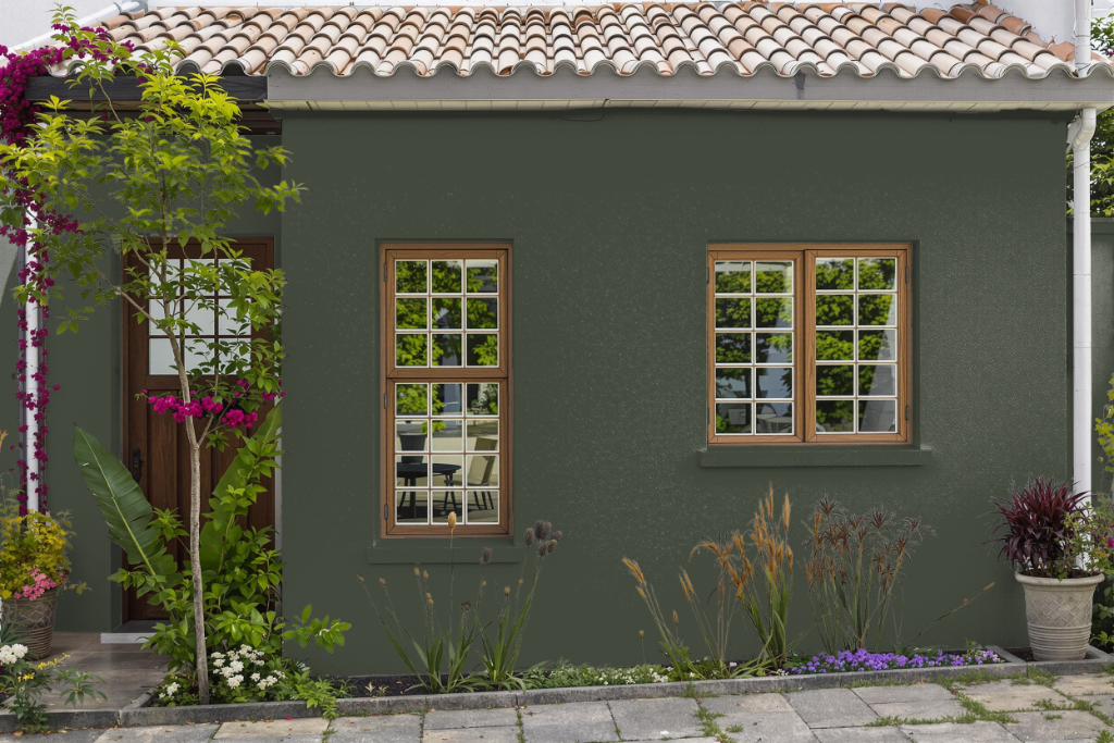
For outdoor use, Sherwin-Williams Laurel Woods SW 7749 brings a sophisticated and serene charm to your home's exterior. Ideal for adding a refined ambiance to exterior walls and other surfaces, this hue creates a harmonious blend with natural surroundings.
Before making a final decision, it is recommended to examine a physical color sample to ensure the chosen tone meets your expectations. The color works well as part of a broader design scheme, particularly when paired with neutral or contrasting shades to further elevate your exterior aesthetic.