Sherwin Williams Luxe Blue SW 6537, also known as Blue Yonder, is a sophisticated blend of hues that captures a calming yet invigorating essence. This shade, with its RGB composition of (81,101,130), evokes a tranquil atmosphere reminiscent of a serene twilight sky. Ideal for creating a serene environment, Luxe Blue harmonizes beautifully with neutral tones while adding a touch of refined elegance to any space.
Color Description
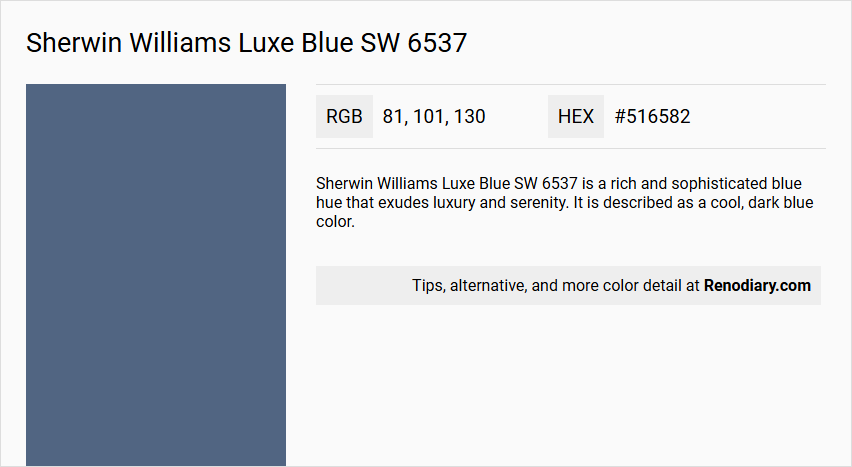
Sherwin Williams Luxe Blue SW 6537 is a rich and sophisticated blue hue that exudes luxury and serenity. It is described as a cool, dark blue color.
Undertones
The undertone of Luxe Blue is predominantly blue, with no significant other undertones noted.
Color Values
- HEX value: #516582
- RGB code: 81, 101, 130
Usage
Luxe Blue is suitable for various rooms, including bedrooms, home offices, and cozy reading nooks. It can be used as a statement wall color or incorporated into furnishings and decor. It pairs well with crisp whites and metallic accents for a modern look, or with soft neutrals for a more traditional feel.
Atmosphere
This color creates a calming atmosphere, adding a touch of opulence to any space. It helps in transforming living spaces into refined retreats, promoting a sense of luxury and serenity.
Sherwin Williams Luxe Blue SW 6537 Color Alternative
Sherwin Williams Luxe Blue SW 6537 presents a captivating and sophisticated hue that elevates any space with its striking appeal. Designers and homeowners have discovered reliable color alternatives in Tikkurila Indigo L429, Tikkurila V490, and Tikkurila L436, each offering a similar depth and vibrancy. Embracing these alternatives provides a way to achieve a distinct yet harmonious aesthetic that enhances both interior and exterior environments.
Bathroom
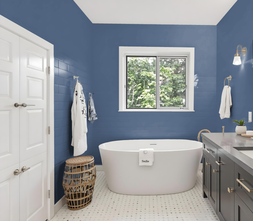
For a bathroom, Sherwin Williams Luxe Blue SW 6537 can create a calming and sophisticated atmosphere. It pairs beautifully with crisp whites and metallic accents for a modern, chic look, or with soft neutrals for a more traditional, inviting feel. Using a monochromatic scheme by incorporating various shades, tints, and tones of Luxe Blue adds depth to the space, while strategic accent decor prevents the design from feeling monotonous.
Complementing the blue with colors featuring orange hues can introduce a dynamic and balanced visual effect, adding energy to the overall aesthetic. Testing the color with a physical sample before full application is advised to ensure the final outcome aligns with your vision, as digital representations may not accurately reflect the true appearance.
Bedroom
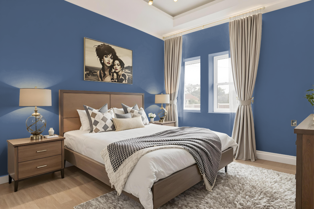
Sherwin Williams Luxe Blue lends a tranquil tone to a bedroom, whether used as a striking accent wall or as the primary color throughout the space. Its deep, serene hue creates a sense of luxury and depth, setting a refined atmosphere suitable for both contemporary and classic designs.
Enhance the look by combining Luxe Blue with crisp whites and metallic elements for a modern and chic appeal, or mix it with soft neutrals to craft a traditional yet inviting space. Adding a touch of contrast with complementary hues that incorporate warm undertones can further elevate the room’s dynamic and engaging visual presence.
Kitchen
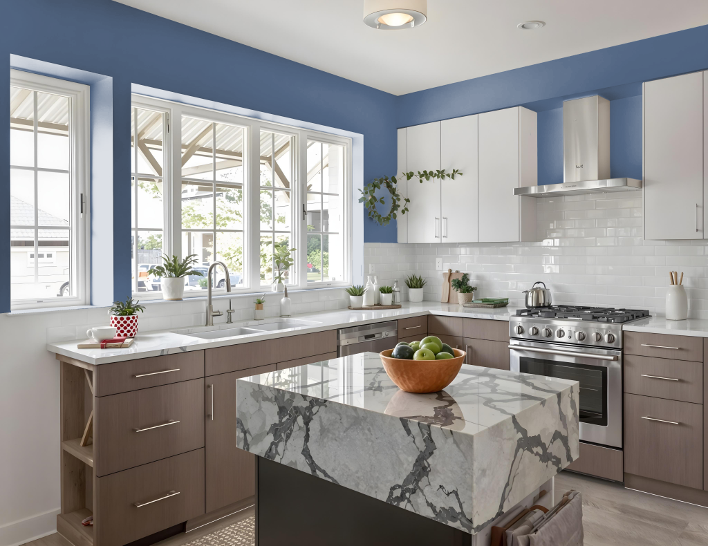
For a kitchen color scheme, Sherwin Williams Luxe Blue SW 6537 offers a striking base that sets the stage for inspired design. Pairing this bold hue with varying shades, tints, and tones of itself can create a layered, monochromatic effect that avoids repetition and adds depth.
Alternatively, Luxe Blue can be teamed with orange-hued accents or paired with crisp whites, metallic finishes, and soft neutrals to achieve contrasting or harmonious moods. These combinations allow the color to shine on statement walls or as accent pieces, contributing to either a modern, chic vibe or a warm, inviting atmosphere in the kitchen.
Living Room
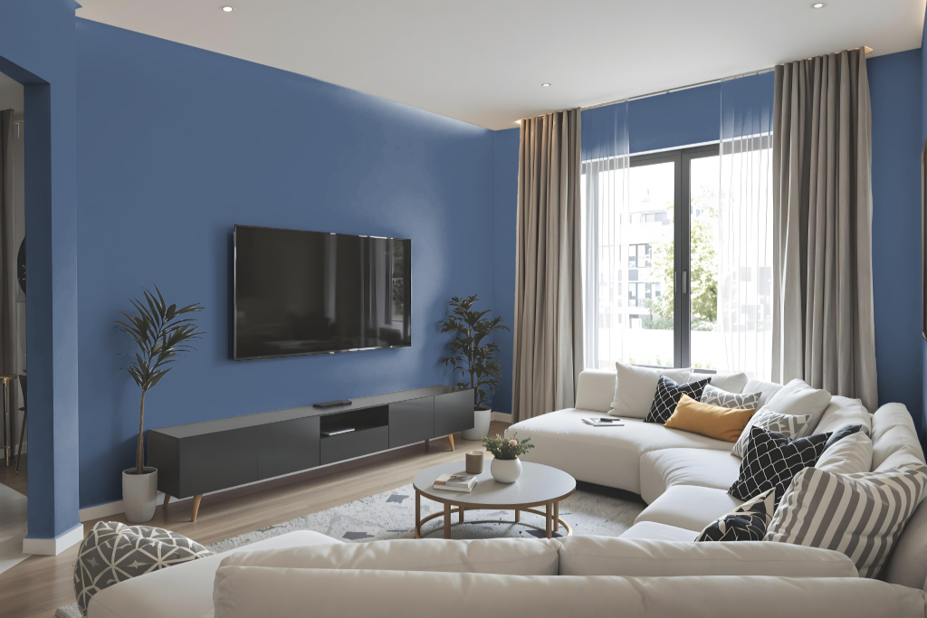
In the living room, Sherwin Williams Luxe Blue SW 6537 creates a sophisticated atmosphere with an elegant and modern appeal. Pairing this bold tone with crisp whites and metallic accents enhances its chic feel, while incorporating soft neutrals produces a more traditional and inviting setting.
For a balanced look, consider employing varied shades, tints, and tones of this blue to establish a cohesive monochromatic environment, while accent pieces help maintain visual interest. Complementing it with colors in the orange spectrum delivers a vibrant contrast that adds energy and dynamic flair to the overall design.
Outdoor
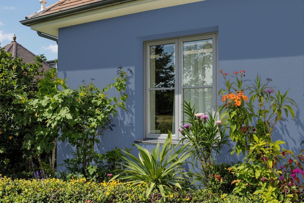
For home outdoor color, Sherwin Williams Luxe Blue SW 6537 offers a unique and striking option for exterior projects. Though traditionally noted for its dark and rich tone in interior settings, when used outside it demands careful attention to product durability and sunlight resistance to ensure lasting performance on various surfaces.
When planning your outdoor paint application, using customized spray paint designed for the exterior is recommended to achieve a strong adherence on metal or previously painted wood. Testing the color on different surfaces with samples can help you determine the optimal pairing with surrounding trim, accents, and landscaping, while professional advice from a color expert ensures a cohesive outdoor design.