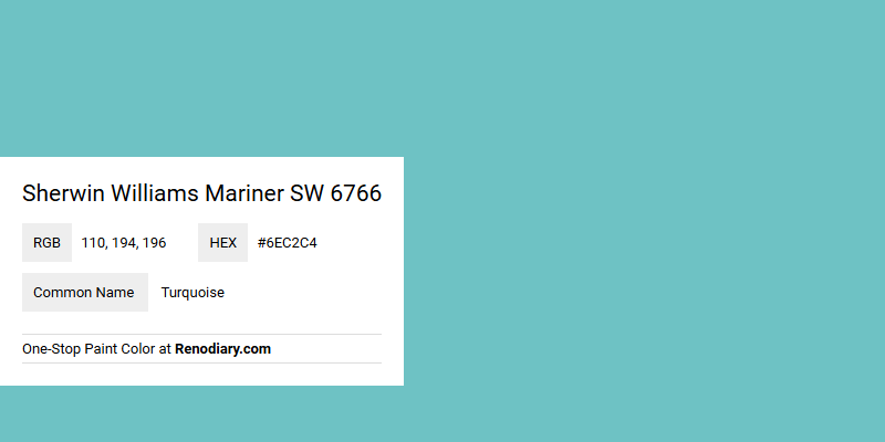
Sherwin Williams Mariner SW 6766, with its RGB composition of 110, 194, 196, captures a serene and invigorating turquoise shade. This tranquil hue, reminiscent of soothing ocean waves, brings a refreshing ambiance to any space it adorns. Perfect for creating a calm and rejuvenating environment, it seamlessly merges the tranquility of blue with the revitalizing energy of green.
Color Description
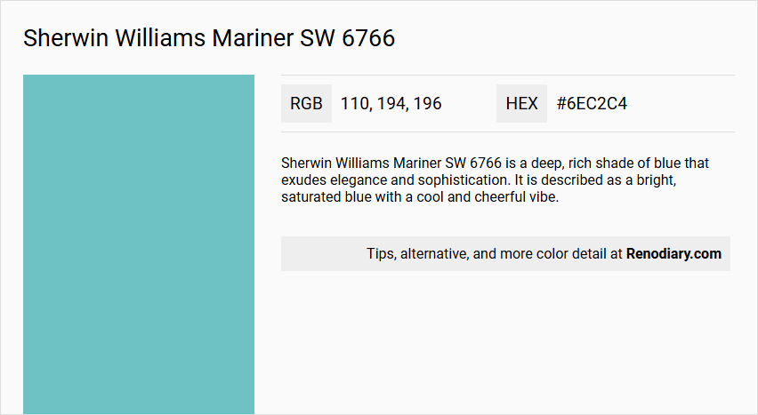
Sherwin Williams Mariner SW 6766 is a deep, rich shade of blue that exudes elegance and sophistication. It is described as a bright, saturated blue with a cool and cheerful vibe.
Undertones
The undertone of Mariner SW 6766 is predominantly blue, with a noticeable cool undertone. Some sources also mention a slight green undertone, which contributes to its unique hue.
Color Values
- HEX: #6EC2C4
- RGB: 110, 194, 196
- CMYK: 43.9% cyan, 1.0% magenta, 0.0% yellow, 23.1% key (black)
- HSL: 181.4deg hue, 42.2% saturation, 60.0% lightness
- HSV/HSB: 181.4deg hue, 43.9% saturation, 76.9% brightness/value
- LRV (Light Reflective Value): 46 (medium light category)
Usage
Mariner SW 6766 pairs beautifully with neutral tones such as off-white and beige, as well as bolder hues. It can be used in various rooms, including children's bedrooms where it creates a playful and cheerful atmosphere. It also works well in classic and timeless interior design schemes when combined with soft creams and warm grays.
Atmosphere
This color creates a luxurious and sophisticated atmosphere when paired with metallic finishes like gold or bronze. It can make a room feel more spacious and airy due to its medium LRV, while also maintaining a cool and cheerful ambiance.
Sherwin Williams Mariner SW 6766 Color Alternative
Sherwin Williams Mariner SW 6766 is a distinctive marine hue that brings depth and sophistication to any design. For those exploring alternatives, Sherwin Williams Rapture Blue SW 6773 offers a comparable expressive quality while RAL Effect RAL 670-4 introduces a fresh, contemporary accent. Moreover, RAL Effect RAL 660-5 stands as another compelling option, ensuring designers have a balanced palette that bridges classic appeal and modern versatility.
Bathroom
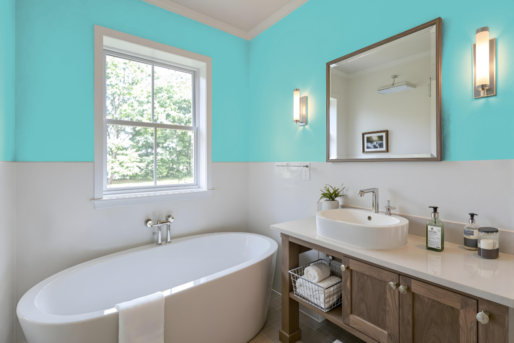
Sherwin Williams Mariner SW 6766 is an elegant bathroom color that adds depth and sophistication to the space when balanced with complementary neutrals. The rich tone works beautifully with softer creams, warm grays, and subtle accents like gold or bronze to enhance its luxurious appeal.
Given its intensity, the color is best suited for accent walls or smaller areas, maintaining a calm and inviting atmosphere. The use of ample natural light along with lighter shades on ceilings and trims helps keep the overall look open and harmonious.
Bedroom
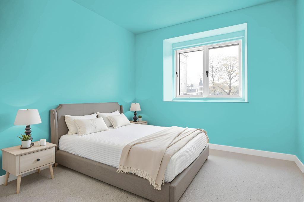
For a bedroom color scheme using Sherwin Williams Mariner SW 6766, pairing this deep blue with off-white and beige establishes a refined and balanced atmosphere. The rich hue of Mariner creates an inviting backdrop when mixed with soft creams and warm grays, resulting in an interior design that exudes both sophistication and timeless charm.
Accents in metallic finishes such as gold or bronze add a striking contrast, while integrating bolder shades like SW 7619 Labradorite and SW 6620 Rejuvenate introduces dynamic visual interest. The palette works seamlessly with natural textures and materials, emphasizing the blue undertone to foster harmonious, layered design elements throughout the space.
Kitchen
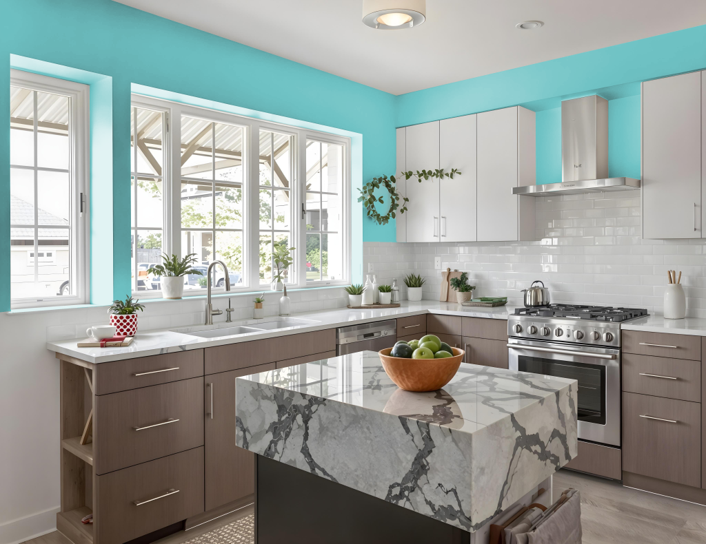
For a kitchen color scheme, Sherwin Williams Mariner SW 6766 creates a refreshing and engaging atmosphere. It pairs beautifully with neutral tones like off-white and beige, making it an excellent choice for balancing cabinets, countertops, or walls while providing ample opportunities for accentuating key design features such as islands or furniture.
Enhance the overall aesthetic by incorporating complementary elements that add visual depth and interest. Subtle pops of color in decor items, along with varied shades nearby on the same color family, and warm metallic finishes in hardware can elevate the space, resulting in an inviting and sophisticated kitchen ambiance.
Living Room
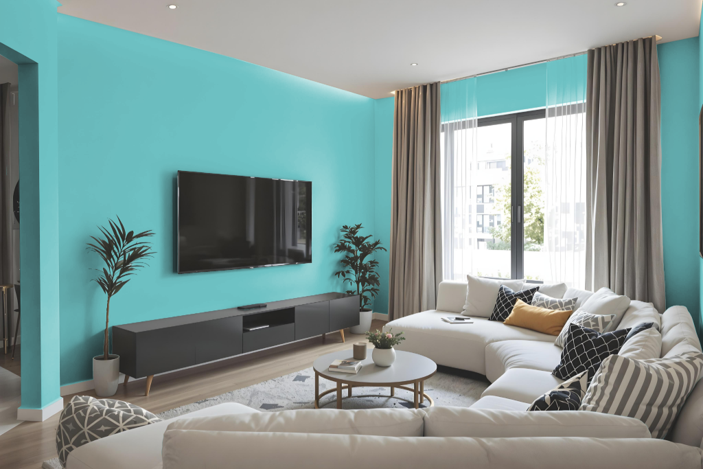
In a living room setting, Sherwin Williams Mariner SW 6766 offers a serene backdrop that harmonizes beautifully with a range of coordinating tones. It pairs nicely with neutral shades like off-white, beige, warm grays, and soft creams, while also standing out when accentuated by bolder hues and red-inflected colors for a dynamic impact.
Layering metallic accents in gold or bronze further enhances the luxurious feel of the space. These curated combinations allow for a balanced design scheme that interweaves soft, calming elements with invigorating pops of color to create a refined and inviting atmosphere.
Outdoor
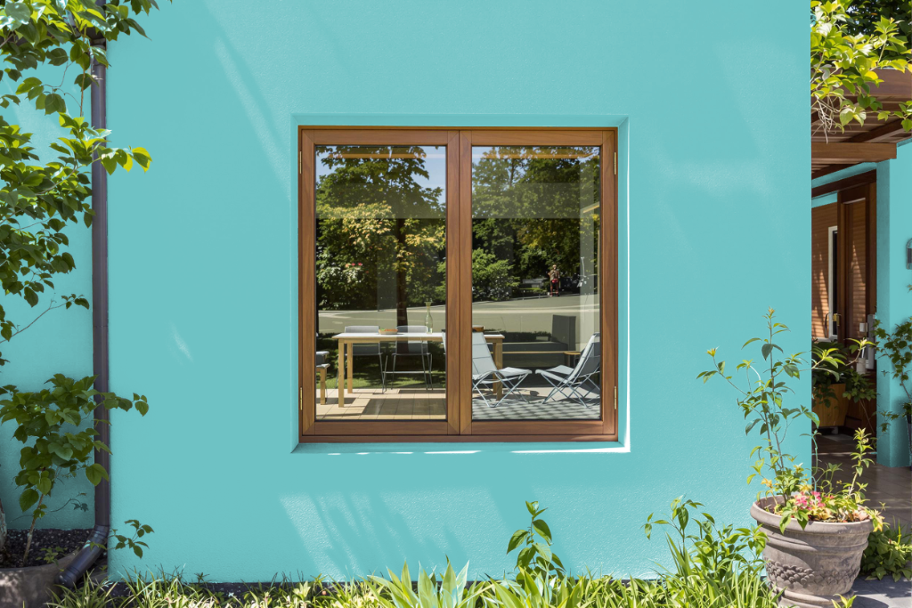
Sherwin Williams Mariner SW 6766 is an excellent home outdoor color that creates a classic, timeless look for exterior surfaces. Its durability and subtle blue undertone make it an attractive option for enhancing the home’s curb appeal.
This distinctive hue pairs beautifully with neutral elements such as off-white, beige, soft creams, and warm grays, and it harmonizes with metallic accents like gold or bronze to evoke a luxurious feel. The carefully balanced color scheme contributes to a cohesive and sophisticated outdoor design.