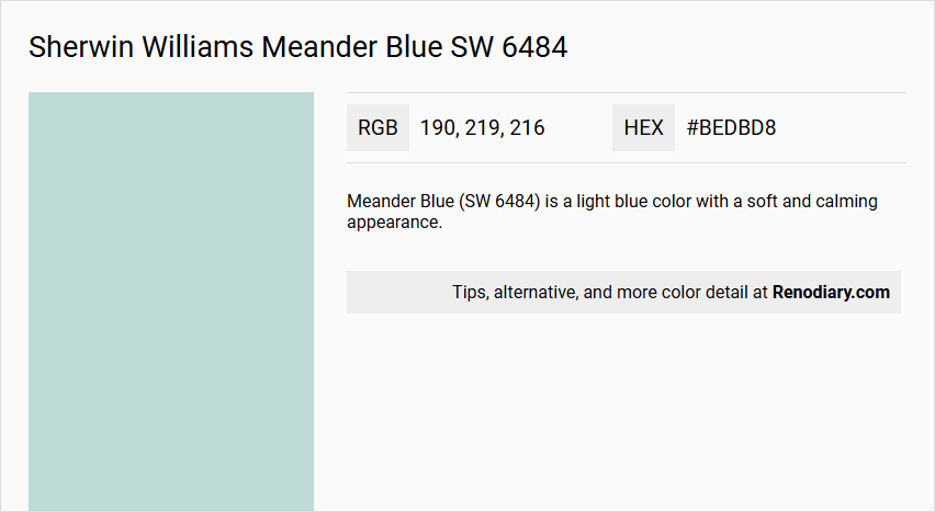
Sherwin Williams' Meander Blue SW 6484, with its soothing RGB composition of 190, 219, 216, evokes a sense of calm reminiscent of tranquil waters. This particular shade, often described as Pale Turquoise, seamlessly blends green and blue undertones to create a refreshing ambiance. Perfect for spaces seeking a serene atmosphere, it effortlessly complements both modern and coastal interior designs.
Color Description
Meander Blue (SW 6484) is a light blue color with a soft and calming appearance.
Undertones
It has teal undertones, which give it a slightly greenish-blue hue.
Color Values
- RGB: 190, 219, 216
- HEX: #BEDBD8
- CMYK: 13.2%, 0.0%, 1.4%, 14.1%
- LRV (Light Reflectance Value): 66
Usage
This color is suitable for various areas in the home, particularly bedrooms, due to its cheerful and calming nature.
Atmosphere
Meander Blue creates a light, airy, and serene atmosphere, making it ideal for spaces where a sense of tranquility is desired.
Sherwin Williams Meander Blue SW 6484 Color Alternative
Sherwin Williams Meander Blue SW 6484 is celebrated for its balanced and striking appeal, making it a preferred choice for designers who value both elegance and versatility. Its color alternatives—Tikkurila G436, Sherwin Williams Tidewater SW 6477, and Sherwin Williams Waterfall SW 6750—offer subtle differences that maintain the essence of its blue charm while introducing unique tones and depths. Together, these options enhance the creative potential in design projects by providing a spectrum of blue-inspired hues that suit various environments and aesthetics.
Bathroom
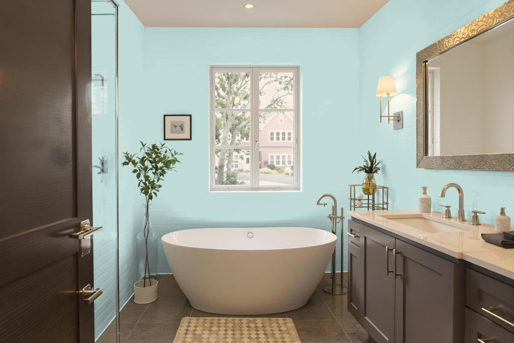
Sherwin Williams Meander Blue SW 6484 brings a spa-like sanctuary feel to your bathroom with its calming tone and soothing ambiance. This hue enhances the space, creating a retreat where relaxation takes center stage.
Pairing this color with coordinating shades, including those with red undertones like Sherwin Williams Whimsical White or Chaise Mauve, can add a dynamic and vibrant touch to the overall design. It is advisable to test the color in your specific lighting conditions before making your final decision for the best results.
Bedroom
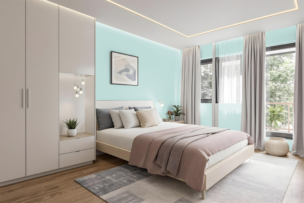
For a bedroom color scheme, Sherwin Williams Meander Blue SW 6484 sets a soothing and elegant tone that creates a peaceful retreat. The color works exceptionally well in a monochromatic design where varying shades, tints, and tones provide depth without overwhelming the space.
For a more dynamic appearance, incorporating colors with a red hue can introduce a vibrant contrast while still maintaining balance. Complementary accents in neutral hues further enhance the serene ambiance, making the overall space harmonious and inviting.
Kitchen
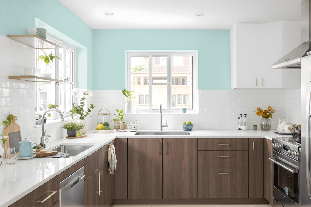
For a kitchen color scheme, Sherwin Williams Meander Blue creates a calming and elegant atmosphere that transforms the space. It pairs beautifully with neutral elements like white or light-colored cabinetry, marble or luxury vinyl plank flooring, and refined backsplashes such as white ceramic or subway tiles.
To enliven the overall design and avoid monotony, consider integrating complementary red-hued accents such as touches of warm, inviting shades. Using this deep blue on an accent wall, for example, can establish a striking focal point while allowing the remaining space to maintain the serene, balanced look.
Living Room
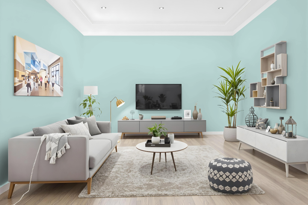
In living rooms, Sherwin Williams Meander Blue SW 6484 creates a refreshing and airy ambiance that sets a perfect mood for unwinding. Its calming tone lends itself well to transforming bedrooms into soothing retreats and bathrooms into spa-like sanctuaries.
When used within a monochromatic scheme, this hue delivers a cohesive look while benefiting from the inclusion of complementary shades to enhance visual interest and dynamism. Warm accents can introduce a dynamic contrast that elevates the overall decor and keeps the space engaging.
Outdoor
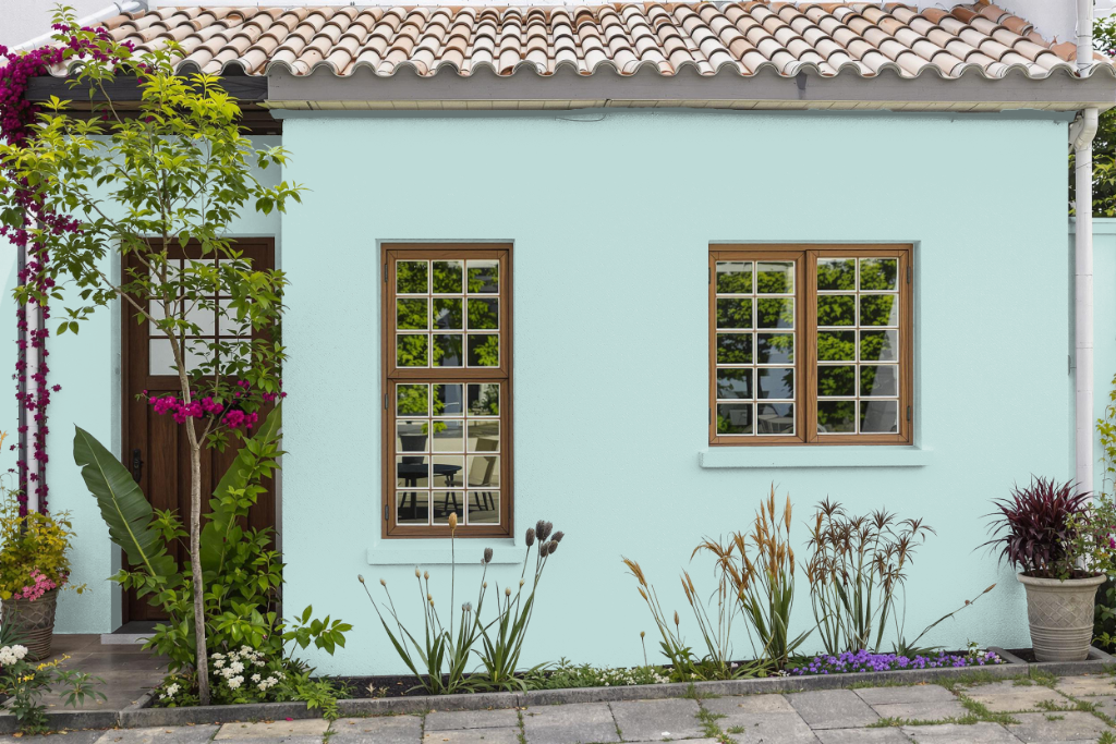
For home exteriors, Sherwin-Williams Meander Blue creates a calm and refined atmosphere while enhancing outdoor spaces with its inviting appearance. Its reflective quality allows the surface to remain relatively cool, even when exposed to ample natural light, making it a suitable option for elevating the aesthetic of any residence.
Given its performance under various lighting conditions, selecting a paint specifically formulated for external use is essential for long-lasting durability. Testing a small sample on the exterior before full application ensures the desired effect is achieved, allowing homeowners to confidently enhance their outdoor environment.