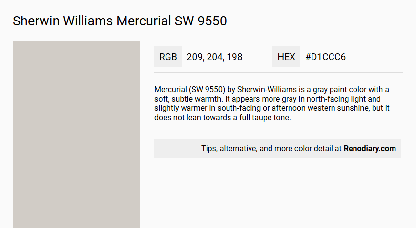
Sherwin Williams Mercurial SW 9550, with its RGB values of (209, 204, 198), is an elegantly balanced blend known as Greige. This versatile color, combining the warmth of beige with the coolness of gray, creates a sophisticated and adaptable backdrop for interior designs. Its neutral tone makes it an ideal choice for creating harmony within diverse color schemes, enhancing both modern and classic settings.
Color Description
Mercurial (SW 9550) by Sherwin-Williams is a gray paint color with a soft, subtle warmth. It appears more gray in north-facing light and slightly warmer in south-facing or afternoon western sunshine, but it does not lean towards a full taupe tone.
Undertones
Mercurial has very subtle, warm violet undertones. It is not a true gray, as it contains these undertones that influence its appearance under different lighting conditions.
Color Values
- LRV (Light Reflectance Value): 61, which places Mercurial in the 'light' range.
- RGB: 209, 204, 198.
Usage
Mercurial can be used for both interior and exterior paint projects. For interior use, it works well in various rooms, especially with east-facing light. For exterior use, it can complement popular stone and brick coverings, though it may appear warmer in southern sunshine and wash out in strong natural light.
Atmosphere
Mercurial creates a versatile and balanced atmosphere. It pairs well with cool colors such as gray-blues and gray-greens, and slightly darker grays with similar or different undertones. It is less compatible with warm colors like beige, tan, and cream. For trim, a soft and slightly warmer white or a clean and true white works best.
Sherwin Williams Mercurial SW 9550 Color Alternative
Sherwin Williams Mercurial SW 9550 offers a distinct color profile that inspires designers to explore its counterparts with similar vibrancy and depth. Tikkurila Median X486 presents a balanced and adaptable option, while Tikkurila Piazza Y487 adds a unique flair emerging from bold undertones. Additionally, Tikkurila Shawl Y467 provides a refined characteristic that complements various design elements, making it an appealing alternative for diverse applications.
Bathroom
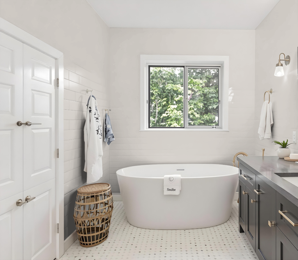
Sherwin Williams Mercurial is a rich, moody choice for a bathroom, offering a deep and dramatic look that adds a luxurious touch to the space. This unique hue works best in larger bathrooms, where its intensity can create a captivating atmosphere without overwhelming the room.
To achieve a balanced design, the color is best paired with lighter shades on the ceiling and trim while incorporating blue-toned accents to introduce a dynamic visual contrast. Additionally, ample lighting is essential to fully highlight the depth and allure of this striking bathroom color.
Bedroom
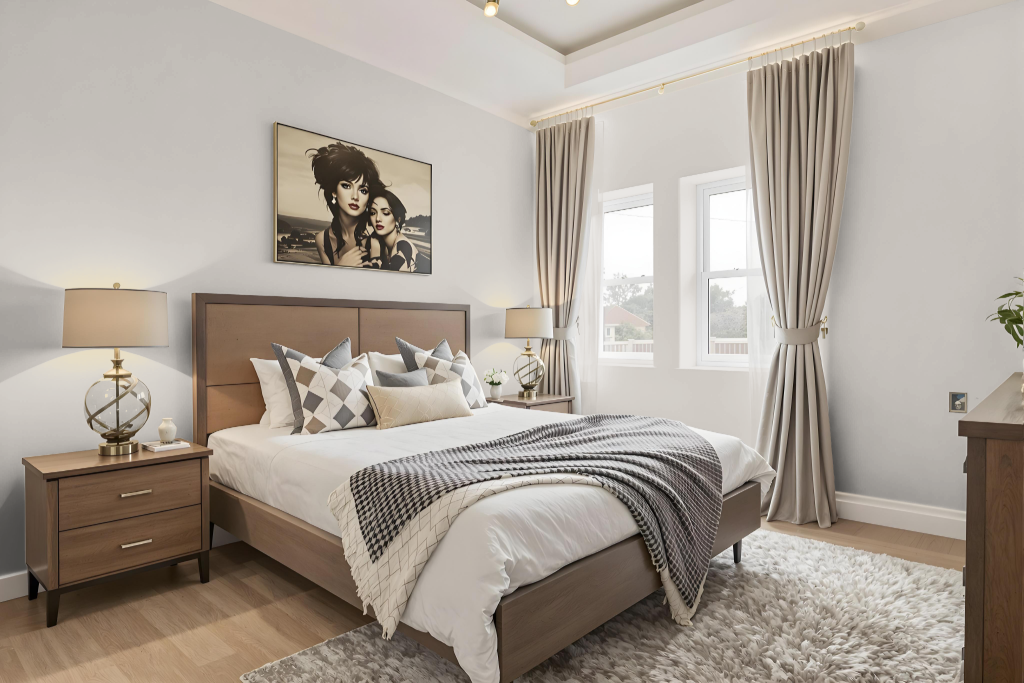
Sherwin Williams Mercurial SW 9550 is an ideal choice for a bedroom color scheme, offering subtle undertones that create a balanced and inviting atmosphere. Its reflective quality ensures that average-sized rooms remain well-proportioned, providing a comfortable setting that feels neither too dark nor too light.
In varying lighting, the tone shifts—cooler in north-facing light and warmer in south-facing or western sunlight—adding dynamic visual interest. The hue pairs well with cool, muted tones and deeper furniture shades, while soft, warm whites on trim help maintain a cohesive and harmonious aesthetic.
Kitchen
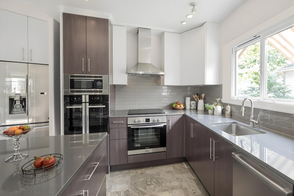
For a kitchen color scheme, Sherwin Williams Mercurial SW 9550 is an elegant choice that brings a balance of light and depth with its well-calibrated light reflectivity. Its subtle warm violet undertones, combined with hints of red, create a sophisticated foundation that integrates seamlessly into varied interior aesthetics.
This color harmonizes with complementary shades such as soft gray-blues and gray-greens, providing striking contrast against carefully selected trim blues like a soft, warm white. The pairing works especially well with dark wood floors and white countertops speckled with light gray, making it ideal for rooms that benefit from abundant natural light and bright morning exposures.
Living Room
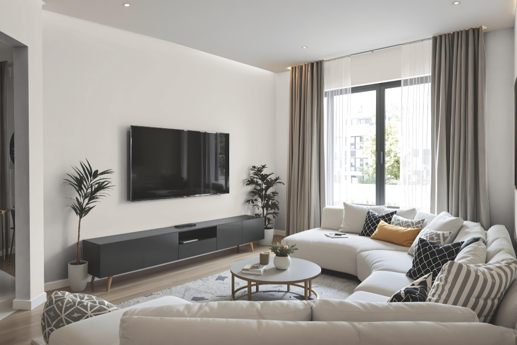
This living room color, Sherwin Williams Mercurial, creates a bright backdrop ideal for average-sized spaces, thanks to its light appearance and modulated brightness. It exhibits subtle shifts in undertones—cooler in diffuse, north-facing light and warmer in direct southern or western sunlight—adding depth and character to any setting.
The color pairs beautifully with soft, warmer whites for trim and works well alongside cool shades such as gray-blues and gray-greens to establish a harmonious blend. It also complements common exterior materials like stone and brick, though its look can vary under stronger natural light conditions.
Outdoor
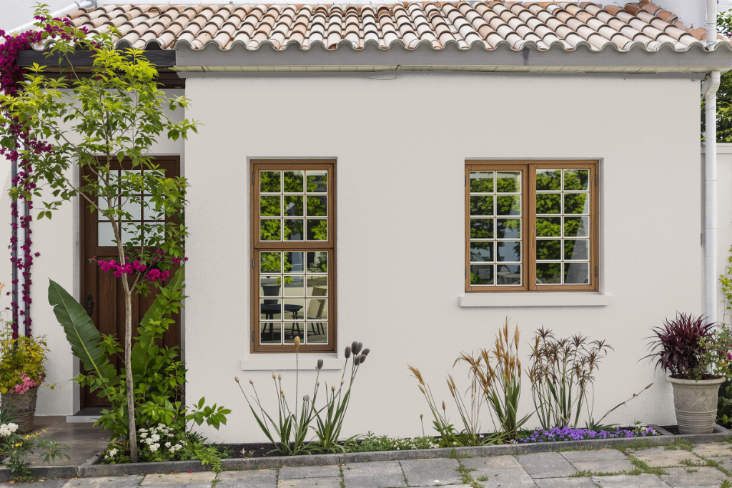
Sherwin Williams Mercurial offers an attractive option for home outdoor color, lending a distinctive ambiance to the exterior of your residence. The paint interacts dynamically with its surroundings, displaying unique characteristics when paired with popular stone and brick elements owing to its inherent undertones.
Its appearance shifts with varying light conditions; under southern sunlight, it radiates a noticeably warmer dimension, while in north-facing light, it adopts a cooler, more subdued gray tone. Evaluating a sample application is essential to ensure that the final result harmonizes with the existing exterior elements.