Sherwin Williams Moderate White SW 6140, with its delicate RGB configuration of 233, 222, 207, embodies a warm and inviting almond hue. This shade effortlessly complements a variety of design aesthetics, making it a versatile choice for both contemporary and traditional interiors. Its calming undertone provides a serene backdrop that can easily harmonize with bold accents or neutral palettes, enhancing the overall ambiance of any space.
Color Description
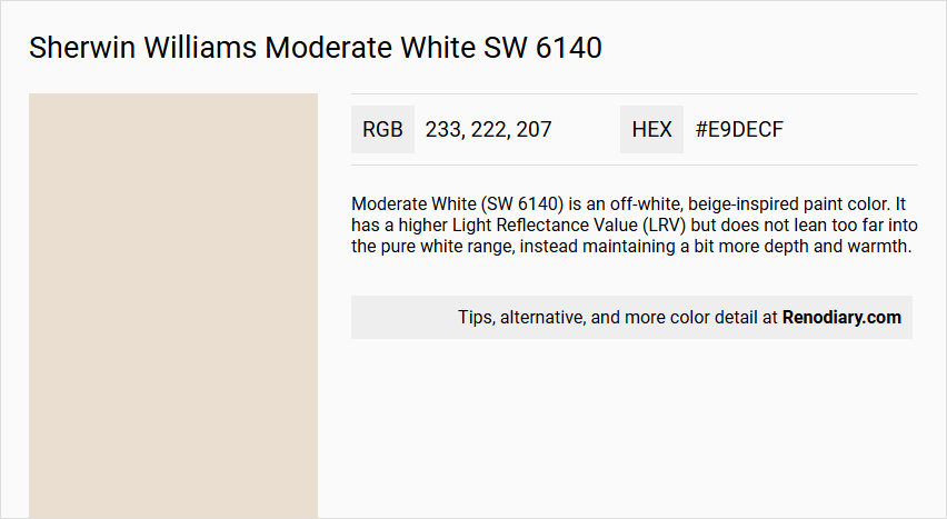
Moderate White (SW 6140) is an off-white, beige-inspired paint color. It has a higher Light Reflectance Value (LRV) but does not lean too far into the pure white range, instead maintaining a bit more depth and warmth.
Undertones
Moderate White centers on an orange undertone, but it is not a single-dimensional orange. It can lean towards both orange-yellow and orange-pink undertones, making it quite flexible and suitable for various settings.
Color Values
- LRV: 74
- Value: 8.71
- Chroma: 1.32
These values indicate it is an off-white color with a moderate level of colorfulness, and it is not too dark or too light.
Usage
Moderate White is versatile and can be used in various rooms, including bedrooms, living rooms, and even exterior trim. It works well in homes built in the 1990s and early 2000s due to its compatibility with common tiles and countertops from those eras. However, it may not be ideal for rooms with very bright lighting as it can wash out, and it may not suit grayer climates for exterior use on the main body of the house.
Atmosphere
Moderate White creates a warm, soft, and gentle atmosphere. In well-lit rooms, it appears as a warm white, while in darker rooms, it maintains a soft and muted look. It can soften the light in north-facing rooms and retain its warmth without losing its undertones. The color is also effective in balancing the coolness of north-facing light and can add warmth to family rooms and kitchens.
Sherwin Williams Moderate White SW 6140 Color Alternative
Sherwin Williams Moderate White SW 6140 offers a versatile base that many designers appreciate for its subtle warmth and modern appeal. Color alternative selections for Sherwin Williams Moderate White SW 6140 include Tikkurila Talcum G484, Tikkurila Parchment F466, and Tikkurila Champignon G467, each bringing its own distinctive nuance to a space. These alternatives allow professionals and homeowners alike to experiment with complementary shades while maintaining the sophisticated feel of the original Sherwin Williams Moderate White SW 6140.
Bathroom
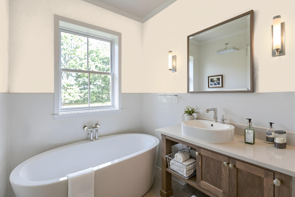
For a bathroom setting, Sherwin Williams Moderate White creates a tranquil and sophisticated atmosphere. Its balanced light reflection works well in both bright and low-light environments while its subtle orange undertones add warmth. This color pairs beautifully with warm earth tones like Accessible Beige and cool blues such as Gale Force, fostering a harmonious design.
When combined with natural stone, brass, or wooden accents, Moderate White enhances the overall ambiance and sophistication of the space. Careful selection of trim, for example using a crisp white like Benjamin Moore Chantilly Lace or a softened version of Moderate White, can help manage the undertones and maintain a cohesive look.
Bedroom
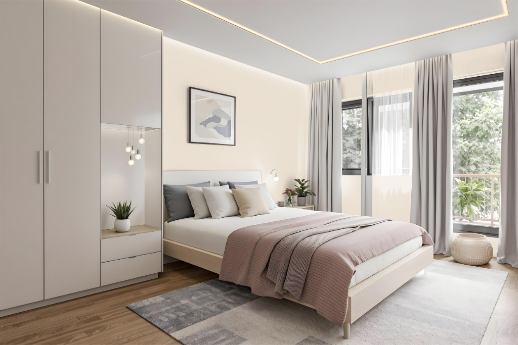
For a bedroom color scheme, Sherwin Williams Moderate White sets a calming foundation that pairs beautifully with warm earth tones like Accessible Beige to create a harmonious and inviting space. Its soft, neutral quality is further enhanced by cool blues such as Gale Force, introducing a balanced contrast that elevates the overall atmosphere.
This refined palette adapts well to varying lighting conditions, delivering a warm, glowing appearance in well-lit rooms and a muted, subtle effect in darker settings. White trim accents can be employed to intensify contrasts and emphasize the sophistication of the color combinations, resulting in a chic and tranquil bedroom environment.
Kitchen
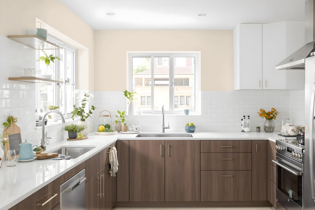
For a kitchen color scheme, Sherwin Williams Moderate White SW 6140 introduces a bright, warm tone that pairs well with earth-inspired hues and complements natural hardwood finishes. Its subtle orange undertones call for careful consideration when selecting cabinetry and coordinating surfaces like countertops and backsplashes to ensure a cohesive design.
This color harmonizes with warm neutrals as well as richer accents such as navy and green, creating a balanced, inviting atmosphere. For trim, choosing a white with minimal yellow undertones helps maintain a smooth transition and prevents any conflicting tonal interplay within the space.
Living Room
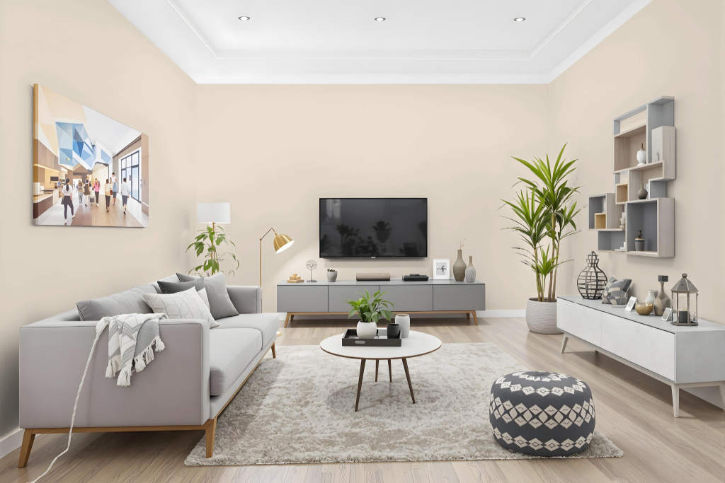
For living room color, Sherwin Williams Moderate White SW 6140 provides a bright and flexible background that adapts to varying light conditions without losing its modern appeal. Its soft neutrality harmonizes with both warm earth tones and cool accents, achieving a balanced and inviting aesthetic.
Ideal for homes from the 1990s and early 2000s, this paint complements period-specific finishes like tiles and countertops while enabling a streamlined design scheme. For trim and doors, selecting a crisp white with minimal yellow undertones ensures a cohesive look without clashing with the underlying warmth of Moderate White.
Outdoor
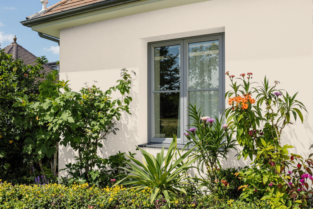
For home exteriors, Sherwin Williams Moderate White SW 6140 is a refined option that pairs exceptionally well with warm architectural elements like terra cotta tile roofs and warm stone driveways. In warmer climates, this shade highlights the beauty of these details, while in cooler or grayer locales, it might seem somewhat muted.
Testing the color in its intended setting is crucial, as its undertones can interact with surrounding materials like stone, brick, and roofing, potentially leaning more towards pink or peach. Experimentation with samples under natural light will help ensure that the overall appearance harmonizes with the home’s exterior features.