Sherwin Williams' Overt Green SW 6718, characterized by its RGB value of 151, 165, 84, closely resembles the calming, natural hue of moss green. This specific shade exudes a peaceful earthiness, making it an ideal choice for spaces designed to evoke a sense of tranquility and connection to nature. It offers a versatile palette that effortlessly complements a range of other colors, thereby enhancing any interior or exterior project with its organic charm.
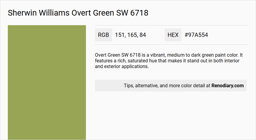
Overt Green SW 6718
Color Description
Overt Green SW 6718 is a vibrant, medium to dark green paint color. It features a rich, saturated hue that makes it stand out in both interior and exterior applications.
Undertones
This color does not have significant undertones of blue, gray, or yellow that would alter its green appearance. It remains a straightforward green shade.
Color Values
- Hex: #97a554
- RGB: (151, 165, 84)
These values indicate a green with moderate brightness and a high level of saturation.
Usage
Overt Green SW 6718 is suitable for both interior and exterior paint projects, including walls, accents, and decorative elements. When used, it's important to consider the surroundings and complementary colors to avoid clashes or overwhelming the space.
Atmosphere
This color creates a bold and vibrant atmosphere. It's ideal for homeowners looking to add a unique and eye-catching accent to their space, contributing to a lively and energetic ambiance especially when paired with other bold colors.
Sherwin Williams Overt Green SW 6718 Color Alternative
Sherwin Williams Overt Green SW 6718 delivers a bold and distinctive hue that can transform any design project. Its color alternatives—Sherwin Williams Tansy Green SW 6424 and RAL Effect RAL 240-3—provide designers with the option to maintain a similar vibrant presence while exploring subtle variations in tone. When considering these choices, users can appreciate how each alternative uniquely complements diverse settings without compromising the original color’s character.
Bathroom
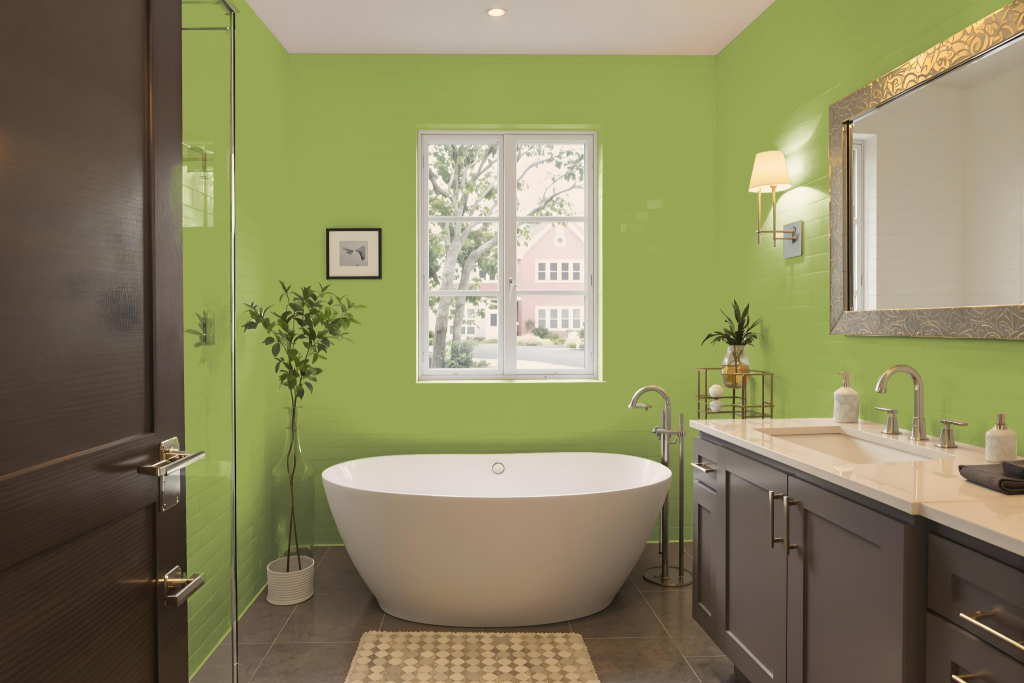
Sherwin Williams Overt Green SW 6718 creates a calming backdrop in a bathroom setting, offering a medium hue that balances sophistication with a sense of tranquility. Its design-friendly nature allows it to complement a range of accents—from earthy tones that evoke a grounded feel to bright pops that add a lively contrast—making it an appealing choice when incorporated with natural materials like wood or stone.
This paint adapts well to varied lighting conditions, maintaining its inviting character whether the space is bathed in soft morning light or enriched with ambient evening hues. A subtle yellow undertone further warms the room, contributing to an atmosphere that is both serene and welcoming.
Bedroom
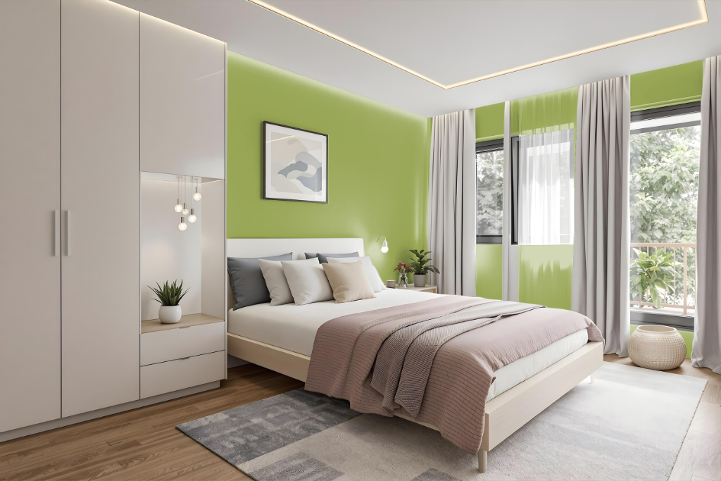
Sherwin Williams Overt Green (SW 6718) creates a calm and balanced atmosphere in a bedroom, making it an excellent choice for spaces designed for relaxation. Its medium tone maintains a comfortable balance that neither overwhelms the area nor diminishes the room's natural light, ensuring a serene and inviting retreat.
The shade pairs seamlessly with earthy hues to foster a grounded feel, while its dynamic contrast works well when combined with vibrant accents that inject energy into the space. In addition, exploring variations of the shade through different intensities offers a cohesive monochromatic scheme that enriches the overall design aesthetic.
Kitchen
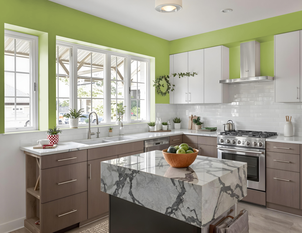
For a kitchen color scheme, Sherwin Williams Overt Green SW 6718 creates a calm and inviting atmosphere. It adapts well to a monochromatic design by utilizing varied shades, tints, and tones that foster a cohesive feel, while accent decor can help break up the uniformity. Complementary color pairings with hues that lean toward blue add an energizing visual contrast.
When selecting design elements, the color harmonizes with earthy tones for a grounded look or with bold splashes for a dynamic effect. It also pairs elegantly with natural materials like wood and marble and can be highlighted with brass or gold hardware to enhance its soothing presence.
Living Room
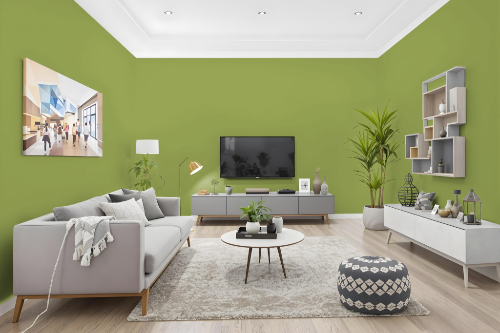
Sherwin Williams Overt Green is a calming, inviting choice for living rooms that creates a serene atmosphere. Its balanced medium tone adapts well to various lighting conditions, making it an excellent option not just for living areas, but also for bedrooms and home offices.
This paint pairs beautifully with earthy hues for a grounded look or can be combined with vibrant accents to create energy within a space. The subtle yellow undertone of Overt Green ensures a harmonious integration with diverse decor styles, whether used in a monochromatic scheme or matched with other complementary shades.
Outdoor
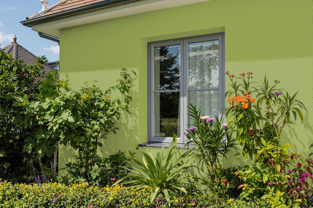
Sherwin Williams Overt Green offers an appealing home outdoor color option for exterior surfaces like walls and trim. With a medium light reflectance that ensures a balanced interplay of brightness and depth, this color creates an attractive, soft yet engaging appearance when applied outdoors.
Its performance on a variety of exterior applications allows homeowners to test paint samples on selected surfaces before committing to a full project, ensuring the final look meets their expectations. Additionally, when paired with earthy tones or complementary shades, this color enhances outdoor spaces with a calming and inviting ambiance.