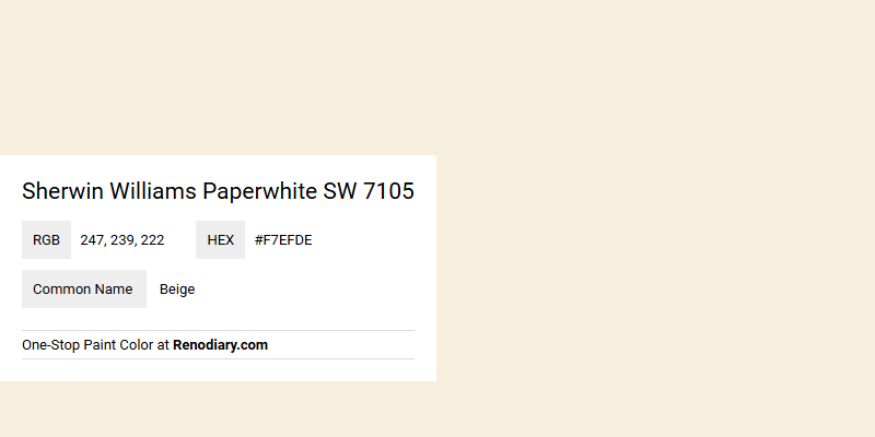
Sherwin Williams Paperwhite SW 7105 is a versatile paint color that embodies a soft, calming beige hue, perfect for creating a serene atmosphere in any space. With an RGB value of (247,239,222), it produces a light and airy feel, reflecting a subtle warmth that complements various design styles. Its gentle undertones make it ideal for pairing with both bold accents and neutral palettes, offering flexibility in achieving a harmonious interior design.
Color Description
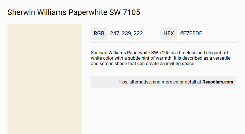
Sherwin Williams Paperwhite SW 7105 is a timeless and elegant off-white color with a subtle hint of warmth. It is described as a versatile and serene shade that can create an inviting space.
Undertones
The undertone of Paperwhite SW 7105 can be accurately described as having a red hue, which is evident when isolating the pure hue and eliminating any tints, tones, and shades.
Color Values
- HEX: #F7EFDE
- RGB: 247, 239, 222
- CMYK: 0.0%, 3.2%, 10.1%, 3.1%
Usage
Paperwhite SW 7105 can be used as a main wall color or as an accent. It pairs beautifully with soft greys like SW 7015 Repose Gray and warm whites like SW 7008 Alabaster. For added depth and contrast, it can be paired with rich navy blues like SW 6244 Naval or earthy greens like SW 7731 San Antonio Sage. This color complements a variety of interior styles, from modern to traditional.
Atmosphere
Paperwhite SW 7105 creates a serene and inviting space, bringing a sense of calm and balance to any room. It is ideal for creating a harmonious and sophisticated color palette that elevates the overall atmosphere of the space.
Sherwin Williams Paperwhite SW 7105 Color Alternative
Sherwin Williams Paperwhite SW 7105 stands out as a versatile base, inspiring designers to explore similar aesthetics with alternative options. Tikkurila Calla G503, Tikkurila Acropolis F458, and Dulux Timeless each embody distinctive nuances that resonate with the same modern appeal as Sherwin Williams Paperwhite SW 7105. These alternatives offer fresh perspectives while ensuring the elegance and balance that make the original color so appealing.
Bathroom
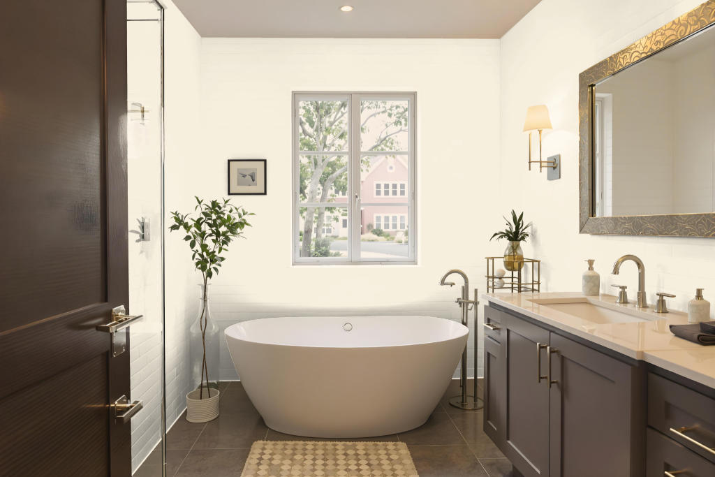
Sherwin Williams Paperwhite SW 7105 is an elegant bathroom color that creates a serene and inviting atmosphere. It harmonizes beautifully with a range of complementary shades—from soft greys and warm whites to rich navy blues and earthy greens—forming a sophisticated color scheme that enhances both modern and traditional interior styles.
This hue's subtle warmth and light-reflecting quality contribute to a balanced, calming environment while also making spaces appear bright and spacious. Its design-friendly nature allows for deliberate pairing with varied tones to achieve depth and contrast, perfect for crafting an atmosphere that exudes quiet sophistication in any bathroom setting.
Bedroom
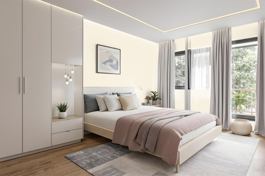
Sherwin Williams Paperwhite SW 7105 is an elegant choice for a bedroom color scheme that creates a serene and inviting atmosphere. It pairs beautifully with soft greys and warm whites, establishing a sophisticated palette that enhances the room's sense of calm and balance.
Adding depth and contrast, this color works well alongside rich navy blues or earthy greens, whether used as a main wall tint or an accent. Suitable for a range of interior styles from modern to traditional, Paperwhite infuses the space with warmth and a subtle red undertone that contributes to a relaxed and comfortable retreat.
Kitchen
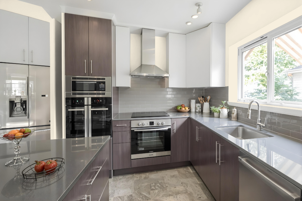
For a kitchen color scheme, Sherwin Williams Paperwhite SW 7105 offers an elegant choice that pairs beautifully with soft greys and warm whites to create a harmonious palette. It works effectively both as a main wall color and an accent, complementing various interior styles ranging from modern to traditional.
To add depth and contrast, consider integrating rich navy blues or earthy greens that bring visual interest. This color easily adapts to schemes that embrace subtle monochromatic variations or more vibrant complementary combinations, making it a strong focal point in any kitchen design.
Living Room
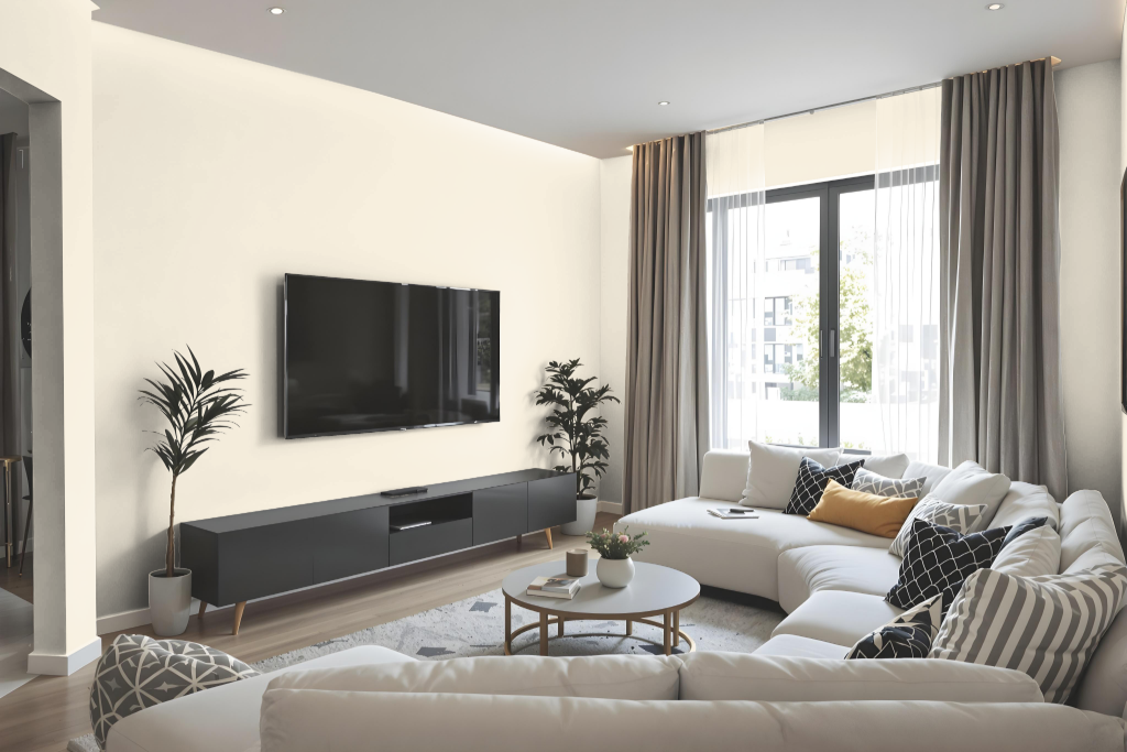
Living room color Sherwin Williams Paperwhite SW 7105 sets an elegant tone with its neutral appeal, making it an ideal backdrop in spaces where style meets subtle sophistication. This refined hue harmonizes wonderfully with soft gradients of greys and warm whites, creating an inviting ambiance that balances well with both contemporary and classic decor elements.
Complement your space by introducing deeper accents such as rich navy hues or earthy shades of green, which provide contrast and dimension. Whether used as a primary wall treatment or as a thoughtful accent, this color enhances a serene environment that is equally at home in tranquil bedrooms, sunlit kitchens, or any area designed for comfort and balance.
Outdoor
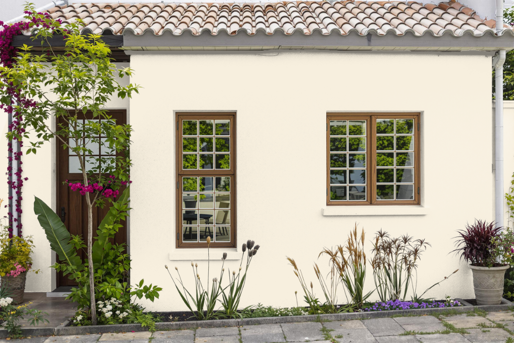
Sherwin Williams Paperwhite SW 7105 is a home outdoor color option that can be used outside, although it is originally designed for interior applications. When applied to external surfaces, it may lack the durability and weather resistance of paints specifically formulated for exterior use.
For better performance under harsh conditions, exterior-specific paints incorporate advanced technology to guard against fading, peeling, and mildew growth. If Paperwhite is chosen for outdoor use, additional protective coatings are advised to maintain its appearance and longevity.