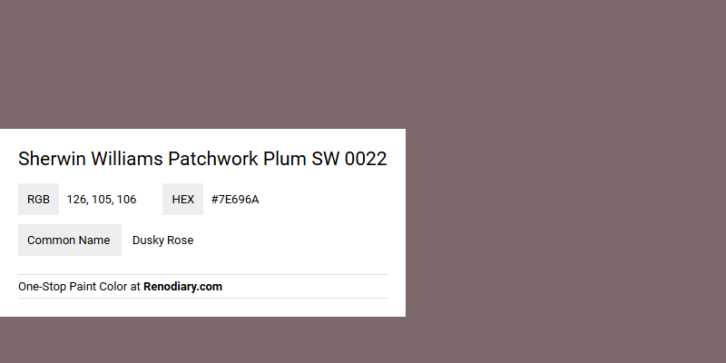
Sherwin Williams Patchwork Plum SW 0022 boasts a rich and sophisticated hue that beautifully balances warmth and elegance. Its blend of deep pink and muted purple, often referred to as Dusky Rose, makes it a versatile choice for creating a cozy atmosphere. The RGB composition of 126, 105, 106 adds a subtle complexity that pairs well with both contemporary and classic design schemes.
Color Description
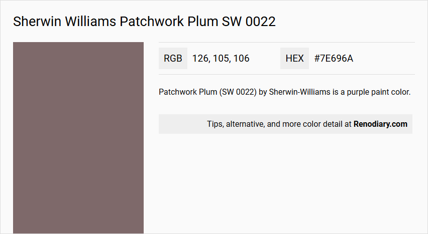
Patchwork Plum (SW 0022) by Sherwin-Williams is a purple paint color.
Undertones
The color has a slightly reddish and bluish undertone, as indicated by its RGB and CMYK values, but it is predominantly purple.
Color Values
- Hex Color Code: #7E696A
- RGB Color Code: RGB(126, 105, 106)
- CMYK Values: 0.0%, 16.7%, 15.9%, 50.6%
Usage
Patchwork Plum is suitable for both interior and exterior paint projects.
Atmosphere
This color can create a rich, warm, and inviting atmosphere, making it ideal for rooms where a cozy and elegant feel is desired. The deep purple hue can add a sense of luxury and sophistication to any space.
Sherwin Williams Patchwork Plum SW 0022 Color Alternative
Sherwin Williams Patchwork Plum SW 0022 offers a rich, deep hue, while its alternatives provide distinctive nuances for various design preferences. Farrow and Ball London Clay 244 delivers a warm, earthy tone that pairs well with both modern and traditional spaces, setting a stylish backdrop that complements the intensity of Patchwork Plum SW 0022. Benjamin Moore Bonne Nuit AF-635 and Jotun Daydream 20142 each offer unique characteristics that introduce additional layers of sophistication and personality, giving designers versatile options to achieve a balanced and dynamic aesthetic.
Bathroom
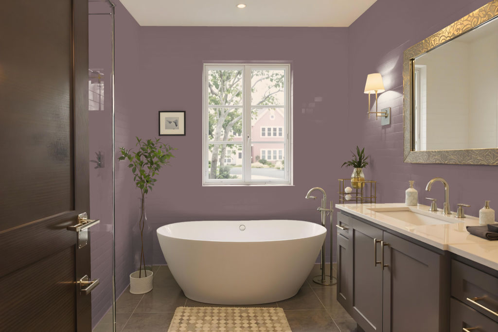
For a bathroom, Sherwin Williams Patchwork Plum (SW 0022) creates a unique and inviting atmosphere, particularly in smaller, well-lit spaces where its deep, rich tone does not overwhelm the room. This shade benefits from environments that enhance its character without causing the space to feel dark or confined.
Pairing this sophisticated color with light, neutral fixtures such as white or cream-colored tiles, trim, and furniture helps balance its intensity. Adding metallic accents or plush textiles further elevates the overall luxurious aesthetic, though it is wise to test the color with a sample first to ensure it harmonizes with the natural lighting and other design elements in your bathroom.
Bedroom
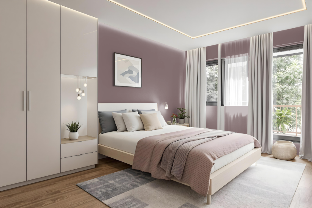
For a bedroom color scheme, Sherwin Williams Patchwork Plum creates a cozy and sophisticated atmosphere when featured alongside light and neutral furniture that accentuates its rich depth. This hue establishes a refined backdrop that invites both relaxation and visual intrigue.
A monochromatic approach using various shades, tints, and tones of the same color can lend harmonious continuity to the space, though it may feel one-note without additional accents. Alternatively, incorporating complementary colors like certain greens introduces a dynamic contrast, layering warmth with refreshing vibrancy.
Kitchen
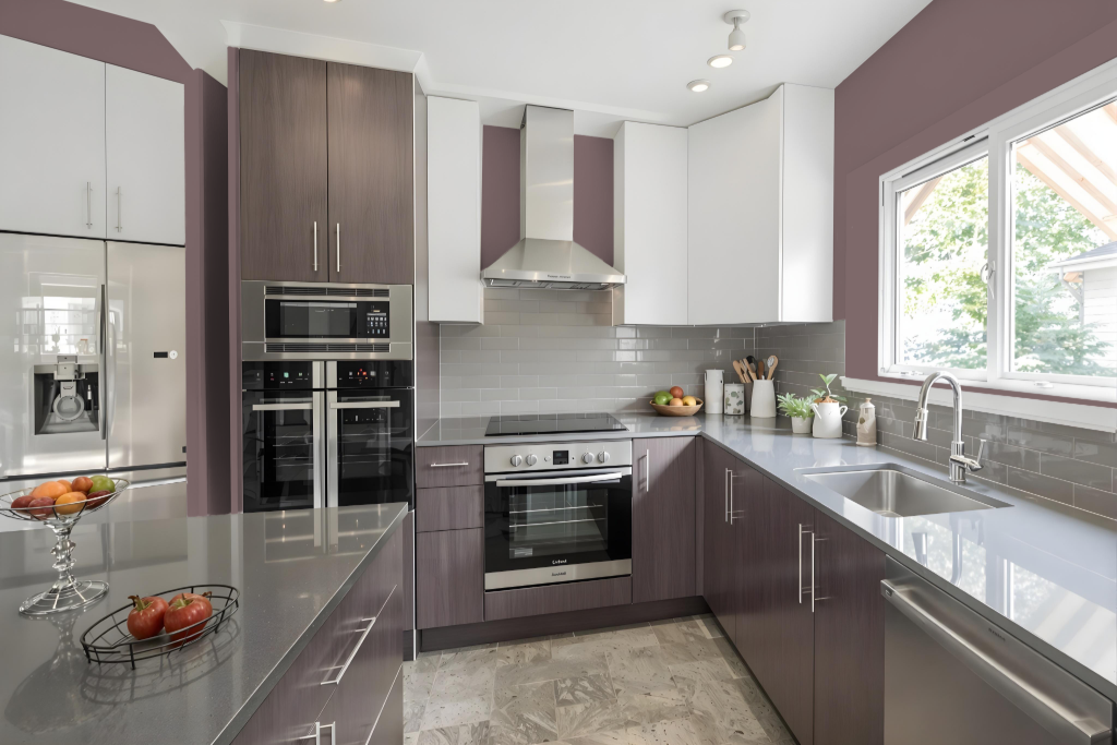
For a kitchen color scheme, Sherwin Williams Patchwork Plum offers a captivating and sophisticated foundation. Its deep, rich tone works well when paired with complementary green hues, creating a vibrant and engaging space.
Alternatively, using this warm shade as an accent on a wall or kitchen cabinets adds drama while maintaining balance with lighter, neutral tones. Incorporating metallic or gold details further elevates the luxurious feel of the room.
Living Room
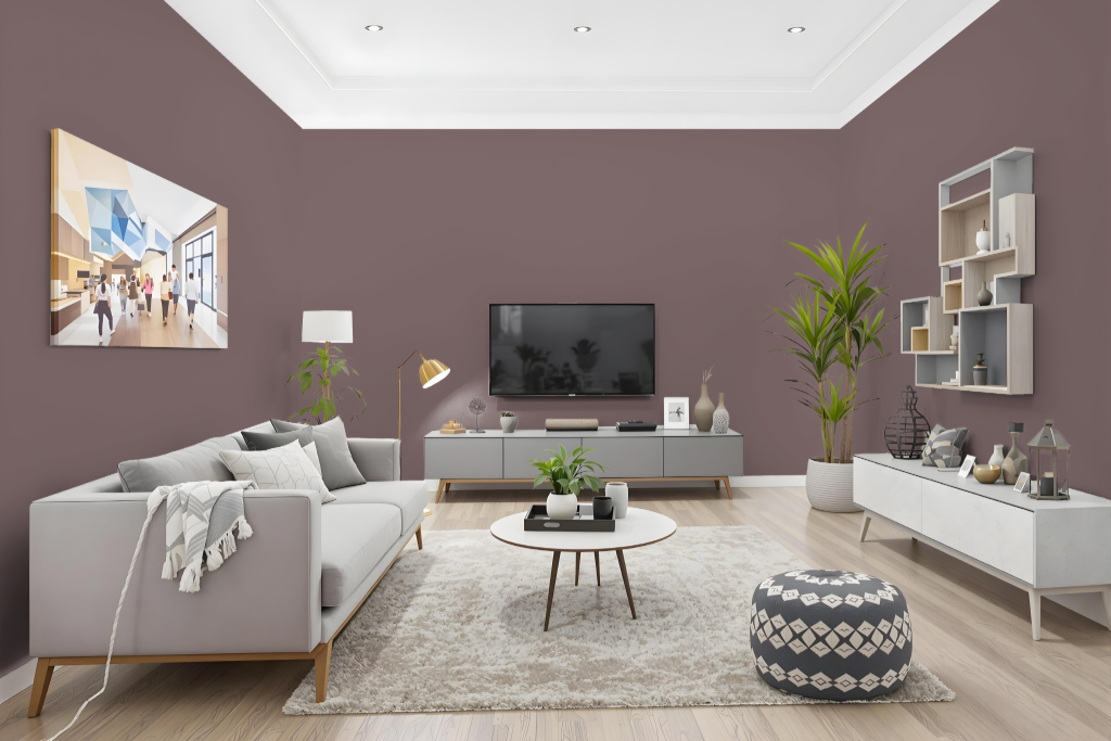
Sherwin Williams Patchwork Plum elevates living room walls with a cozy, sophisticated atmosphere. This rich color creates an inviting backdrop that pairs beautifully with light, neutral furnishings to enhance both warmth and elegance in your space.
Originating from historic design palettes inspired by eras like the Victorian period, Patchwork Plum adds a timeless charm to interiors. Its appearance can vary depending on the surface texture, making it important to test the finish on different materials to achieve the desired effect.
Outdoor
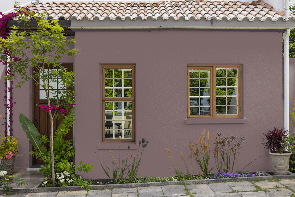
Home outdoor color Sherwin Williams Patchwork Plum provides a unique and sophisticated touch for your home's exterior, drawing inspiration from historic and Victorian design trends. Its timeless charm can enhance architectural features, though natural light and surroundings may subtly shift its appearance compared to interior applications.
Complementary greens like Mountain Air and Niebla Azul can enhance your accent areas and overall effect. Ensuring the paint is specifically formulated for exterior use and applied following manufacturer guidelines will help maintain its durability and lasting appeal over time.