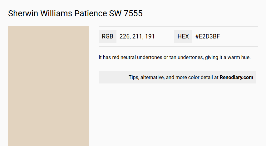
Sherwin Williams Patience SW 7555, characterized by its soothing and neutral appearance, embodies the timeless elegance of beige with its harmonious blend of warm undertones. This color, with an RGB composition of 226, 211, and 191, offers a soft and inviting ambiance, making it a popular choice for creating serene and versatile spaces. Its subtle warmth and adaptability ensure that it complements a variety of design styles, from modern minimalism to cozy traditional settings.
Color Description
Patience SW 7555 is a warm beige white color.
Undertones
It has red neutral undertones or tan undertones, giving it a warm hue.
Color Values
- Hex Color Code: #E2D3BF
- RGB Color Code: RGB(226, 211, 191)
- CMYK Values: 0.0%, 6.6%, 15.5%, 11.4%
- Hue Family: White and Pastel (specifically in the Yellow (1 Y) hue family on the color wheel)
- Value: 8.41 (rounded to 8.38)
- Chroma: 1.51 (rounded to 1.50)
Usage
Suitable for kitchens and any gathering spaces to create a sophisticated and welcoming atmosphere.
Atmosphere
The color adds vibes of sophistication and fellowship, making it ideal for spaces where elegance and warmth are desired.
Sherwin Williams Patience SW 7555 Color Alternative
Sherwin Williams Patience SW 7555 offers a distinct ambiance, and for those seeking comparable hues, the alternatives Tikkurila Y484, Dulux Natural Hessian, and Dulux Bleached Lichen 3 40YY 67/087 provide appealing options. These shades blend contemporary appeal with classic undertones, ensuring that design intent and visual harmony remain intact. By choosing Tikkurila Y484, Dulux Natural Hessian, or Dulux Bleached Lichen 3 40YY 67/087, designers can maintain the sophisticated vibe of Sherwin Williams Patience SW 7555 while exploring nuanced variations that perform well under different lighting conditions.
Bathroom
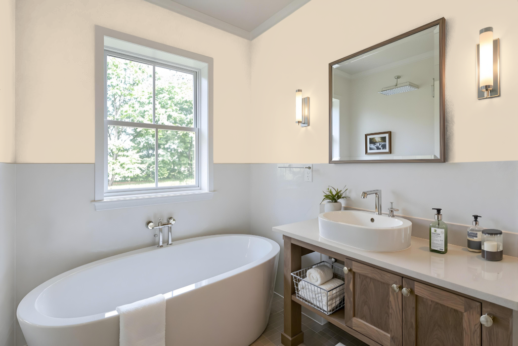
Sherwin Williams Patience SW 7555 is an excellent bathroom color renowned for its calming influence and ability to create a serene atmosphere. Its peaceful tone lends a balanced backdrop that promotes relaxation, setting the stage for a space designed for repose and rejuvenation.
This hue pairs effortlessly with various decorating approaches, from monochromatic schemes to complementary color accents that provide vibrant contrast. Its high light reflectance ensures the room remains well-lit and airy, contributing to an environment that is both practical and soothing.
Bedroom
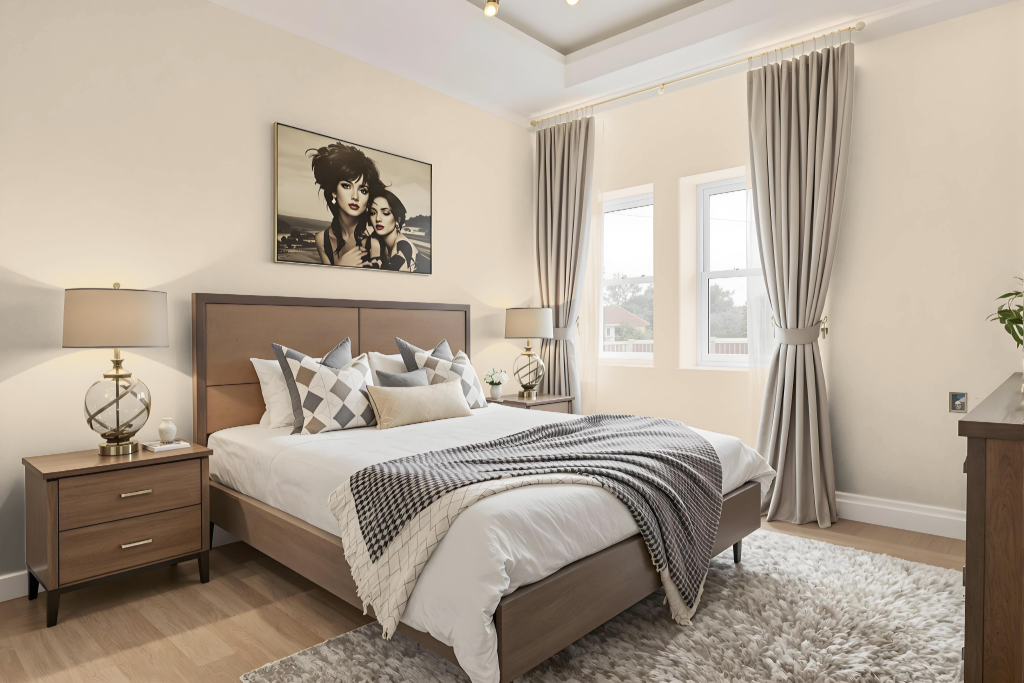
Sherwin Williams Patience SW 7555 is an excellent choice for a bedroom color, offering a calming and peaceful backdrop ideal for relaxation and rest. This gentle shade creates a serene atmosphere when combined with soft furnishings, wood accents, and subtle lighting, establishing a balanced and harmonious setting.
To enhance the overall aesthetic, consider layering different tones of Patience for a monochromatic effect or introducing complementary hues with a blue undertone for contrast. Thoughtful integration with elements such as furniture, carpets, and textiles ensures a cohesive and finished room design where every detail contributes to a well-rounded environment.
Kitchen
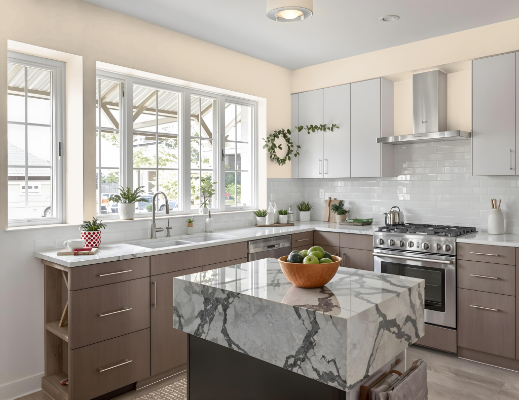
For a kitchen color scheme, Sherwin Williams Patience SW 7555 adds a touch of sophistication and elegance. This hue creates a calm and inviting atmosphere perfect for gathering spaces, setting a serene foundation that highlights both modern and traditional design elements.
Pairing this color with complementary hues, particularly with a hint of blue, introduces a dynamic visual effect that enlivens the space. For a more cohesive appearance, using lighter or darker shades from the same color family reinforces a balanced decorative theme, especially when considering its subtle red undertone in coordinating the overall decor.
Living Room
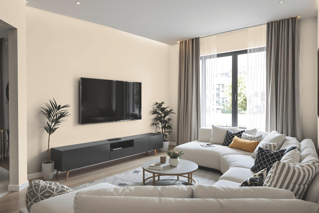
Sherwin Williams Patience deepens the living room's ambiance, infusing the space with sophistication and elegant appeal that invites relaxation after a long day. Its calming quality establishes balance and harmony, creating a smooth transition that soothes and refreshes the mind.
Beyond the living room, this carefully crafted hue works beautifully in bedrooms and home offices, where it enhances environments by promoting focus and creativity. When paired with complementary colors featuring a blue note and paired with classic trim shades, it contributes to a timeless and dynamic aesthetic that enriches any well-designed home.
Outdoor
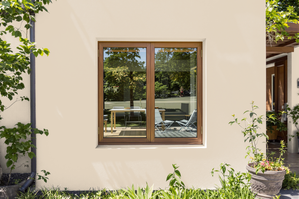
For home outdoor color, Sherwin Williams Patience SW 7555 can bring a refined touch to an exterior setting when thoughtfully applied. While this hue is frequently chosen for interiors, its outdoor use warrants careful consideration of natural lighting and environmental influences that may alter its appearance.
It is essential to test the sample on your home’s exterior to ensure the color holds true under direct sunlight and varying weather conditions. Additionally, evaluate its harmony with elements like roofing, siding, and landscaping to achieve a balanced and attractive overall look.