Sherwin Williams Pearl Gray SW 0052, with its soft RGB composition of (203, 206, 197), exudes a gentle and balanced aesthetic often associated with tranquility and sophistication. Although sometimes referred to as ‘sage’ due to its muted green undertones, the color elegantly merges the timeless allure of gray with a subtle hint of earthiness. This blend makes it a perfect choice for creating serene and inviting interiors that can seamlessly complement a variety of design styles.
Color Description
Sherwin Williams Pearl Gray (SW 0052) is an elegant and timeless neutral color. It is described as a subtle, warm light gray shade that adds a touch of understated sophistication to any space.
Undertones
The undertone of Pearl Gray can be accurately described as having a green hue. This is evident from the color space analysis, which isolates the pure hue and eliminates any tints, tones, and shades.
Color Values
- HEX value: #CBCEC5
- RGB code: 203, 206, 197
- Light Reflectance Value (LRV): Approximately 61
Usage
Pearl Gray is versatile and can be used in various rooms such as bedrooms, living rooms, and bathrooms. It pairs well with deep navy blue, soft pastel pink, and crisp white, creating a sophisticated color palette. It is suitable for both main color and accent uses.
Atmosphere
This color helps create a calming and stylish ambiance in any room. It contributes to a serene and comfortable living space, making it ideal for those seeking a neutral yet elegant atmosphere.
Sherwin Williams Pearl Gray SW 0052 Color Alternative
Sherwin Williams Pearl Gray SW 0052 offers a sophisticated and nuanced tone that enhances both modern and traditional spaces. Tikkurila Median X486, Tikkurila Sea Smoke X447, and Tikkurila Gorgonzola G444 serve as excellent alternatives, each bringing its own distinctive character while maintaining the refined spirit of the original color. These options provide designers with a versatile palette to achieve a similar aesthetic, allowing for creative expression that aligns with the timeless appeal of Sherwin Williams Pearl Gray SW 0052.
Bathroom
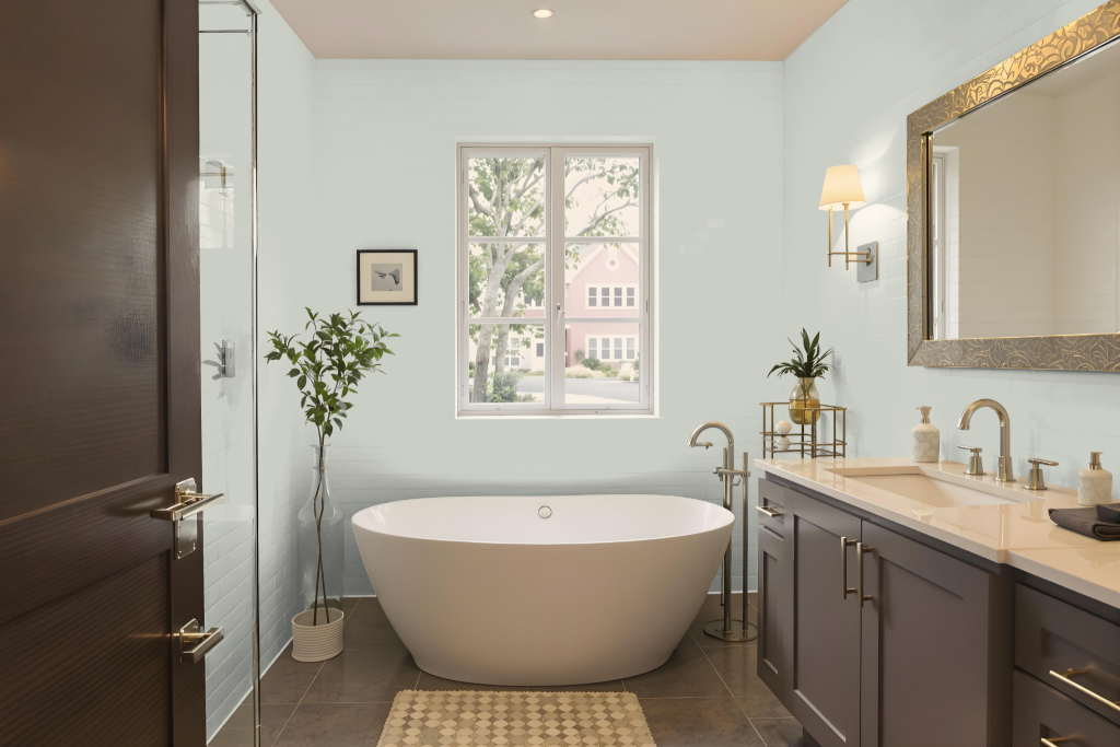
Sherwin Williams Pearl Gray delivers an ideal bathroom color that brings a calming nuance to any space. It pairs seamlessly with elements like white-and-gray penny tile flooring, white subway tiled showers, and chrome or silver-toned fixtures, creating a timeless and sophisticated aesthetic that enhances both contemporary and traditional designs.
When planning for humid conditions, it's essential to select a finish that boosts durability and moisture resistance. Opting for a semi-gloss or high-gloss finish can safeguard the walls from mold and mildew while maintaining an inviting and serene atmosphere throughout the bathroom.
Bedroom
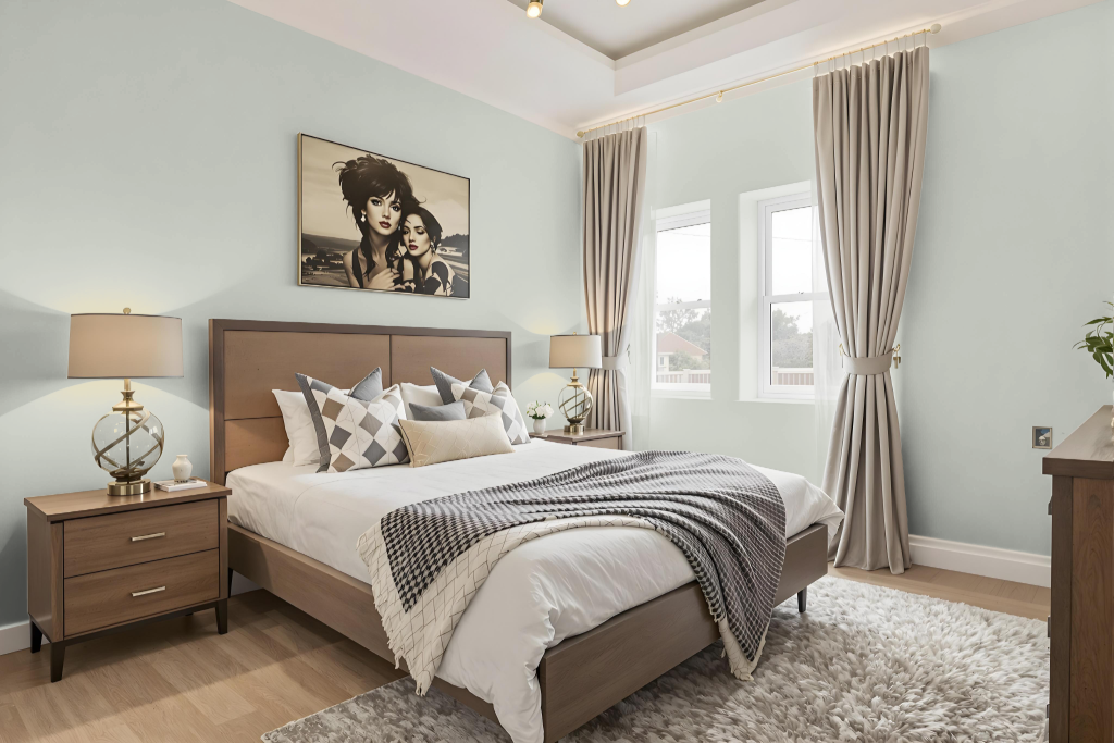
For a bedroom color scheme, Sherwin-Williams Pearl Gray SW 0052 creates a calming atmosphere. It pairs beautifully with deep navy blue for a striking contrast, soft pastel pink for a touch of warmth, and crisp white to maintain a clean, airy feel.
The subtle green undertones enrich the palette when combined with natural elements like wood furniture and greenery. Whether used as the main backdrop or as an accent, the color helps cultivate a harmonious space that promotes relaxation and style.
Kitchen
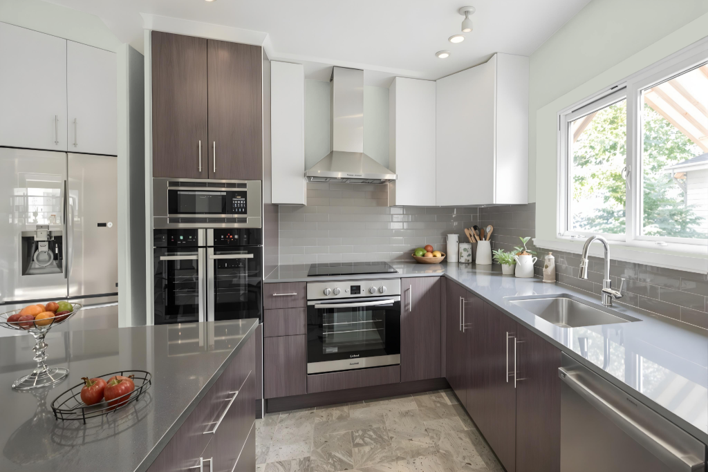
For a kitchen, Sherwin Williams Pearl Gray offers a sophisticated base that elevates the overall design. It pairs well with deep navy blue, soft pastel pink, and crisp white to create a balanced, elegant atmosphere, and can be used in a monochromatic scheme with varying shades or to contrast with hues that produce a dynamic visual effect.
The color’s subtle green undertone enables it to harmonize with natural materials and earthy tones, making it an excellent choice for kitchens featuring wood, stone, or greenery. Its ability to blend seamlessly into diverse design elements adds depth and character to any space.
Living Room
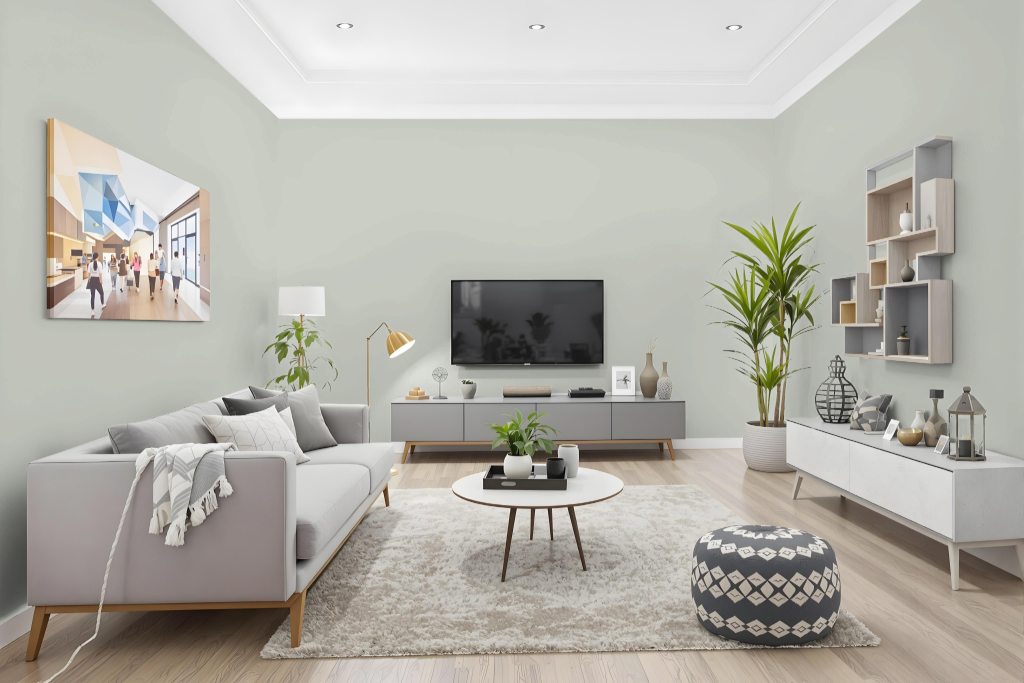
Sherwin Williams Pearl Gray SW 0052 enhances a living room by adding an air of quiet sophistication. This elegant hue creates a balanced ambiance when paired with deep navy blue, soft pastel pink, or crisp white, and its subtle green undertone brings an unexpected depth to both traditional and modern interiors.
Its appeal extends through its adaptability to different design schemes; whether used in a monochromatic setting with varied intensities or combined with complementary colors for vibrant contrasts, Pearl Gray offers a refined foundation that adapts seamlessly to evolving decorative visions.
Outdoor
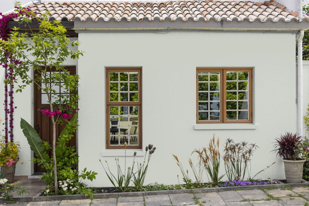
For home outdoor color, Sherwin Williams Pearl Gray provides a sophisticated and enduring option that elevates the look of your exterior spaces. Its inclusion in collections such as Historic Interior Color Wall, 2018 Sincerity, Naturalist, 2021 Sanctuary, and Living Well - Recharge demonstrates its compatibility with a range of architectural styles and design aesthetics.
This finish not only offers a calm and refined look but also features a subtle green undertone that interacts beautifully with natural lighting. For those who prefer to test out the color beforehand, peel-and-stick samples allow you to preview its effect on your exterior surfaces before making a full commitment.