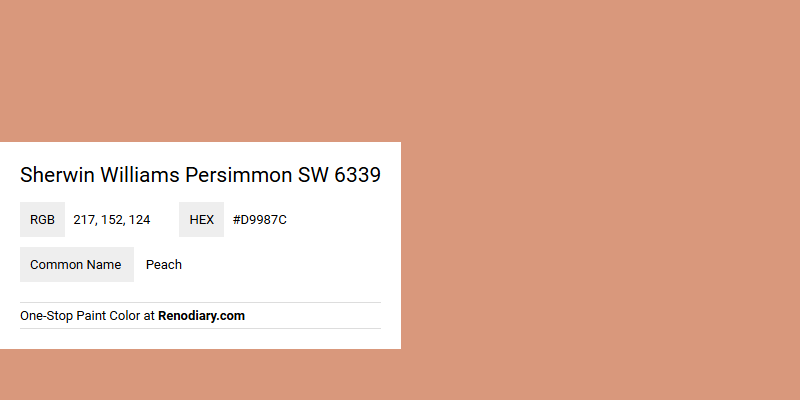
Sherwin Williams' Persimmon SW 6339 exudes a warm and inviting hue that sits comfortably between the vibrant shades of orange and the soft, muted tones of peach. Its RGB composition of 217,152,124 underscores its rich blend of warmth and subtlety, making it an ideal choice for spaces that aim to evoke a sense of comfort and relaxation. This versatile color can transform a room into a cozy oasis, resonating with the natural beauty and tranquility of a sunlit orchard.
Color Description
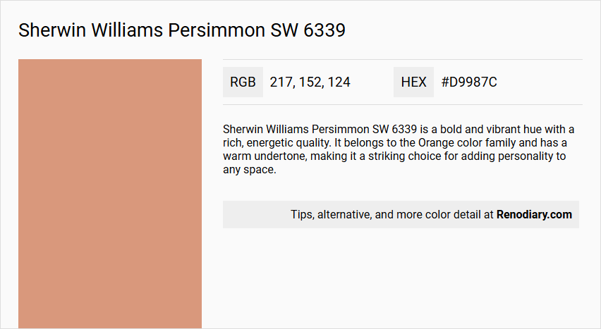
Sherwin Williams Persimmon SW 6339 is a bold and vibrant hue with a rich, energetic quality. It belongs to the Orange color family and has a warm undertone, making it a striking choice for adding personality to any space.
Undertones
The undertone of Persimmon SW 6339 can be accurately described as a red hue, which is evident from its color profile.
Color Values
- Hexadecimal Code: #D9987C
- RGB Code: RGB(217, 152, 124)
- CMYK Values: 0.0%, 30.0%, 42.9%, 14.9%
- Light Reflective Value (LRV): 39.0
Usage
Persimmon SW 6339 can be used in various ways to create different effects:
- For a high-contrast, modern look, pair it with SW 7006 Extra White.
- For a more balanced and sophisticated palette, combine it with SW 7016 Mindful Gray.
- To soften the intensity, incorporate accents in SW 6385 Dover White.
Atmosphere
This color adds a pop of personality and energy to any space, making it ideal for those looking to make a statement. It can create a dynamic and visually appealing interior design, especially when used in a complementary color scheme or with carefully chosen accents.
Sherwin Williams Persimmon SW 6339 Color Alternative
For those seeking an alternative to the vibrant Sherwin Williams Persimmon SW 6339, several options offer distinct yet harmonious variations in warmth and intensity. Dulux Copper Blush 50YR 36/263 brings a sophisticated metallic accent, while Sherwin Williams Rosedust SW 0025 and Sherwin Williams Coral Island SW 6332 provide softer, nuanced interpretations that maintain a similar energy. Choosing among these color alternatives allows you to refine the ambiance of your space while preserving the unique character of Sherwin Williams Persimmon SW 6339.
Bathroom
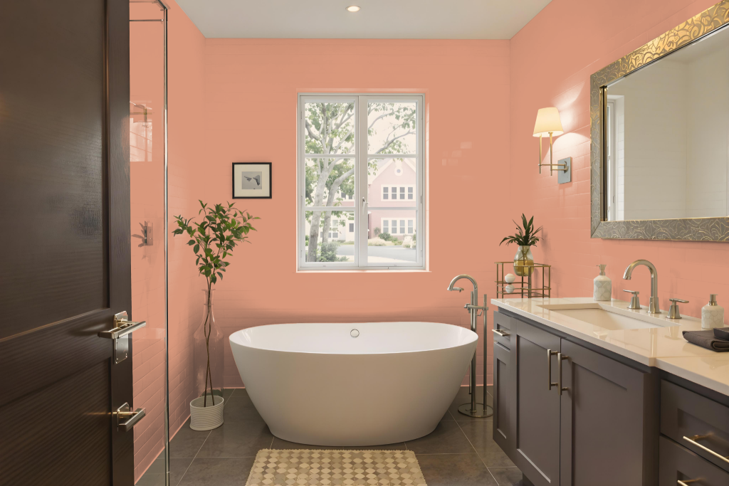
The bathroom painted in Sherwin Williams Persimmon features a bold hue with a unique orange-pink undertone that may clash with typical bathroom elements like off-white furniture, grayish trim, and cream-colored drapes. Its distinct color quality can make it challenging to coordinate with standard fixtures and accents, leading to difficulties in achieving a balanced look.
With a medium light reflectance value, this shade does not reflect much light, potentially causing the bathroom to feel darker and more enclosed. Furthermore, matching trim colors proves problematic, as bright whites appear too stark and warmer whites with yellow undertones do not harmonize with Persimmon’s vibrant character when applied to large surfaces.
Bedroom
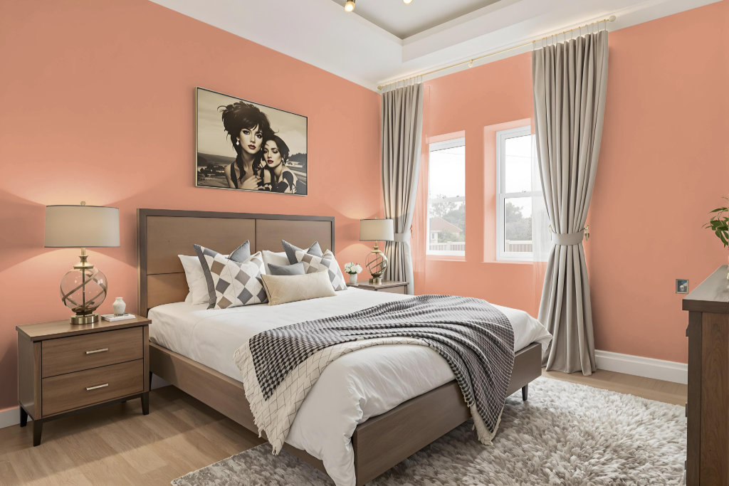
For a bedroom color scheme, Sherwin Williams Persimmon SW 6339 offers a warm, inviting tone that works brilliantly as either an accent or primary wall color. Pairing this hue with neutral shades like Pearly White or Pure White for the trim and ceiling creates a refined and cohesive atmosphere, emphasizing Persimmon’s depth and vibrancy.
To enhance the design further, incorporating muted tones with gentle undertones—such as soft greens or darkened shades with subtle orange-pink nuances—can create an engaging and well-balanced palette. In contrast, lighter neutrals with hints of gray or beige should be avoided since they may clash with Persimmon’s distinctive warmth.
Kitchen
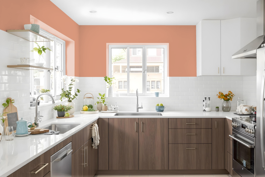
For a kitchen color scheme, Sherwin-Williams Persimmon SW 6339 makes a bold, energetic choice. It can be applied as an accent—on cabinets or a single wall—to inject personality into the space while serving as a dynamic focal point.
To balance its intensity, neutral tones such as Extra White, Mindful Gray, and Pure White for trim and ceilings create a striking contrast or a more harmonious feel. Incorporating lighter accents like Dover White further softens the look, and when integrated into a broader home color collection featuring complementary shades, it helps achieve a visually appealing and unified design.
Living Room
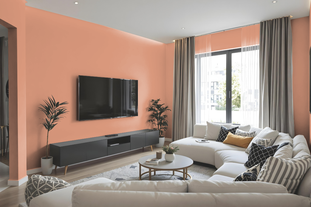
In the living room, Sherwin Williams Persimmon SW 6339 adds depth and warmth as an accent wall or a standout piece within the overall decor. This bold hue creates an inviting, cozy atmosphere when used on walls or incorporated via textiles and upholstery, such as throw pillows, area rugs, or a unique armchair.
To create a balanced space, this striking color is often paired with soft, neutral backdrops that promote a harmonious feel. Lighter shades on surrounding walls and carefully chosen decorative accents work together with Persimmon elements to maintain a cohesive, polished look throughout the room.
Outdoor
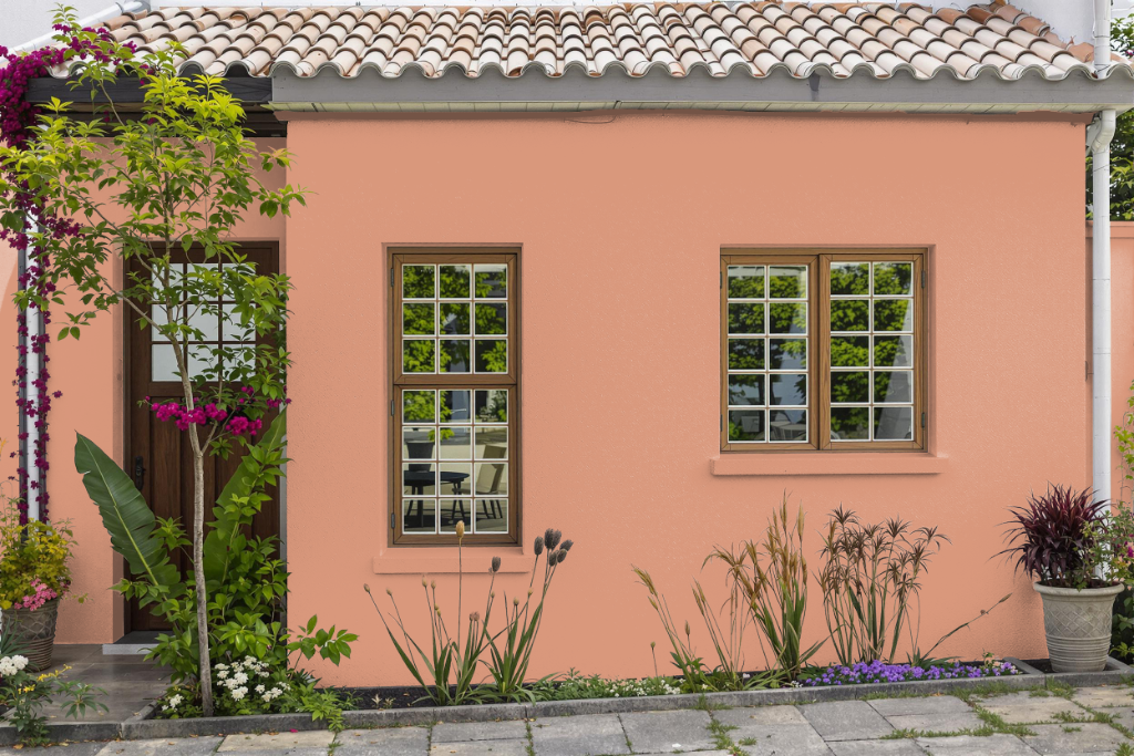
Home outdoor color Sherwin-Williams Persimmon SW 6339 brings a bold, energetic character to exterior spaces with its rich red undertones. Its deep, intense shade creates a dramatic impression, although the darker tone may absorb heat and sunlight, which over time can contribute to fading and reduced durability.
For exterior surfaces such as vinyl siding, the absorbent properties of darker hues like Persimmon may also lead to warping or buckling. While specially formulated paints help combat these challenges, lighter hues are generally recommended to achieve maximum resilience and long-lasting performance in outdoor painting projects.