Sherwin Williams Polite White SW 6056, characterized by its subtle RGB composition of 233, 221, 212, is a refined and tranquil shade often referred to as Beige. This delicate hue exudes warmth and elegance, making it an ideal choice for creating a soothing and harmonious ambiance in interior spaces. Its versatility allows it to seamlessly complement a variety of design styles, from traditional to contemporary, enhancing the overall aesthetic appeal of any room.
Color Description
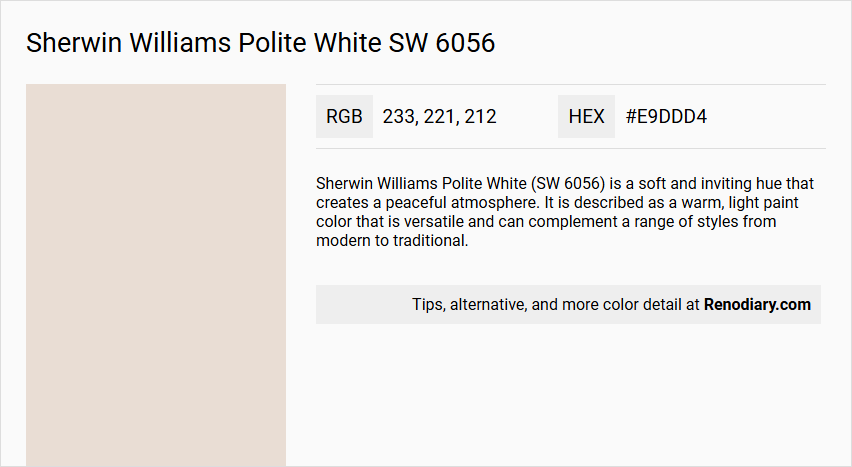
Sherwin Williams Polite White (SW 6056) is a soft and inviting hue that creates a peaceful atmosphere. It is described as a warm, light paint color that is versatile and can complement a range of styles from modern to traditional.
Undertones
The undertone of Polite White is accurately described as having a red hue, which is evident from its color space analysis.
Color Values
- HEX Value: #E9DDD4
- RGB Values: RGB(233, 221, 212)
- CMYK Values: 0.0%, 5.2%, 9.0%, 8.6%
Usage
Polite White is ideal for living rooms, bedrooms, and nurseries. It is suitable for spaces where a sense of tranquility and sophistication is desired.
Atmosphere
This color creates a serene and peaceful atmosphere, making it perfect for areas where a sense of calm and understated beauty is desired.
Sherwin Williams Polite White SW 6056 Color Alternative
Sherwin Williams Polite White SW 6056 has inspired designers to explore similar hues, leading to a range of alternatives such as Tikkurila Talcum G484, Tikkurila Parchment F466, and Tikkurila Merino Y458. Each of these colors offers a unique variation in warmth and brightness while maintaining the versatile appeal found in Sherwin Williams Polite White SW 6056. Together, these alternatives provide excellent options for those looking to achieve a comparable aesthetic with subtle shifts in tone and character.
Bathroom
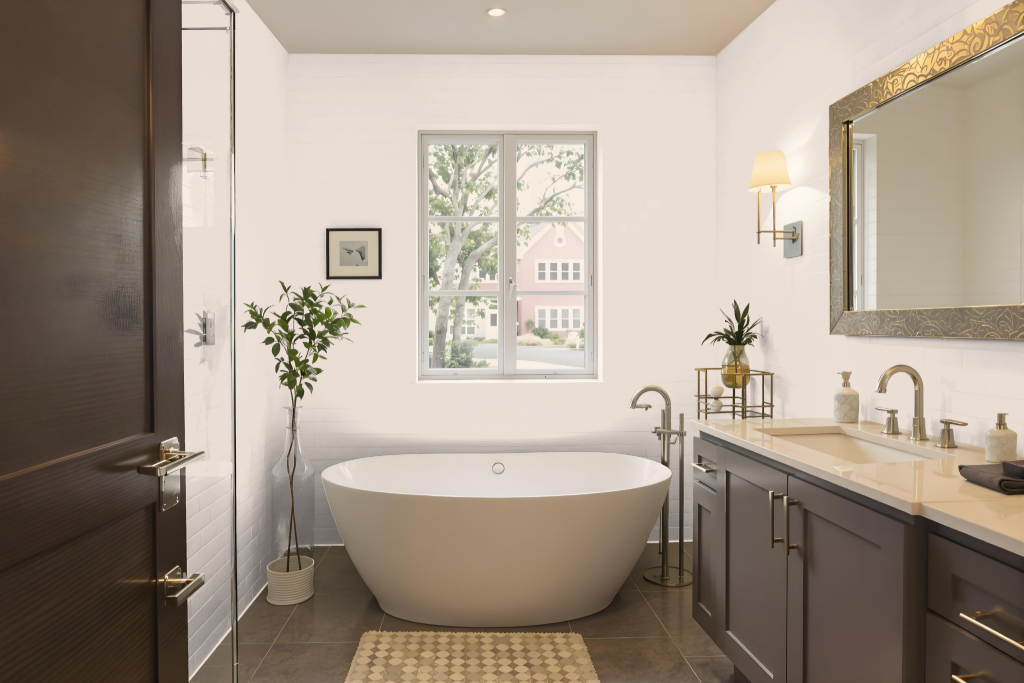
The bathroom is painted in Sherwin Williams Polite White SW 6056, lending the space a calm and serene atmosphere ideal for relaxation. This gentle hue reflects light effectively, enhancing the room’s perceived size and brightness when paired with lighter shades or complementary colors, and works harmoniously with a range of decor styles from modern to traditional.
Its subtle undertones maintain a consistent appearance even in varying light conditions throughout the day, ensuring that the calming backdrop remains uniform and inviting. Overall, this color creates a peaceful environment that enhances both the aesthetic and functionality of the space.
Bedroom
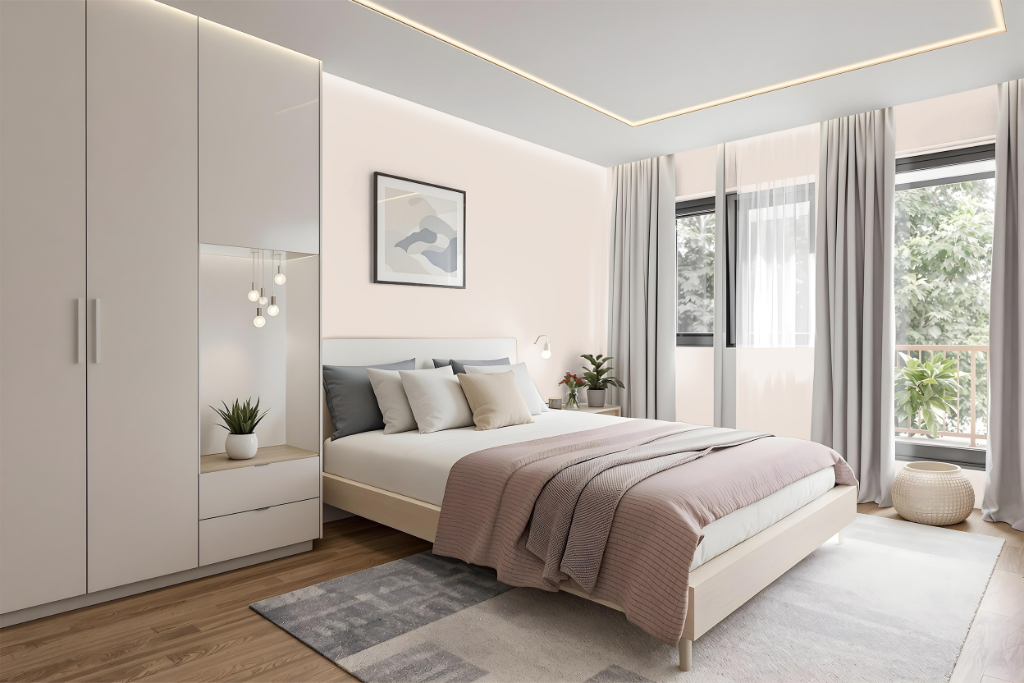
For a bedroom, Sherwin Williams Polite White sets a refined and inviting tone. It pairs seamlessly with lighter hues such as Lightweight Beige or with deeper tones like Malted Milk and Classic Sand, creating a cohesive and harmonious ambiance that enhances the space.
Using Polite White as a foundation, you can also introduce a dynamic contrast by incorporating green-inflected colors like Glass Bead and Morning at Sea, which add visual vitality. Alternatively, blending Polite White with adjacent tones on the color wheel fosters a soothing environment with a naturally coherent flow.
Kitchen
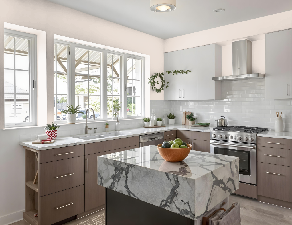
For a kitchen color scheme, Sherwin Williams Polite White (SW 6056) sets the tone for a harmonious and meticulously curated space. It works well in a monochromatic palette when paired with lighter and darker hues like Lightweight Beige, Malted Milk, Classic Sand, Likeable Sand, and Sand Dollar, maintaining a balanced and unified look throughout the room.
Alternatively, a complementary approach that introduces green hues such as Glass Bead and Morning at Sea can add vibrant contrast without overpowering the overall design. Serving as a neutral backdrop, Polite White allows key design elements—such as cabinetry and countertops—to stand out as focal points, ensuring both visual appeal and functionality in the kitchen environment.
Living Room
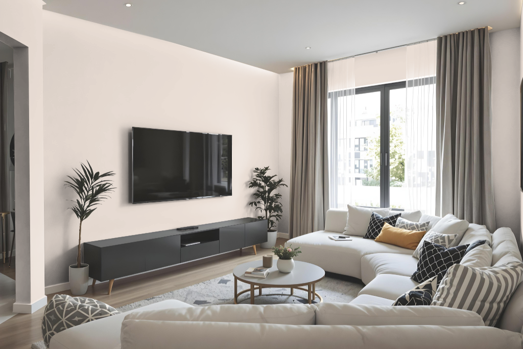
Living room color Sherwin Williams Polite White SW 6056 delivers a soft, serene ambiance that brings a sense of calm and sophistication to any space. Its gentle tone creates an inviting atmosphere ideal for relaxing living areas, bedrooms, and nurseries.
This neutral backdrop elegantly elevates both modern and traditional interiors. It harmoniously blends with lighter or darker accents for a cohesive look, yet can be paired with bolder hues to introduce a vibrant contrast.
Outdoor
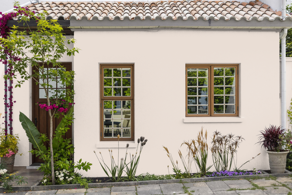
Sherwin Williams Polite White SW 6056 is a home outdoor color that delivers a soft and inviting ambiance enhanced by its subtle warm undertones. Its light-reflecting quality lends a gentle presence that works best on surfaces shielded from intense direct sunlight, ensuring that the color’s mild appearance is maintained even in brighter settings.
When incorporating this hue into your exterior design scheme, attention should be paid to its inherent red undertones. By carefully selecting complementary shades for accents and trim, you can achieve a harmonious look that enhances the overall character of your outdoor space.