Sherwin Williams Porpoise SW 7047, with its distinctive RGB values of 107, 100, 91, is often recognized as a warm taupe shade that blends the subtle elegance of gray with a hint of earthy brown. This versatile color adds a refined touch to both contemporary and traditional interiors, effortlessly creating a cozy and inviting atmosphere. Its muted tones make it an excellent choice for pairing with a wide range of accent colors, enhancing the overall aesthetic appeal of any space.
Color Description
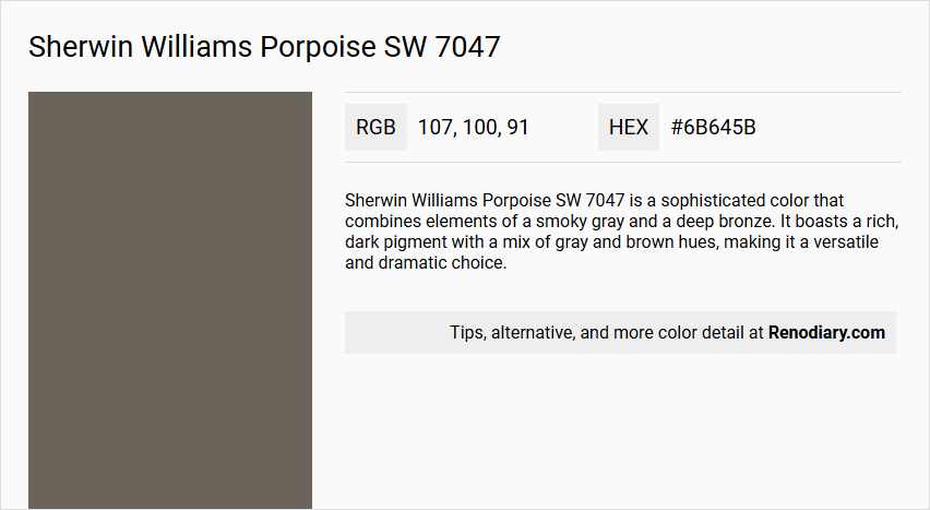
Sherwin Williams Porpoise SW 7047 is a sophisticated color that combines elements of a smoky gray and a deep bronze. It boasts a rich, dark pigment with a mix of gray and brown hues, making it a versatile and dramatic choice.
Undertones
The undertones are primarily brown and gray. In certain lighting conditions, the brown undertones become more prominent, and occasionally, a subtle green undertone may also appear.
Color Values
- HEX Value: #6B645B
- RGB: R: 107, G: 100, B: 91
- LRV (Light Reflectance Value): 13
Usage
- Interior: Ideal for creating a moody atmosphere in living rooms, bedrooms and works well on doors, furniture, and feature walls.
- Exterior: Suitable for exterior trim, doors, and other elements, particularly when paired with lighter neutrals like cream-colored siding.
Atmosphere
This color creates a dramatic and moody vibe, adding a sense of luxury and coziness. The bronze undertones contribute to a striking appeal, perfect for adding depth and elegance whether used indoors or outdoors.
Sherwin Williams Porpoise SW 7047 Color Alternative
Sherwin Williams Porpoise SW 7047 serves as a sophisticated base for a wide range of design schemes. Alternative options such as Tikkurila Chalet N485, Dulux City Fog 16GY 15/037, and Sherwin Williams Night Owl SW 7061 offer distinctive variations while preserving the nuanced feel of the original color. These complementary choices enable designers to experiment with subtle shifts in tone and atmosphere, ensuring that every space reflects a unique aesthetic vision.
Bathroom
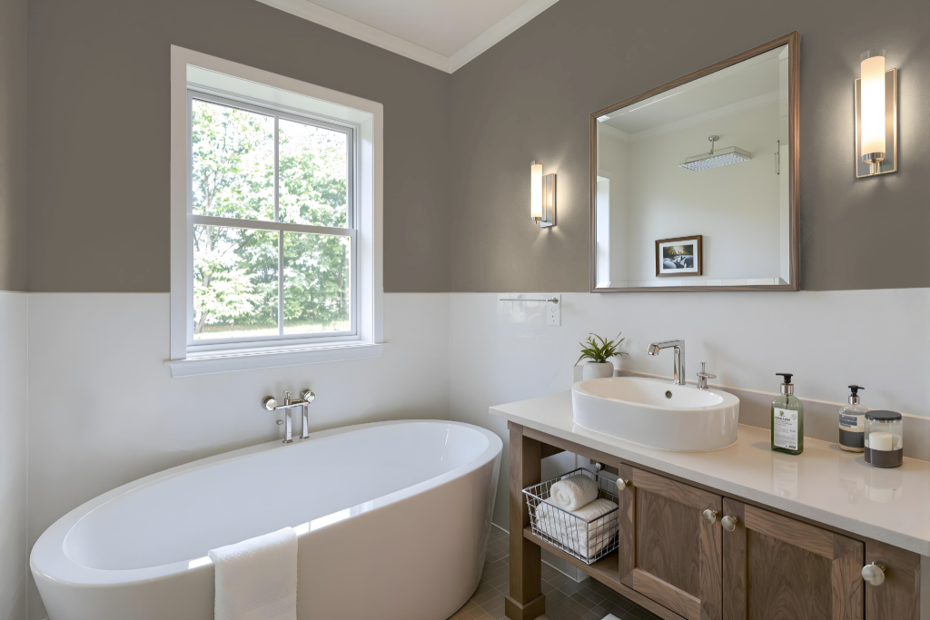
Sherwin Williams Porpoise SW 7047 is an excellent bathroom color that harmonizes with both warm and cool whites, creating a refined and cohesive atmosphere. Its earthy undertones add sophistication when paired with warmer lighting, enhancing areas like vanity mirrors.
Ideal for both main walls and accents on trim, cabinets, or doors, Porpoise brings depth and drama to the space. It works exceptionally well with natural tones and industrial-inspired fixtures, offering practical yet stylish potential for modern bathroom design.
Bedroom
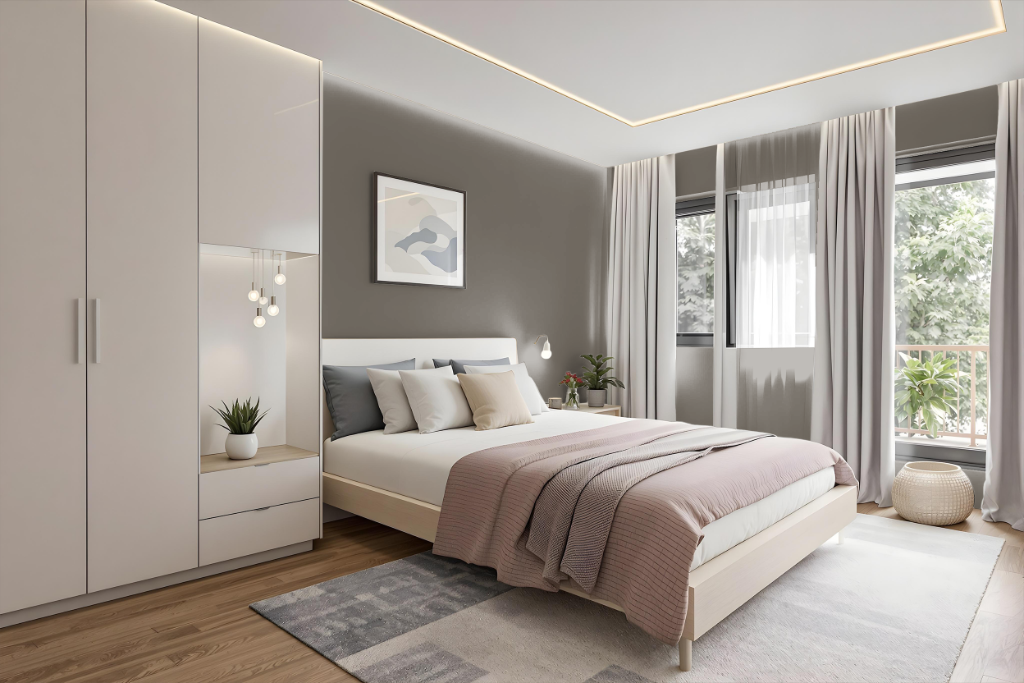
For a bedroom color scheme, Porpoise delivers a dramatic and cozy atmosphere that works exceptionally well on accent walls or around a fireplace. Its deep tone creates a moody vibe, making the room feel intimate and inviting.
Pairing Porpoise with lighter neutrals helps balance the dark intensity while maintaining a sense of airiness. Incorporating warm accents like bronze or gold in furnishings and lighting further enhances the luxurious feel, and using a monochromatic palette with complementary shades can seamlessly tie the aesthetic together.
Kitchen
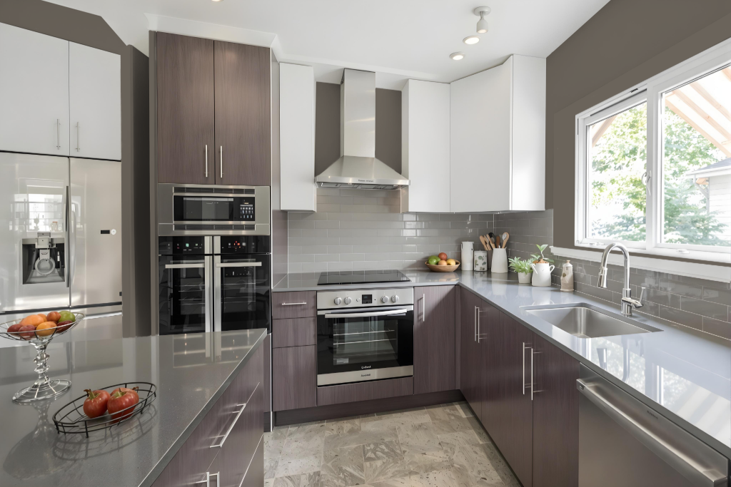
For a kitchen color scheme, Sherwin Williams Porpoise SW 7047 offers a dramatic, bold choice that creates an inviting space when paired with crisp whites like Pure White and warm neutrals such as Accessible Beige. Its depth harmonizes with lighter accents used on trim and walls, offering a cohesive balance that highlights architectural details and complementary elements.
Enhanced by dark contrasting accents like Tricorn Black and Austere Gray, the color works beautifully alongside beige or tan tile and honey oak finishes in cabinets and floors. This refined palette integrates seamlessly into modern settings, with carefully selected lighting and accessories adding texture and visual interest throughout the space.
Living Room
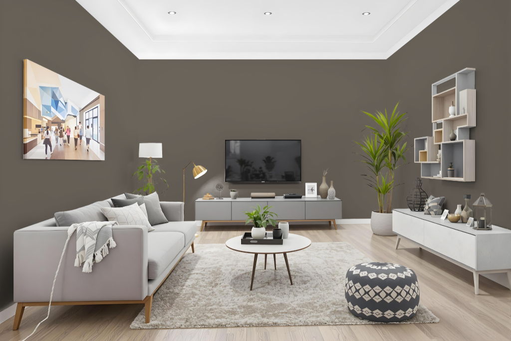
Sherwin Williams Porpoise SW 7047 is an excellent living room color choice that delivers a dramatic and luxurious appeal, perfect for creating a moody atmosphere, particularly on accent or feature walls such as around a fireplace. Its deep, rich pigment is balanced by warm, bronze undertones that add comfort and sophistication to the space.
Pairing this bold tone with lighter neutrals like Sherwin Williams Eider White SW 7014 or Shoji White SW 7042 helps maintain a bright and welcoming ambiance. Enhancements with bronze or gold accents on mirrors, light fittings, and trim further contribute to an upscale, sleek interior design.
Outdoor
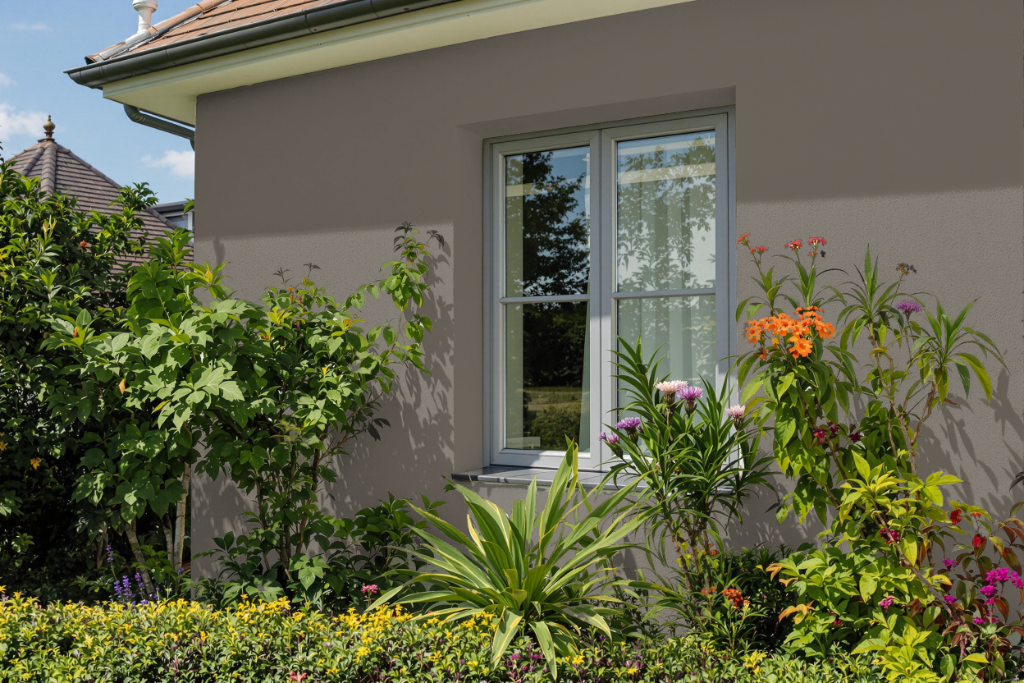
Home outdoor color Sherwin Williams Porpoise SW 7047 makes an excellent statement on exterior surfaces such as wood siding, shingles, and brick. It can serve as the main shade, supported by white and cream accents, or be used for finer details like trims and shutters.
This hue also lends itself to creating a rustic, distressed look, evoking a farmhouse vibe when paired with warm wood shutters and barn doors. It adds a bold touch to specific features such as doors while maintaining a harmonious balance with lighter tones across the overall exterior.