Sherwin Williams Privilege Green SW 6193, an elegant shade with RGB values of 122, 135, and 117, is popularly known as Sage. This subdued green boasts a harmonious blend of undertones that evoke a sense of tranquility and sophistication, making it an excellent choice for both contemporary and traditional spaces. Its versatile nature allows it to seamlessly complement a wide range of color palettes, enhancing the overall ambiance of any room.
Color Description
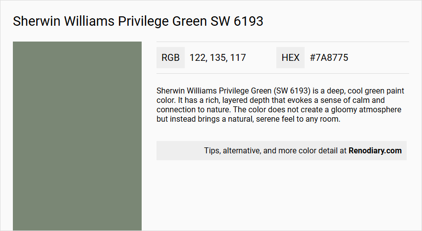
Sherwin Williams Privilege Green (SW 6193) is a deep, cool green paint color. It has a rich, layered depth that evokes a sense of calm and connection to nature. The color does not create a gloomy atmosphere but instead brings a natural, serene feel to any room.
Undertones
Privilege Green has prominent blue and gray undertones. These undertones are more noticeable in certain lighting conditions but generally remain in the background, enhancing the cool and calming effect of the color.
Color Values
- RGB: 122 R, 135 G, 117 B
- Hex Value: #7A8775
- LRV (Light Reflectivity Value): 23, indicating that the color reflects 23% of light and absorbs 77%, placing it on the darker side of the LRV scale.
Usage
Privilege Green is versatile and can be used in various rooms to create a relaxing atmosphere. It works well in bedrooms for maximum relaxation and can be balanced with other colors to suit different lighting conditions. For example, in north-facing rooms, it can feel icy, but pairing it with warm colors can mitigate this. In south-facing rooms, it balances the warmth of the natural light.
Atmosphere
The color creates a calm and serene atmosphere, enhancing the feeling of relaxation. It is particularly effective in creating a nature-inspired mood and can be paired with other natural-feeling neutrals to maintain this ambiance. When combined with coordinating colors like soft whites, grays, or warm yellows, it can balance the coolness and add a playful or elegant touch to the room.
Sherwin Williams Privilege Green SW 6193 Color Alternative
Sherwin Williams Privilege Green SW 6193 presents a distinctive hue, and designers looking for color alternatives have noted that Tikkurila K444, Tikkurila S448, and Tikkurila Mermaid V376 offer compelling options. Each of these alternatives provides unique tonal qualities and can be used to achieve a look that aligns with a variety of design aesthetics. While Sherwin Williams Privilege Green SW 6193 remains a classic choice, the Tikkurila options deliver versatility and creativity for any project.
Bathroom
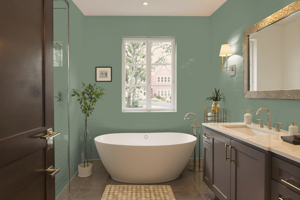
When using Sherwin Williams Privilege Green SW 6193 in a bathroom, this deep, rich shade creates a unique and calming atmosphere. Its bold hue stands out beautifully alongside crisp white cabinet tops and cool gray tiles, bringing balance and sophistication to walls and cabinetry alike.
To maintain its visual appeal, ensuring ample lighting is essential since the depth of this color can appear subdued in dim spaces. Coordinating with complementary neutrals such as Sherwin Williams Opaline or Eider White helps brighten the environment, enhancing light reflection and preserving the overall serene ambiance of the bathroom.
Bedroom
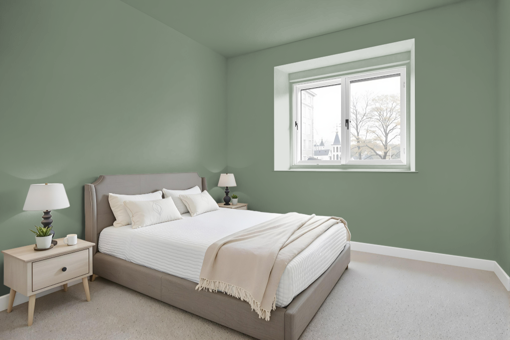
Sherwin Williams Privilege Green sets a serene tone for a bedroom, creating a calming and relaxing environment. Its gentle hue works beautifully with soft tones like clay white and chalky gray to enhance a tranquil atmosphere designed for rest.
Balancing the cooling presence of this shade with warm neutrals such as Sherwin Williams Jogging Path or Repose Gray can prevent the space from feeling too cold, particularly in rooms with limited natural light. Accentuating the look with trim options like Pearly White or Kilim Beige and introducing warm touches such as Friendly Yellow adds depth, ensuring the room remains inviting and conducive to deep relaxation.
Kitchen
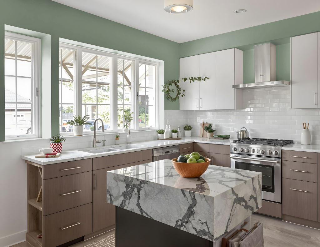
For a kitchen color scheme, Sherwin Williams Privilege Green SW 6193 creates a distinctive and appealing atmosphere. When applied to kitchen cabinets, it harmonizes beautifully with whites and off-whites, especially creamy tones on cabinetry combined with white or gray tiles to bring balance and warmth to the space.
To further enhance the inviting feel, it's important to use the shade in a well-lit area, ensuring its deep tone remains active without overwhelming the room. Complementary hues such as subtle wall colors or accent shades help mellow the cool character of Privilege Green, contributing to a naturally calming and balanced environment.
Living Room
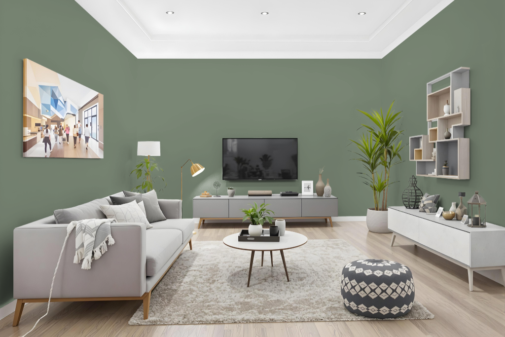
Sherwin Williams Privilege Green is an excellent living room color choice that adds depth and sophistication to any space. Its deep and cool tone is best showcased in a well-lit environment, where the nuances of the rich shade can shine. Pairing it with lighter, cool shades or more muted gray tones helps to create an engaging contrast, allowing the color’s character to elevate the overall atmosphere.
For added visual interest, consider incorporating crisp, light trim shades to preserve definition even in less illuminated areas. Accents in warmer hues can introduce a balanced contrast to the cool undertones, ensuring the room maintains a welcoming and harmonious aesthetic.
Outdoor
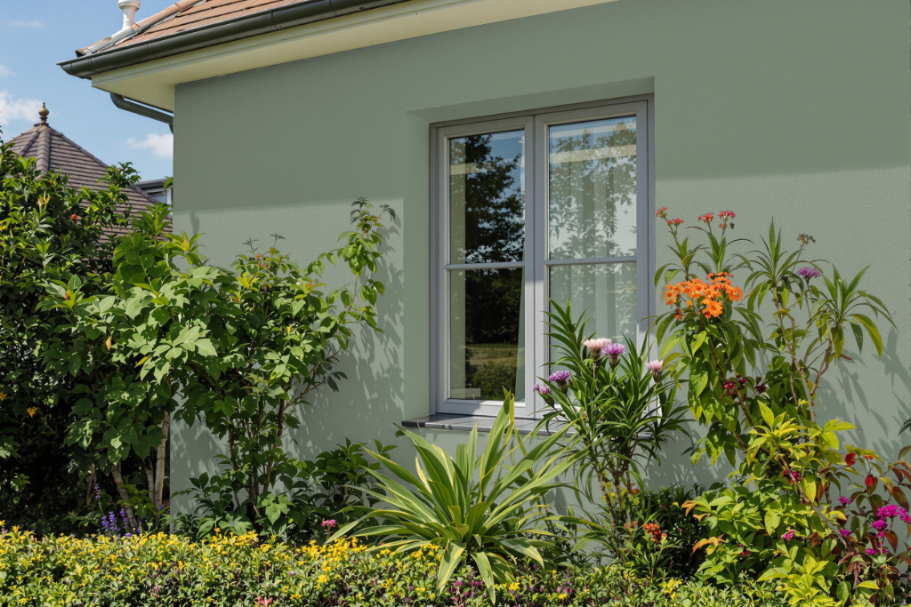
Sherwin Williams Privilege Green serves as an attractive home outdoor color that brings a sophisticated edge to exterior spaces. This deep, cool-toned shade enhances sunlit areas by absorbing light, making it ideal for sites with intense sunlight while potentially deepening the ambiance in shaded or northward settings. Its blend of cool hues works to counterbalance the warm intensity of south-facing exposures.
To achieve a harmonious finish, pairing this color with neutral or warm trim shades creates contrast that lifts the overall appearance without overwhelming the space. Careful attention to the surrounding lighting and environmental conditions ensures that the aesthetic appeal of Privilege Green remains intact across various outdoor settings.