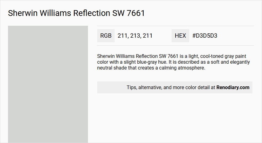
Sherwin Williams' Reflection SW 7661 is a sophisticated hue, characterized by its soothing and versatile light gray tones. Its balanced RGB composition of 211, 213, 211 gives it a subtle nuance, allowing it to fit effortlessly into various interior design styles, from contemporary to classic. This shade acts as a perfect backdrop, enhancing the ambience while maintaining a harmonious aesthetic in any room.
Color Description
Sherwin Williams Reflection SW 7661 is a light, cool-toned gray paint color with a slight blue-gray hue. It is described as a soft and elegantly neutral shade that creates a calming atmosphere.
Undertones
The undertones of Reflection SW 7661 are primarily blue, although some sources also mention a slight green undertone in certain lighting conditions. However, the dominant undertone is blue-gray.
Color Values
- HEX Value: #D3D5D3
- RGB Code: 211, 213, 211
- LRV (Light Reflectance Value): 66, indicating it reflects 66% of the light that hits it, making it a relatively light color.
Usage
Reflection SW 7661 is versatile and can be used in various rooms, including bedrooms, living rooms, bathrooms, and even exterior spaces. It pairs well with other neutral colors, dark blues, and certain tones of green and warm grays. It is particularly effective in creating a calming and serene atmosphere.
Atmosphere
This color creates a calming, elegant, and soothing atmosphere, making it ideal for spaces where relaxation is desired. It helps to create an illusion of a larger and airier space due to its light and bright nature.
Sherwin Williams Reflection SW 7661 Color Alternative
Sherwin Williams Reflection SW 7661 is renowned for its modern and adaptable appeal, making it a popular choice for various design projects. Color alternative for Sherwin Williams Reflection SW 7661 are: Tikkurila Batiste G487, Tikkurila Tailwind G486, Tikkurila G488, each providing a distinct interpretation that echoes the original’s character. These alternatives enable designers and homeowners alike to explore diverse finishing options while retaining the sophistication inherent in Sherwin Williams Reflection SW 7661.
Bathroom
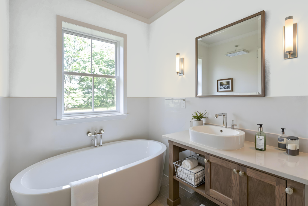
Sherwin Williams Reflection SW 7661 is an excellent bathroom color that creates a calming and elegant ambiance. It works seamlessly with elements like dark wood furniture, white cabinets, and gold accents, enhancing these hues without overwhelming the space.
This paint instills a spa-like feel in well-lit areas and can complement existing blue details with its balanced look. However, it is important to test the color in the actual bathroom setting, as its appearance may shift between cooler and warmer undertones depending on the lighting conditions.
Bedroom
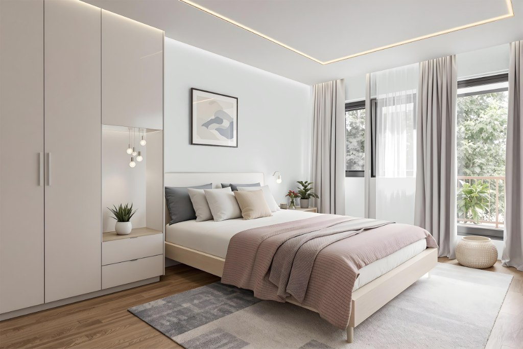
Sherwin Williams Reflection lends a calming presence to a bedroom, establishing a serene environment ideal for relaxation. Its soft tone harmonizes with cool-toned décor elements, including subtle shades of gray, black, and clean whites, thereby enhancing countertop materials and elegant moldings.
Optimally paired with cooler flooring like gray-brown, this color avoids clashing with warm wood tones that may intensify its inherent cool character. Additionally, combining it with deeper accents such as dark grays and navy blues creates a balanced look that fosters a peaceful retreat.
Kitchen
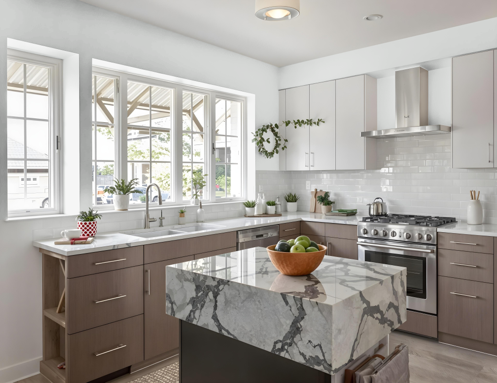
For a kitchen color scheme, Sherwin Williams Reflection SW 7661 brings sophistication and a calming ambience. This refined shade complements white cabinets and countertops and harmonizes with cool-toned materials like quartz and soapstone, setting a crisp, neutral backdrop.
Paired with trim colors such as Extra White, Pure White, or High Reflective White—or even a subtly blue-tinged option like Ice Cube—Reflection creates an airy, inviting space. Its light character maintains brightness in rooms filled with natural or artificial light, enhancing the overall aesthetic appeal of the kitchen.
Living Room
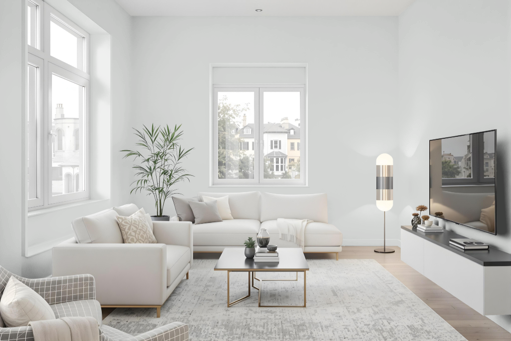
In living rooms, Sherwin Williams Reflection offers a soothing ambiance that pairs beautifully with cool white trim, creating an atmosphere that feels expansive and calming. This color, light enough to brighten spaces while retaining its character in direct sunlight, provides a refined backdrop for well-designed interiors.
Reflection also enriches bedrooms, bathrooms, kitchens, and dining areas by complementing both dark wood accents and white decor. Its consistent hue and ability to create a sense of tranquility make it an excellent choice for interiors, although its performance in direct sunlight is better suited to indoor use.
Outdoor

For your home's outdoor spaces, Sherwin Williams Reflection SW 7661 might seem appealing at first glance, yet it tends to lose its vibrancy in harsh sunlight, appearing nearly white as it fades throughout the day. This light shade can struggle to maintain its saturation when exposed to extensive sun, which may result in a less captivating curbside presence than expected.
While it can still be experimented with in exterior settings if its transformation is pleasing, its true strength lies in interior environments where its calming elegance is preserved. For outdoor applications where lasting depth is essential, selecting a color with stronger resistance to light exposure could ensure a more enduring and enriched appearance.