Sherwin Williams Relaxed Khaki SW 6149 exudes a soothing ambiance with its balanced tones that fall gracefully within the beige family. Its RGB composition of 200, 187, 163 provides a warm, earthy palette that complements a wide array of interior design styles, enhancing both modern and traditional aesthetics. This versatile hue, inspired by nature, effortlessly infuses spaces with a sense of calm and understated elegance.
Color Description
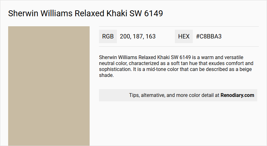
Sherwin Williams Relaxed Khaki SW 6149 is a warm and versatile neutral color, characterized as a soft tan hue that exudes comfort and sophistication. It is a mid-tone color that can be described as a beige shade.
Undertones
The undertone of Relaxed Khaki is accurately described as a red hue, which is evident when isolating the pure hue and eliminating any tints, tones, and shades.
Color Values
- HEX value: #C8BBA3
- RGB code: 200, 187, 163
Usage
Relaxed Khaki is highly versatile and can be used in various rooms such as living rooms, bathrooms, and other interior spaces. It works well as a main wall color or as an accent color. It complements a variety of color palettes and decor styles, including crisp whites, soft blues, deep greens, and rich browns.
Atmosphere
This color creates a serene and inviting atmosphere when paired with lighter colors like whites and soft blues. When combined with deeper colors like greens and browns, it produces an earthy and grounding feel. It adds a timeless elegance to any space, making it suitable for creating both calm and sophisticated environments.
Sherwin Williams Relaxed Khaki SW 6149 Color Alternative
Sherwin Williams Relaxed Khaki SW 6149 is celebrated for its warm, earthy tone that effortlessly complements a wide range of decor styles. Tikkurila Sandstone X463, Tikkurila H467, and Tikkurila Rope V459 serve as excellent color alternatives with subtle variations that maintain the original hue's inviting character. Each alternative lends its distinctive touch, allowing designers and homeowners to explore creative possibilities while staying true to the comforting essence of Sherwin Williams Relaxed Khaki SW 6149.
Bathroom
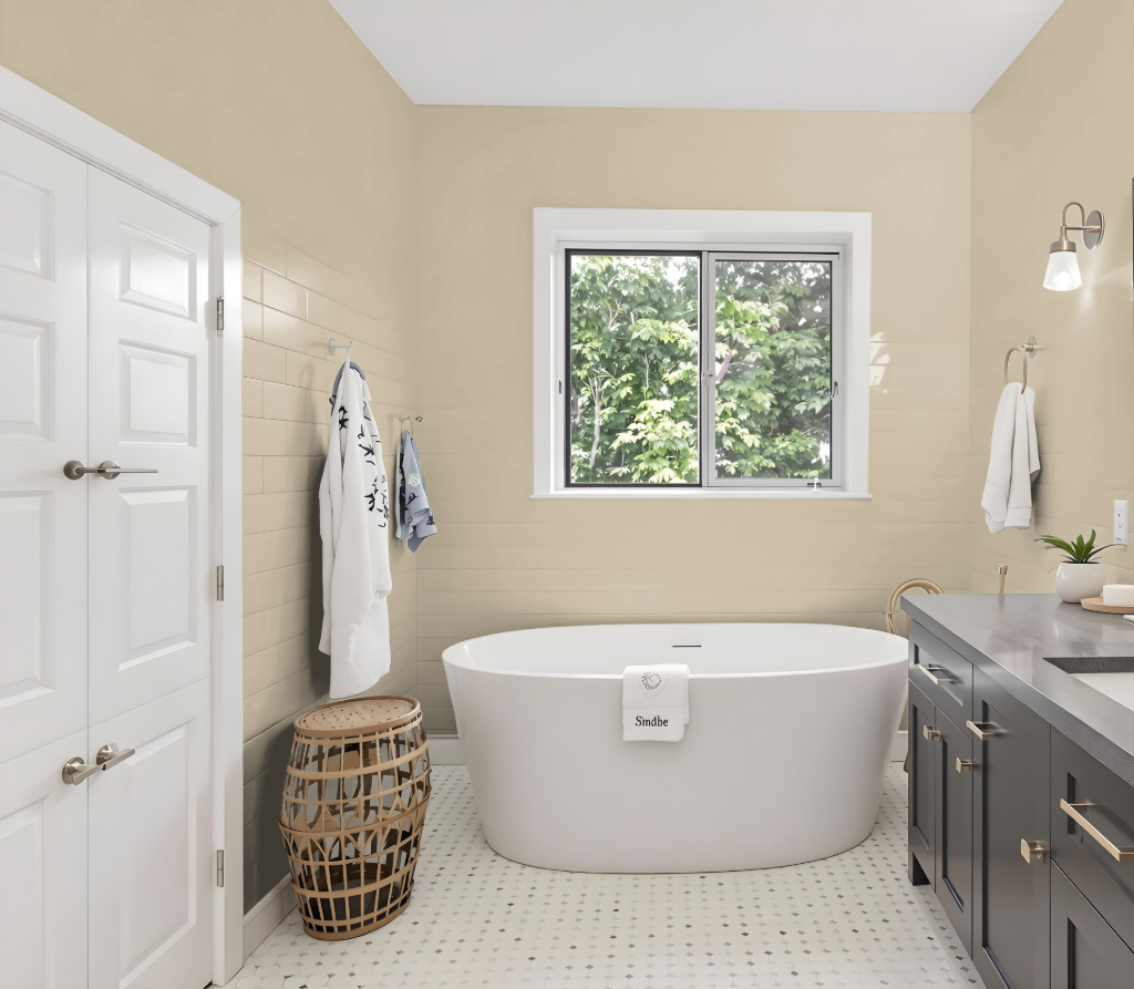
For a bathroom, Sherwin Williams Relaxed Khaki SW 6149 offers a comforting and refined backdrop that invites a serene atmosphere. It works well with crisp whites and soft blues for a light, airy feel or with deep greens and rich browns for an earthy, grounded look.
Using this color as a main wall shade or an accent can add timeless elegance to a bathroom space. Pairing it with complementary hues, such as shades of blue, creates a dynamic visual impact while a suitable finish like satin or eggshell ensures the wall meets the practical demands of moisture and cleanability.
Bedroom
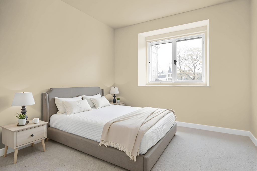
For a bedroom color, Sherwin Williams Relaxed Khaki SW 6149 sets a calming foundation that works well with crisp whites and soft blues to evoke a serene and peaceful atmosphere. This welcoming base can be enhanced with deep greens and rich browns, providing an earthy, grounding feel.
In a monochromatic approach, consider blending lighter shades like Dried Edamame or darker tones such as Khaki Shade and Avenue Tan to add nuanced depth. Alternatively, infusing complementary colors with a blue undertone brings a dynamic visual effect that livens the space without compromising tranquility.
Kitchen
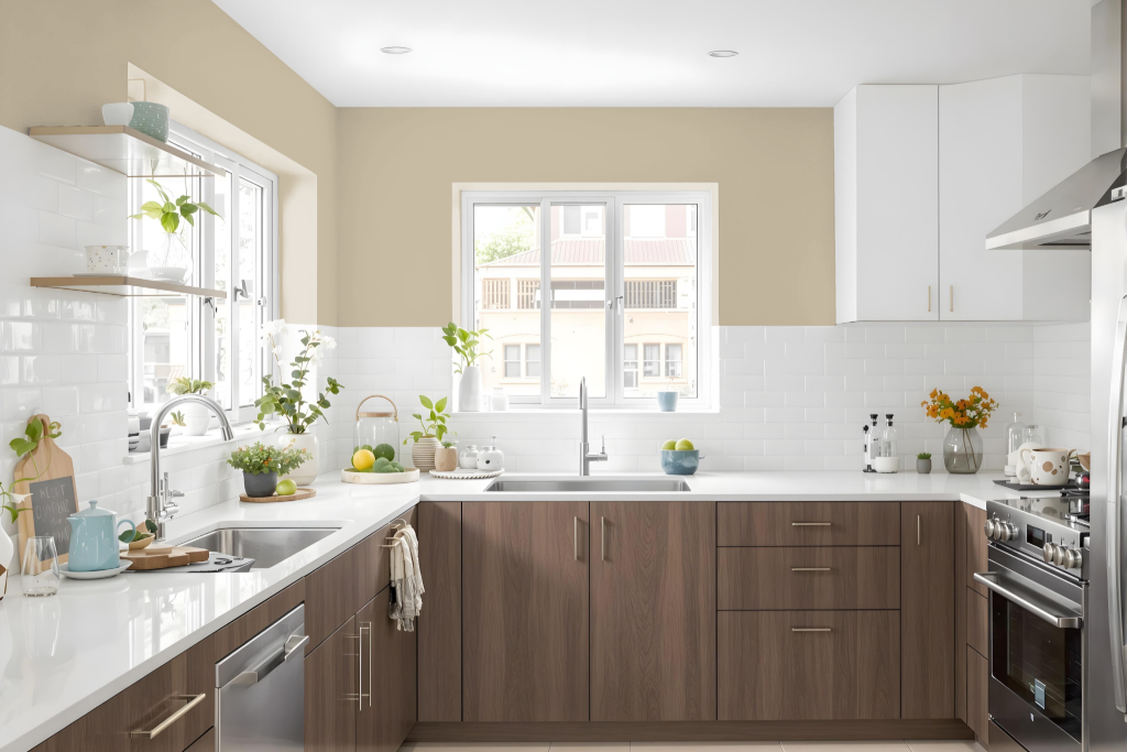
For a kitchen color scheme, Sherwin Williams Relaxed Khaki SW 6149 provides a warm and inviting ambiance, setting the stage for a space that feels both welcoming and sophisticated. This tone works beautifully when layered with crisp whites on trim and ceilings, creating a serene and clean backdrop that enhances the overall atmosphere.
Incorporating complementary hues such as deep greens or rich browns can evoke an earthy, grounding feel, while accents in blues add a vibrant contrast that livens the space. Used on kitchen cabinets and paired with natural stone surfaces, this color elevates the design by infusing it with both elegance and character.
Living Room
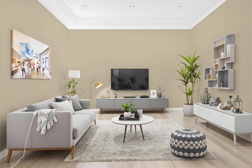
Sherwin Williams Relaxed Khaki SW 6149 is a popular living room color celebrated for its ability to harmonize with a range of decor styles. It pairs beautifully with crisp whites and calming blues to create a serene ambiance, while deep greens and rich browns bring out an earthy, grounded feel.
Whether applied as a dominant wall finish or a thoughtful accent, this shade adds timeless elegance to any room. It also works seamlessly with neutral hues to establish a cohesive look, and when contrasted with complementary tones, produces a striking and dynamic visual impact.
Outdoor
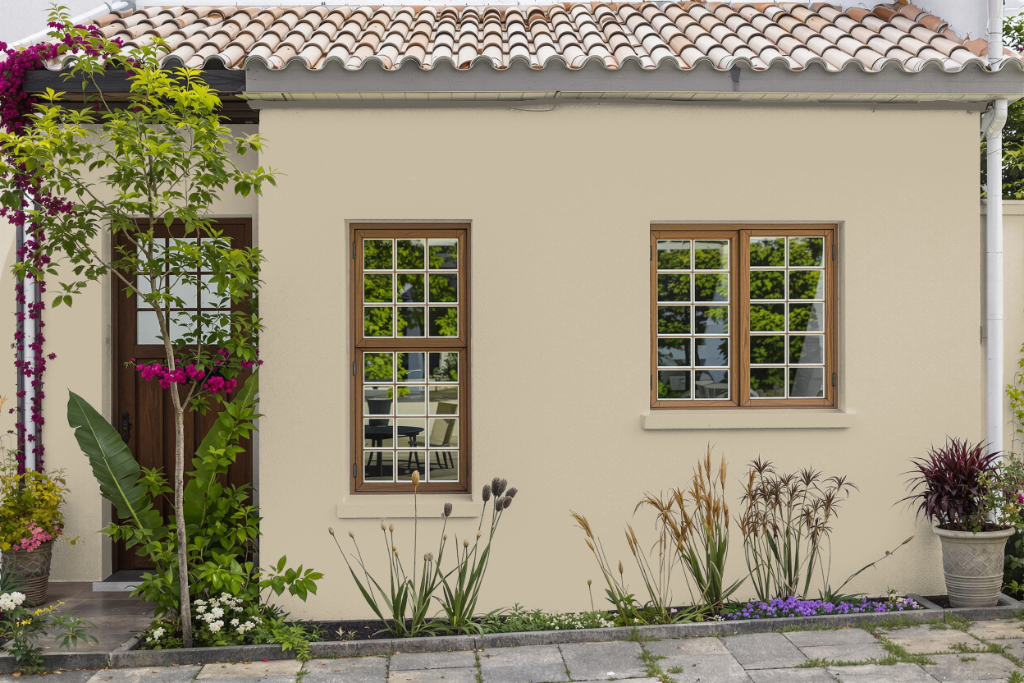
For home outdoor use, Relaxed Khaki offers a robust option that enhances your exterior with its enduring quality and appealing finish. Its custom spray paint formulation utilizes an acrylic enamel that dries quickly and adheres effectively to a wide range of surfaces, including metal, plastics, and previously painted wood, ensuring it withstands varying outdoor conditions.
When applying this color outside, be mindful that sun exposure and weathering may subtly alter its appearance over time, making it advisable to reapply the coating consistently for the best visual outcome. Using peel-and-stick samples to test the color on different surfaces and pairing it with hues like crisp whites, soft blues, deep greens, or rich browns can help you achieve a harmonious and inviting exterior design.