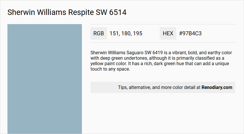
Sherwin Williams Respite SW 6514 is a soft and calming color that balances the tranquility of blue with the understated sophistication of gray. With its RGB composition of 151, 180, 195, this hue effortlessly enhances spaces with a serene ambiance, making it an ideal choice for rooms intended to promote relaxation and peace. Often described as a blue-gray, Respite subtly shifts between these tones depending on the lighting, providing a versatile and harmonious backdrop for diverse interior design styles.
Respite SW 6514 Color Details
- Color Description: Respite SW 6514 is a purple paint color, although it is sometimes categorized under the blue family due to its cool undertones.
- Undertones: It has cool undertones, which give it a calming and soothing appearance.
- Color Values: The color is represented by the hex code#97b4c3. It also features a Light Reflective Value (LRV) that indicates its light reflectance, though the exact LRV value is not specified in the provided sources.
- Usage: This color is suitable for both interior and exterior paint projects.
- Atmosphere: The cool undertones and calming hue of Respite SW 6514 create a serene and peaceful atmosphere, making it ideal for spaces where relaxation is desired.
Sherwin Williams Respite SW 6514 Color Alternative
Sherwin Williams Respite SW 6514 can be beautifully complemented with a trio of alternatives that offer distinct yet harmonious tones. Dulux River Valley 50BG 44/094, Sherwin Williams Faded Flaxflower SW 9146, and Benjamin Moore Slate Blue 1648 each provide a unique interpretation of the mood and ambiance intended by the original shade. These alternatives allow designers and homeowners the flexibility to explore varied lighting conditions and interior design themes while maintaining a sophisticated color narrative.
Bathroom
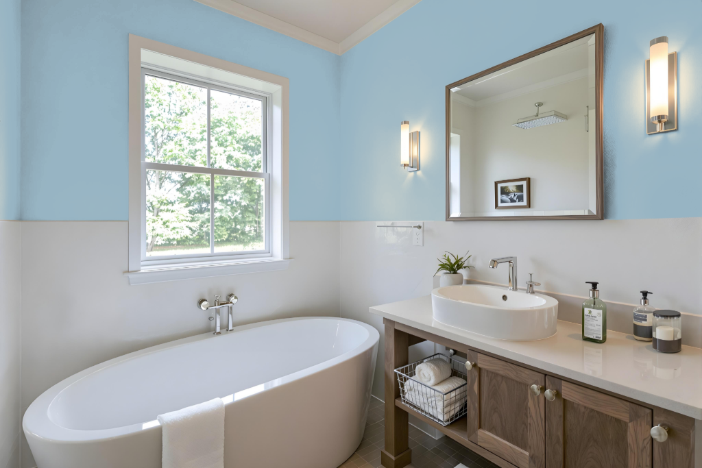
Sherwin Williams Respite SW 6514 creates a serene and calming atmosphere for a bathroom, making it a perfect backdrop for a peaceful retreat. Coordinating with soft neutrals like Repose Gray and Alabaster for trim or accents builds a harmonious palette, while richer shades can be introduced on cabinets or a statement wall to add striking contrast.
The blue undertone of Respite ensures it complements a range of bathroom fixtures and decor, fostering a cohesive and sophisticated look. Using peel-and-stick samples is an effective way to visualize the overall effect in your specific space before fully committing to the chosen color scheme.
Bedroom
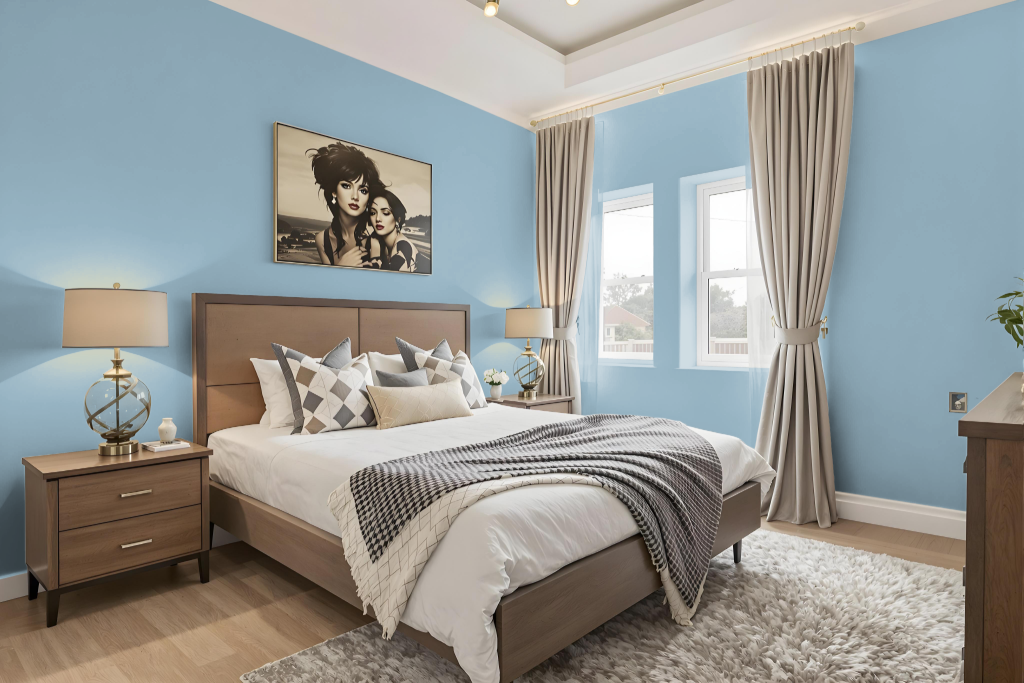
For a bedroom color scheme, Sherwin Williams Respite sets a calm and inviting tone that anchors the room's design. Pair it with soft neutral shades, such as a gentle gray and a light, creamy tone, for walls, trim, or furnishings to create a seamless, serene backdrop.
Introduce contrast by incorporating deeper, richer shades for elements like bedding, curtains, or accent pieces, and consider a monochromatic approach by varying the intensity of Respite itself. Adding occasional pops of complementary hues with a warm undertone can also infuse a touch of vibrancy while maintaining overall balance.
Kitchen
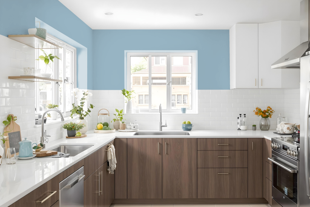
For a kitchen color scheme, Sherwin Williams Respite SW 6514 sets a serene and calming tone while lending a spacious, airy feel to the room. The medium-light shade forms the perfect backdrop for a harmonious palette, pairing beautifully with soft neutrals like Repose Gray and Alabaster.
Accentuate the overall design by incorporating deeper hues such as Anonymous or Underseas to introduce striking contrast. This design approach supports a cohesive and visually appealing space that can easily incorporate both monochromatic and complementary color arrangements.
Living Room
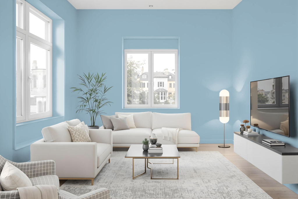
Sherwin Williams Respite serves as a living room paint color that creates a serene and sophisticated atmosphere. It pairs beautifully with soft neutrals like Repose Gray and Alabaster to establish a harmonious, calming palette, while accents in deeper tones such as Anonymous or Underseas add contrasting depth and character.
Respite adapts seamlessly to a variety of lighting conditions, making it suitable as either a primary wall hue or a highlight. It can also be integrated within a monochromatic or complementary color scheme to further elevate the visual appeal and create a balanced, inviting space.
Outdoor

Sherwin Williams Respite SW 6514 is an inviting choice for home outdoor color, boasting a medium light tone that reflects a moderate amount of visible light. With an LRV near 43, it skillfully balances the creation of a bright, airy feel with a more intimate ambiance, making it a compelling option for enhancing exterior spaces.
Part of the Living Well – Focus and Memory collections, this hue offers a serene backdrop that complements a wide array of design elements. Its balanced light reflectance and thoughtful design enable it to integrate seamlessly with other colors, fostering a harmonious and calming environment both indoors and outdoors.