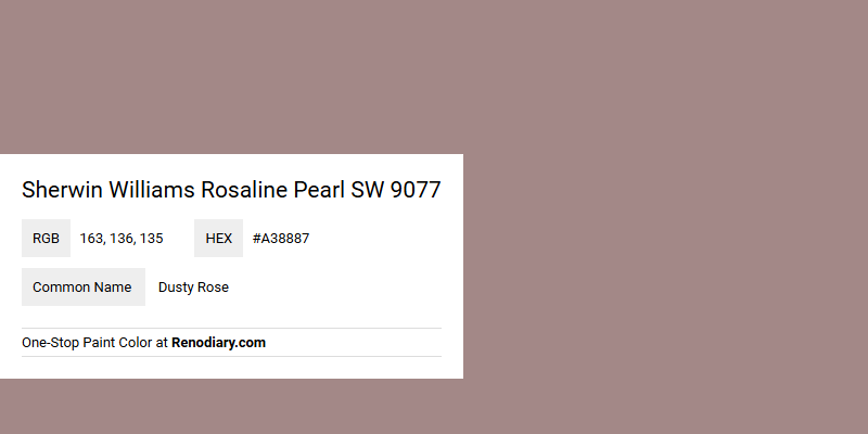
Sherwin Williams Rosaline Pearl SW 9077, often recognized by its RGB values (163,136,135), embodies the gentle and muted elegance of Dusty Rose. This particular shade is celebrated for its warm undertones, which evoke feelings of comfort and tranquility, making it a popular choice for both modern and vintage-inspired interior designs. Its versatile nature allows it to pair seamlessly with a variety of color palettes, adding a touch of sophistication to any space.
Color Description
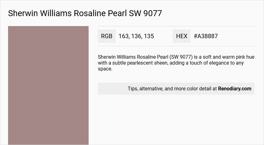
Sherwin Williams Rosaline Pearl (SW 9077) is a soft and warm pink hue with a subtle pearlescent sheen, adding a touch of elegance to any space.
Undertones
The undertone of Rosaline Pearl can be accurately described as a red hue.
Color Values
- HEX value: #A38887
- RGB code: RGB(163, 136, 135)
- CMYK values: 0.0%, 16.6%, 17.2%, 36.1%
Usage
Rosaline Pearl is ideal for bedrooms, nurseries, or living rooms. It pairs beautifully with shades of ivory, soft grays, and metallic accents to create a sophisticated and serene atmosphere. It can also be combined with complementary colors like SW 7008 Alabaster or SW 7015 Repose Gray for a harmonious look.
Atmosphere
Incorporating Rosaline Pearl into your interior design scheme can bring a sense of tranquility and femininity, creating a sophisticated and inviting atmosphere.
Sherwin Williams Rosaline Pearl SW 9077 Color Alternative
Sherwin Williams Rosaline Pearl SW 9077 boasts a unique appeal, and its color alternatives provide a refreshing range of options for designers seeking variety. Tikkurila Stonehenge V477 offers a warm, earthy tone that enhances contemporary spaces, while Tikkurila Bastion V467 brings a more subdued intensity for versatile applications. Adding further depth, Tikkurila Vulcanite S486 infuses an element of sophistication, ensuring that these alternatives maintain the distinct charm that Sherwin Williams Rosaline Pearl SW 9077 is renowned for.
Bathroom
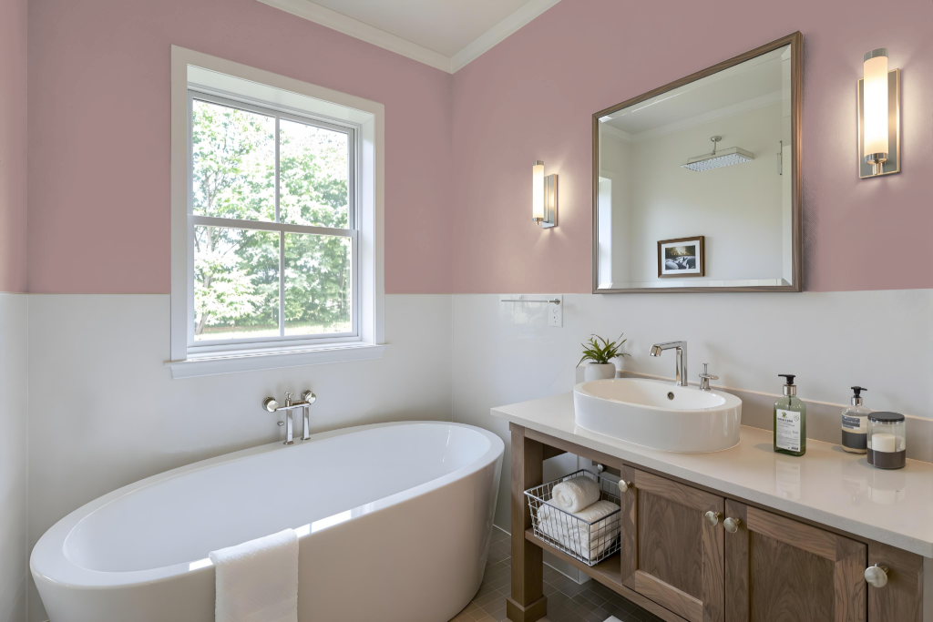
For a bathroom, Sherwin Williams Rosaline Pearl SW 9077 creates a distinctive and inviting environment, rich in warmth and character when paired with ample natural light. This unique hue transforms the space into a cozy retreat that exudes both charm and refinement.
To maintain a balanced atmosphere, consider complementing this standout color with nearby shades such as soft greens or muted neutrals to prevent visual overwhelm. Incorporating accents like metallic finishes or lighter, subtle tones further refines the overall ambiance, ensuring the bathroom remains both lively and serene.
Bedroom
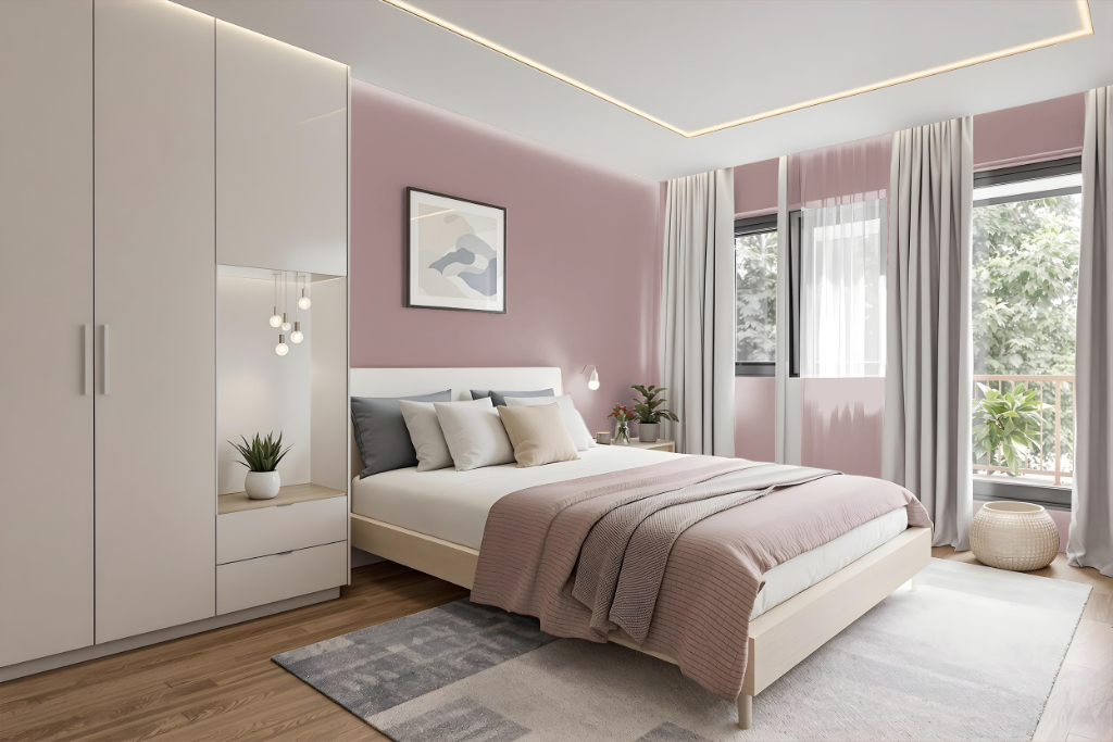
Sherwin Williams Rosaline Pearl is a refined choice for a bedroom palette that evokes both serenity and sophistication. When paired with complementary tones like ivory and soft grays—alongside subtle greens for a dynamic touch—the color creates an atmosphere of calm and understated elegance, ideal for spaces meant for rest and rejuvenation.
A layered approach using various tints and shades of this hue can add depth and interest to the room, while thoughtful accent decorations help prevent a monotonous feel. Accents in metallic finishes enhance the overall ambiance, contributing to a balanced and inviting environment for both relaxation and creativity.
Kitchen
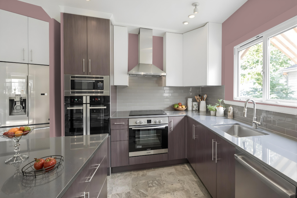
For a kitchen color scheme, Sherwin Williams Rosaline Pearl sets a warm, inviting tone that enhances the space's character. This hue works beautifully alongside soft ivory, gentle gray tones, and metallic accents—ideal for elements like cabinets, countertops, and lighting fixtures—to create a harmonious and sophisticated look.
To elevate the ambiance, consider playing with varying shades of Rosaline Pearl within a monochromatic palette or introducing complementary green hues such as Mountain Air or Niebla Azul for a dynamic contrast. Pairing this color with neutral tones like Alabaster or Repose Gray further adds an element of elegance and serenity to the overall design.
Living Room
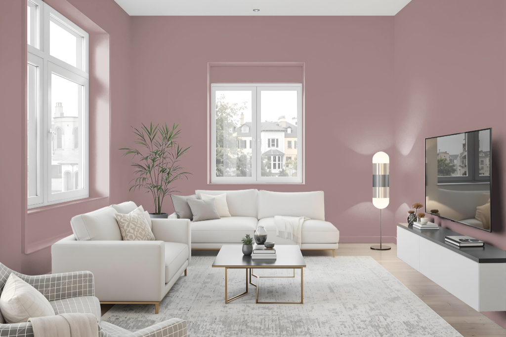
For the living room, Sherwin Williams Rosaline Pearl presents an elegant option that pairs beautifully with shades of ivory, soft grays, and metallic accents, creating a sophisticated and serene atmosphere. This carefully curated backdrop sets the stage for a tranquil space where femininity and refined style are accentuated.
Complementing this hue with tones such as Alabaster or Repose Gray further enhances the overall aesthetic. The subtle pearlescent sheen of Rosaline Pearl adds a touch of luxury, ensuring the room radiates a chic yet inviting ambiance.
Outdoor
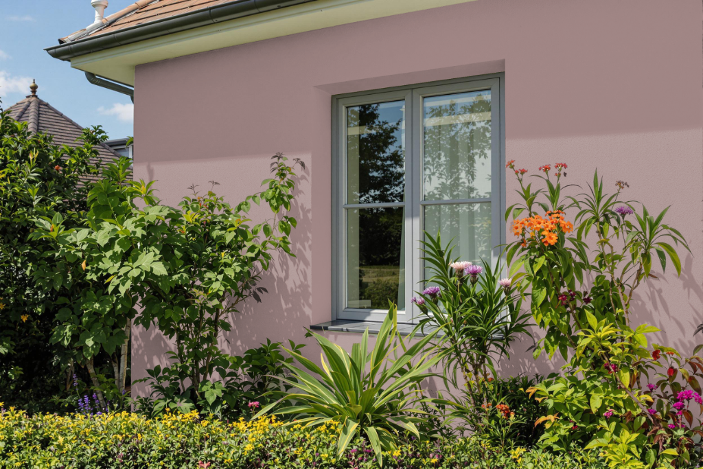
Sherwin Williams Rosaline Pearl offers a unique home outdoor color with a distinct red undertone. This particular shade is prone to fading, cracking, and peeling under prolonged exposure to sunlight and heat, as darker hues absorb more of these elements rather than reflecting them.
For exterior surfaces, it is advisable to choose high-quality 100% acrylic latex paints in lighter shades that better reflect heat and sunlight. This approach helps ensure a more durable finish and extends the life of the paint against challenging weather conditions.