Sherwin Williams Santorini Blue SW 7607, with its RGB composition of (65, 109, 131), offers a marine-inspired hue that straddles the line between muted teal and soft slate. This color embodies a serene blend of blue and green, evoking the tranquil yet invigorating essence of coastal landscapes. Its versatile shade makes it an ideal choice for creating calm and refreshing indoor spaces that emulate the natural beauty of Santorini's iconic vistas.
Color Description
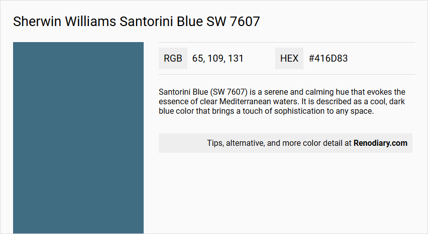
Santorini Blue (SW 7607) is a serene and calming hue that evokes the essence of clear Mediterranean waters. It is described as a cool, dark blue color that brings a touch of sophistication to any space.
Undertones
The undertone of Santorini Blue is predominantly blue, with no significant presence of other color undertones.
Color Values
- HEX: #416D83
- RGB: 65, 109, 131
- CMYK: 50.4%, 16.8%, 0.0%, 48.6%
Usage
This color is versatile and can be used in various rooms to create different atmospheres. It is suitable for bedrooms to create a serene oasis, living rooms for a coastal-inspired look, and kitchens and bathrooms to transform them into inviting retreats.
Atmosphere
Santorini Blue promotes a peaceful and harmonious atmosphere, infusing a sense of calm and serenity into the space. It helps in elevating the ambiance and creating a tranquil environment.
Sherwin Williams Santorini Blue SW 7607 Color Alternative
Sherwin Williams Santorini Blue SW 7607 stands out as an elegant and balanced hue, ideal for introducing a calm and inviting atmosphere into any space. Sherwin Williams Azure Tide SW 9684, Sherwin Williams Silken Peacock SW 9059, and Sherwin Williams Down Pour SW 6516 serve as vibrant color alternatives that echo similar oceanic cool tones while offering unique modern twists. Each option enriches design projects by providing versatile interpretations that maintain a connection to the timeless appeal of Sherwin Williams Santorini Blue SW 7607.
Bathroom
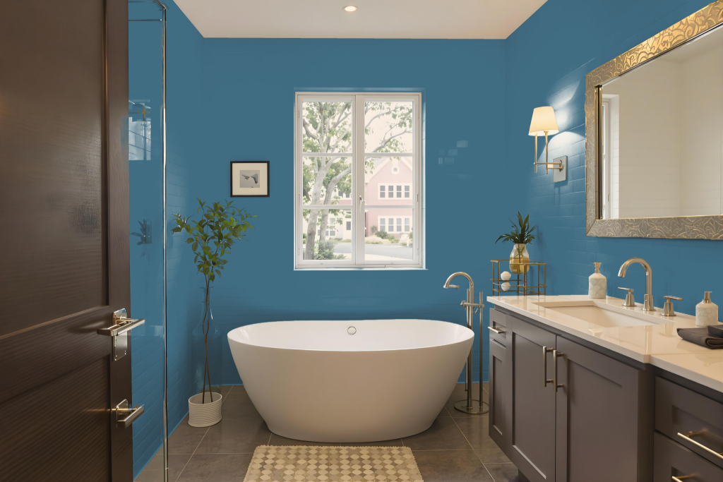
Sherwin Williams Santorini Blue SW 7607 is an excellent bathroom color, creating a calming and inviting atmosphere that transforms the space into a soothing retreat. It works harmoniously with crisp white accents to enhance brightness and cleanliness while contributing to an overall serene aesthetic.
This calming hue can be paired with lighter shades on ceilings and trims for a dramatic effect or offset with deeper colors to add sophistication. Its excellent performance in different lighting conditions makes it suitable for bathrooms of any size, guaranteeing a timeless and elegant look.
Bedroom
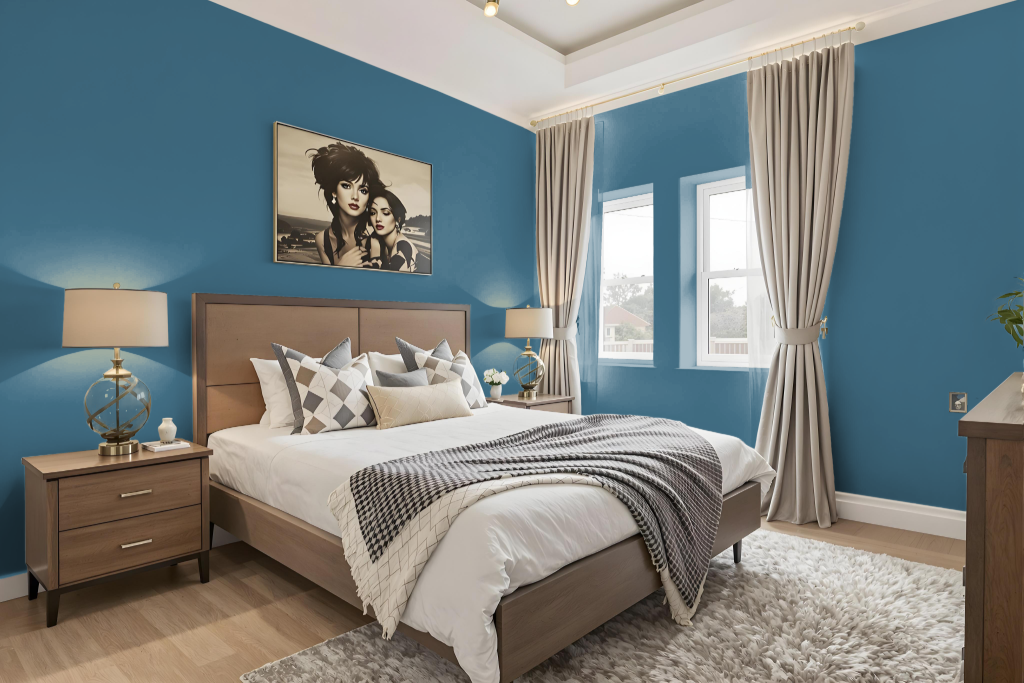
For a bedroom color scheme, Sherwin Williams Santorini Blue creates a calming and serene atmosphere that adapts beautifully to different lighting conditions. This hue sets the stage for a balanced design, especially when it is paired with complementary tones such as warm neutrals or gentle greens.
By incorporating lighter shades on multiple walls while designating the blue as an accent, you can establish a harmonious effect that complements dark wood furnishings and maintains a visually appealing balance. This approach ensures the space feels open and tranquil without becoming overpowering.
Kitchen
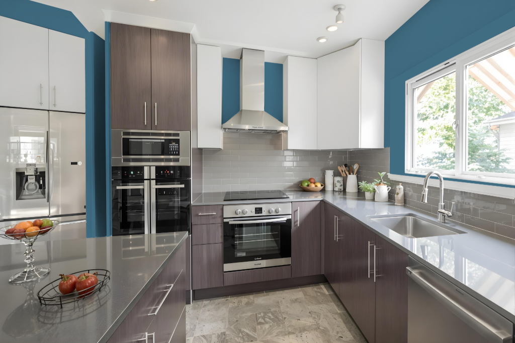
For a kitchen color scheme, Sherwin Williams Santorini Blue SW 7607 offers an inviting option that creates a serene, calming atmosphere. Its soothing quality makes it perfect for spaces where tranquility is key, setting the stage for a peaceful environment.
This hue pairs well with a range of coordinating colors. You can explore a monochromatic look with lighter and darker blue variations or introduce complementary tones with red or green undertones, such as those found in selections like Studio Mauve or Truly Taupe. Neutral shades including white, beige, and warm grays further balance the overall effect, ensuring the space remains dynamic without feeling overwhelming.
Living Room
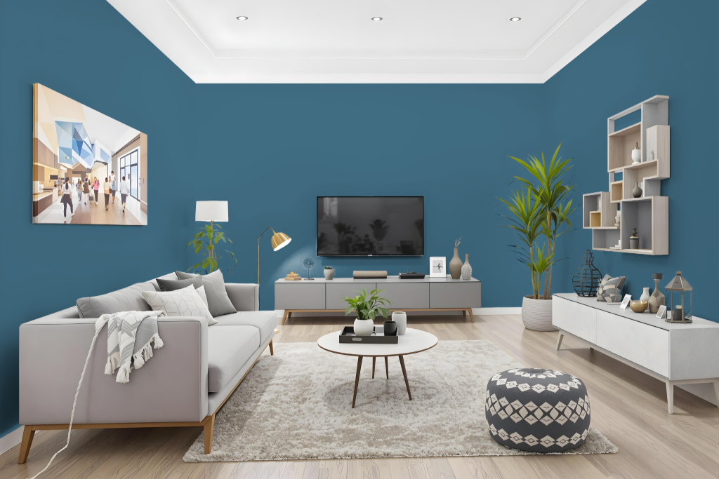
Sherwin Williams Santorini Blue SW 7607 is an ideal living room paint choice that imparts a calming and serene atmosphere. It creates a peaceful and inviting space while harmonizing with various lighting conditions and coastal-inspired decor styles.
The tranquil hue lends itself to both a monochromatic design—using varied shades, tints, and tones—and a complementary scheme with warmer accents, enhancing visual vibrancy. It also contributes to a consistent, soothing aesthetic in kitchens, bathrooms, and bedrooms throughout the home.
Outdoor
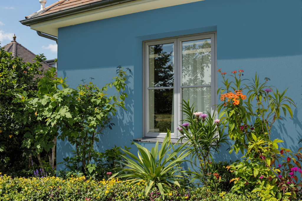
Sherwin-Williams Santorini Blue is a popular home outdoor color choice, though its formulation is not ideal for exterior use. Its characteristics do not address the rigorous demands of outdoor applications, which require a more robust solution.
For exterior projects, options like Sherwin-Williams Duration Exterior provide a superior level of protection against fading, cracking, and peeling. This product is engineered with advanced technology that enhances its durability and performance on surfaces such as vinyl siding, making it more suitable for withstanding various weather conditions.