Sherwin Williams Sea Salt SW 6204 is a subtle, muted green hue that evokes a calming and serene atmosphere, reminiscent of peaceful coastal landscapes. With its RGB composition of 205, 210, 202, it exhibits a soft balance between green and gray, often likened to the calming tones of sage. Its versatile nature makes it a popular choice for both interior and exterior spaces aiming to achieve a tranquil aesthetic.
Color Description
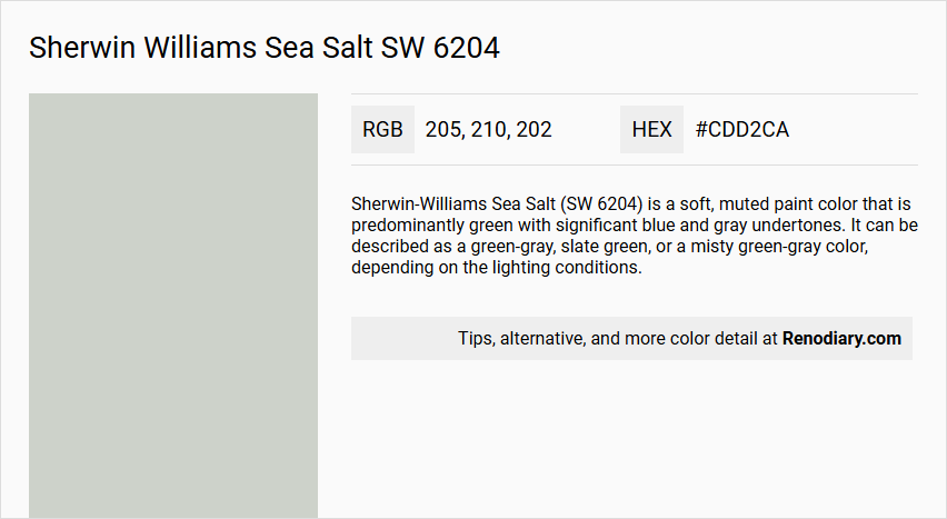
Sherwin-Williams Sea Salt (SW 6204) is a soft, muted paint color that is predominantly green with significant blue and gray undertones. It can be described as a green-gray, slate green, or a misty green-gray color, depending on the lighting conditions.
Undertones
Sea Salt has a complex undertone profile, featuring green, blue, and gray. The green undertone is more dominant than the blue, but the color can appear more blue-ish in cooler lighting conditions and more green in warmer lighting. It is often described as a chameleon color because its undertones change significantly with different lighting settings.
Color Values
- RGB: 204, 209, 200
- HEX: #CCD1C8
- Light Reflectance Value (LRV): 62.82
Usage
Sea Salt is highly versatile and can be used in various settings, including Coastal, Farmhouse, and Classic color schemes. It is suitable for rooms such as offices, mud rooms, laundry rooms, and calm, peaceful bedrooms. It works well with muted terra cotta floors and crisp white colors. However, it is recommended to avoid using it for large common spaces unless you are particularly fond of the palette.
Atmosphere
Sea Salt is a cool-toned color that creates a calm, bright, and spacious atmosphere. It makes rooms feel cool, crisp, and calm, making it an excellent choice for areas where relaxation is desired. It pairs well with warm neutrals like taupe and beige, and it complements pure white or off-white colors for trims and ceilings.
Sherwin Williams Sea Salt SW 6204 Color Alternative
Sherwin Williams Sea Salt SW 6204 is known for its soothing and modern hue, making it a favored choice for many designers and homeowners. Its color alternatives, Tikkurila Median X486, Tikkurila Sea Smoke X447, and Tikkurila Gorgonzola G444, provide distinct yet complementary shades that seamlessly blend with various design schemes. By opting for these alternatives, individuals can achieve a fresh and vibrant look while exploring new creative possibilities in their living spaces.
Bathroom
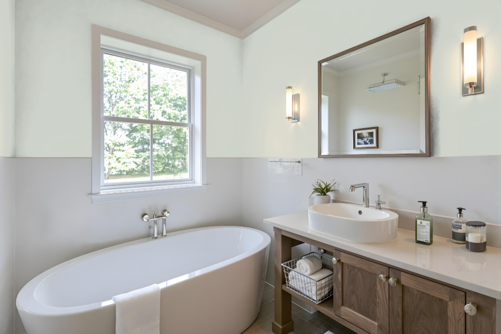
Bathroom color Sherwin Williams Sea Salt sets a calming tone ideal for a bathroom setting. The hue brightens and enlarges the space while imparting a soothing and tranquil atmosphere, making it a fitting backdrop that pairs exquisitely with crisp white or soft off-white trim. Its character is enriched when complemented by gentle neutral tones, adding a refined elegance to the room.
The color naturally adapts to varying lighting conditions throughout the day, preserving its inviting appeal under both natural and artificial illumination. This characteristic ensures it maintains its serene presence, enhancing the overall ambiance while offering a stylish yet timeless choice for bathroom decor.
Bedroom
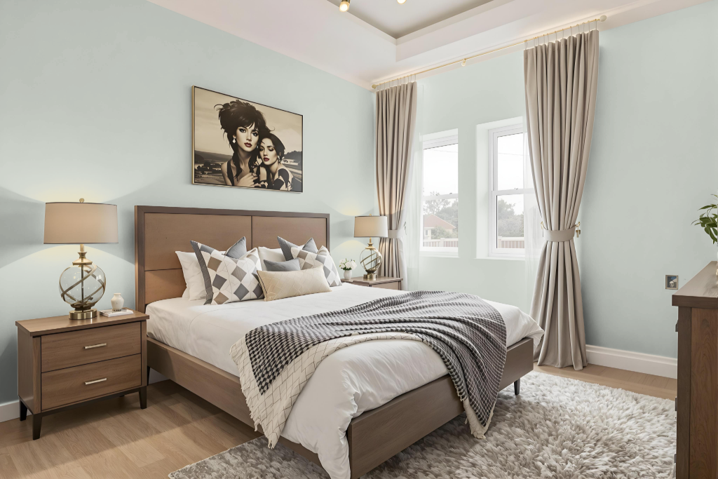
Sherwin Williams Sea Salt is a soothing and elegant choice for a bedroom color that creates a serene environment. It pairs beautifully with crisp white for trims and ceilings while harmonizing with natural woods, textured whites, and touches of black, lending the space both a beachy charm and refined sophistication.
In spaces with ample natural light, this shade reveals a brighter, more refreshing tone, whereas in lower light conditions, it maintains a soft, muted allure. Its ability to complement dark accents or harmonious shades enhances the overall ambiance, crafting a balanced retreat that feels both light and inviting.
Kitchen
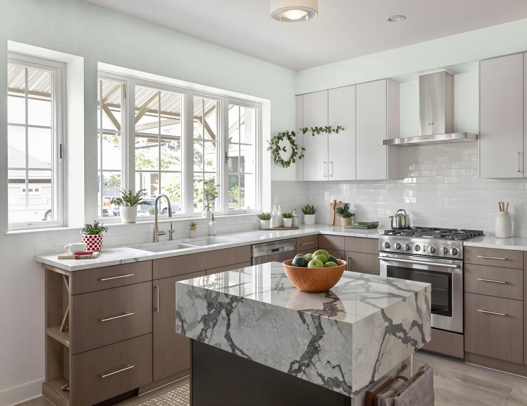
For a kitchen color scheme, Sherwin Williams Sea Salt SW 6204 brings a calming, water-inspired vibe that elevates the space. It works beautifully with various neutrals and whites—such as those used for trim and ceilings—to create a cohesive, clean look that harmonizes with the rest of the design.
In addition, Sea Salt pairs well with warm neutrals like taupe and beige and can be effortlessly combined with deep navy and soft grays when coordinating with cabinet choices. Its reflective quality helps to brighten kitchens with different lighting conditions, making it an excellent choice for creating a welcoming atmosphere.
Living Room
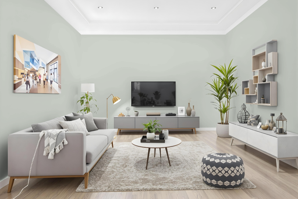
In living rooms, Sea Salt brings a soothing ambiance, creating a calm retreat with its understated charm when paired with muted terra cotta floors or crisp white trim and ceilings. This hue enriches spaces with a peaceful vibe that harmonizes well with warm neutrals like taupe and beige while brightening the room through its cool undertones.
The color adapts beautifully to Coastal, Farmhouse, and Classic design themes, offering a consistent look when matched with complementary trim and ceiling shades. Its appearance varies with different lighting conditions—appearing greener in warm light and more blue in cooler, diffused settings—so testing with samples is recommended to achieve the perfect effect.
Outdoor
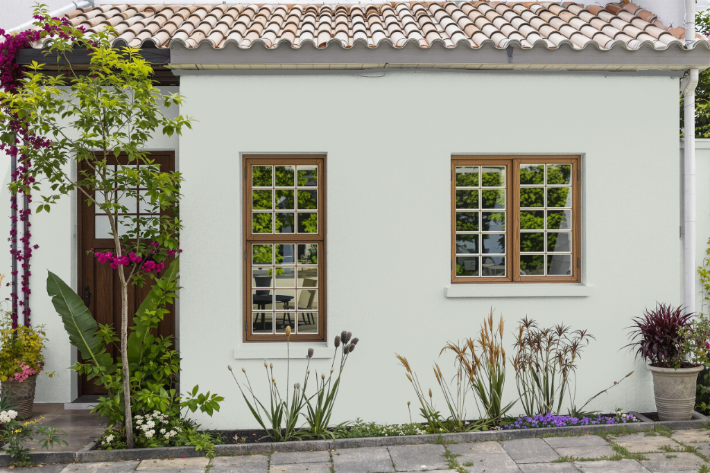
Sherwin-Williams Sea Salt (SW 6204) is a popular choice for home outdoor designs, particularly in coastal or farmhouse-style exteriors. Its appearance can vary with different lighting conditions, so it's essential to test the color in your specific outdoor space to ensure it meets your expectations in both bright sunlight and shaded areas.
When used outside, this calming hue pairs well with white trim and other neutral shades to create a cohesive look. For the best results, choose an exterior paint finish formulated to stand up to the elements, ensuring long-lasting protection and maintaining the desired aesthetic.