Sherwin Williams Shamrock SW 6454, identified by its RGB values 32, 81, 52, is often associated with the rich and vibrant hue known as Hunter Green. This color exudes a sense of lush verdancy, reminiscent of dense forests and the enduring depth of nature's palette. Ideal for creating a calming yet sophisticated atmosphere, Hunter Green brings a touch of timeless elegance to any space it adorns.
Color Description
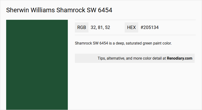
Shamrock SW 6454 is a deep, saturated green paint color.
Undertones
It has cool blue undertones, which contribute to its rich and vibrant appearance.
Color Values
The RGB values for Shamrock SW 6454 are 32, 81, 52.
Usage
This color is suitable for both interior and exterior paint projects, particularly recommended for living rooms or studies where a confident and charming mood is desired.
Atmosphere
Shamrock SW 6454 creates a confident, charming atmosphere, making it ideal for spaces where you want to draw attention and evoke a sense of depth and warmth.
Sherwin Williams Shamrock SW 6454 Color Alternative
Sherwin Williams Shamrock SW 6454 offers a timeless hue that inspires creativity, and its color alternatives present designers with fresh options to evoke a similar feel. Dulux Pine Needle 07GG 07/143, Sherwin Williams Hunt Club SW 6468, and Sherwin Williams Derbyshire SW 6741 each bring a distinctive character to projects while maintaining the vibrant spirit of Sherwin Williams Shamrock SW 6454. These alternatives not only complement the original shade but also empower designers to explore varied textures and moods in their artistic endeavors.
Bathroom
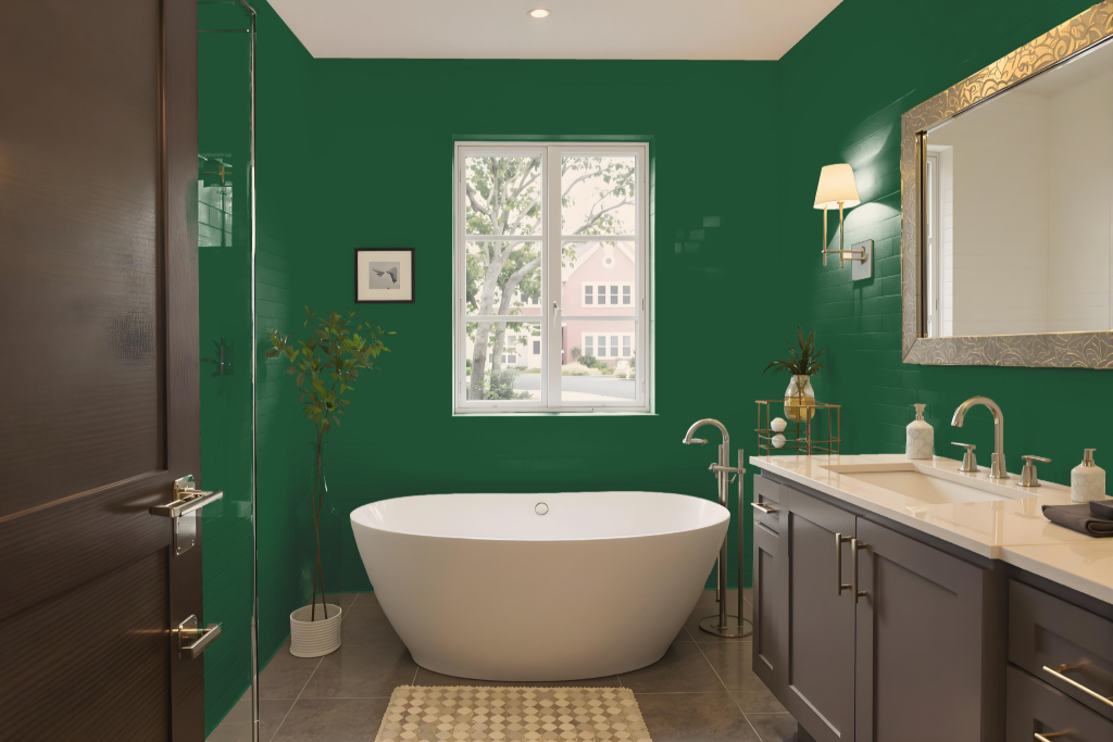
Sherwin Williams Shamrock SW 6454 is a bold, dark green shade designed for bathrooms seeking a cozy, nature-inspired ambiance. Its deep tone absorbs a significant amount of light, which contributes to an intimate atmosphere in the space.
When used alongside lighter hues on ceilings, trims, or accent pieces, this color can harmonize with other bathroom elements like tiles, baths, and sinks to create a balanced, functional environment. The overall lighting and surrounding décor play key roles in maximizing its warm, inviting character.
Bedroom
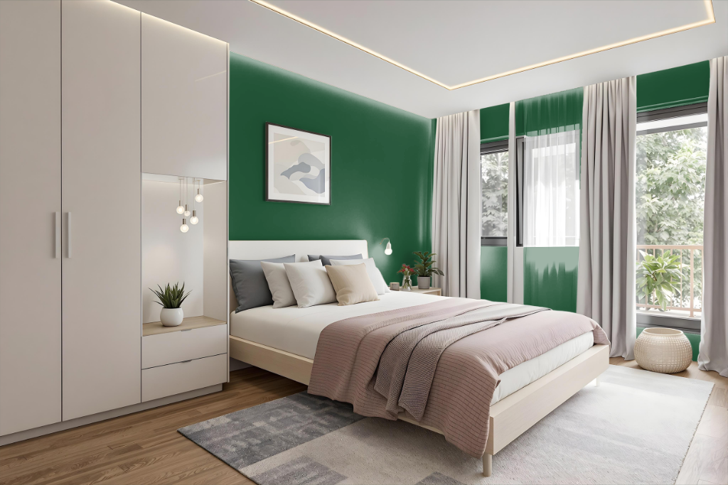
Sherwin Williams Shamrock SW 6454 is an excellent bedroom color that creates a tranquil yet playful atmosphere, making the space feel intimate and cozy—perfect for relaxation. Its deep hue establishes an inviting mood, enhancing the room’s capacity as a personal retreat.
This color can be effectively paired with lighter shades to balance the ambiance or employed within a monochromatic scheme for a unified look. Additionally, it pairs beautifully with complementary tones like purple to add a dynamic visual contrast while evoking a serene, naturally inspiring environment.
Kitchen
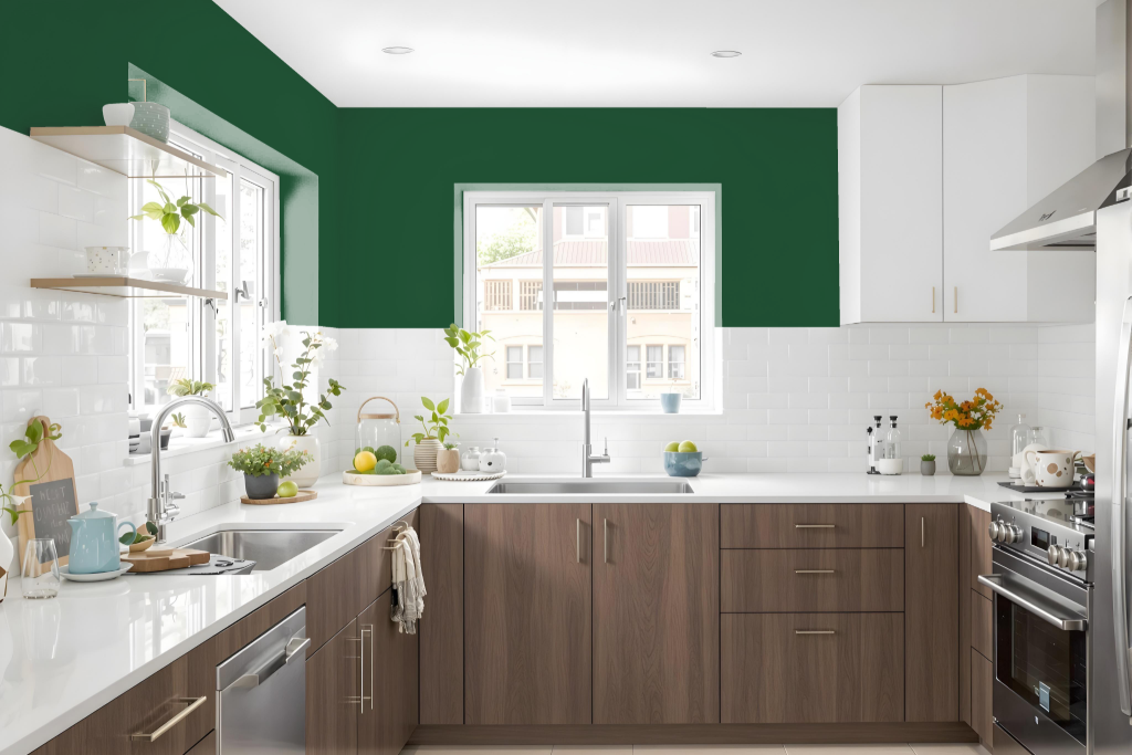
For a kitchen color scheme, Sherwin Williams Shamrock SW 6454 introduces a deep green tone that sets a cozy and intimate atmosphere. Its dark character invites the use of complementary shades with a purple hue to create a vibrant dynamic, enhancing the richness of the overall look.
Pairing this bold color with a monochromatic approach—using various shades, tints, and tones of green—can maintain harmony throughout the space. Using this deep green on accent walls or cabinets adds depth and character, while lighter colors on surrounding surfaces help balance the intensity and ensure the kitchen feels inviting and well-proportioned.
Living Room
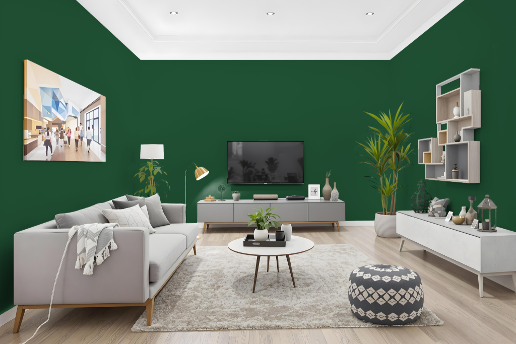
Sherwin Williams Shamrock SW 6454 is a living room color that provides a unique and intimate ambiance with its deep, absorbing hue. Its low light reflectance transforms a space into a confident and inviting retreat, making it an excellent choice for areas where a bold yet refined mood is desired.
This striking color delivers a saturated impact in settings like living rooms and studies, enhancing the room’s overall character. It is recommended to examine a physical color sample under actual lighting conditions to ensure the depth and feel align with your design vision.
Outdoor
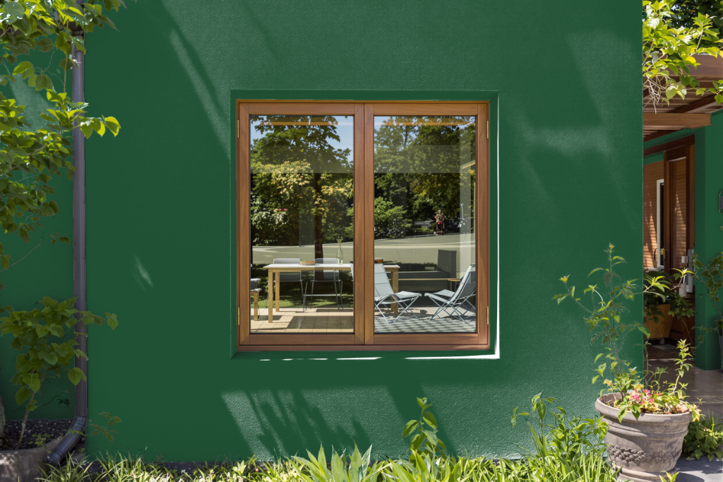
For home outdoor color, Sherwin Williams Shamrock SW 6454 offers a bold appearance that may face durability challenges. Its dark, saturated tone is more prone to absorbing sunlight and heat, which can contribute to fading, cracking, or peeling over time compared to lighter alternatives.
To counter these issues, opting for high-quality exterior paint designed to resist weather-related wear can help preserve the color’s longevity. Additionally, the way this hue appears may vary across different surfaces and under changing lighting conditions, so testing its look on the intended area is recommended.