Sherwin Williams Softer Tan SW 6141 is a warm and inviting shade, characterized by its subtle balance of beige and cream tones. With its RGB composition of 218, 202, 178, it offers a versatile and neutral palette that complements a wide range of interior designs. This shade of tan brings a sense of coziness and sophistication to any space, making it a popular choice for homeowners and interior decorators alike.
Color Description
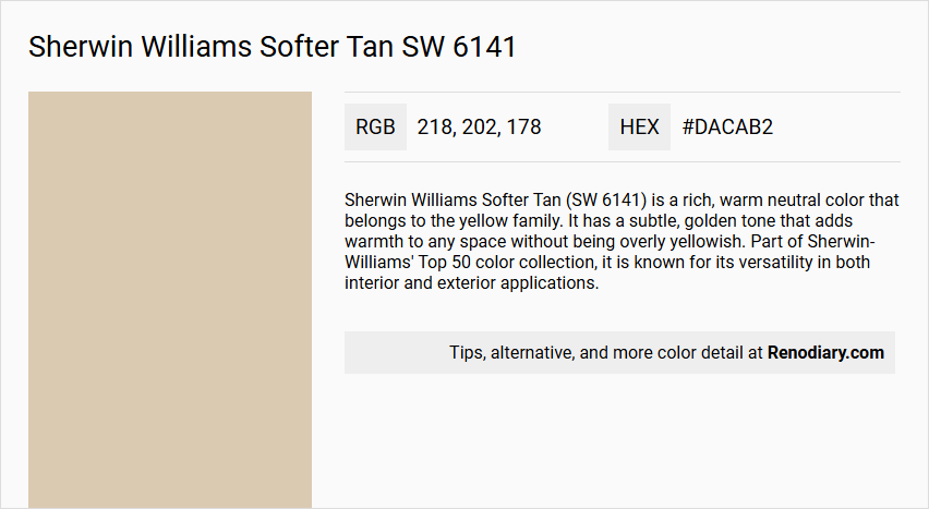
Sherwin Williams Softer Tan (SW 6141) is a rich, warm neutral color that belongs to the yellow family. It has a subtle, golden tone that adds warmth to any space without being overly yellowish. Part of Sherwin-Williams' Top 50 color collection, it is known for its versatility in both interior and exterior applications.
Undertones
Softer Tan has a complex undertone profile, featuring yellow, orange, and green undertones. The yellow and orange components contribute to its warm character, while the green undertones prevent the color from feeling overly pink or red-leaning, giving it a soft golden glow.
Color Values
- Light Reflectance Value (LRV): 60
- RGB Decimal: 218, 202, 178
- Hex Code: #DACAB2
- CMYK Percentage: 0, 8, 19, 14
Usage
- Works well in large spaces, bathrooms, kitchens, and open floor plans due to its ability to reflect and absorb light evenly.
- Can be used as a main wall color or as an accent wall color.
- Pairs well with other colors, making it suitable for both modern and traditional decor.
- Suitable for both outdoor and indoor settings, and it complements natural materials like jute rugs.
Atmosphere
Softer Tan creates a warm and inviting atmosphere, contributing to a cozy and energetic space. Its balance of warm and cool undertones prevents it from feeling overly warm or cold. This balanced neutrality promotes a sense of well-being and enhances natural lighting in a room, particularly in southern-facing spaces where the color appears lighter and warmer.
Sherwin Williams Softer Tan SW 6141 Color Alternative
Sherwin Williams Softer Tan SW 6141 has inspired several intriguing alternatives in the market, offering designers a chance to explore various expressions of warmth and balance in interior and exterior applications. Tikkurila Chai H459 and Tikkurila Repose H450 present themselves as compelling options for those who appreciate a refined yet distinct touch, while maintaining a connection to the inviting character of the original color. Additionally, Dulux Raw Cashmere 40YY 60/103 provides a versatile choice that complements both modern and traditional design aesthetics, ensuring a rich palette of possibilities when considering an alternative to Sherwin Williams Softer Tan SW 6141.
Bathroom
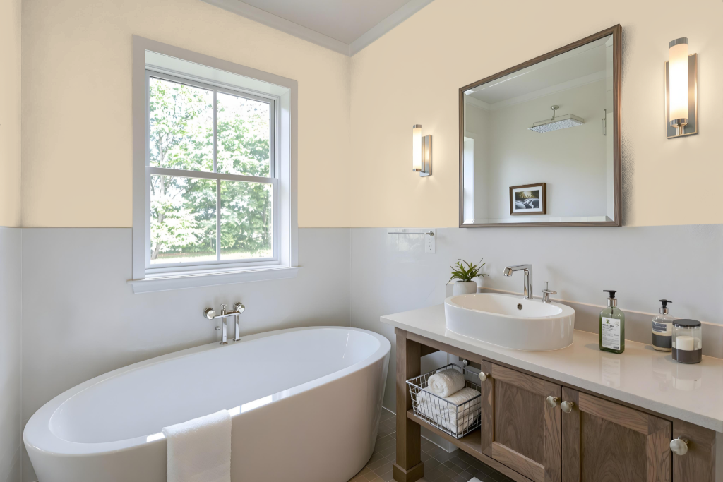
For a bathroom, Sherwin Williams Softer Tan SW 6141 provides a calming and inviting atmosphere. Its soft, warm tone works beautifully in spaces with average to good natural light, ensuring the color remains airy and balanced without feeling overly heavy. The hue harmonizes with a range of fixtures and design elements, blending seamlessly with warm-toned woods, soft whites, and even cooler accents like blues and greens that subtly emphasize its inherent warmth.
To enhance the overall design, consider pairing this serene backdrop with a warm white for trims and cabinetry to bolster a cohesive, soothing look. Testing the color under your specific lighting conditions is recommended, as it helps ensure that the rich undertones and welcoming ambiance align perfectly with your bathroom’s unique environment.
Bedroom
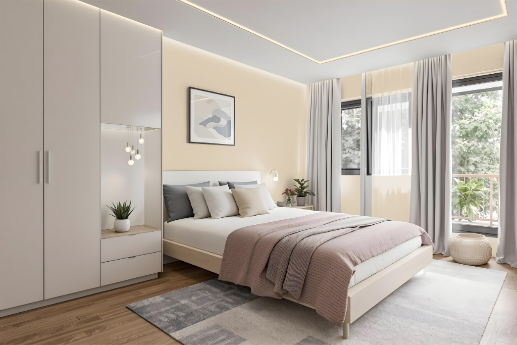
For a bedroom color scheme, Sherwin Williams Softer Tan is a calming neutral that adapts to varied lighting conditions—appearing cooler and darker in north-facing rooms while looking lighter and warmer in southern spaces. Its soothing quality creates an inviting and balanced atmosphere that serves as an ideal backdrop for the room's design.
Enhance this ambiance by pairing Softer Tan with complementary blue hues such as Tarragon or Rain Cloud to introduce vibrant contrast, or choose harmonious analogous shades like Classic Sand or Acanthus for a more unified look. Incorporating accent trim colors such as Moderate White or Threaded Loom further ties the overall design together, resulting in a seamless and engaging bedroom space.
Kitchen
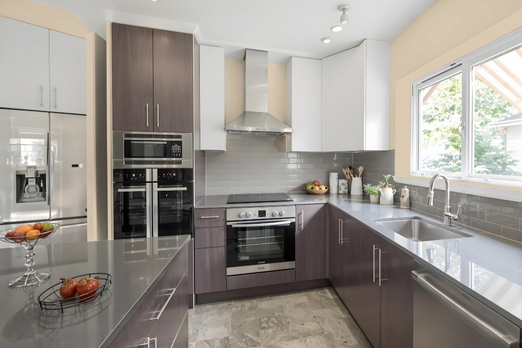
For a kitchen color scheme, Sherwin Williams Softer Tan SW 6141 creates an inviting, warm neutral backdrop that sets the stage for a welcoming space. Pair this inviting tone with warm whites such as Sherwin Williams Alabaster or Dover White to achieve a smooth transition and maintain subtle contrast throughout the room. Adding neutral accents like Sherwin Williams Antler Velvet or Smokehouse deepens the overall warmth, ensuring a harmonious blend that feels both modern and comfortable.
For those seeking a touch of contrast, cooler shades like Sherwin Williams Charcoal Blue or Misty can be introduced carefully to bring a dynamic element to the space. Additionally, incorporating creamy tones like Sherwin Williams Creamy can brighten the kitchen further, enhancing the overall coziness while retaining the integrity of the warm, neutral palette.
Living Room
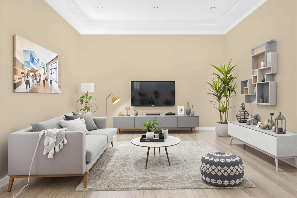
Sherwin Williams Softer Tan SW 6141 is an excellent living room color that brings warmth and balance to the space while pairing well with both modern and traditional design elements. Its balanced light reflection creates an inviting atmosphere without overwhelming the room, making it a strong choice for those looking to enhance brightness subtly.
This color harmonizes beautifully with rich accents such as red, black, and dark brown, while providing a striking contrast when paired with white trims and ceilings. It also serves as an adaptable backdrop that works well with complementary tones for accent walls, as well as blues and purples to deliver a vibrant, dynamic visual effect.
Outdoor
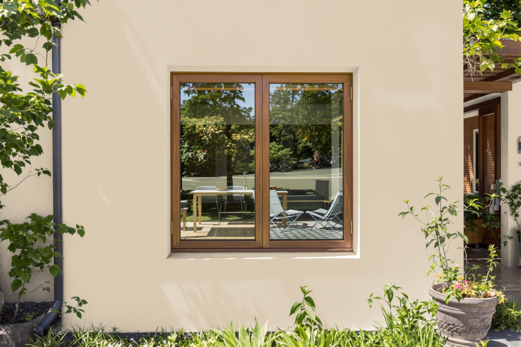
Sherwin Williams Softer Tan SW 6141 offers a warm, inviting option for home outdoor use, even though it is typically recommended for interior spaces. Its natural, earthy tone pairs well with complementary colors found in traditional Spanish-style exteriors, such as deeper earth tones and richer neutrals that can highlight architectural details.
Before committing to this color for your exterior, it is essential to test it under actual outdoor lighting conditions, as environmental factors can influence its appearance. In settings with prolonged direct sunlight, the color may seem lighter than intended, so careful evaluation on site will ensure the desired visual impact is achieved.