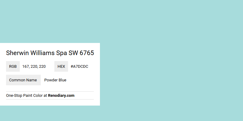
Sherwin Williams Spa SW 6765, with its serene RGB composition of 167,220,220, embodies the tranquil essence of a gentle Powder Blue. This soothing hue is reminiscent of calm waters and clear skies, making it an ideal choice for creating a relaxing atmosphere in any room. Perfect for both modern and traditional settings, this color evokes a sense of peace and clarity, enhancing any space it graces.
Color Description
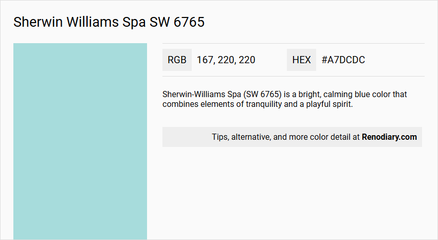
Sherwin-Williams Spa (SW 6765) is a bright, calming blue color that combines elements of tranquility and a playful spirit.
Undertones
This color has warm green undertones, which contribute to its cheerful and refreshing appearance.
Color Values
The RGB values for Spa (SW 6765) are 167, 220, 220. This indicates a moderate to high light reflectance, making it a relatively bright and vibrant color.
Usage
Spa (SW 6765) is suitable for various rooms, particularly those where a cheerful and calming atmosphere is desired, such as bathrooms or nurseries.
Atmosphere
The color introduces a perky cheerfulness and can create a sense of tranquility, making it ideal for spaces where a balance of calmness and playfulness is needed.
Sherwin Williams Spa SW 6765 Color Alternative
Sherwin Williams Spa SW 6765 is celebrated for its calming yet sophisticated presence that effortlessly enhances a space. For those seeking a fresh twist while retaining a similar vibe, Benjamin Moore San Clemente Teal 730 and Benjamin Moore Sonoma Skies 737 provide enchanting alternatives that blend vibrant energy with subtle refinement. Additionally, RAL Effect RAL 190-1 offers a modern perspective, delivering a distinct yet harmonious option that complements the original tone.
Bathroom
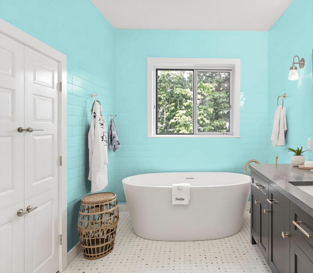
Sherwin Williams Spa SW 6765 creates a calming atmosphere in a bathroom with its serene hue, ideal for fostering a restful retreat. This color pairs well with crisp whites, sandy beiges, and earthy neutrals, fitting seamlessly with coastal or modern farmhouse styles while supporting both monochromatic and complementary designs.
Enhancements using shades such as SW 7008 Alabaster or SW 7036 Accessible Beige reinforce the soothing allure of the space. Whether applied to walls, furniture, or decor, this color bridges classic and contemporary elements, especially when highlighted by natural light, to craft an inviting and harmonious environment.
Bedroom
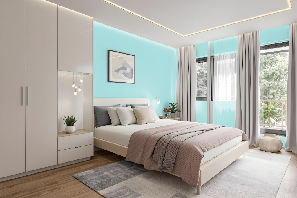
For a bedroom color scheme, Sherwin-Williams Spa SW 6765 sets a calm, coastal-inspired tone when paired with crisp whites, sandy beiges, and earthy neutrals. Incorporating complementary accents in gentle, warm shades helps create an inviting retreat by balancing light and dark variations of the same hue.
This color adapts to different design strategies, whether using a monochromatic approach to establish harmony or introducing contrasting hues for a lively dynamic. Its compatibility with both modern farmhouse and coastal design styles makes it an excellent choice for enhancing a serene and welcoming bedroom environment.
Kitchen
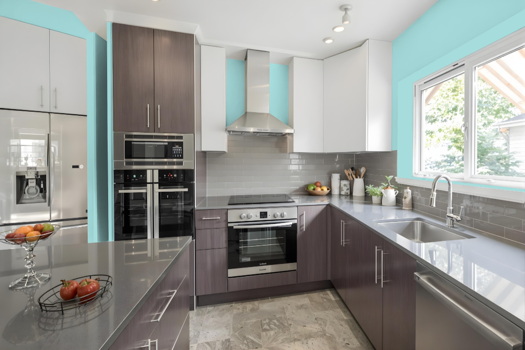
For a kitchen color scheme, Sherwin Williams Spa SW 6765 establishes a refreshing and calming backdrop that complements designs ranging from coastal to modern farmhouse. Its light quality enhances space by reflecting ample light throughout the room, creating an airy feel that brightens the overall environment.
The color pairs harmoniously with crisp whites like Alabaster and earthy neutrals akin to Accessible Beige, while darker tones such as a deep blue or indigo can be introduced as accent pieces on cabinets, islands, or decorative elements. This thoughtful combination creates an inviting and balanced kitchen design with depth and visual interest.
Living Room
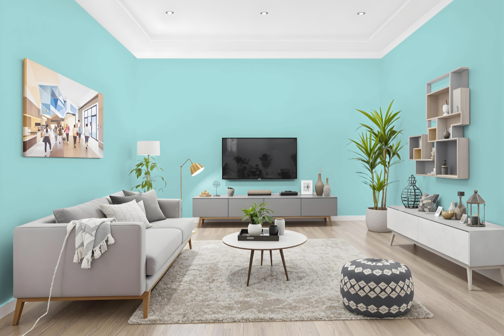
Sherwin Williams Spa SW 6765 living room color creates an inviting, bright atmosphere that makes spaces feel larger and more welcoming. With a high light reflectance value, this light shade reflects plenty of natural light and brings a serene mood to the room, especially when paired with crisp whites and earthy neutrals.
This color works beautifully across different decor styles, from coastal to modern farmhouse, and can enhance walls, furniture, and decorative accents alike. It integrates seamlessly into various color schemes, such as monochromatic or analogous arrangements, while also offering striking visual contrast when accented with deeper, bolder tones.
Outdoor
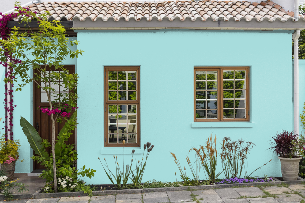
Home outdoor color Sherwin-Williams Spa SW 6765 creates a calming and inviting exterior, pairing seamlessly with crisp whites, sandy beiges, and earthy neutrals to evoke coastal or modern farmhouse aesthetics. This thoughtful hue is ideal for accentuating exterior walls, trim, or architectural details, enhancing the overall tranquility of your home's façade.
For the best results, it's recommended to preview this color digitally and consult with a color expert, ensuring it harmonizes with your specific home features. Whether used subtly or as a statement, this serene option brings a refreshing and balanced element to your outdoor design.