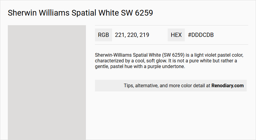
Sherwin Williams Spatial White SW 6259 is a versatile light gray paint hue, known for its subtle warmth and adaptability in various lighting conditions. With an RGB value of 221, 220, 219, it creates a soft, inviting atmosphere, making it a favorite for both modern and traditional interior designs. Its ability to seamlessly blend with a wide range of accent colors makes it a popular choice for those seeking a neutral yet dynamic backdrop.
Color Description
Sherwin-Williams Spatial White (SW 6259) is a light violet pastel color, characterized by a cool, soft glow. It is not a pure white but rather a gentle, pastel hue with a purple undertone.
Undertones
Spatial White has purple or violet undertones, which distinguish it from traditional white or neutral colors.
Color Values
- Hue: 30
- Saturation: 3
- Value: 86
- LRV (Light Reflectance Value): 71.87%
Usage
This color is suitable for interior and exterior paint projects. However, it is more commonly used for interior spaces to create a soft and calming atmosphere. For exterior use, it might be more effective as an accent color rather than a primary color due to its light and pastel nature.
Atmosphere
Spatial White creates a cool and soft atmosphere, making it ideal for rooms where a gentle, calming ambiance is desired. It can be paired with deeper violet shades to enhance its graceful tone.
Sherwin Williams Spatial White SW 6259 Color Alternative
Sherwin Williams Spatial White SW 6259 has inspired several appealing alternatives that maintain a similarly refined character. Tikkurila Y486 and Tikkurila Bungalow G500 offer unique nuances while still echoing the balanced simplicity of Spatial White SW 6259. Additionally, Dulux Just Walnut 90YR 73/029 serves as a complementary choice that adds warmth and depth, making these alternatives versatile options for varied design projects.
Bathroom
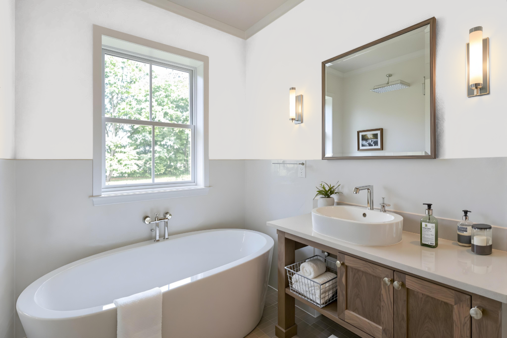
Sherwin Williams Spatial White SW 6259 is an excellent bathroom color that creates a clean, airy feel while reflecting light to enhance the space's size. This shade pairs beautifully with complementary hues like deep greens, muted blues, and earthy neutrals to enrich the overall aesthetic, making it a strong choice for ceilings, walls, and cabinets alike.
Its performance can vary depending on surface textures and lighting conditions, so using physical color swatches or samples, such as those provided by Samplize, is recommended to ensure that the final look meets your design expectations.
Bedroom
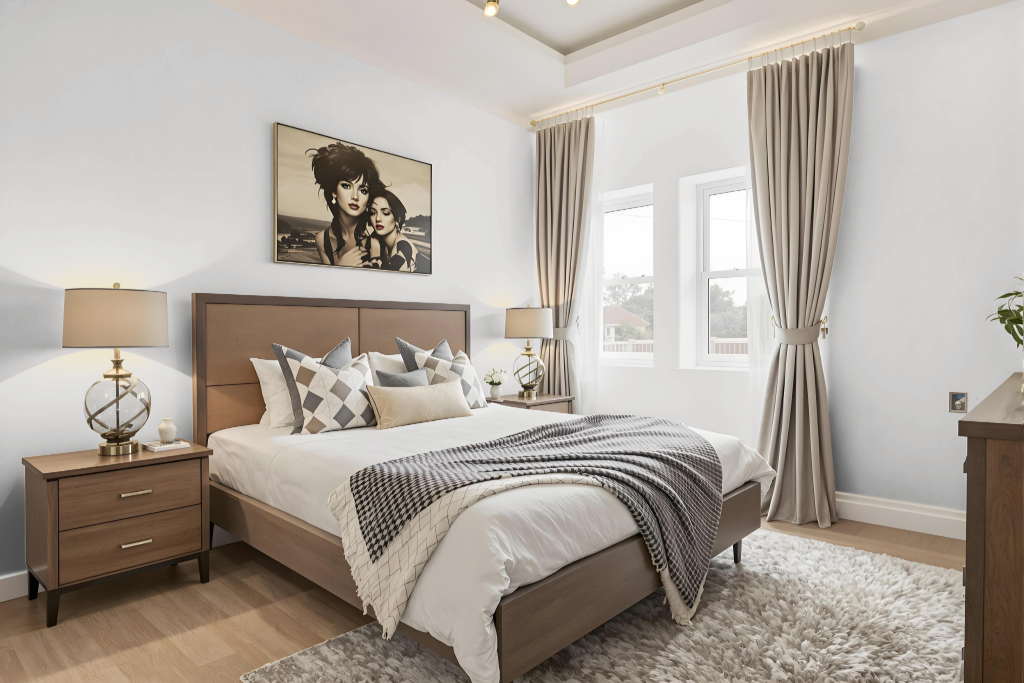
Sherwin Williams Spatial White SW 6259 is an appealing bedroom color with a subtle red undertone that infuses the space with a calm yet engaging warmth. This shade harmonizes beautifully when paired with deep greens, muted blues, and earthy neutrals to create a balanced and inviting ambiance.
For those looking to introduce a dynamic contrast, incorporating vibrant blues can enhance the overall design. Spatial White SW 6259 seamlessly integrates with similar hues from other collections, ensuring a well-coordinated aesthetic that spans various design elements.
Kitchen
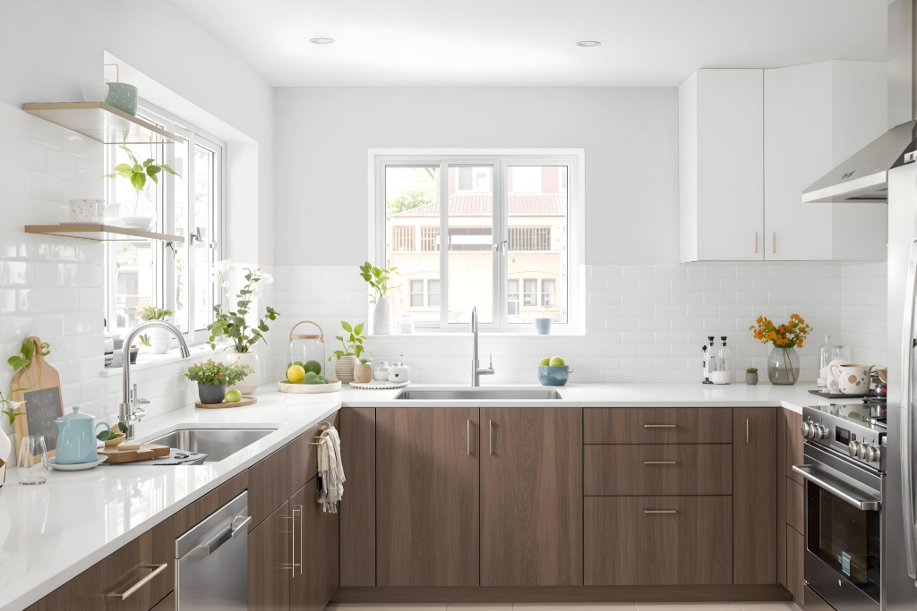
For a kitchen color scheme, Sherwin Williams Spatial White SW 6259 offers an elegant and contemporary option. This stylish shade creates a neutral backdrop that coordinates beautifully with deep greens like Sea Salt, muted blues such as Naval, and earthy tones like Accessible Beige, achieving a refined and well-balanced design aesthetic.
Its crisp and clean appearance enhances white appliances and kitchen fixtures, lending the space a bright and modern appeal. Additionally, Spatial White works harmoniously with blue-hued accents to produce a vibrant and dynamic visual effect throughout the room.
Living Room
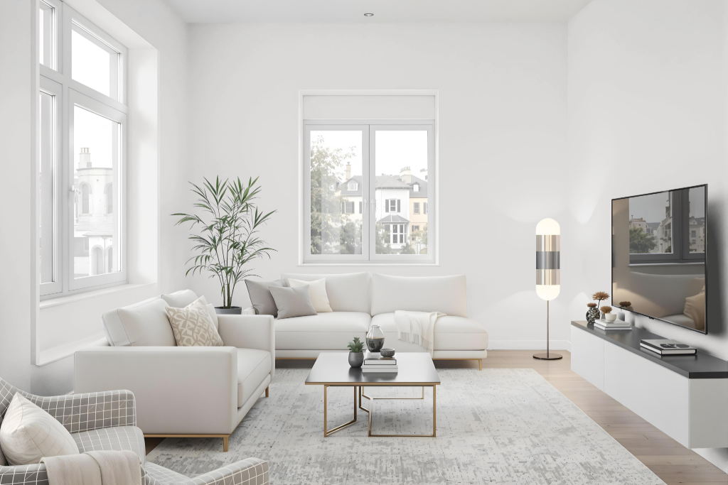
Sherwin Williams Spatial White SW 6259 is a refined living room color that brings a clean, airy feel to interior spaces. It is part of several distinguished collections, such as Living Well – Create, 2017 Noir, and 2020 Mantra, and pairs beautifully with deep greens, muted blues, and earthy neutrals, enhancing the overall sophistication and balance in any design setting.
When selecting this shade, it is important to consider that its appearance can vary depending on the texture and finish of different surfaces. Sampling the color on various sections of your home is recommended to ensure that the final result aligns perfectly with your envisioned aesthetic.
Outdoor
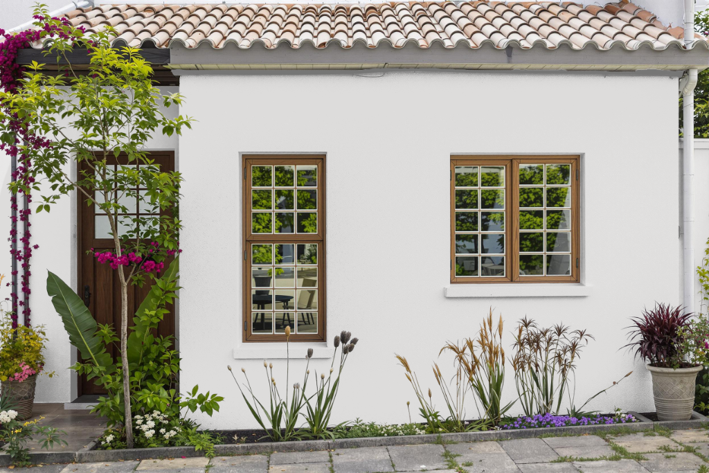
Sherwin Williams Spatial White is a practical choice for home outdoor painting, adding a clean and modern finish to features like walls and railings. Hailing from collections such as Living Well - Create, 2017 Noir, and 2020 Mantra, this color suits a variety of design themes while maintaining its appeal even as natural light and age subtly alter its appearance; complete re-coating is recommended over time to enhance its longevity.
For application, a custom spray paint option is available and crafted from a fast-drying acrylic enamel formula that works well both indoors and outdoors. An 11oz can typically covers around 20 square feet per coat, and the product is engineered to adhere smoothly to multiple surfaces—including metal, plastics, and pre-painted wood—ensuring consistent coverage and a reliable finish for your exterior projects.