Sherwin Williams Splashy SW 6942 is a vibrant shade that falls within the teal color family, known for its soothing and refreshing qualities. With its RGB composition of (1, 145, 150), this color achieves a balanced blend of blue and green hues, making it an excellent choice for spaces that aim to evoke tranquility and energy. Ideal for accent walls or decor, Splashy SW 6942 can serve as a versatile and uplifting element in both modern and traditional interior designs.
Color Description
Sherwin Williams Splashy SW 6942 is an electrifying shade of aqua blue that instantly enlivens a room, creating a modern and dynamic atmosphere.
Undertones
The undertone of Splashy is accurately described as a blue hue, without any significant deviations into other color families.
Color Values
- HEX value: #019196
- RGB code: 1, 145, 150
Usage
Splashy pairs beautifully with crisp whites, soft neutrals, and natural wood tones to balance its energetic presence. It can also be complemented with accents in coral or sunny yellow for a playful and cheerful contrast.
Atmosphere
This color creates a modern and dynamic atmosphere, making it ideal for adding a bold and vibrant pop of color to any space. It infuses interiors with personality and style.
Sherwin Williams Splashy SW 6942 Color Alternative
Sherwin Williams Splashy SW 6942 remains a bold and vibrant choice that inspires creative design decisions. Designers and homeowners can consider alternative hues such as Dulux Teal Touch 16BG 24/357, Sherwin Williams Nifty Turquoise SW 6941, and Sherwin Williams Gulfstream SW 6768 to achieve a diverse palette. Each of these color alternatives offers its own distinct appeal, providing flexibility in design while maintaining the spirit of dynamic, eye-catching aesthetics found in Sherwin Williams Splashy SW 6942.
Bathroom
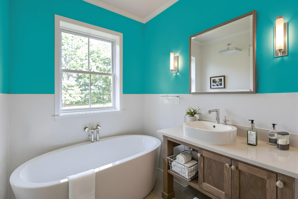
For a bathroom, Sherwin Williams Splashy SW 6942 can be a vibrant and dynamic choice. This appealing hue creates an eye-catching focal point when applied in bathrooms, lending a spirited and lively atmosphere that invigorates the space.
It harmonizes beautifully with crisp whites, soft neutrals, and natural wood tones while offering a playful contrast when paired with coral or sunny yellow accents. Keep in mind that the color’s appearance may vary based on the texture of the surface, making it a compelling option for both integrated monochromatic setups or designs featuring a complementary color scheme.
Bedroom
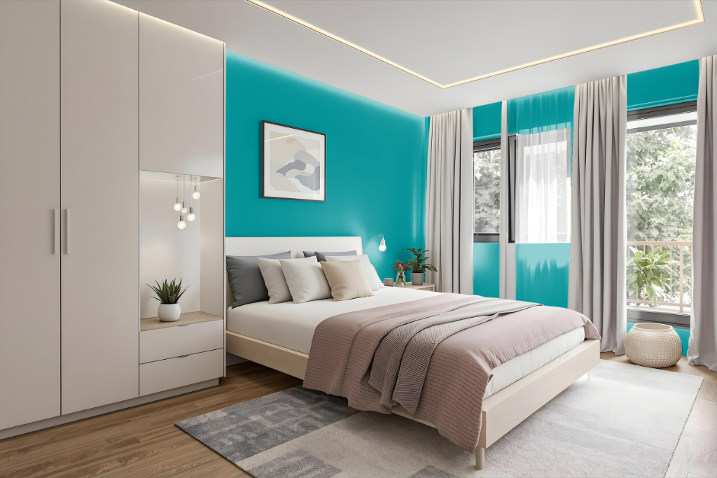
In a bedroom setting, Sherwin Williams Splashy SW 6942 offers a medium-dark color that creates a cozy and intimate atmosphere. Its cool tone and low light reflectance value provide an ideal backdrop that harmonizes with crisp whites, soft neutrals, and natural wood accents, while playful hints of coral or sunny yellow introduce a lively contrast.
This color adapts well to various design schemes such as monochromatic, complementary, or analogous pairings. When applying it to different surfaces, it’s important to consider the texture, as its appearance can change between rough walls and smooth finishes like cabinets or furniture.
Kitchen
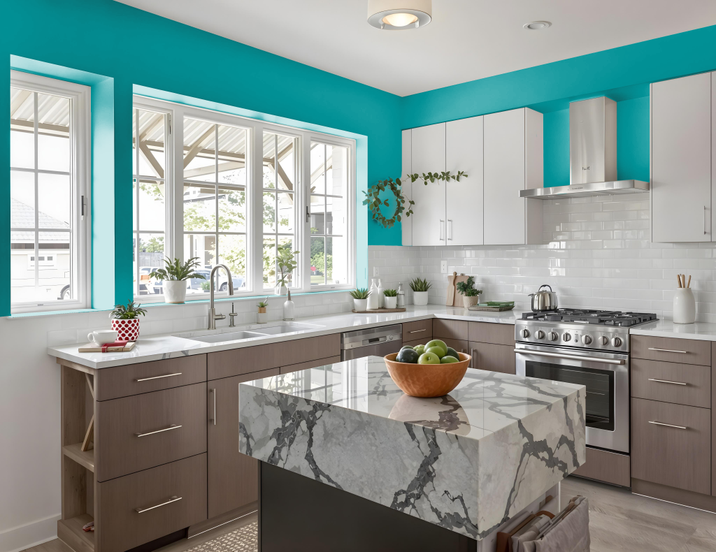
For a kitchen color scheme, Sherwin Williams Splashy SW 6942 brings vibrancy and energy, complementing crisp whites, soft neutrals, and natural wood tones. Playful accents in coral or sunny yellow can enhance the dynamic presence of this lively shade.
For a cohesive design, consider a monochromatic approach using various shades, tints, and tones of Splashy, or introduce complementary hues such as Raucous Orange and Blushing to elevate the visual impact. With its medium-dark light reflectance, ensuring ample natural light in the kitchen is essential to maintain a welcoming atmosphere.
Living Room
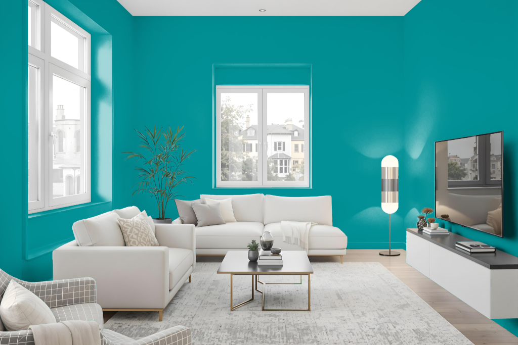
Splashy by Sherwin Williams enhances a living room with its modern, dynamic allure. This hue harmonizes with crisp whites, soft neutrals, and natural wood tones to create a balanced backdrop, while playful accents in coral or sunny yellow introduce a cheerful contrast.
It is essential to consider the surface on which Splashy is applied, as its appearance may vary between rough walls and smooth surfaces like cabinets. For optimal results, visualize the color in your space or consult with an expert to ensure it meets your design goals.
Outdoor
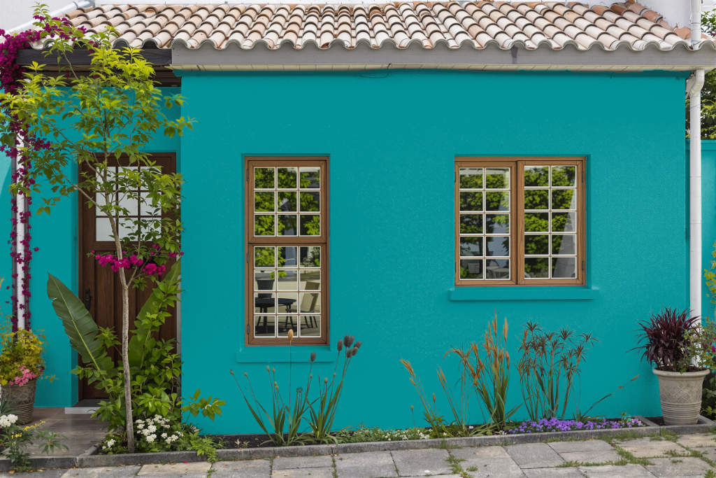
Home outdoor color Splashy SW 6942 sets an energetic tone for exterior projects, offering a medium-dark hue that creates an intimate and cozy atmosphere in outdoor spaces. Its depth delivers a bold yet inviting presence that can transform a home's exterior, particularly when applied on smooth surfaces where its character is most pronounced.
For outdoor applications, this dynamic shade pairs effectively with crisp whites, soft neutrals, and natural wood tones, providing a harmonious balance that enriches architectural elements. Strategic accents in warm tones, such as coral or sunny yellow, introduce a playful contrast, while its adaptability supports creative design schemes ranging from monochromatic to complementary and analogous palettes.