Sherwin Williams Topsail SW 6217 is a soothing light gray hue that effectively balances subtle warmth and coolness, ideal for creating a calming atmosphere in any space. With an RGB value of 218, 226, 224, this delicate shade exudes elegance and sophistication, aligning perfectly with contemporary design trends. Its versatility makes it a popular choice for enhancing both modern and traditional interiors, providing a serene backdrop that complements a wide range of color palettes.
Color Description
Sherwin Williams Topsail SW 6217 is a light-toned, clean, and crisp blue paint color. It has a calming and soothing effect, making it ideal for creating a tranquil atmosphere. In bright and natural light, it can exhibit aqua color tones, adding to its coastal and versatile appeal.
Undertones
Topsail SW 6217 has undertones that include deep blue and green, with slight gray undertones. These undertones help in moving away from yellow and beige tones, creating a modern coastal color palette. There are also mentions of it showing hints of other colors like pale yellow, light purple, mint, lilac, and pale pink, though the primary undertones are blue and green.
Color Values
- RGB Values: Red = 218, Green = 226, Blue = 224.
- HEX Code: #dae2e0.
- LRV (Light Reflectance Value): 74.67 to 75, indicating it is a relatively light paint color that reflects a significant amount of light.
Usage
Living Room
Ideal for smaller rooms to make them appear larger. It can be paired with subtle and darker blues as accents, white sheer curtains, and black or patterned throw pillows and rugs.
Kitchens
Suitable for cooler kitchen designs, paired with greys and deep blues for contrast. It can be used on cabinets or the back wall.
Bedrooms
Creates a cool and relaxing aura. Can be paired with neutral beiges, greiges, or greys, and decorative accents like blush or mustard yellow.
Exteriors
Especially recommended for warmer states, as it reflects incoming light, making exteriors cool and inviting. It can be paired with super whites or grays for decorative moldings and trims.
Atmosphere
Topsail SW 6217 contributes to a light, airy, and calm atmosphere. It helps in reducing stress and creating a sense of tranquility. The high reflectivity of the color makes spaces appear larger and more spacious, which is particularly beneficial for small rooms or apartments.
Sherwin Williams Topsail SW 6217 Color Alternative
Sherwin Williams Topsail SW 6217 offers elegant characteristics that are beautifully echoed by the alternative choices available in the market. Tikkurila Y486 provides a vibrant appeal that adds energy to any space, while Tikkurila Bungalow G500 introduces a warm, inviting nuance perfect for both modern and classic settings. Additionally, Tikkurila Spa X442 imparts a serene and sophisticated ambiance, making these three alternatives ideal selections for a refreshed yet familiar color experience.
Bathroom
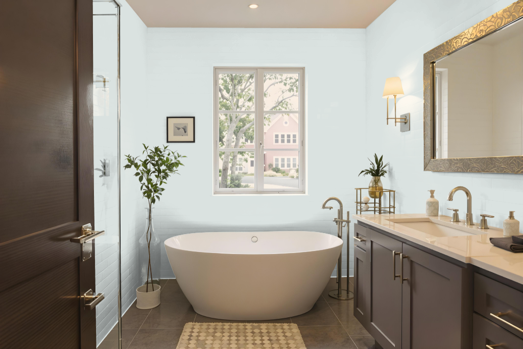
Sherwin Williams Topsail SW 6217 is an excellent choice for a bathroom, creating a serene and inviting atmosphere. It pairs beautifully with warm neutrals and earthy tones such as those provided by Worldly Gray and Accessible Beige, while strategic accents like Gambol Gold or Hardware add visual contrast.
The cool and light undertones of Topsail enhance natural light, lending a bright and airy feel to the space. Its ability to coordinate with various design elements, from flooring to fabrics, makes it a practical option for transforming bathroom aesthetics.
Bedroom
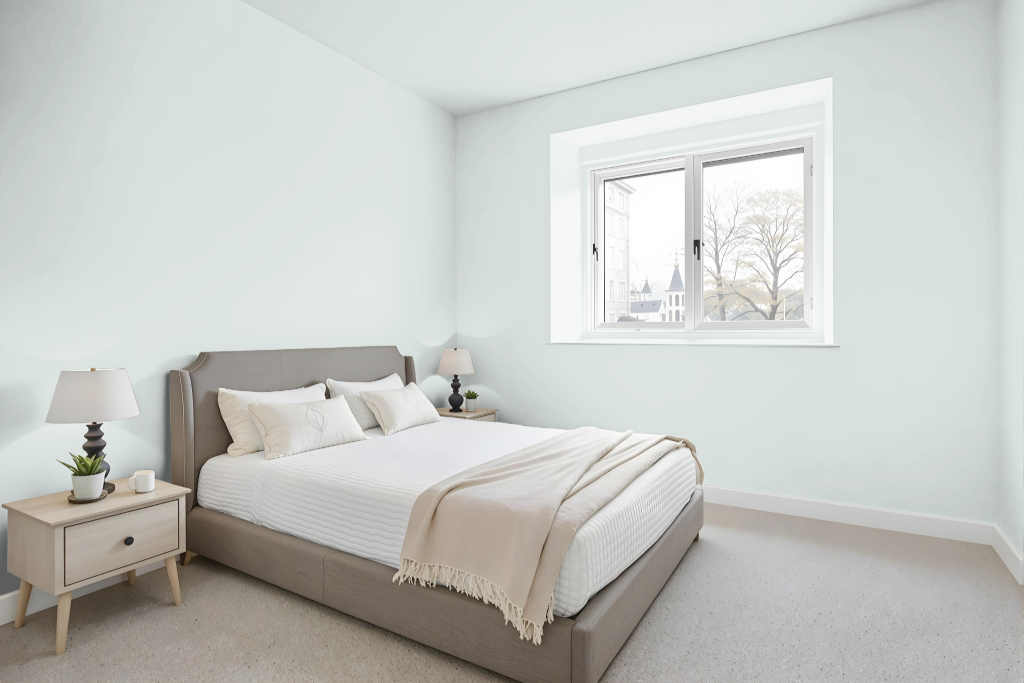
Sherwin Williams Topsail SW 6217 is an excellent bedroom color choice, offering a calming and sophisticated appeal that sets a serene tone in the space. Its ability to reflect light enhances room brightness and creates a more open feel, ensuring that bedrooms appear inviting and refreshed under different lighting conditions.
This shade pairs beautifully with white trim, subtle wood tones, and complementary shades such as blue and gray. It works harmoniously with warm neutrals and earthy tones to create a cohesive environment, while strategic pops of deeper accents bring contrast and definition to the overall décor.
Kitchen
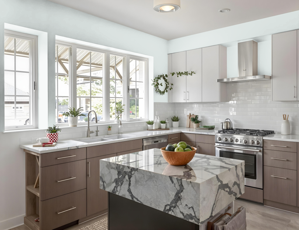
For a kitchen color scheme, Sherwin Williams Topsail SW 6217 offers a refreshing backdrop that pairs harmoniously with warm neutrals like Worldly Gray and Accessible Beige, creating a balanced feel for cabinets, countertops, and surrounding elements. Its subtle aqua tone and green undertones lend a lively yet calm character that elevates the overall ambiance.
To introduce dynamic contrast, incorporating accents in shades such as Gambol Gold or Hardware can enhance fixtures and accessories, adding a touch of bold elegance. It is important to consider the kitchen's lighting, as both natural and bright light conditions can influence how this hue is perceived on different surfaces.
Living Room
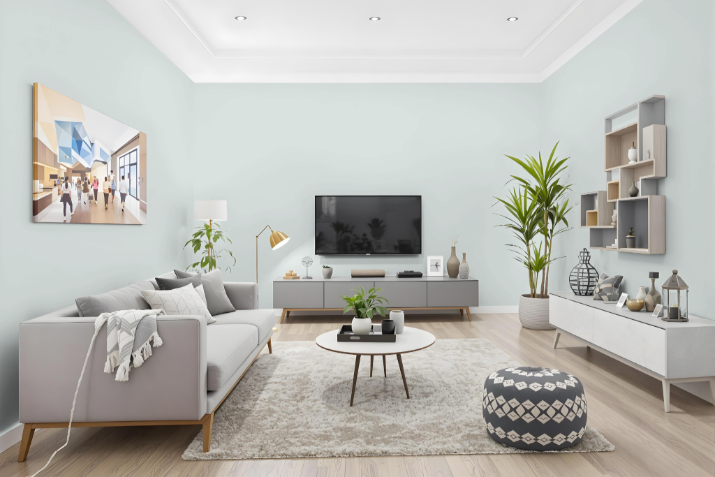
Sherwin Williams Topsail SW 6217 is a calming living room color that enhances the ambiance and creates a welcoming space. It blends seamlessly with warm neutrals like Worldly Gray and Accessible Beige, and offers a refined backdrop for accent colors such as Gambol Gold or Hardware.
This hue pairs elegantly with subtle blues to provide balance, while decorative elements like white sheer curtains, black accents, and patterned throw pillows or rugs add visual interest. In spaces featuring fireplaces or distinctive architectural details, complementary features such as exposed brick, black marble, or white tiles further elevate the room’s character, making it feel light, airy, and more spacious.
Outdoor
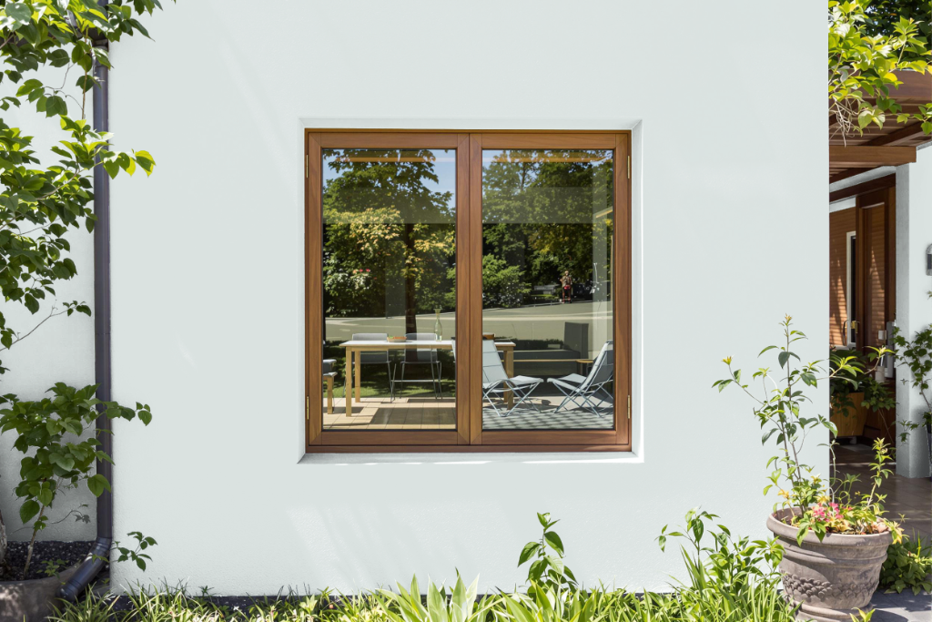
For outdoor use, Sherwin Williams Topsail SW 6217 provides an excellent option for home exteriors, especially in warmer climates where its reflective quality helps maintain a cooler and more inviting space. Its light-reflecting properties make it especially suitable for regions with abundant sunlight, contributing to both energy efficiency and curb appeal.
In areas such as Florida, Topsail is effective on the body of the home, shutters, and other exterior elements. It pairs well with crisp white or soft gray accents on moldings, door and window frames, and trims to highlight architectural details, while doors in stark white or lighter wooden hues create a harmonious balance without the use of darker tones.