Sherwin Williams Touch of Sand SW 9085, characterized by its RGB composition of 213, 199, 186, embodies a refined and versatile shade of taupe. This subtle color infuses spaces with a warm, earthy ambiance, making it an ideal choice for creating a cozy and welcoming environment. Its neutral undertone seamlessly complements a variety of design elements, effortlessly enhancing both classic and contemporary interiors.
Color Description
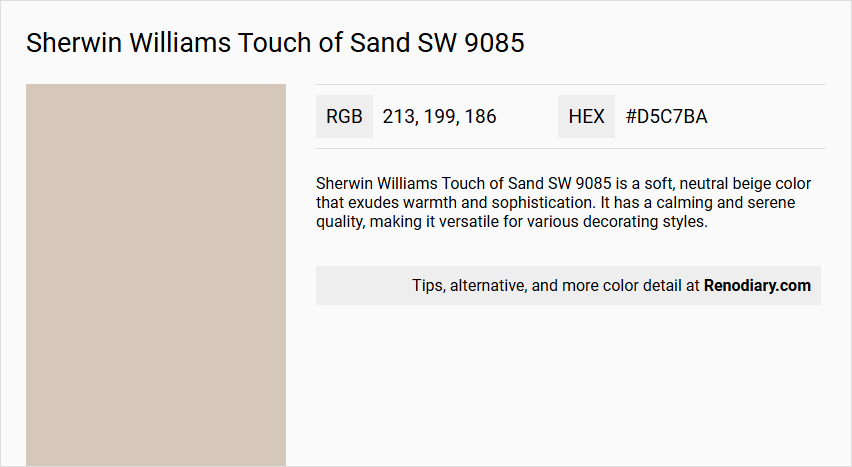
Sherwin Williams Touch of Sand SW 9085 is a soft, neutral beige color that exudes warmth and sophistication. It has a calming and serene quality, making it versatile for various decorating styles.
Undertones
The undertone of Touch of Sand is predominantly red, which is evident when analyzing its color space.
Color Values
- HEX: #D5C7BA
- RGB: 213, 199, 186
- CMYK: 0, 7, 13, 16
- Light Reflectance Value (LRV): Approximately 59
Usage
Touch of Sand is suitable for use as a main wall color or as an accent. It pairs well with other neutral colors like SW 7029 Agreeable Gray for a classic look, or with SW 6690 Gambol Gold for a touch of luxury. It can also be part of a monochromatic color scheme with lighter shades like SW 6028 Cultured Pearl or darker shades like SW 2805 Renwick Beige.
Atmosphere
This color creates a serene and inviting atmosphere, bringing a sense of tranquility and understated elegance to any room. It is ideal for creating a calming backdrop and can contribute to a warm and sophisticated interior design.
Sherwin Williams Touch of Sand SW 9085 Color Alternative
Sherwin Williams Touch of Sand SW 9085 offers a balanced neutral palette that can be beautifully complemented or substituted by alternative hues. Tikkurila Shawl Y467 and Tikkurila Brexia X465 provide distinctive variations that maintain the warm, inviting essence of the original while introducing subtle shifts in character. Meanwhile, Dulux Raw Cashmere 40YY 60/103 emerges as a refined possibility, ensuring that the overall aesthetic remains consistent across different design contexts.
Bathroom
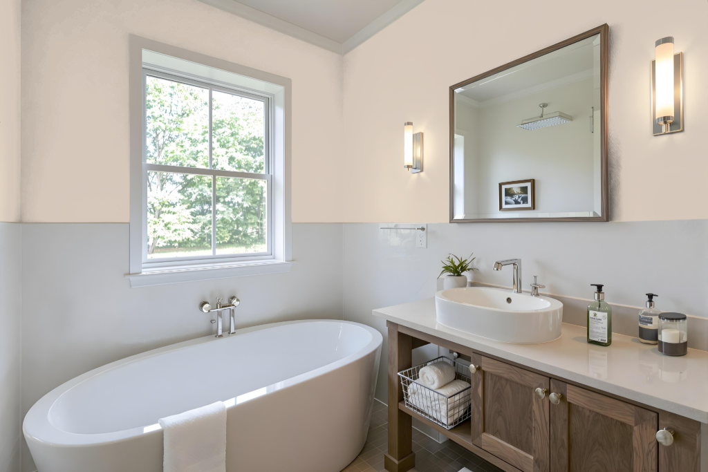
For a bathroom, Sherwin Williams Touch of Sand offers a serene and calming look that enhances the space’s overall ambiance. Its warm and balanced tone lends itself to seamless integration with existing bathroom elements such as tiles, baths, and sinks, allowing for a harmonious interplay of design features.
This shade pairs beautifully with lighter hues to create subtle contrast or with deeper tones for added visual depth. The inherent red undertone also provides a dynamic complement to green accents, resulting in a cohesive and inviting bathroom atmosphere that exudes understated elegance.
Bedroom
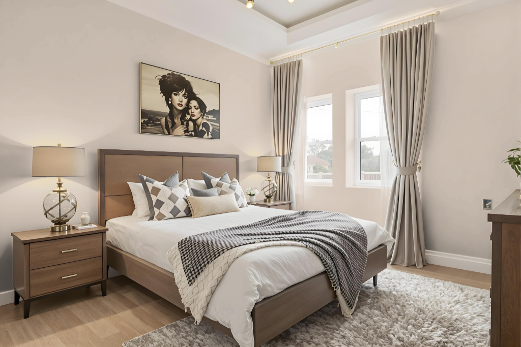
For a bedroom color scheme, Sherwin-Williams Touch of Sand SW 9085 creates a soothing and timeless backdrop that sets a serene tone for restful spaces. It works harmoniously with neutral shades like Agreeable Gray for a classic ambiance or Gambol Gold for added luxury and depth.
This color also adapts well to monochromatic designs, where pairing with lighter hues or deeper accents further enhances its calming effect. Additionally, incorporating green tones and combining it with minimalistic decor and wood accents results in a balanced, inviting environment perfect for a bedroom retreat.
Kitchen
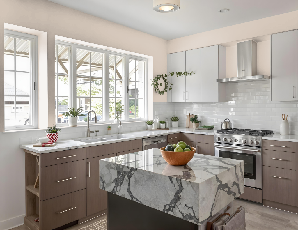
For a kitchen color scheme, Sherwin Williams Touch of Sand creates a calm and sophisticated backdrop. It pairs beautifully with other hues to form classic, soothing combinations when matched with colors like Agreeable Gray or to introduce a richer accent with shades resembling Gambol Gold. This layer of neutral elegance works well as a dominant wall color or an accent, enhancing spaces that feature minimalistic design, warm tones, and natural wood elements.
For those seeking a more dynamic ambiance, Touch of Sand also complements colors with hints of green found in collections such as Mount Etna and Debonair. This combination adds a sense of liveliness to interiors while maintaining an inviting and serene kitchen atmosphere.
Living Room
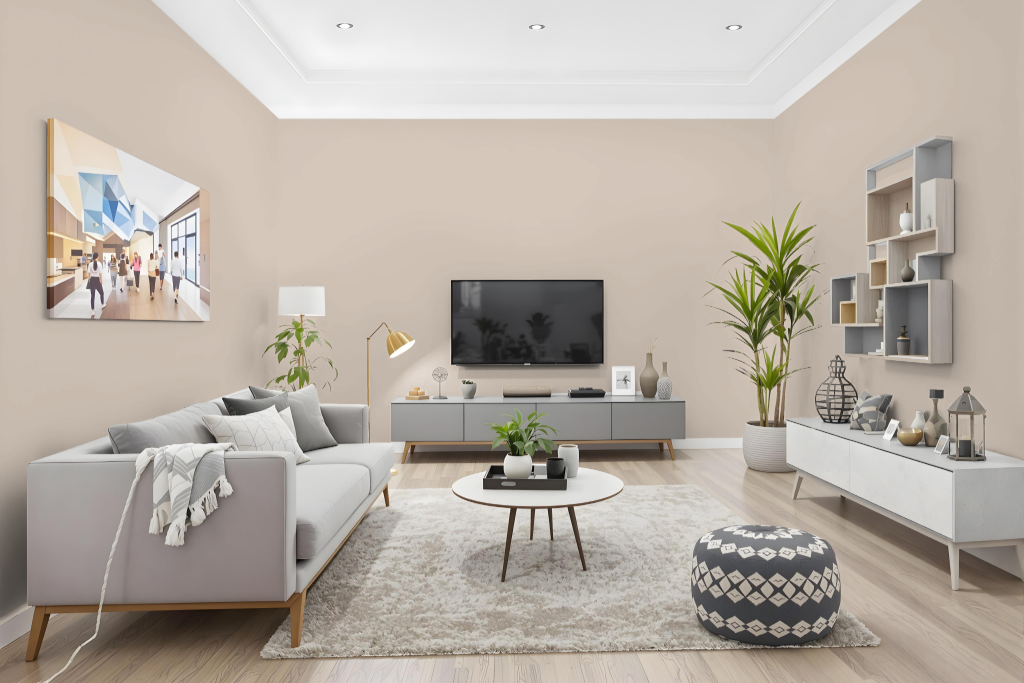
Sherwin-Williams Touch of Sand SW 9085 creates a serene and inviting living room ambiance, pairing harmoniously with options like a classic gray or a luxurious complementary gold. Its warmth and subtle depth enhance wood accents and can be balanced with greener shades for a dynamic, contemporary feel.
This charming hue adapts well to various decor styles including minimalism and warm neutrals, offering a refined backdrop that elevates any space. As part of well-regarded collections like Living Well and 2020 Alive, it delivers both distinction and a sense of calm in interior design settings.
Outdoor
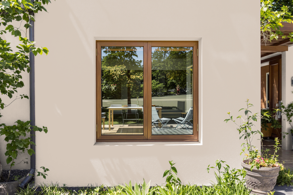
Sherwin-Williams Touch of Sand SW 9085 provides an attractive home outdoor color option ideal for enhancing exterior spaces. Its innovative, no-damage adhesive backing in sample form makes it easy to try on various surfaces like exterior walls without causing harm, and it comes from highly regarded collections that emphasize a well-balanced, living environment.
This color creates a serene and inviting atmosphere perfect for complementing different decorating styles and materials, including wood accents. It pairs beautifully with classic grays for a timeless look or more opulent hues for added luxury, aligning seamlessly with minimalistic and warm neutral design themes in outdoor projects.