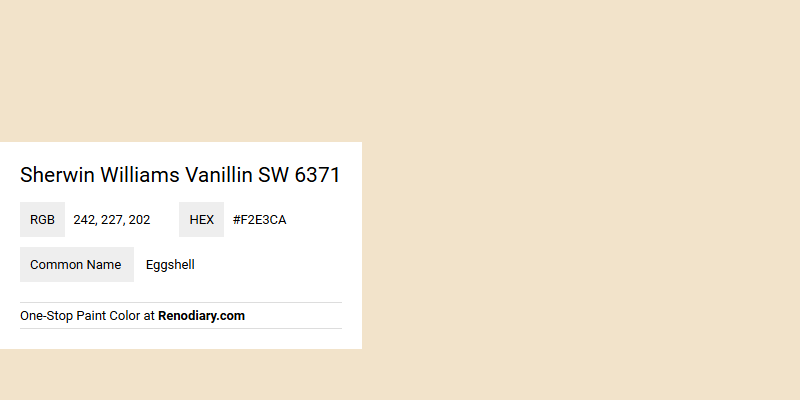
Sherwin Williams' Vanillin SW 6371 is a soft, warm hue that embodies a creamy, eggshell-like essence. This color, with its RGB composition of (242, 227, 202), offers a subtle blend of warmth and serenity, making it a versatile choice for interior spaces looking to capture a harmonious and inviting atmosphere. Its gentle, neutral undertone complements a variety of design elements, from rustic wood finishes to sleek, modern accents.
Color Description
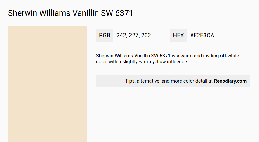
Sherwin Williams Vanillin SW 6371 is a warm and inviting off-white color with a slightly warm yellow influence.
Undertones
The undertones of Vanillin can be described as having a warm, yellow hue, although some analyses suggest a red undertone when isolated from other color components.
Color Values
- HEX: #F2E3CA
- RGB: 242, 227, 202
- CMYK: 0.0%, 6.2%, 16.5%, 5.1%
Usage
Vanillin is versatile and can be used as the main color or as an accent. It pairs well with soft pastels, bold and rich tones, and creates a cohesive look in various color schemes. It can be combined with colors like SW 6748 Maple Leaf, SW 6258 Tricorn Black, SW 6187 Rosemary, or SW 9060 Connor's Lakefront.
Atmosphere
Vanillin creates a cozy and timeless atmosphere, adding a touch of sophistication when paired with certain colors. It can also produce a calming effect when matched with softer tones, making it suitable for a wide range of interior designs.
Sherwin Williams Vanillin SW 6371 Color Alternative
Sherwin Williams Vanillin SW 6371 has several compelling color alternatives that can complement a wide range of decor styles. Tikkurila Parchment F466, Dulux Barrister White 30YY 80/088, and Little Greene Light Beauvais 323 each offer a unique balance between warm elegance and modern sophistication. Selecting one of these alternatives allows designers and homeowners to tailor a space with a fresh yet timeless appeal while remaining true to the essence of the original Vanillin.
Bathroom
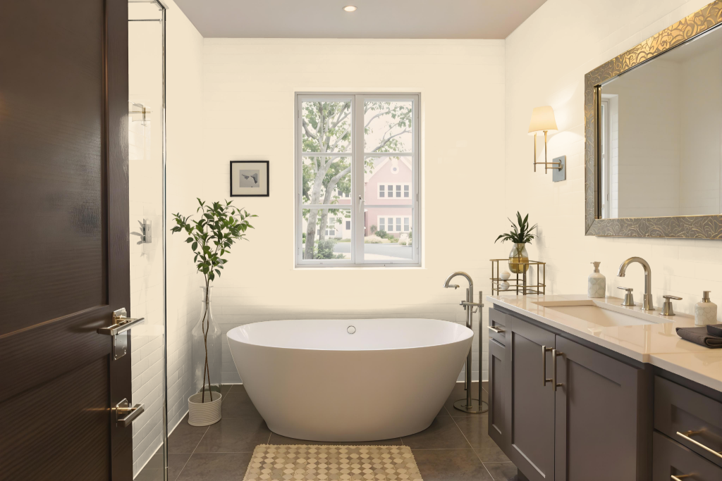
For a bathroom, Sherwin Williams Vanillin SW 6371 creates a warm and inviting atmosphere while pairing beautifully with a range of fixtures and decor. It harmonizes with softer pastels or richer hues to add depth and visual interest, and its light nature helps make the space feel larger and airier—though careful attention to lighting is needed to prevent it from looking washed out.
For trim and baseboards, lighter tones or slightly darker shades can be employed to provide contrast and enhance the overall look. This approach results in a refreshing, well-balanced bathroom setting that adapts gracefully to various design details.
Bedroom
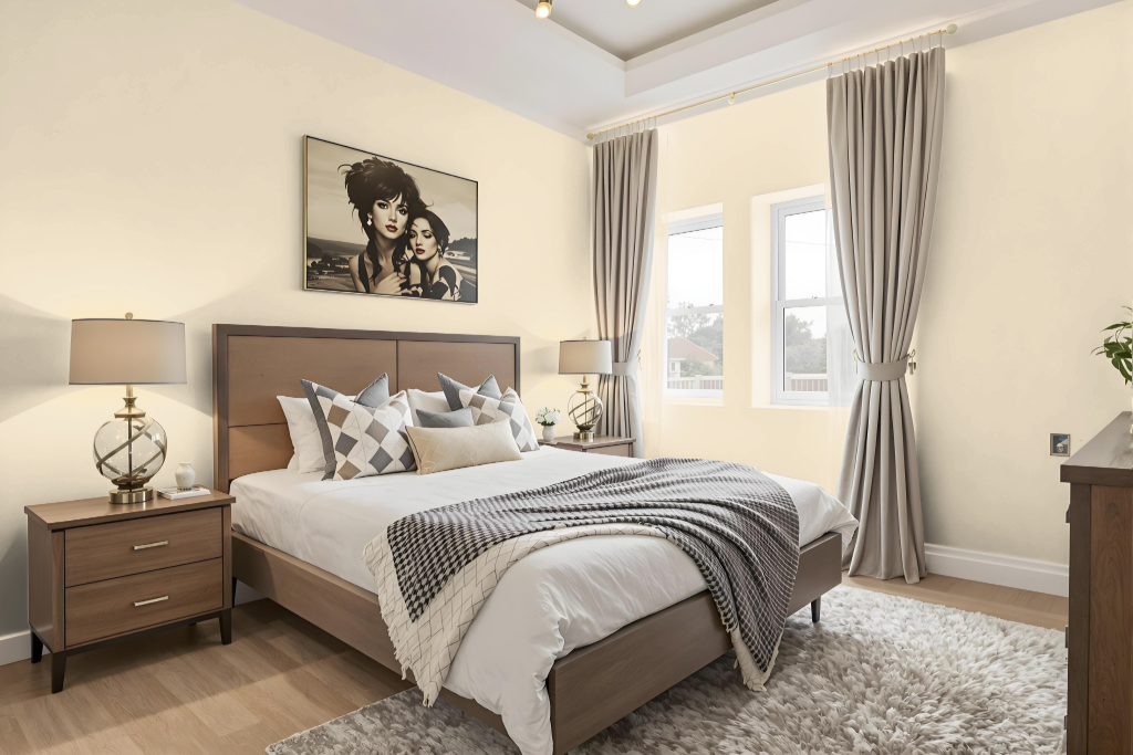
Sherwin Williams Vanillin SW 6371 stands out as an excellent bedroom color, offering a warm and inviting tone that creates a cozy ambience. The color pairs well with neutral complements like a subtle warm gray with faint violet hints to accentuate its softness, or a mid-tone gray enriched with shades of chocolate brown to add depth and contrast.
Adding a bold accent with a deep blue-green on select accessories or an accent wall can inject a dynamic element into the space, while lighter finishes for trim and baseboards enhance the overall balanced feel. Together, these thoughtfully chosen hues craft a harmonious and appealing palette tailored for a welcoming, tranquil bedroom retreat.
Kitchen
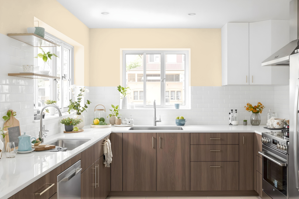
For a kitchen color scheme, Sherwin Williams Vanillin SW 6371 creates a warm and inviting foundation that works well with a variety of complementary hues. It harmonizes beautifully with neutral warm grays featuring a subtle violet undertone, while a mid-tone gray with shaded chocolate brown accents adds depth and balance.
Enhancing the overall design, a deep aquatic blue-green can be incorporated sparingly as an accent, creating a striking pop of color. For trim and baseboards, pairings that echo the warm characteristics provide a refined contrast, ensuring a well-balanced and cohesive kitchen atmosphere.
Living Room
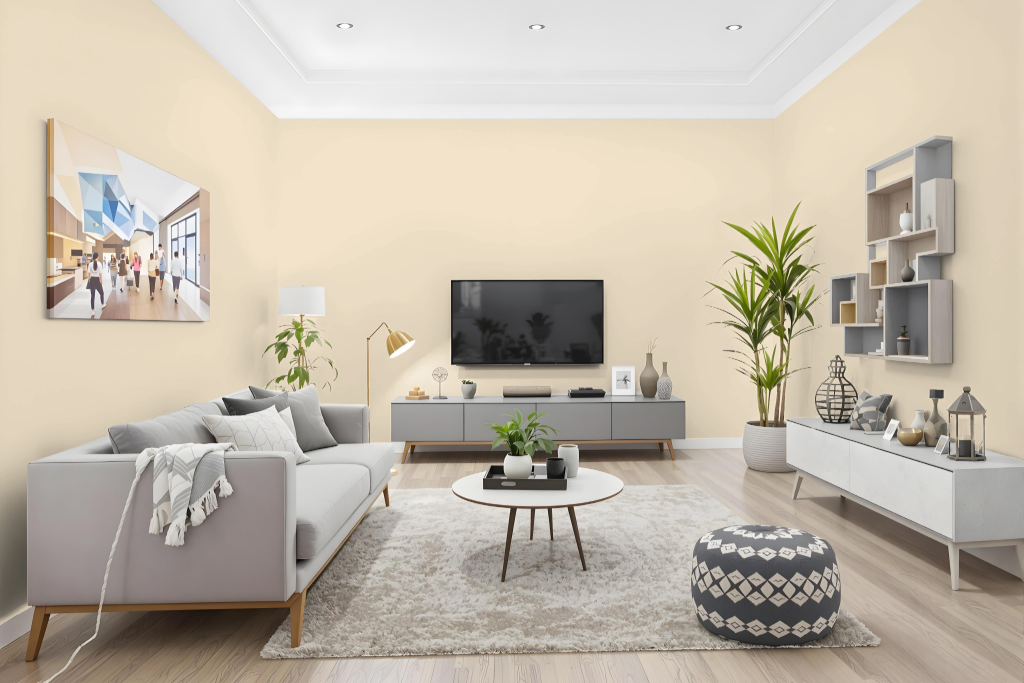
Vanillin creates a warm and inviting living room setting, serving as a dynamic statement color that pairs beautifully with both soft pastels and bold tones. It works seamlessly with complementary colors to enhance spaces, whether paired with shades that bring sophistication or hues that evoke a calming effect.
This adaptable color supports a range of design schemes, from coherent monochromatic arrangements to vibrant, contrasting compositions featuring lively blue accents. Additionally, it can be effectively used as an accent in bright, cheerful spaces like kitchens, where it is gracefully complemented by coordinating trim colors.
Outdoor
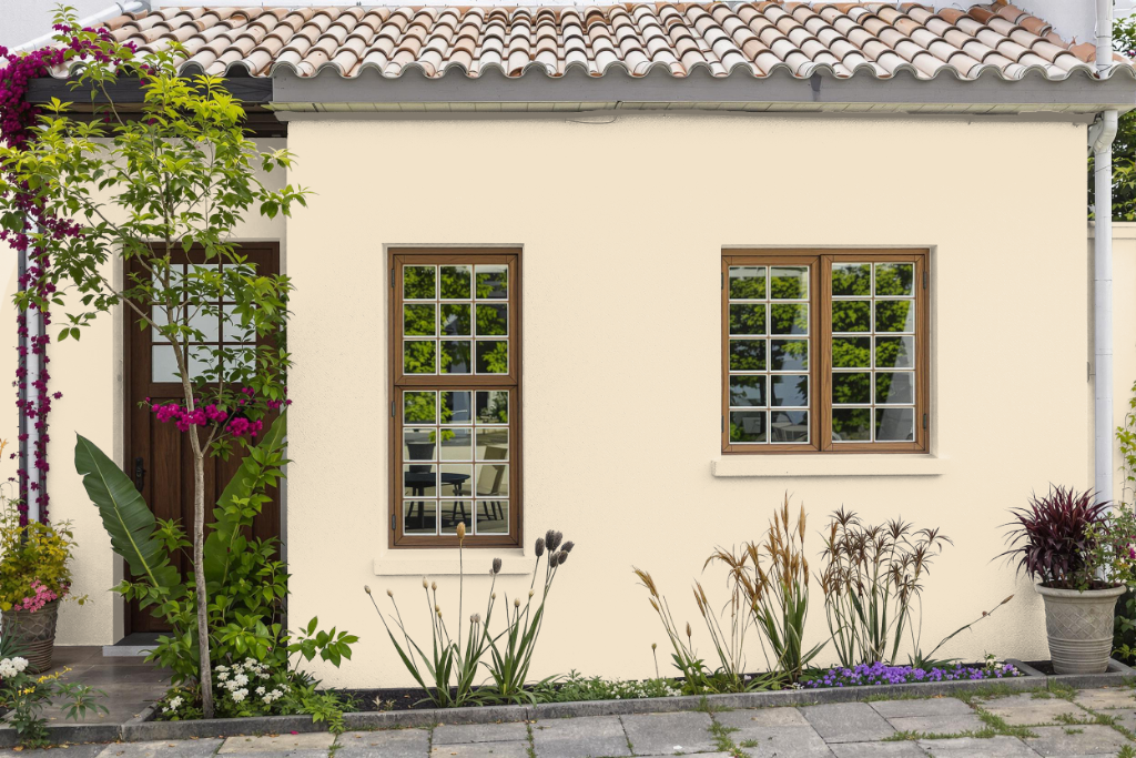
Sherwin Williams Vanillin SW 6371 enhances home exteriors by introducing a warm, inviting tone that elevates outdoor living spaces. This color works beautifully on the exterior of houses, adding brightness and a timeless appeal to patios, porches, and garden structures.
Indoors, it pairs effectively with soft pastels and deep, rich hues to create cozy, balanced environments across bedrooms, kitchens, and hallways. Paired with complementary shades such as Rosemary or Lakefront, it achieves a sophisticated yet calming atmosphere. For the best outcome, it's advisable to test samples in different lighting conditions to ensure the intended look is maintained.